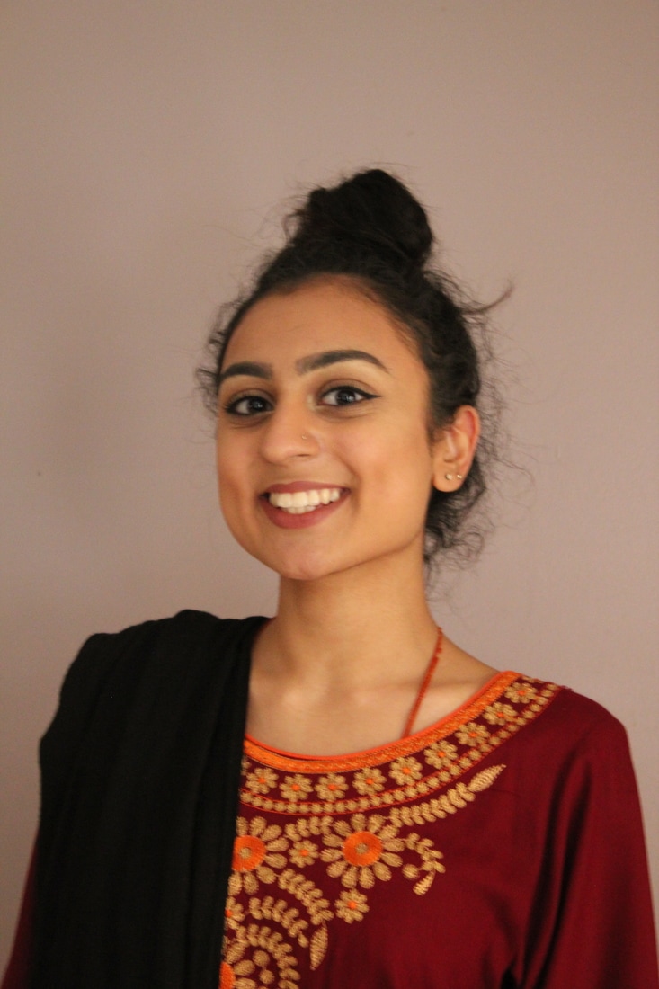
Portraiture
|
|
|
|
Threshold Concepts
Photography wasn't the first thing we had to document other thing, artist had paintings where they can document other things and after a while photography came along which was second place next to painting because no one believed that it would work and painting was much easier and would last longer. Then Fox Talbot came along and claimed that photography was the pencil of nature. Which it took time while artists began to see the real creative potential in photography. At this stage photographers and painters were keen to compete with each other. As time went by photography began to grow and to create its own genres, showing its abilities of the camera such as - photojournalism, fashion and etc.
|
|
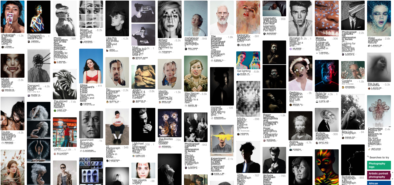
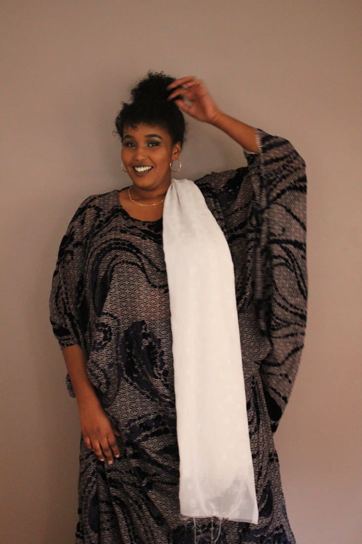
I was able to do some research using Pinterest to gather more ideas. By looking at other artists work I would be able to gather more ideas and try to find a link to my work.
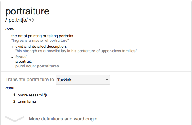
By researching the definition of "Portraiture" you have a clear understanding and also you realise that they include art and photography into it. What I have also done was translated it into Turkish, so that I would have a better understanding of the word "Portraiture".
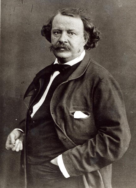
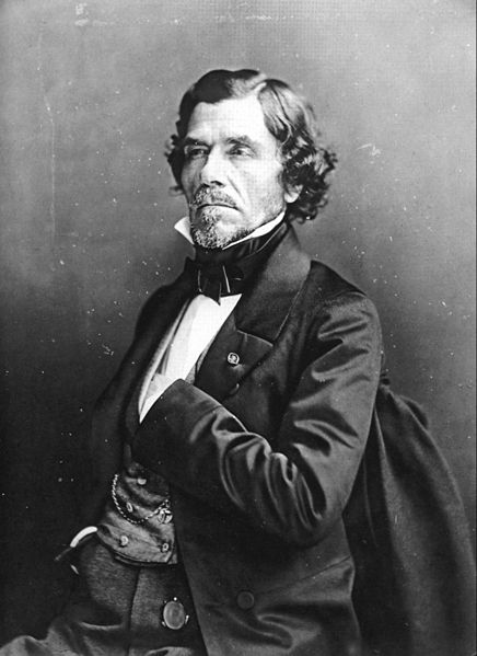
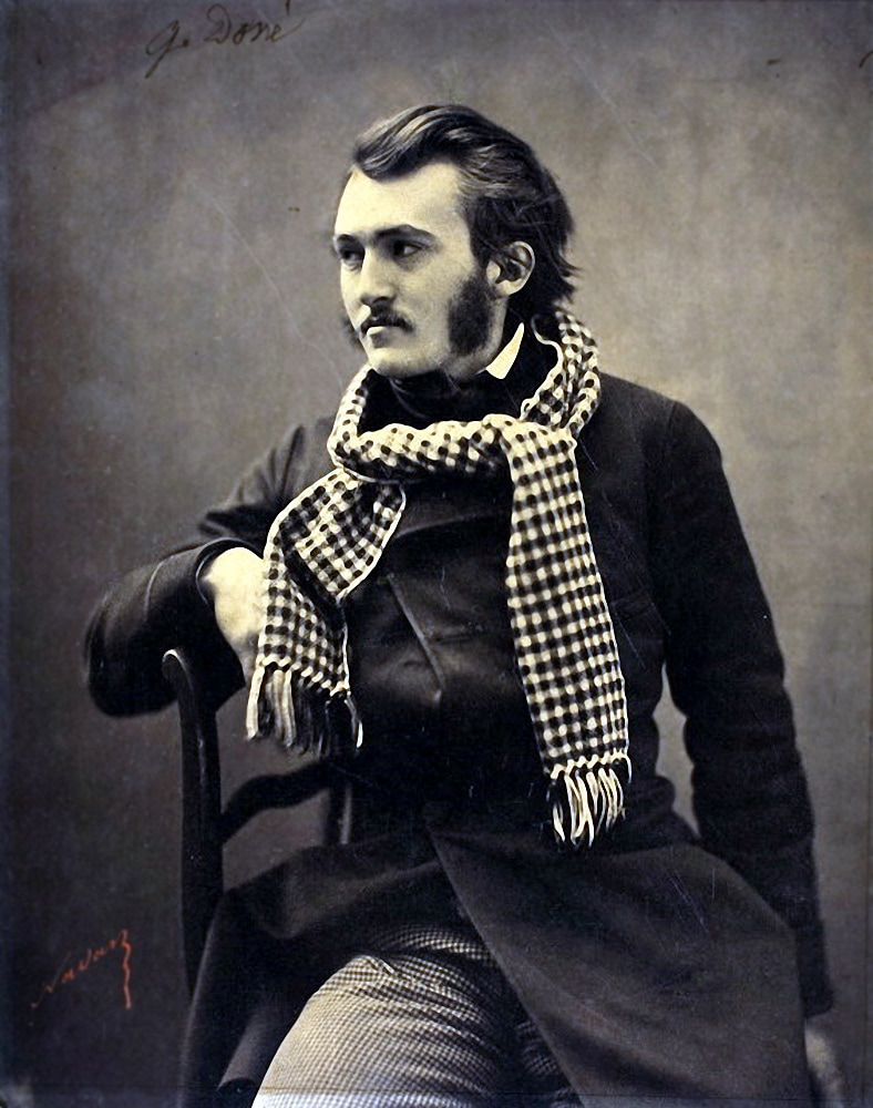
Felix Nadar - Photographer(1820–1910)
Felix Nadar is a French photographer, journalist, caricaturist and many more. He became famous for his studios and the images that he has taken using the giant gas-powered balloon. He built a giant balloon named Le Géant ("The Giant"), it was a balloon powered by gas so that he could take the world's first aerial photograph, which he also experimented with serial photography. Nadar's photographic portrait were held in many of the great national collections of photographs. His photographs were amazing the way he would capture something so that it could last a life time and back then they didn't have any other way to take a picture of them self so that they could be remembered keeping it as a self portrait, keeping it a memory and showing us the style they had now. If these type of photographs didn't exist we wouldn't have a clue on what type of setting and clothing they had back in 1820 onwards. The content of the work is a portrait of people so that it could be a memory something that would last a really long time, because were focusing and research on the time that photography just started to get interesting people thought that this was the best way to remember things and how they could be remembered. What Nadar did for work was captured photographs of people and sometimes self-portraits, him taking the picture of the people was like us sitting in a Photo Booth so it could take a picture for our passport or ID. He called his work 'The Absurd Life of Felix Nadar" and the word "Absurd" gives a few things away meaning that its meaningless, nonsense but why would he call his work that? What was he trying to tell us? What was his aim with these pictures? By reading the title of the work you start to think why he named it that and the way you look at things, for example the word 'absurd' it might just tell us that the pictures might not mean anything to anyone even himself.
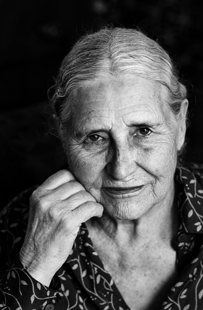
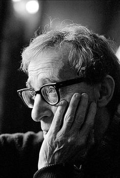
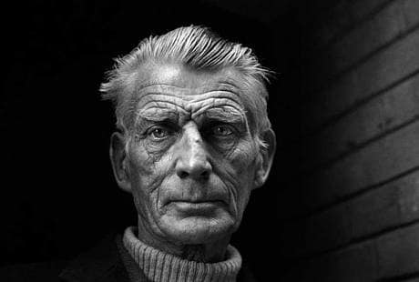
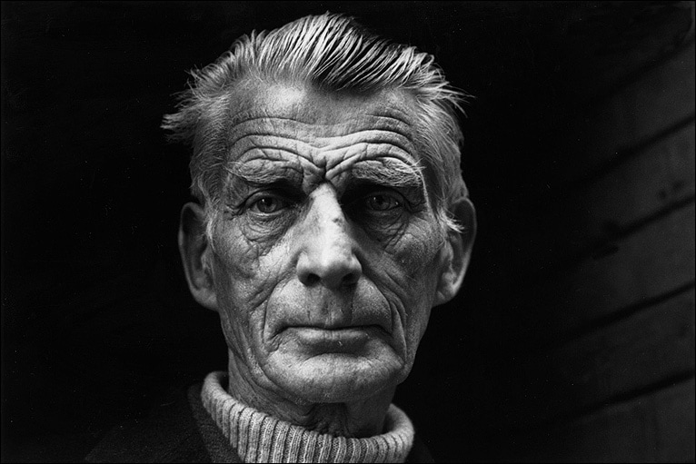
Jane Bown - Photographer(1925 – 2014)
Jane Hope Bown was an English portrait photographer who worked for The Observer from 1949. Each of her photographs were taken in black and white film, using the available light. Bown photographed different things you would expect from photographers such as the good and bad, the rich and poor, things that go on everyday and things that you don't hardly see, each photographers would have been taken with a gentle eye and with compassionate.
|
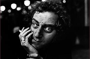
The content of the work is a man that has been captured in a very unique and detailed way. I can see a man that has no sympathy or emotion towards the photograph expect from have a straight face. He is looking directly into the camera with his face turned to the side, he could be sitting down so that his head is turned like that. Jane named this work "a life in photography" which could mean like meeting someone or stopping someone in the streets so that they can take a picture of him. This is what it says next to the picture "Having thought she'd missed her quarry, Jane snuck round the back of the Royal Court Theatre in London’s Sloane Square, where she caught him exiting via the stage door" - Samuel Beckett, 1976. The theme of the work is to capturing people that were rich and poor, good and bad for a commission for the Observer. Why did the photographer capture this man in this way? Why in black and white? What would make it different if it was in colour?What was the photographer trying to hide? The photographer doesn't use any colour in his pictures and this could be because he wanted to find something maybe the way you look at an image and you think totally differently to what you normally think. For example the way you look at an image when its in colour you think and behave different but when its in black and white you start to ask questions.
|
|
The detail on the picture is so fine and unique its beautiful you can see every little detail on the mans face which mass him special and what makes him, him. The looks of it Jane used a film camera to capture this picture, so it means that just for this image so much time would have been spent on it just so it could be focused and just perfect.
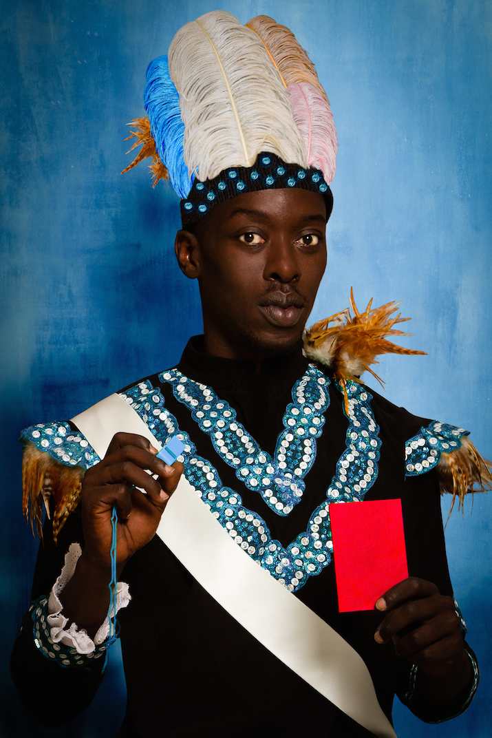
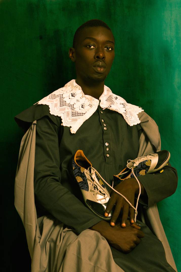
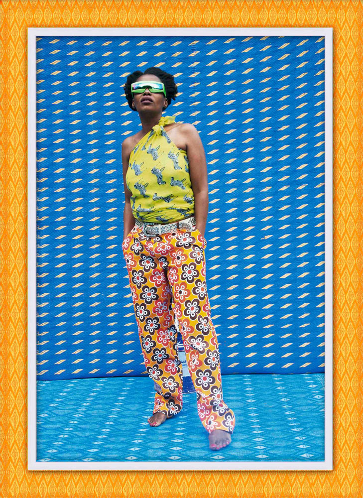
Omar Victor Diop
Omar Victor Diop: ‘I want to reinvent the heritage of African studio photography’
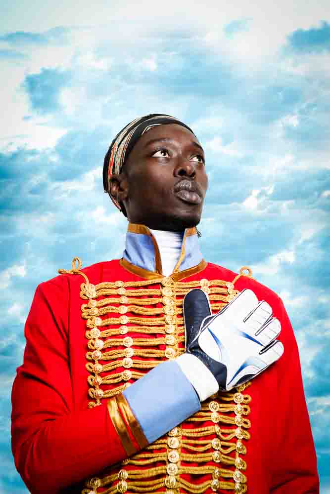
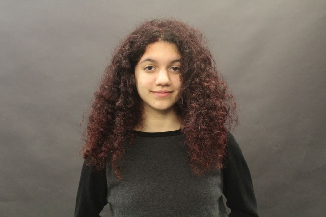
Omar focuses on portraiture that has a historical meaning to it, such as the history of the black figure. As for the African Diaspora, some were owned by white people and other exotic treatments, though, elegant and self-assured. What can I see? I can see a self-portrait and Omar wearing African clothing or maybe something similar. What I love about these images are that they are so colourful and bright it catches attention, the bright colours that stand out the most with the body postures as well, each one is different to one another. Each posture could have meanings to it and why is pose that way, focusing to the clothing he is wearing the postures could mean something about that and the way he puts his head. What I loved about these pictures is the way he matched the clothing with the background and thats rally powerful because then it doesn't get too confusing plus you would want a lot going on in the picture either.
Eric Kim
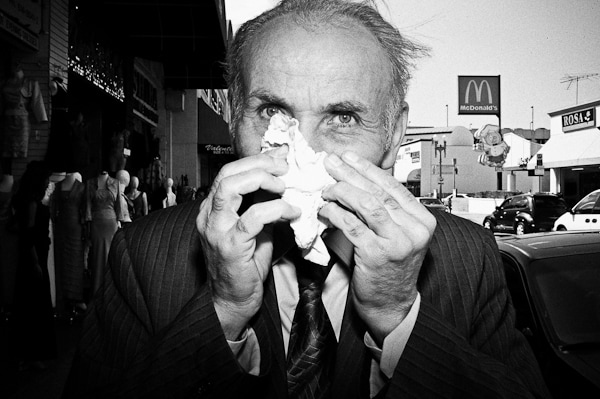
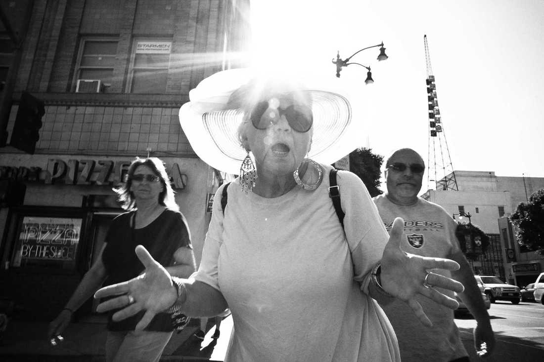
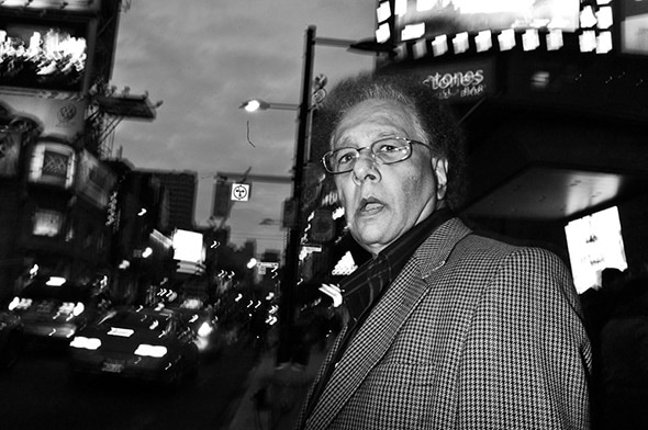
Eric Kim's focus was more of black and white film and portraiture, as I can see from his photographs all of his pictures are centred, there is at least one person in the picture that is close to the camera so that it can get more depth and focus into the picture. What I realised within his pictures was that he just takes the pictures of the people doing their own thing, and what I also like about his pictures is that he doesn't just take pictures, he thinks about the composition and angles of the pictures, just he probably thinks really quick because its street photography as well, so everyone would be minding their own business so everything has to be on time and just right.
Things to think about:
- Going to peoples houses and photographing their clothing and everyday life.
- Going out on the street, making someone sit down while you take a picture of them, with all of the movement and backdrop.
- Calling people to the studio and taking pictures of their traditional dress code.
- Create a typology out of the pictures you have taken, including different skin tones, dress sense and hair styles.
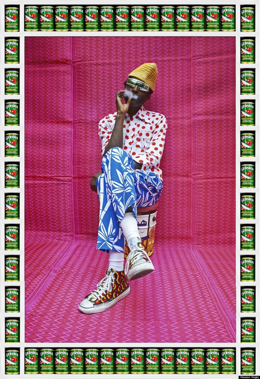
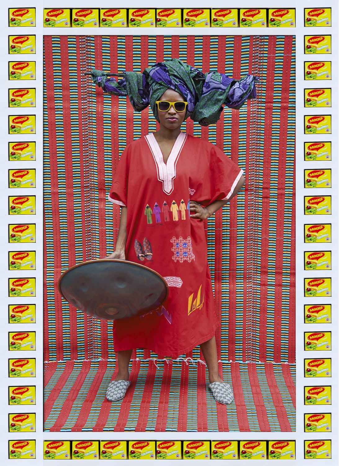
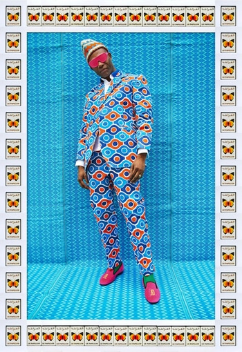
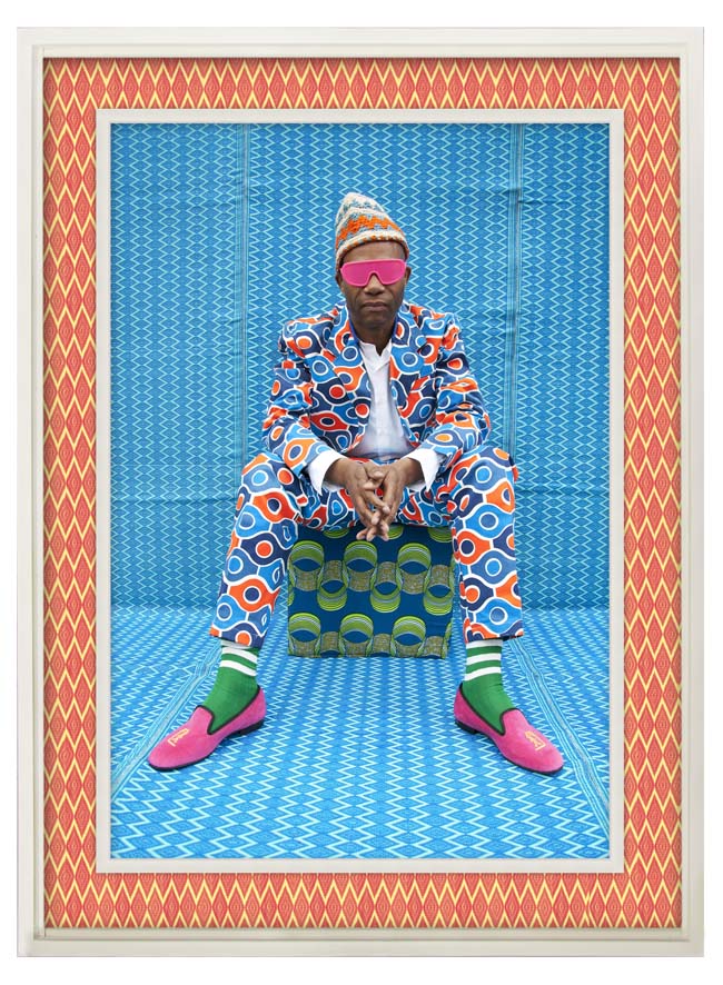
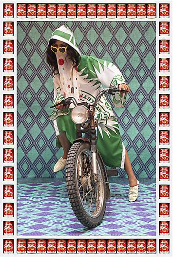
Hassan Hajjaj
Hajjaj is a photographer that has no education or help from others he is self-taught which he was inspired by a mixture of artist from London and Morocco, focusing on international artist from both countries and trying to make a link between the two. His practice includes portraiture, installation, performance and fashion design, but is best known for his photography. What I find interesting about his work is that the theme of the photograph and the sense of fashion all links to each other, creating a combination between the two, other than using a landscape for the background he uses a long piece of sheet that would fit with the outfit. Hassan Hajjaj's work has inspired me to take pictures of people linking them to their culture, trying out something different to others, seeing the difference between a few cultures.

|
Hassan Hajjaj called this the "Kesh Angels" which is quite unique and different to what you normally find, the title links to the culture of Marrakesh so basically a shortened version and the models would be the angels, they were represented by using motorcycles. What I like about the images are the bold outline boarders around it, it kind of looks like Andy Warhol the way of the tines and how they are placed. But he says that moving to London has changed the way he sees things which attributes his visual style by linking it to the place he grew up including the bright, bold, contrasting colours and even the repetition around the frames linking to the Moroccan mosaics. When you look at the whole set of images you see a similarity between them, they are all on a motorcycle posing in the same way, which could mean something, maybe like I'm powerful or I'm cool. What I love about this image is the whole concept of the walls and floors been covered up with their traditional fabric and them wearing their own clothing as well which blends in with the background makes them all link to each other. By covering up the things that doesn't mean anything within the picture then it doesn't make sense and thats proper one of the reasons why he used these fabrics, is to cover up the things that didn't have a reason why their there and also it being bright makes it stand out more and theres a lot of movement going on in the picture. The whole motorbike concept could link to Marrakesh, it could be a way they transport in that city which means something to them or it could have a back story to Hajjaj.
|
|
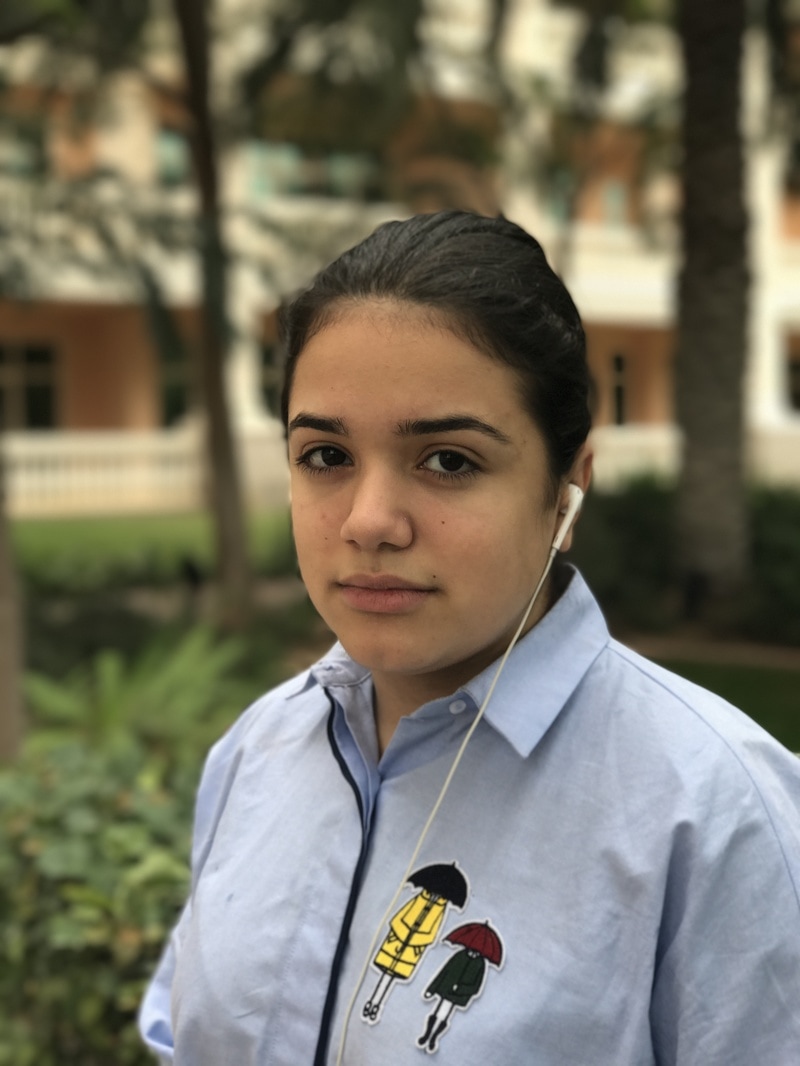
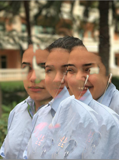
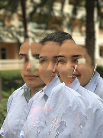
To start off my investigation on portraiture, I felt like I had to start from somewhere that would allow me to gain more knowledge and understanding on capturing people in a different mind set. By doing that I would be able to think in a different way, allowing me to be much more creative and different to what I normally do. Trying out different things allows you to be different. While I was away at Dubai, using my mobile phone I was able to capture some pictures of my little sister. The first three images I said to her 'smile' then 'you are ugly' an then 'laugh'. I think I like these ones to the rest because you can see a different type of feeling towards the image and the excitement in them. Throughout the process of taking these pictures she said 'no I don't want you to take a picture of me' etc but at the end she said okay lets go! The other 6 images were taken from random, just her posing in different ways, I'm trying to capture the picture in different angles. These images were taken with an iPhone 7 Plus using the portrait effect. What it does is, it operates the second camera on the phone and blurs out the background of the image, leaving it with a pictures that looks like you have used a macro lens. What I could of done to improve these images was by testing the effect with different type of lighting for example; sun, light bulb, a torch etc. By doing that I could see the difference between all of them and to see what type of effect and if they would be as good as they are now. Ad you can see some of images have turned out better than the others this is because I might have taken them in different angles so that the camera plays around or it doesn't get enough light.
|
|
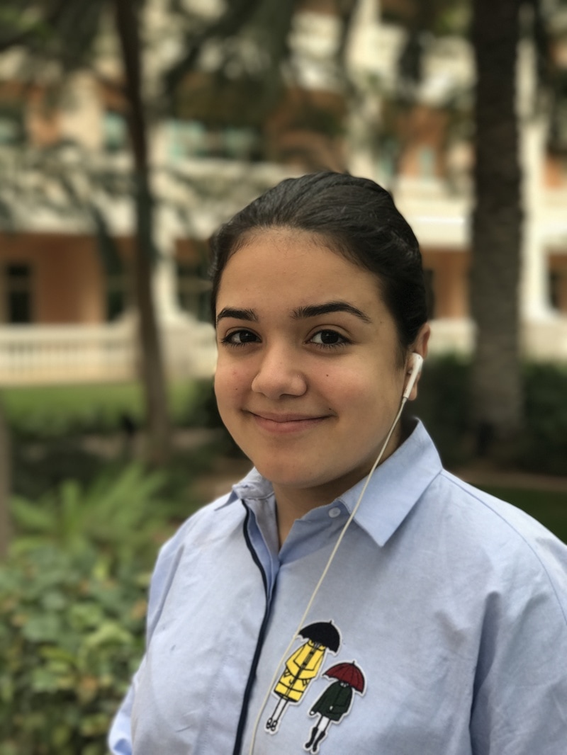


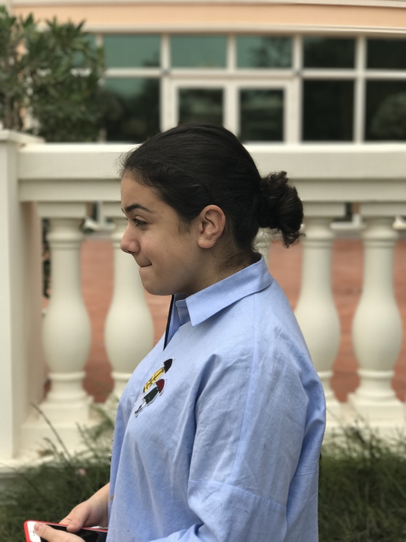
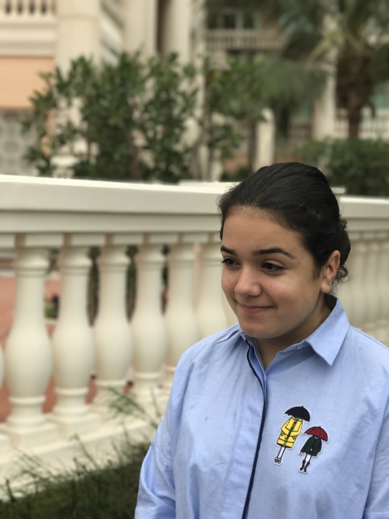
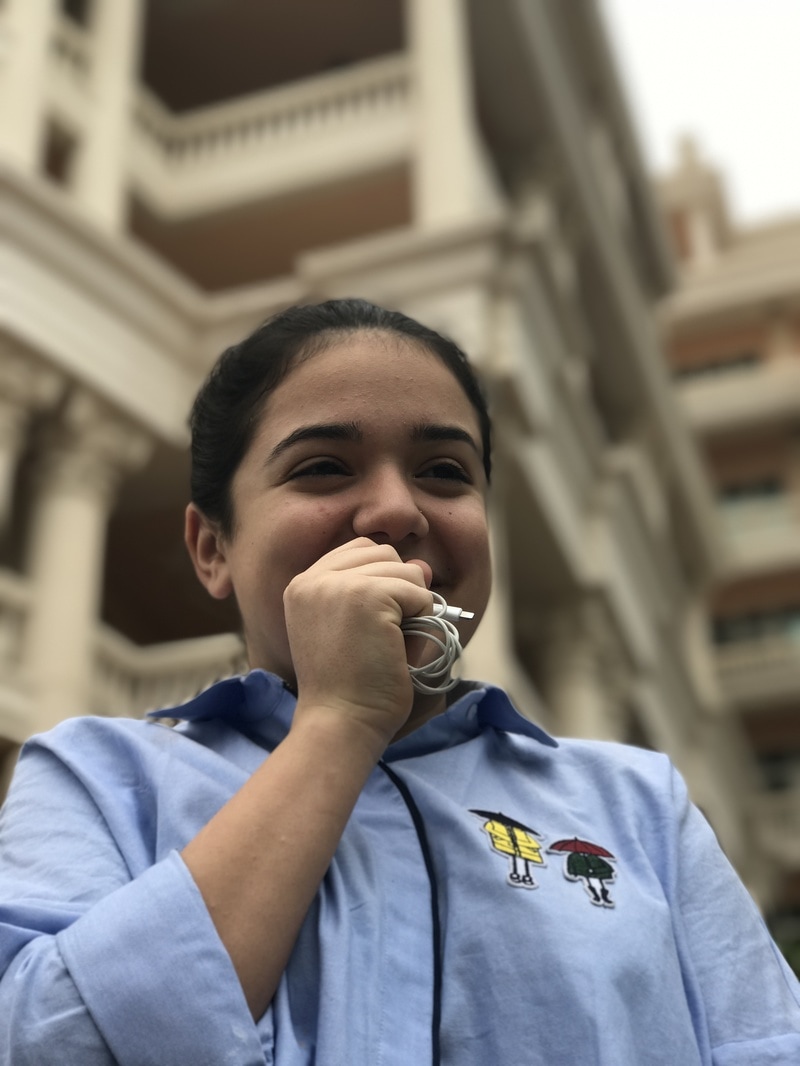
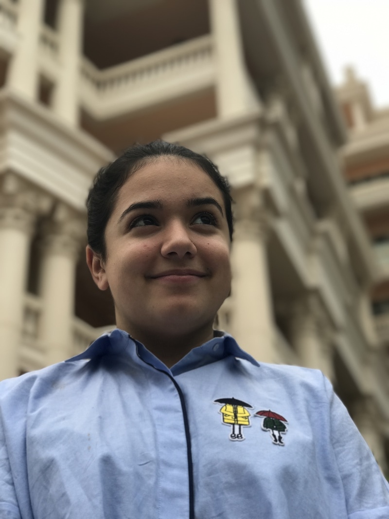
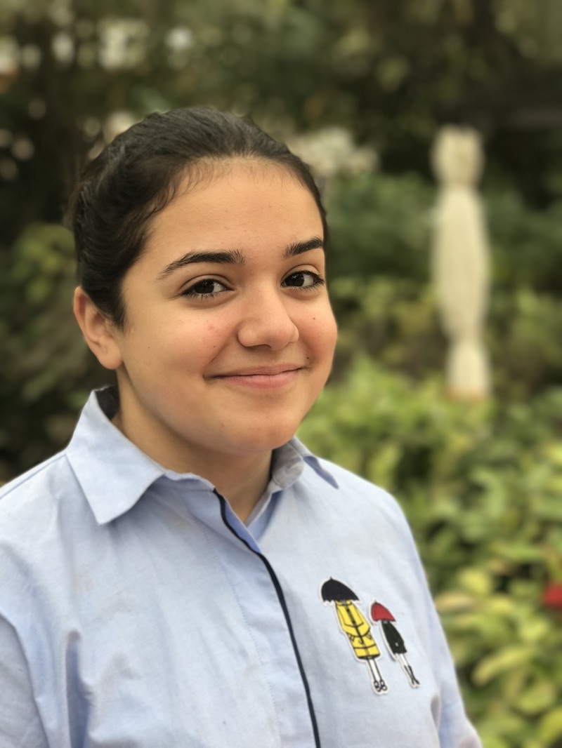
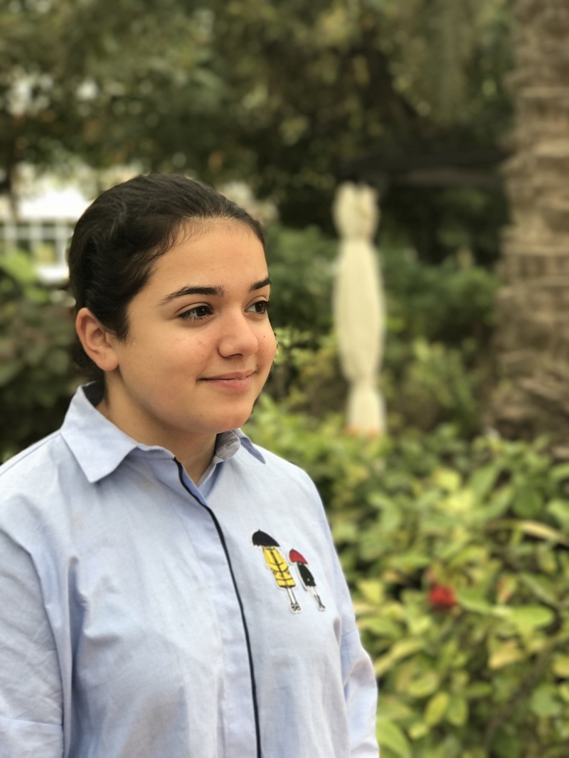
Out of the few pictures that I have taken of my little sister I liked these the most. And maybe because its her facial expressions or the way the picture has been taken. I took these pictures with my iPhone 7 plus camera which has a special effect, you focus on a subject within 8 feet so that you would give a depth effect, blurring the background and focusing on the main subject. The images that I have choice is like a set of three, they loom like all three of the images belong together. What has worked out really well as well is the background, while taking the pictures we both didn't move other than my sisters facial expressions, and what I like about the background is that its simple, not to eye-catching but effective, so that we would know what to look at which is the main subject and then the background. The angling for each picture has been the same, the pictures hasn't been edited, its all natural which works better for some pictures because it's different to others.

|
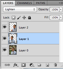
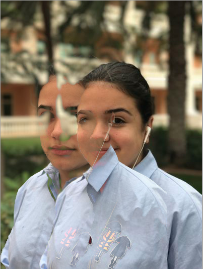
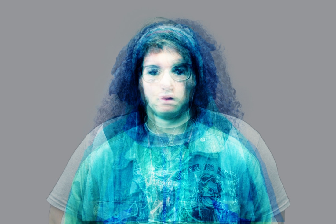
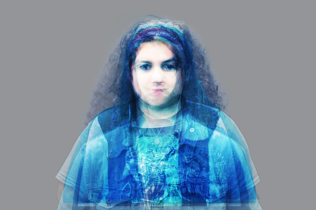
With my little sisters pictures I wanted to try out doing something different to other things I normally do, which is editing the image, playing around with the brightness and contrast but this time I wanted to see how the pictures would turn out to be when they are layered on top of each other, to see if it would make a difference to the other work I have been doing and if I could develop my work from there. By using the quick selection tool on photoshop I was able to layer each of the images on top of each other and by playing around with the layers you can get a different look each time you do so, but I don't think this worked the way I wanted it to because the outcome didn't please me and what I mean in that is I couldn't get nothing out of the image, what I could do next time is take another set of images and try out the layering on that set.
|
|

|
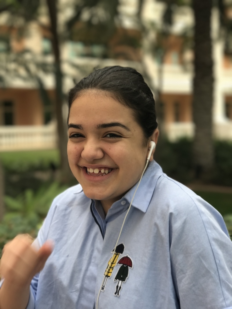
While we was walking around our hotel towards the lobby, I thought it was the perfect time to test out the effect the iPhone 7 plus gives us, which is called portrait. The way you use it is by getting close to a subject and then the camera will blur out the rest and leaving the main object focused. When taking the picture there wasn't much thought or focus it was just taken within seconds so that means I left things to chance and everything went really well, I think this because nothing on my sister was unfocused and its really clear. I love this image out of all of them this is because of the angle of the image, the positioning of the subject and the natural effect the camera gives. I crouched down so that I could get the background of the hotel as well, giving it a better atmosphere and view for the picture, while my sister was laughing I thought why not take a picture. Angling the camera from the ground has a different meaning to it as well, it means that I'm bigger and stronger, in a way that makes them more powerful towards everyone. What I enjoyed the most about taking these types of pictures was that it gives a different effect to what other cameras give, they all give different things, such as you would use a digital camera putting it on automatic mode and leaving everything to the camera or on the other hand you can put it on manual mode so that you can play with the settings, taking pictures with a longer or shorter shutter speed, by testing these things out you would have different things to see and to leave from, even if it didn't turn out well you would go back and learn from your mistakes. What I could have done better to the image was if I tried to take a similar picture with the same effect, instead of my sister posing I would have rather wanted her not to know that I was taking a picture of her which meaning leaving things to chance and by using my camera we would have seen, which parts it would have focused and if it would have been blurry. What I would have wanted to try out while having this photo shoot is by trying it out while there is movement to see if it would still be focused in some places and less focused in other places, by testing these things out now I would have a better understanding and knowledge afterwards. By still focusing on portraiture but including movement to it so that it would be something like a performance art, something totally different, and seeing the movement there was in the background and capturing other peoples reaction towards my sister, seeing what type of face expression they give, if they push he, walk into her or they see the camera and over their face. By testing these out you would know what to do next and you would be able to test other things.
|
Next step:
- Taking pictures using the polaroid camera.
- Calling everyone over to my house and trying to capture and create a typology out of it.
- Combining different cultures to each other - people from the islam culture.
- Capturing people in their traditional clothing in their traditional setting.
- Permission sheet.
- Thinking about lighting and time.
- Explaining to the model about the whole process
- Taryn Simon blood relations and ties - a living man declared dead
- Finding objects that mean something to them.
- Shirin Neshat
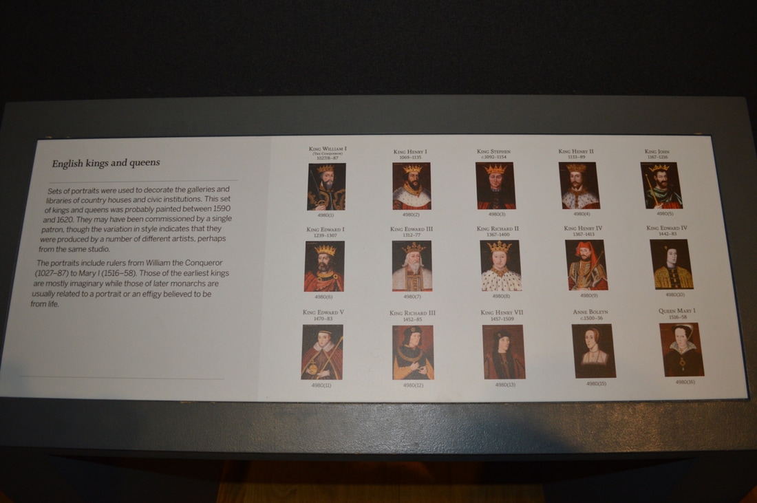
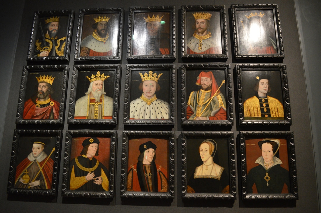
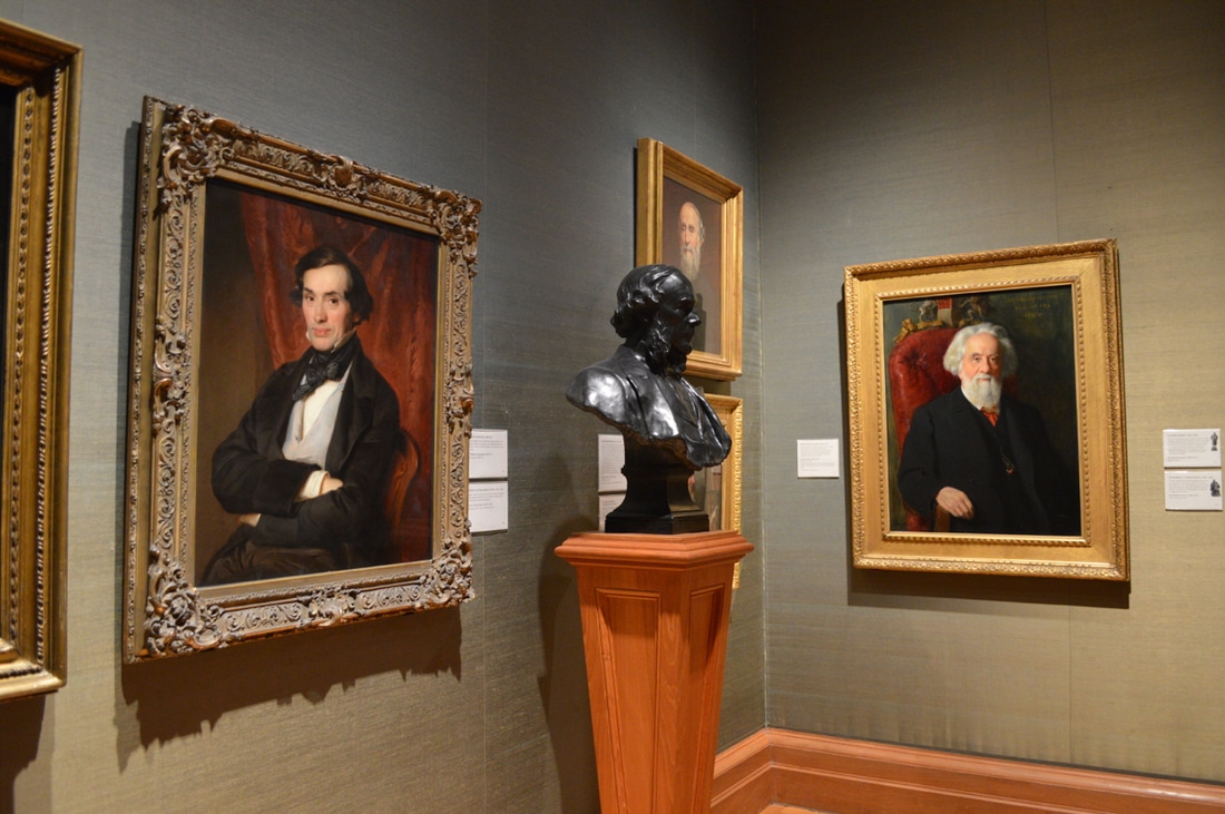
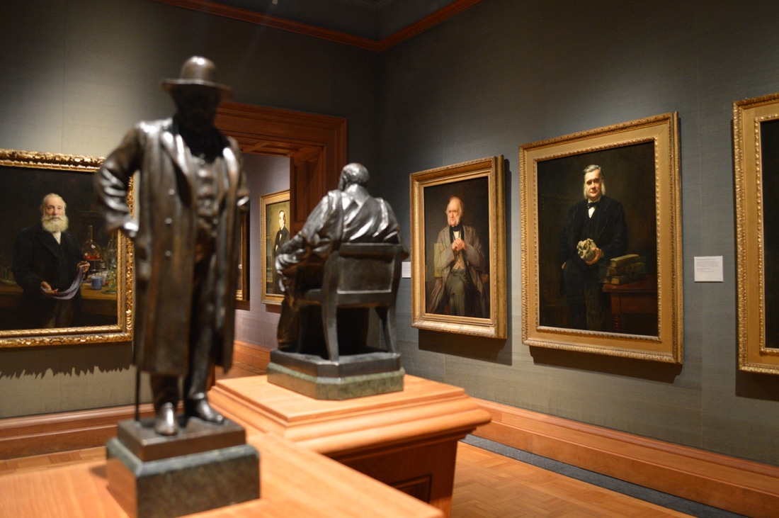
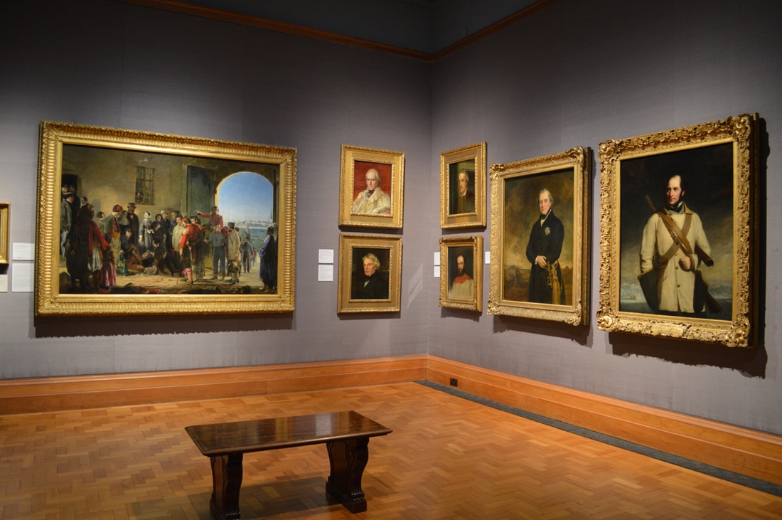
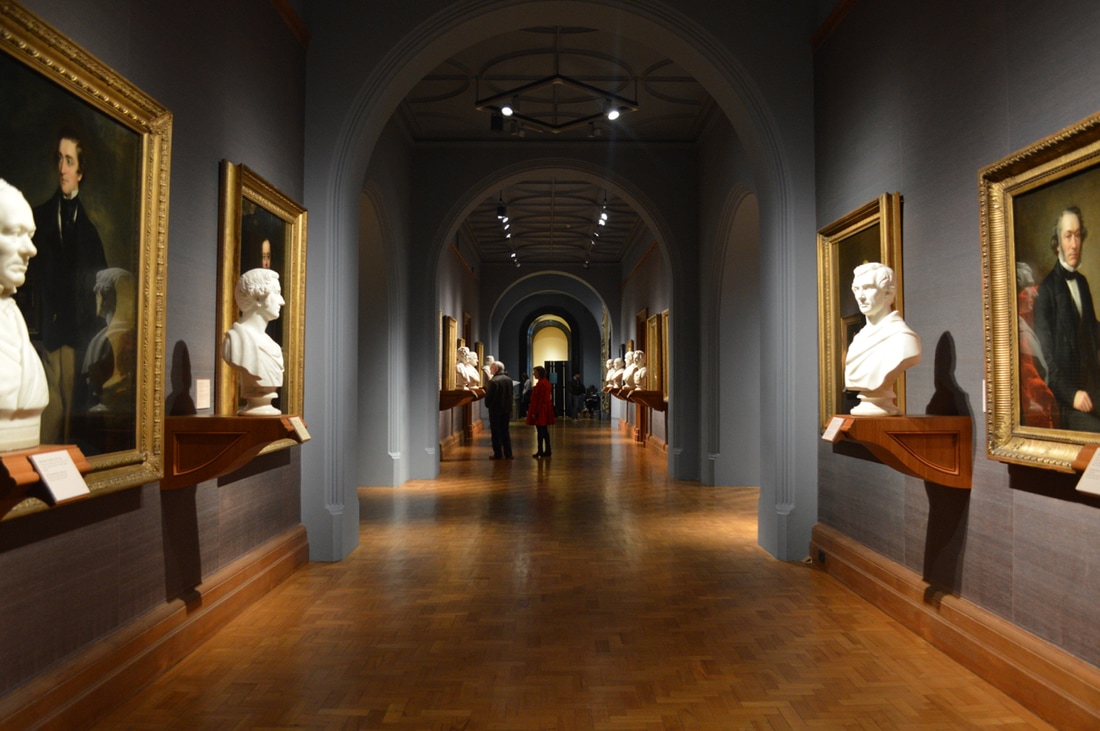
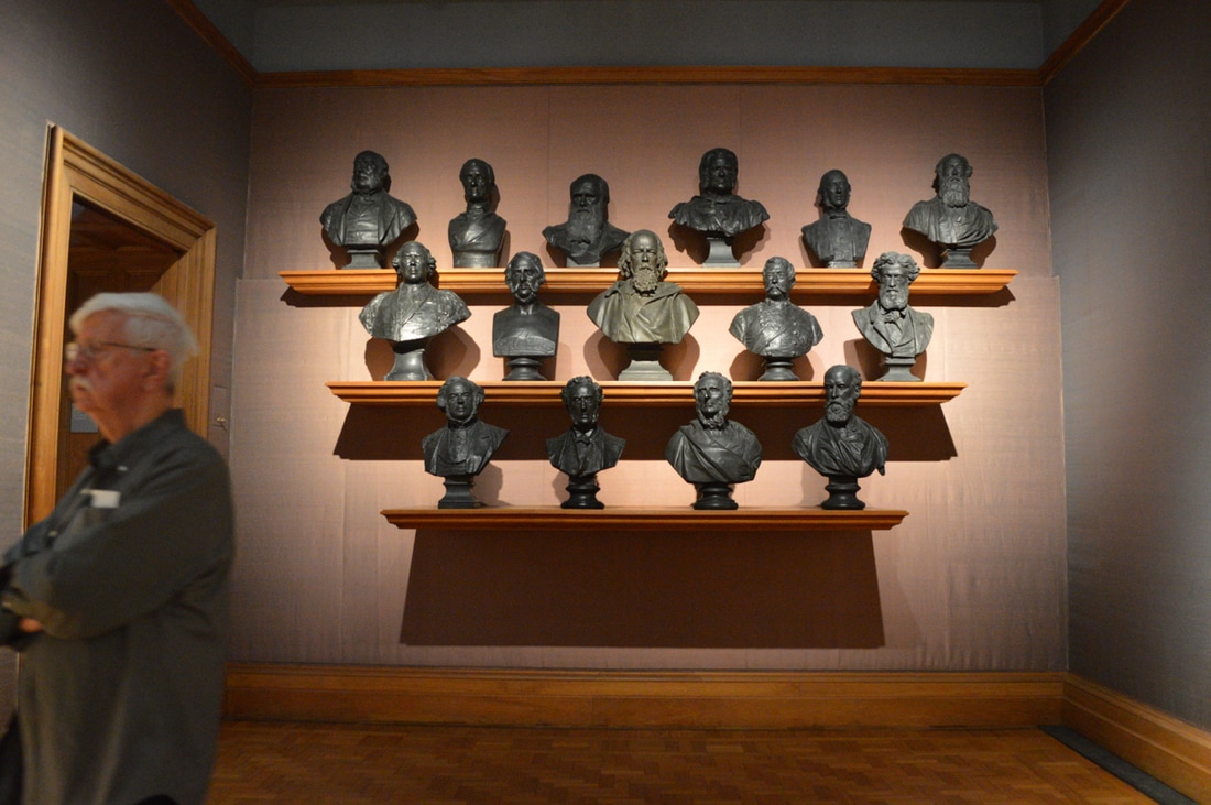
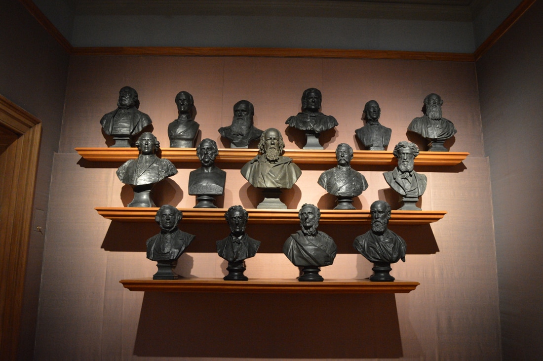
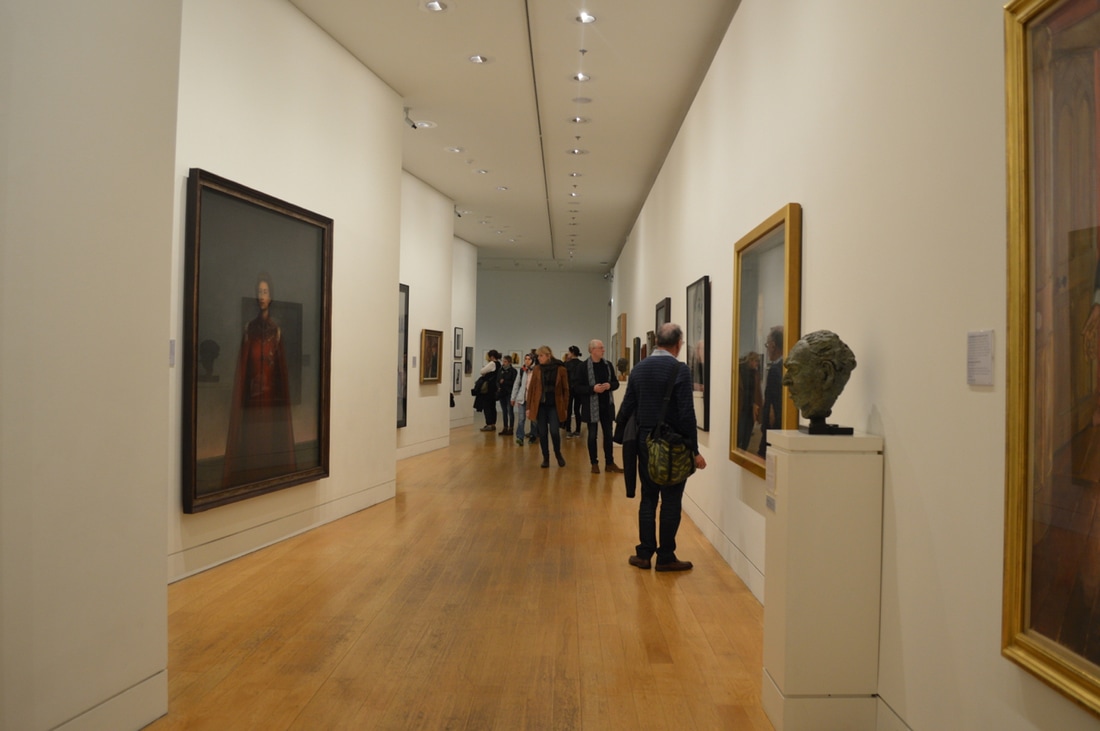
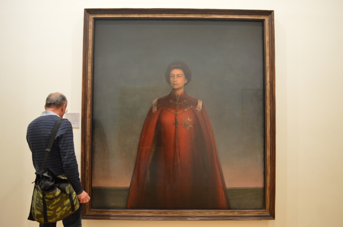
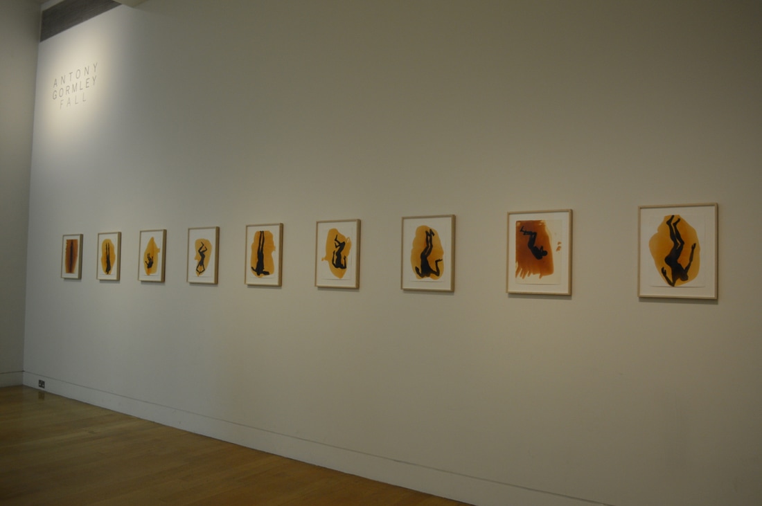
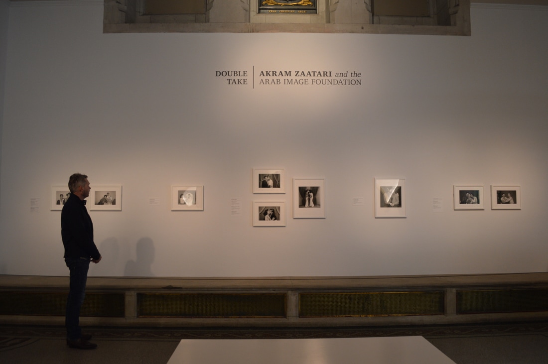
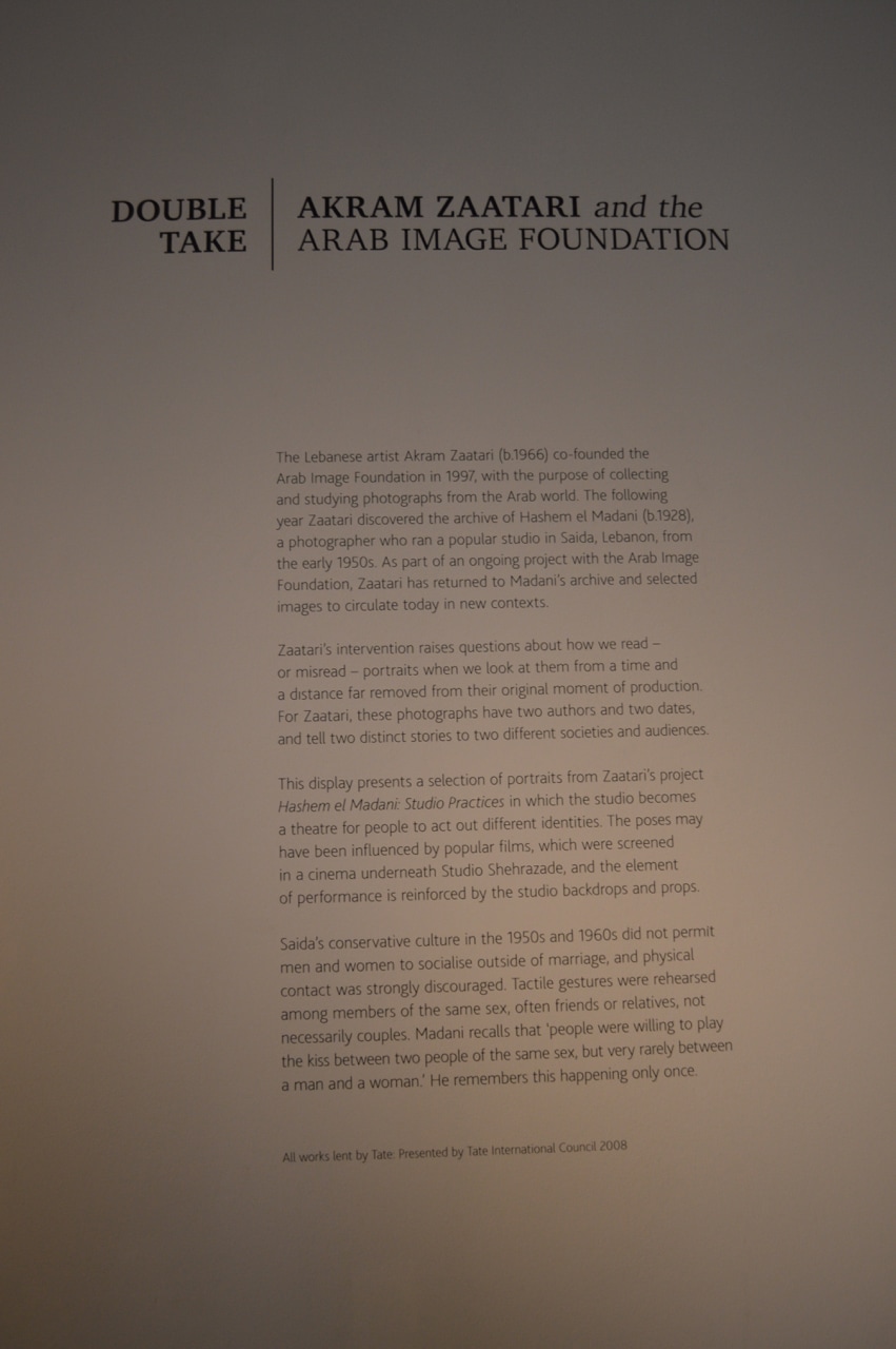
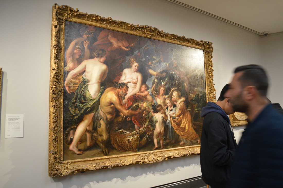
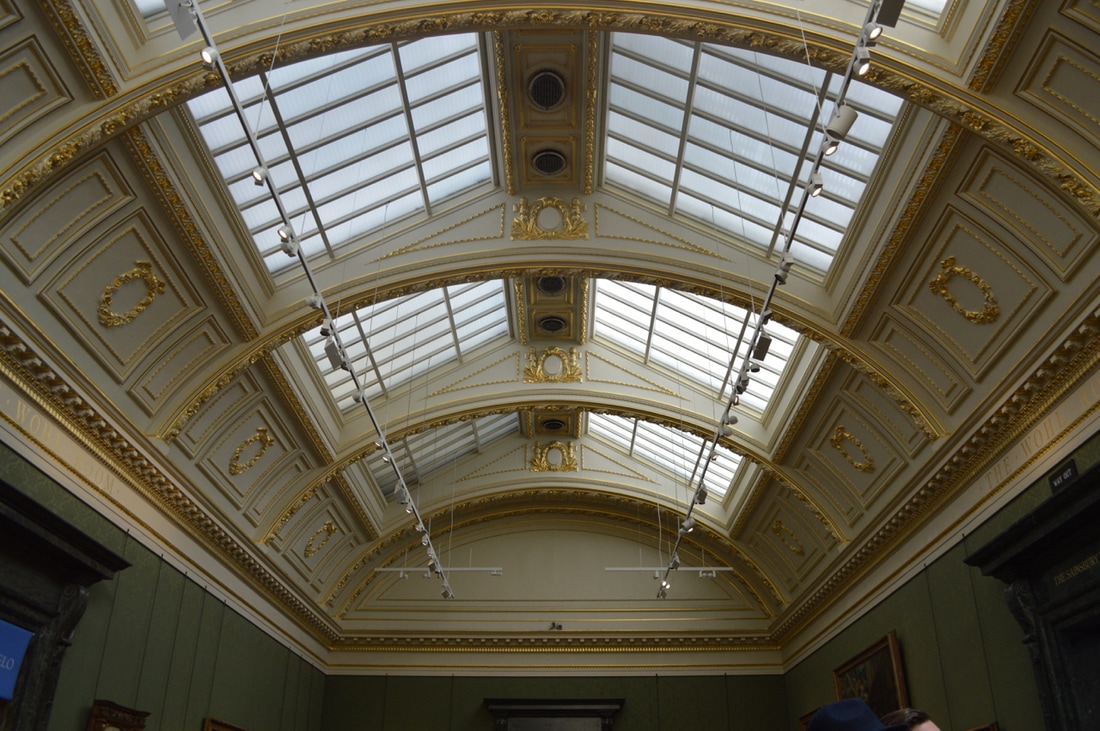
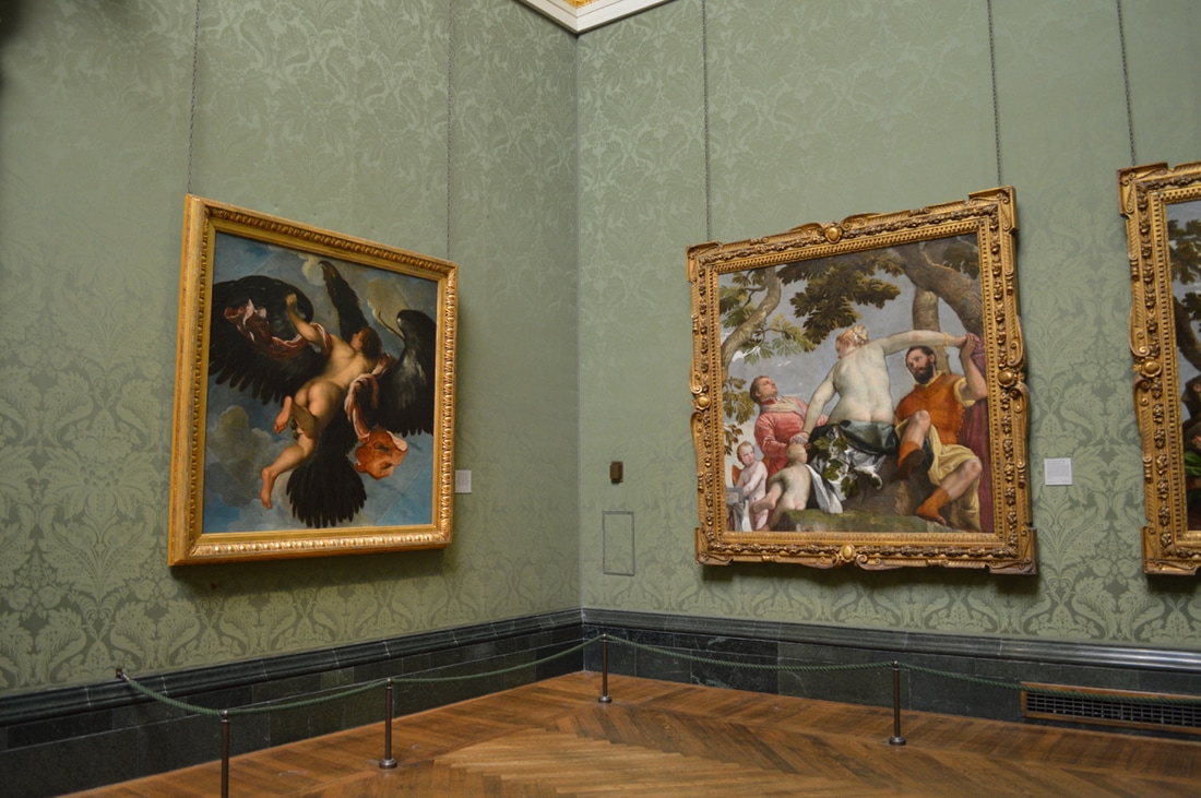
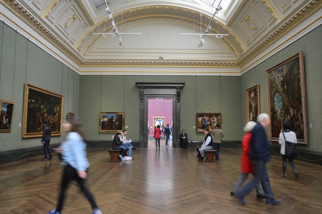
National Portraits Gallery
To develop my work and to gather more ideas I thought that it was time I went to an gallery or an exhibition, by seeing other artists work that inspired me, fascinated me because they all have a unique part to their work. At the National Portraits Gallery these were the following artists work I saw; Antony Gormley (Fall), Akram Zaatari, Gillian Wearing & Claude Cahin (Behind The Mask) and Howard Hodgkin.
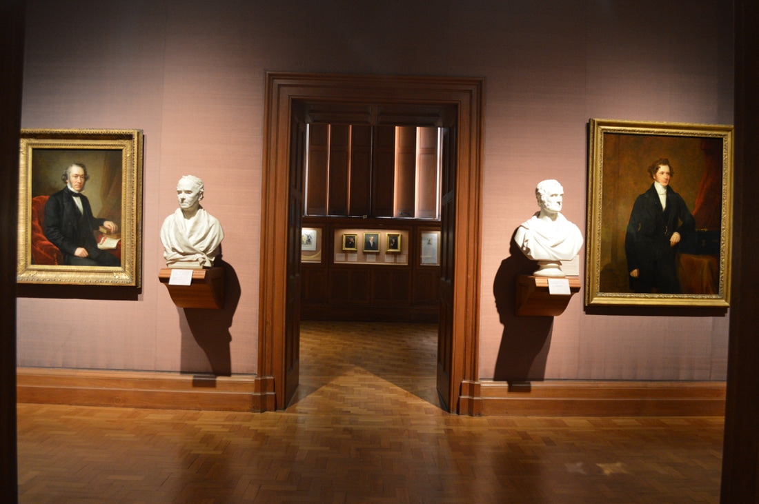
Taryn Simon
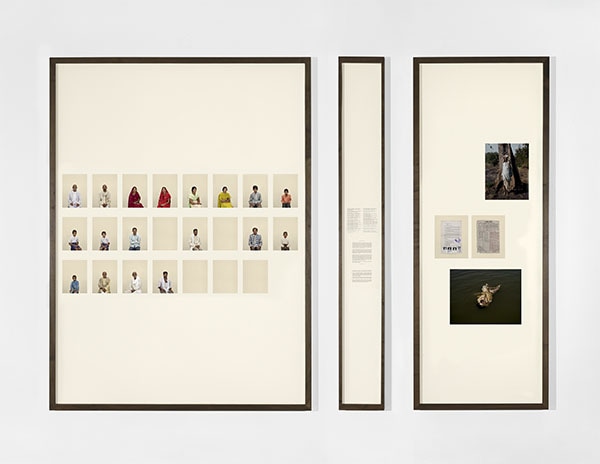
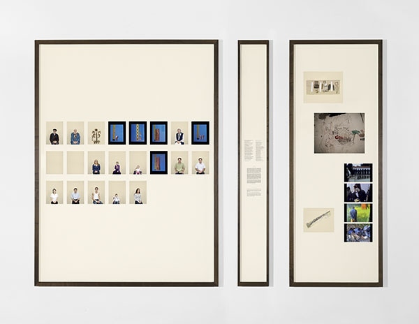
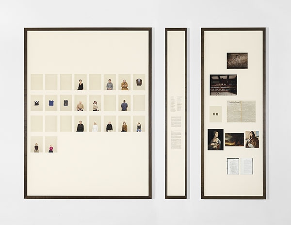
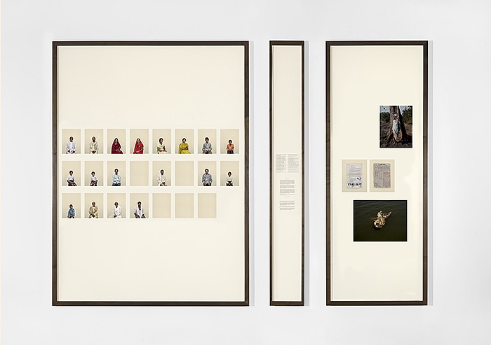
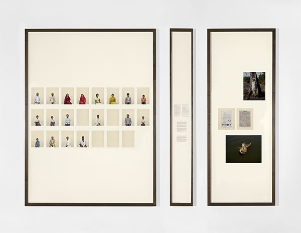
A Living Man Declared Dead and Other Chapters I - XVII was one of the best works that I loved and this is because she tells us a story within the images and the order she has placed the images in. The work was produced over a 4 year period, which you can see that she has spent a lot of time focusing on the thing she wants to investigate the most and carry on from there. She travelled around the world trying to find the perfect place to carry on her investigation, she researched and recorded every single bloodline and their related stories to the people she saw. Each chapters create a external force of territory, power, circumstance, or religion. The empty portraits represent members of the family who couldn't be photographed, the reasons towards this is that they might have pasted away or moved out of the country to study somewhere else, so instead she has included text panels etc. By following the bloodline in order and leaving a blank piece to represent a person in the family that has pasted away is really powerful because at first when you don't know why they have left it blank you start to think about different type of questions to ask to the artist. Simon has included three frames for her exhibition, the first one is the bloodline of the family, second is a text panel and that includes a few words from the family and third frame is images and stuff that means something to that family, making it personal to them.
First Set Of Pictures
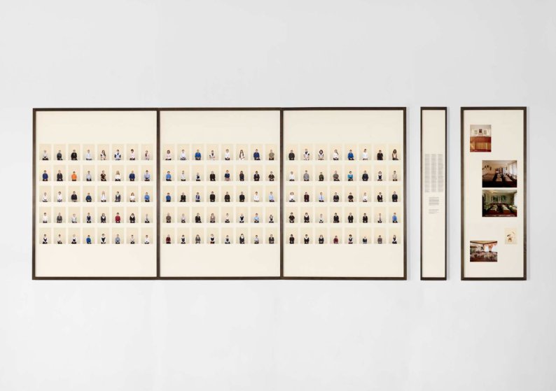
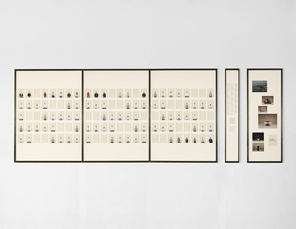
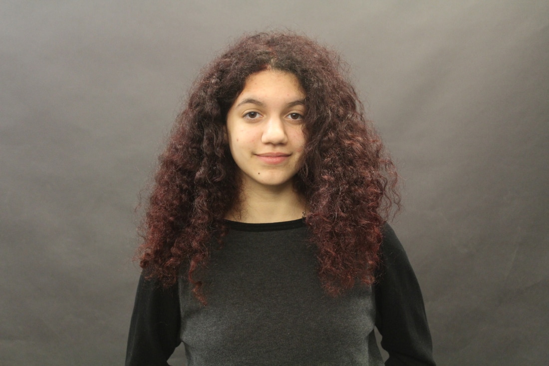
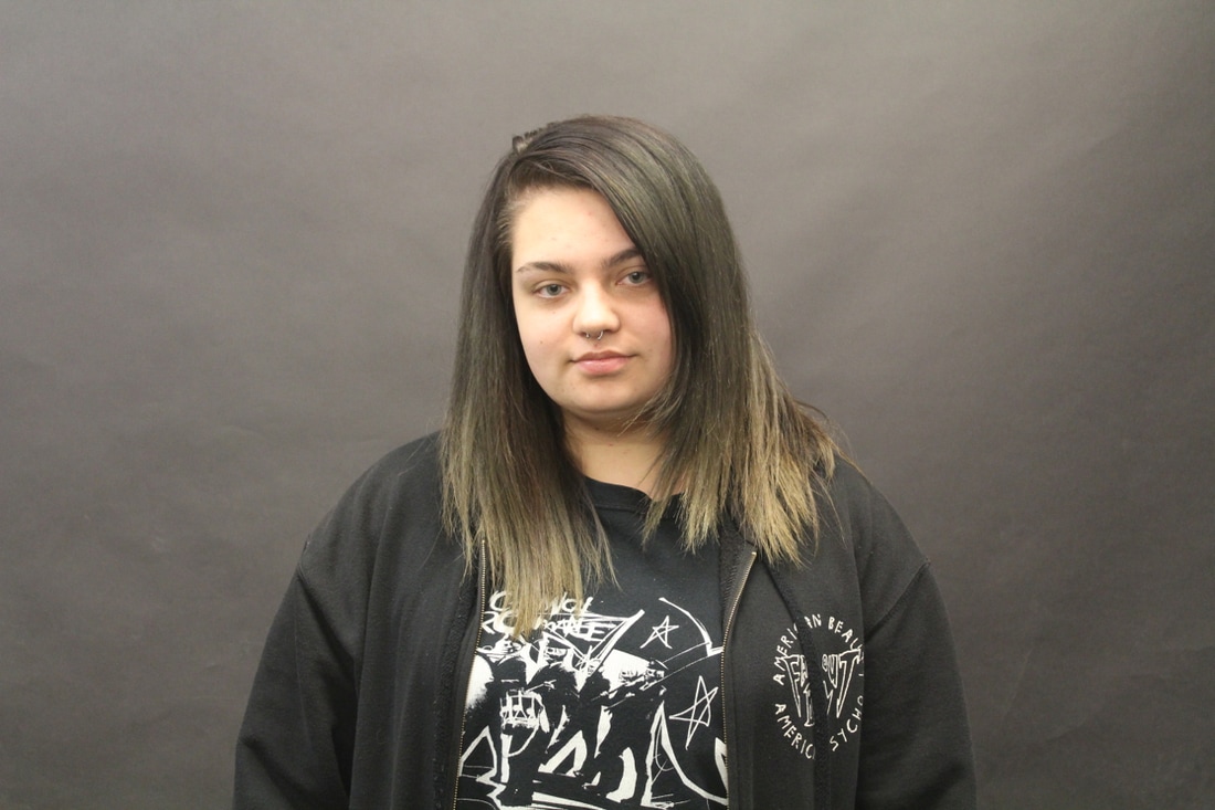
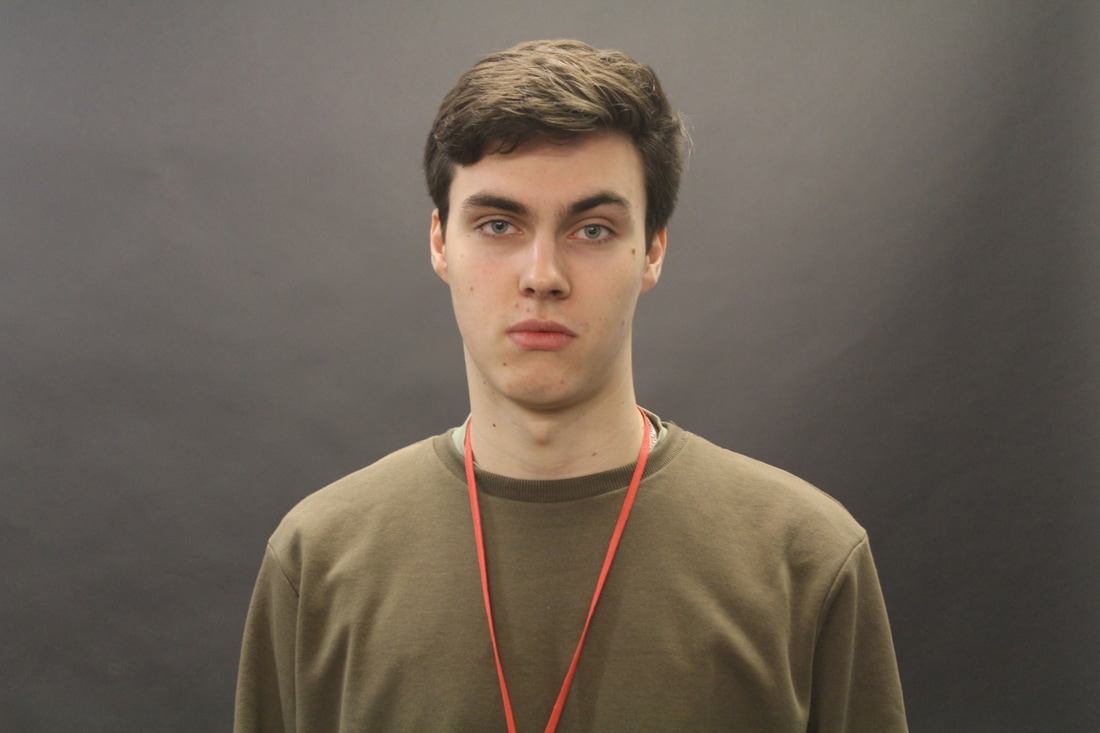
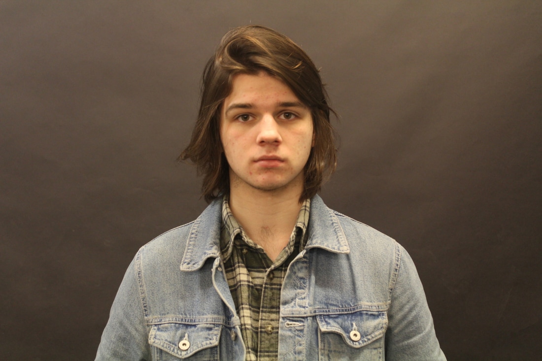
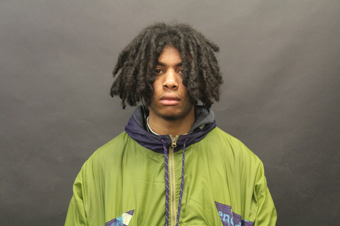
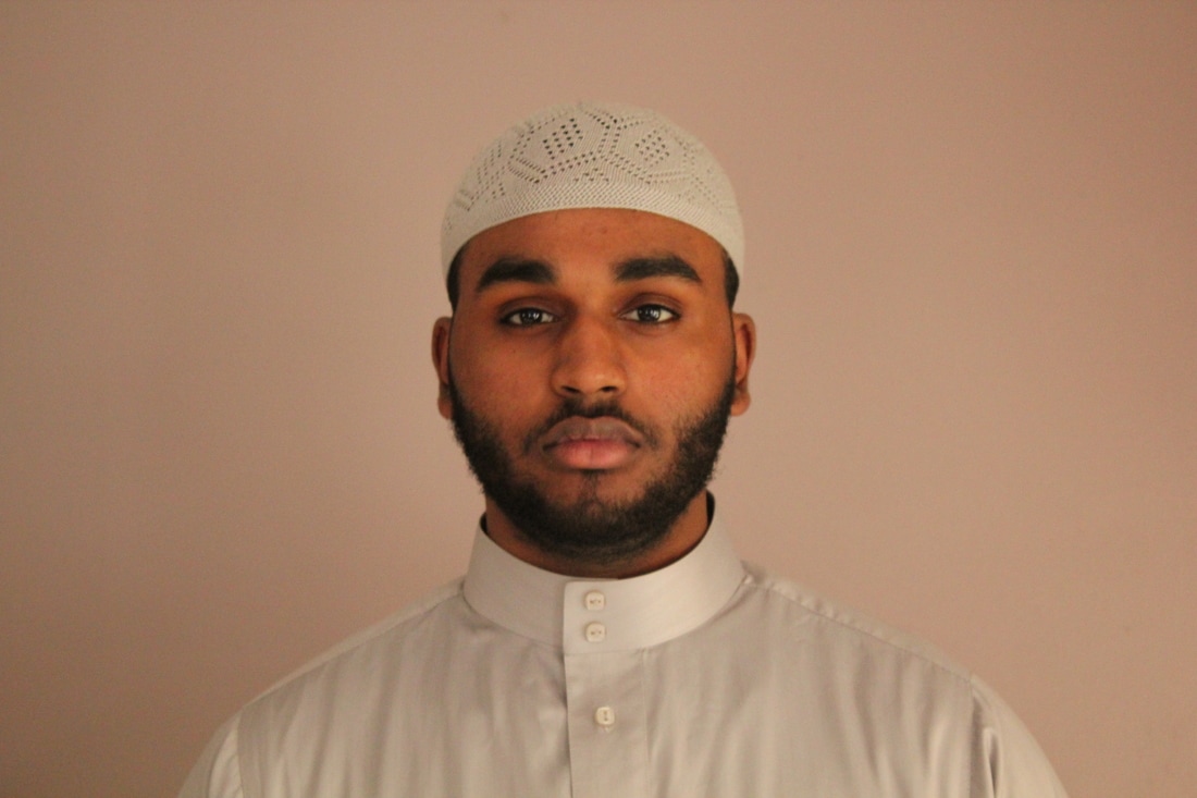
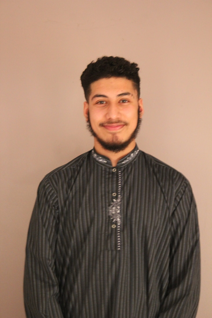
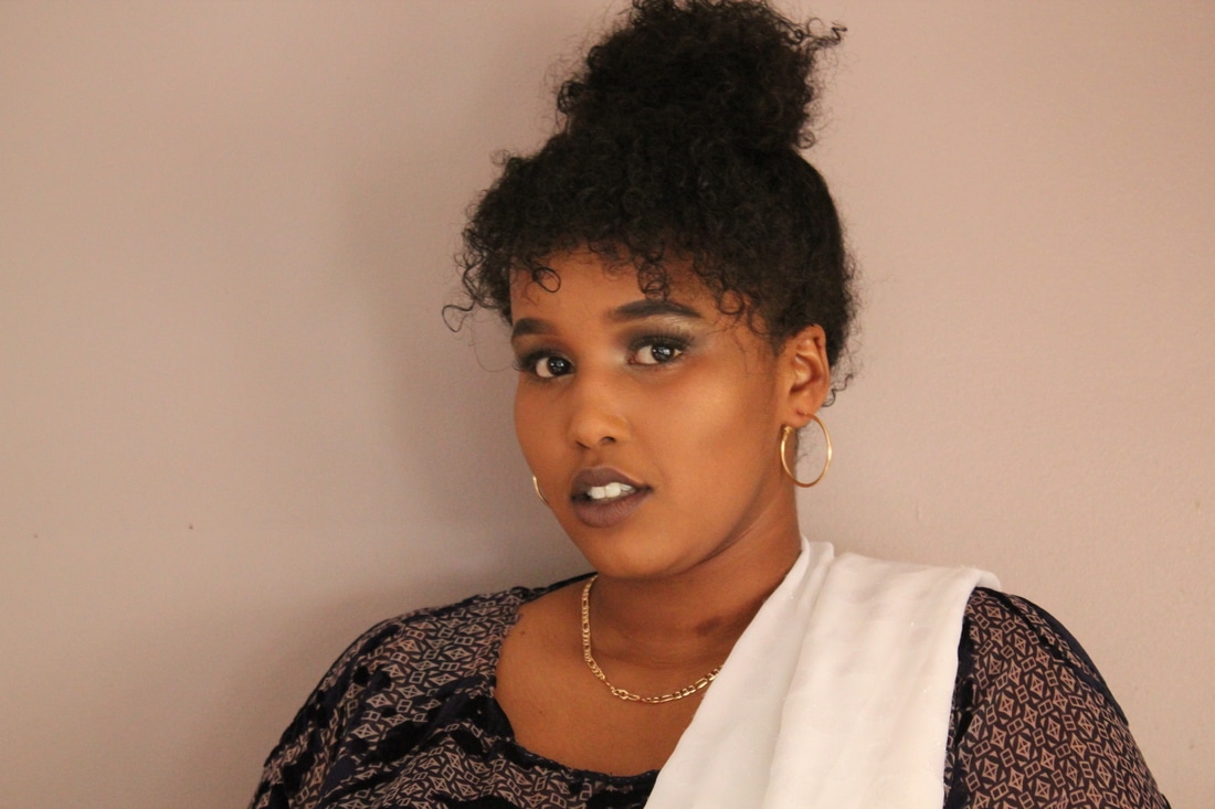
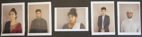
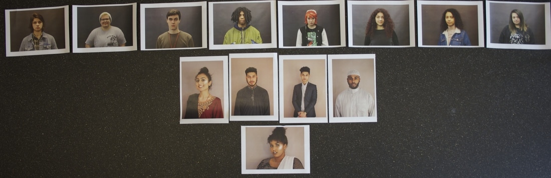
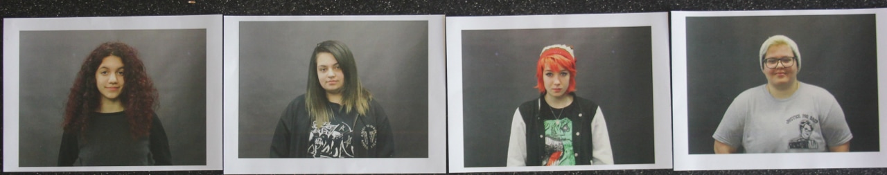
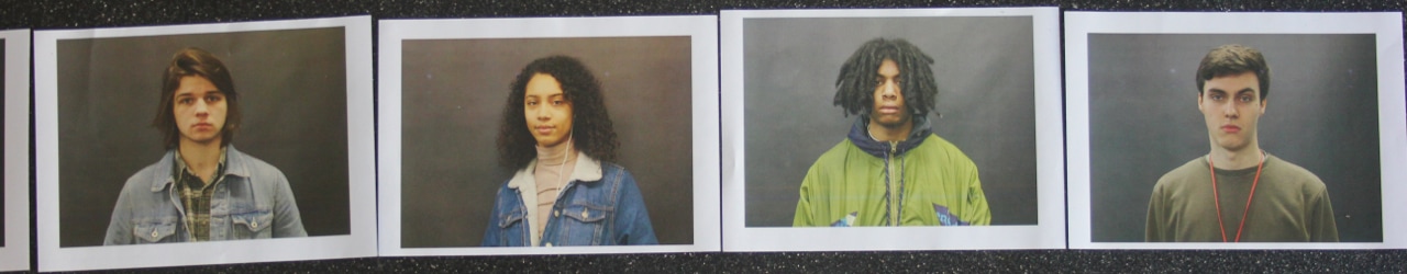
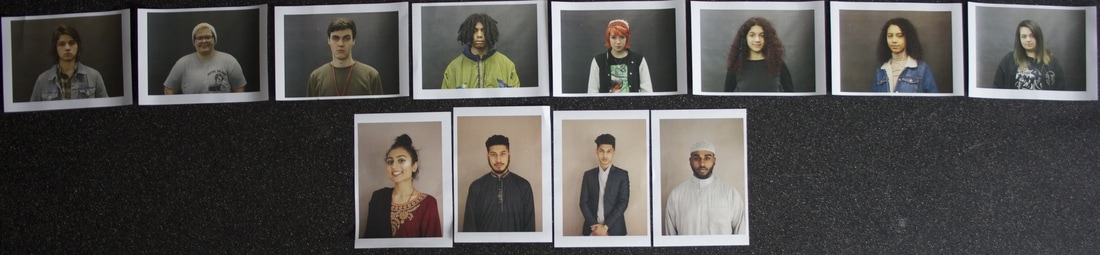
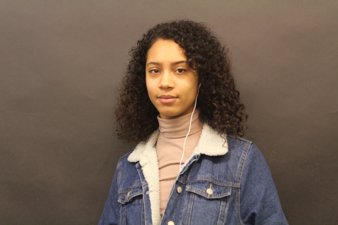
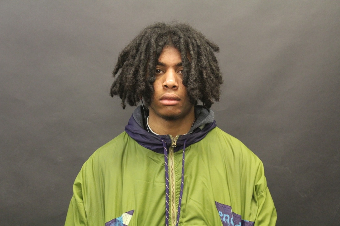
During my lesson, I wanted to take some pictures and I wanted to use the students in my class because them I would have a rough idea when it comes to the actual thing, when you have a rough idea about how it turns out you then will know what to expect and what to do later on to improve your work. The instructions were to stand on the spot I marked and smile, really simple. They turned out really different to what I was expecting because the background was the same each time but still it looks different in some of the pictures. Some looks really yellow or really light and to improve on that I would probably not use a black background again so that they all look alike for the typology. But the main focus here was their skin tones, each one of them is different to each other.


First Set Of Images
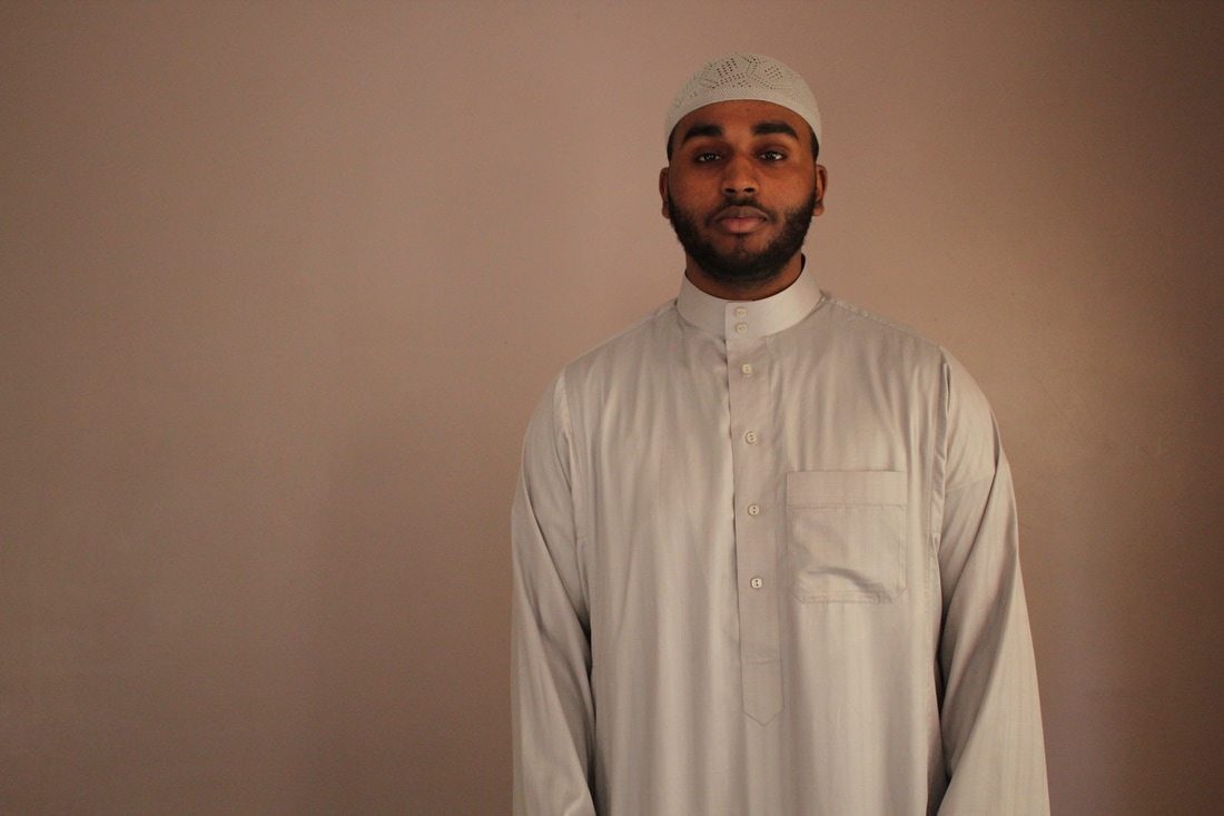
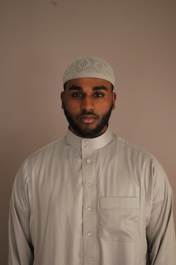
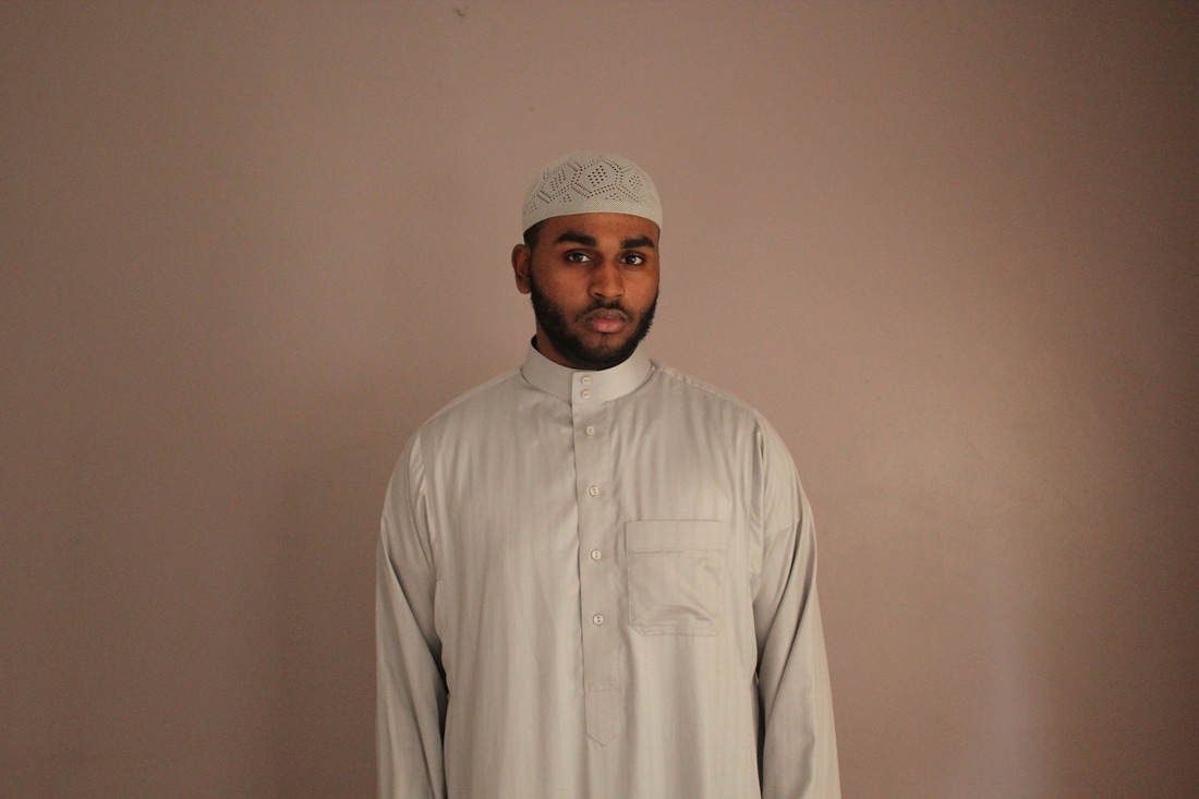
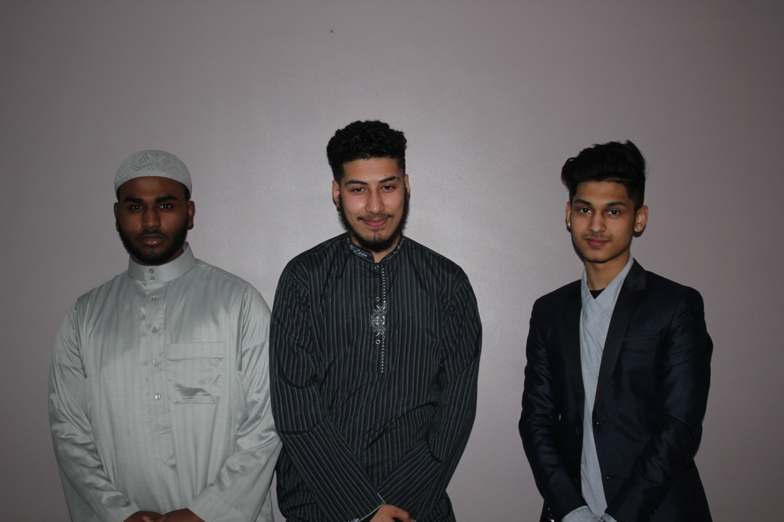
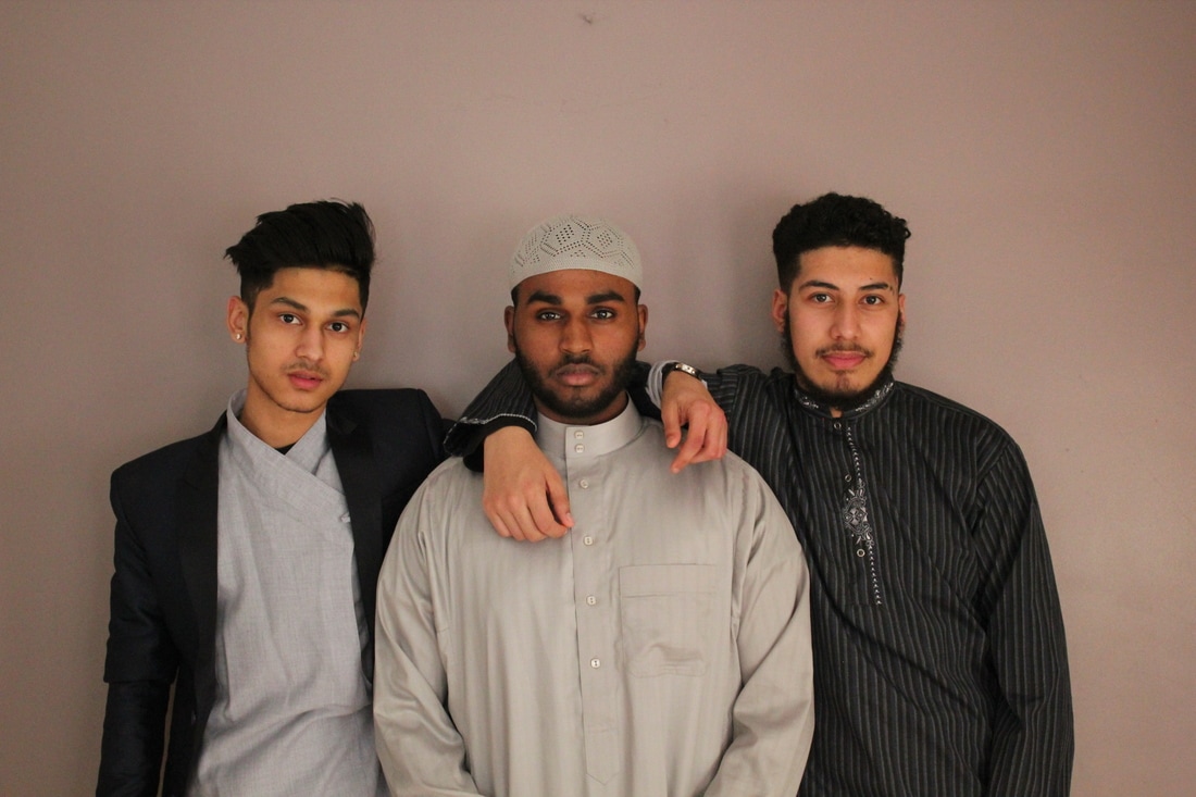
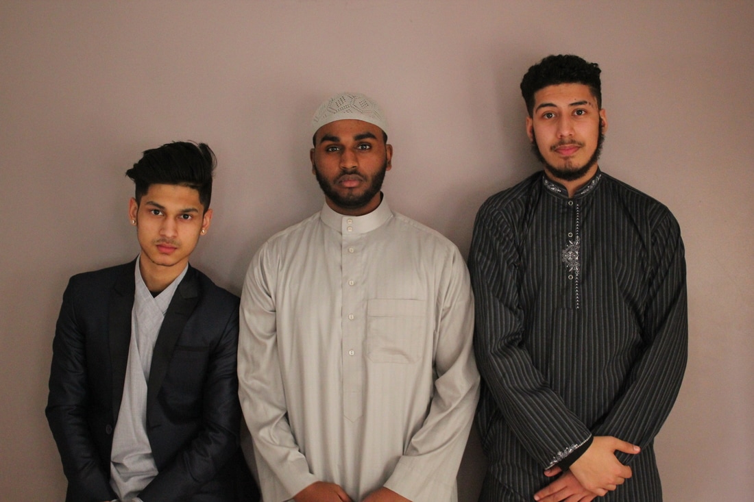
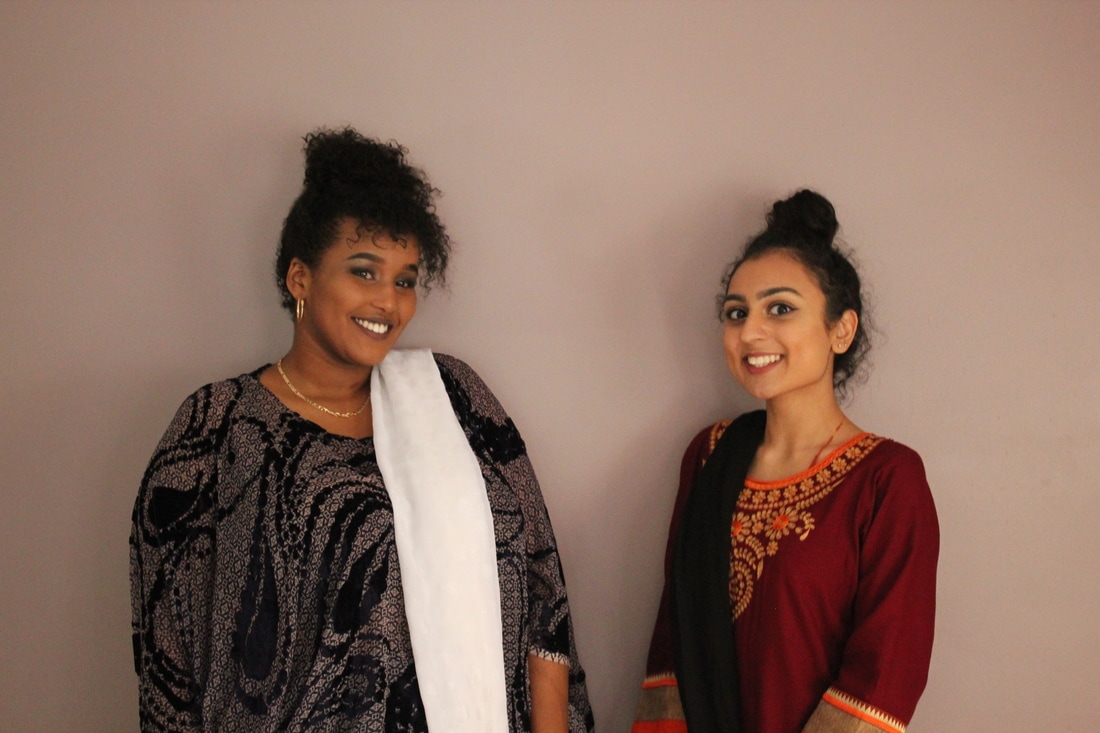
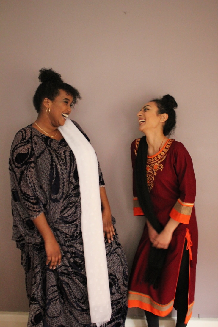
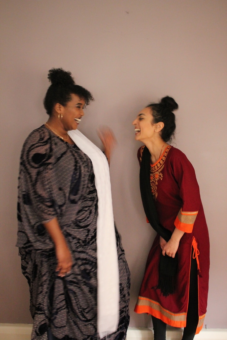
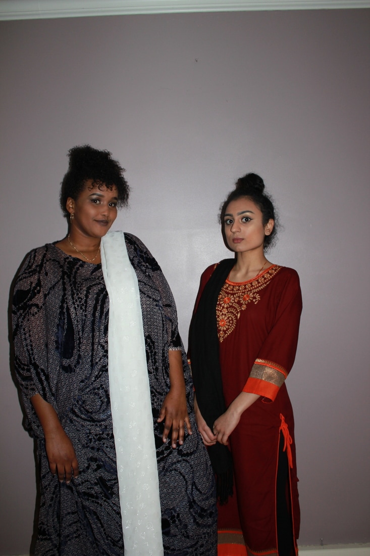
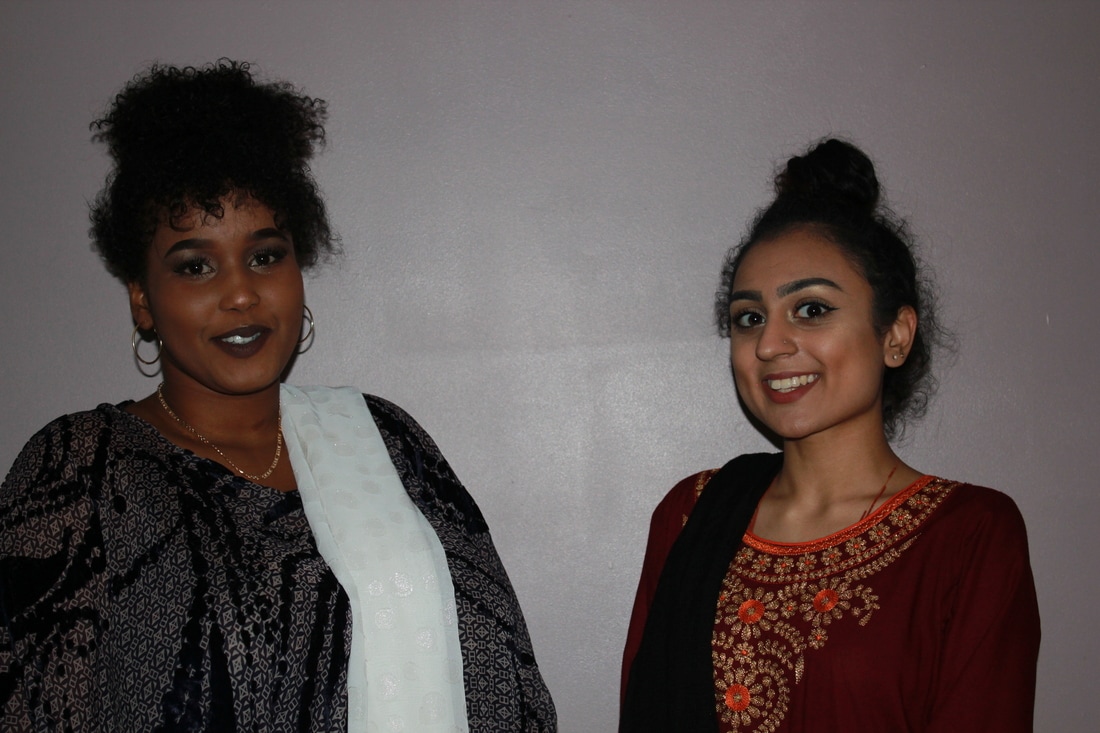
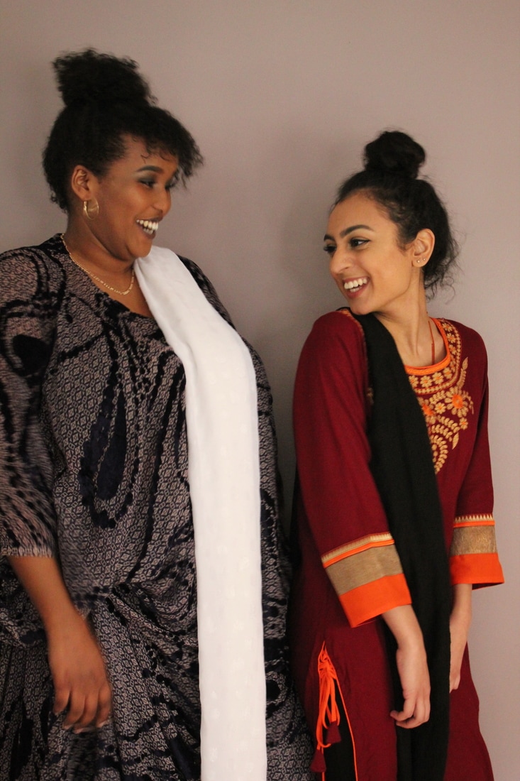
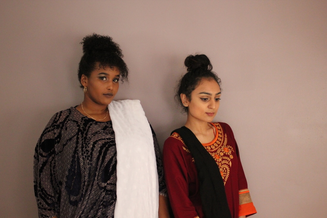
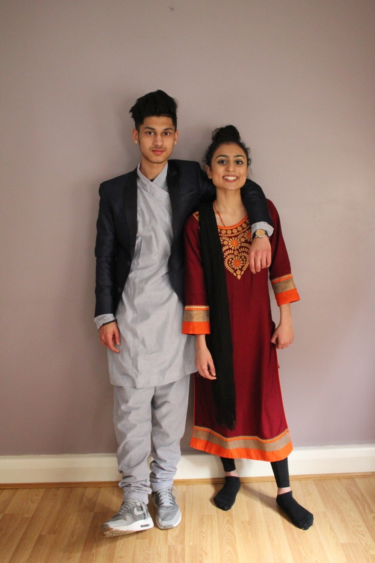
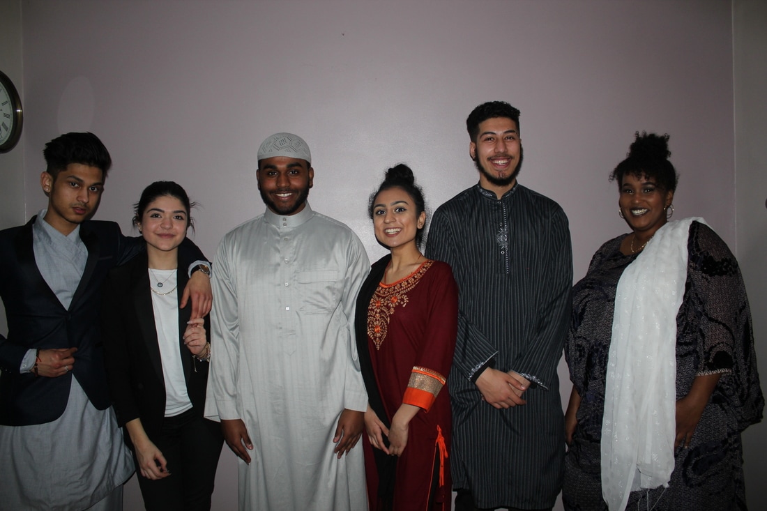
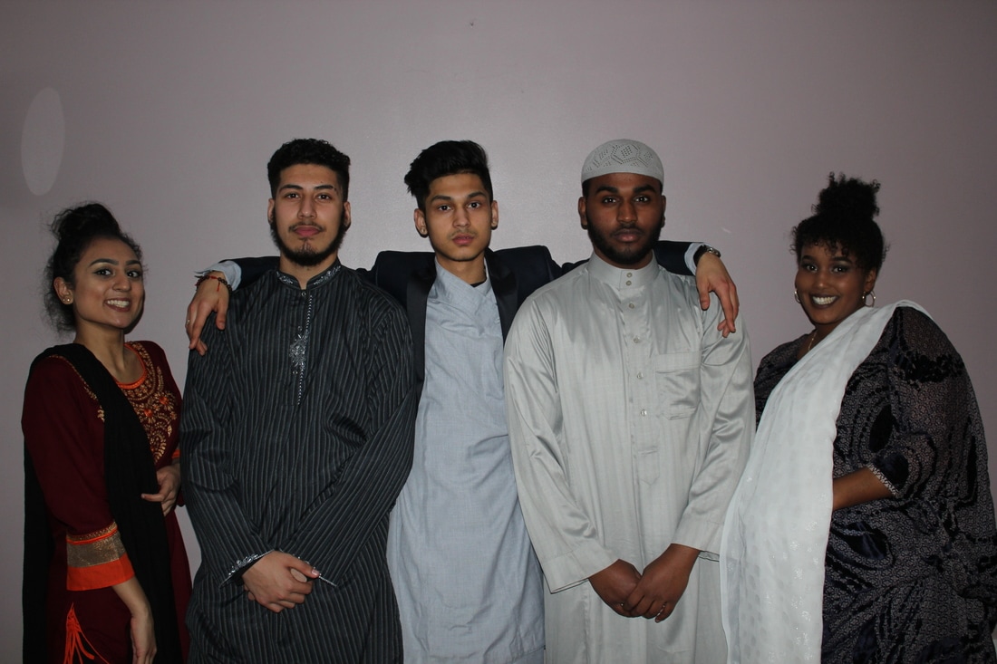
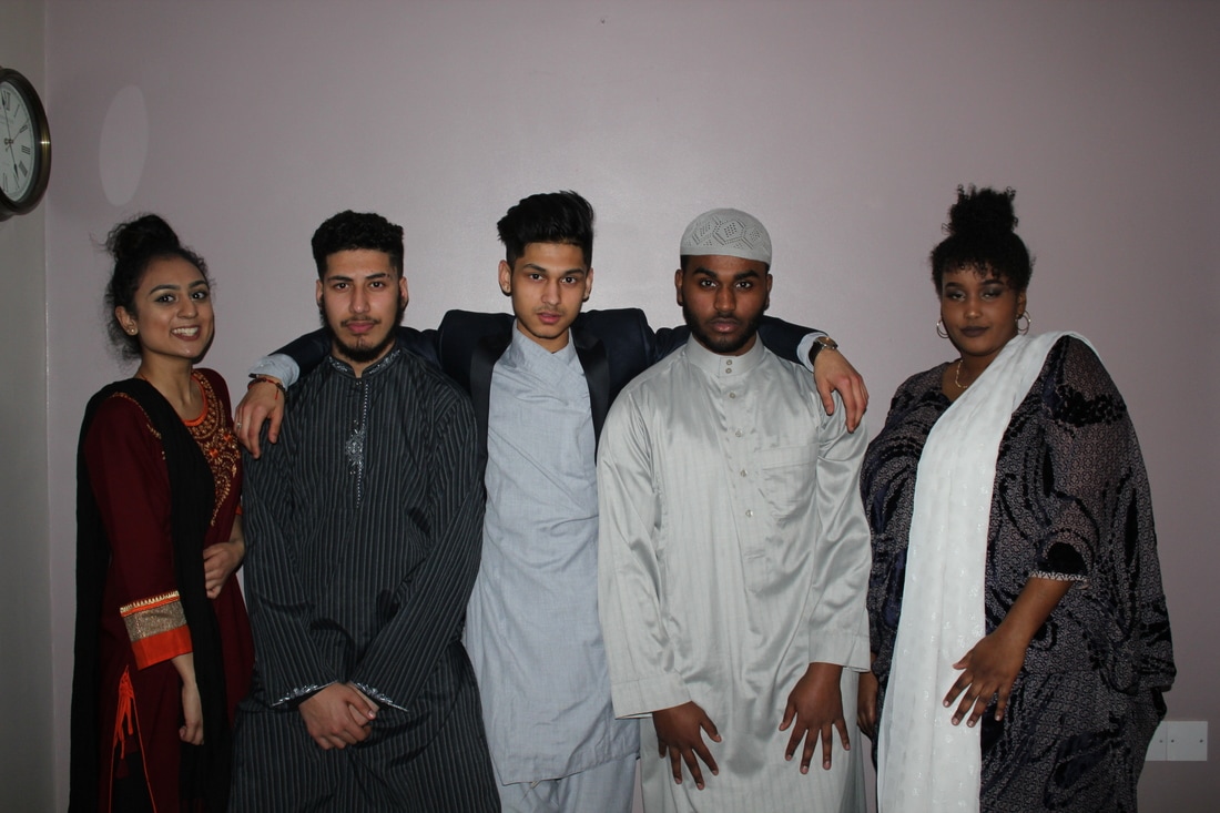
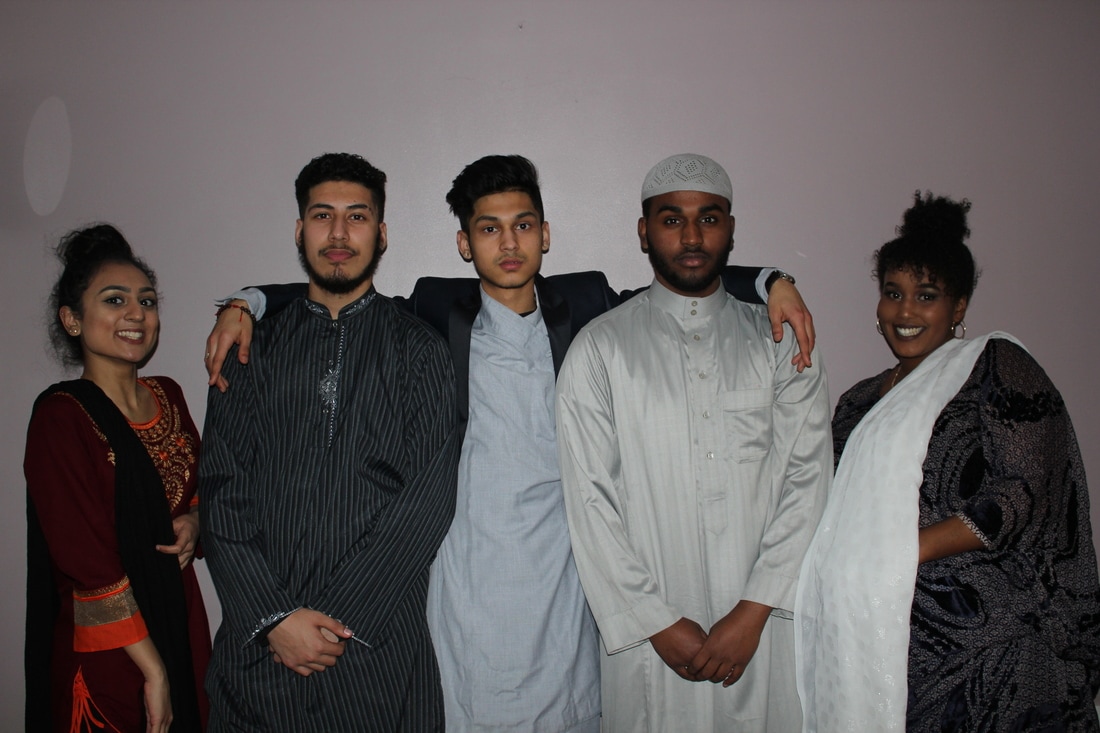
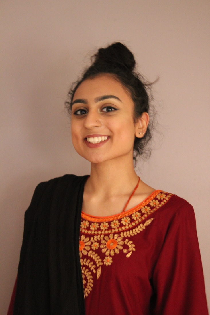
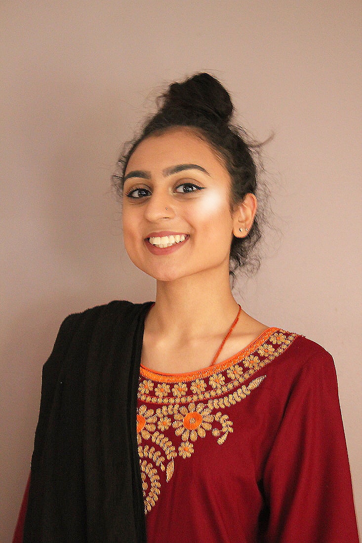
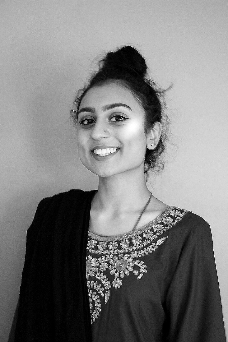
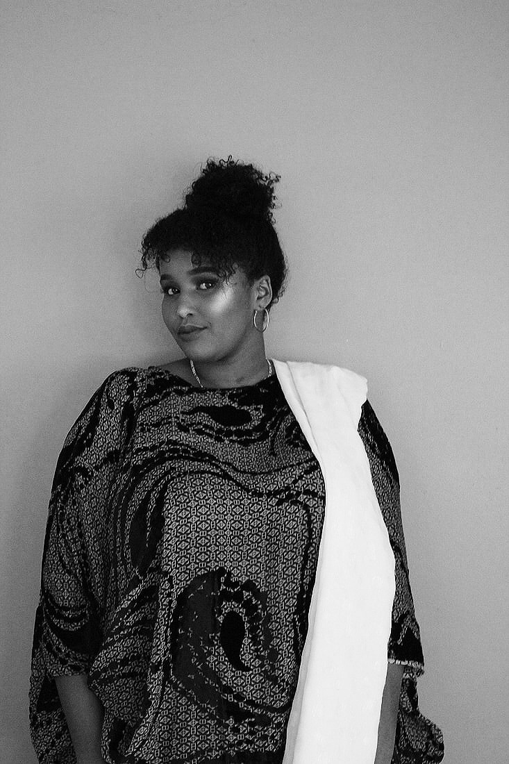
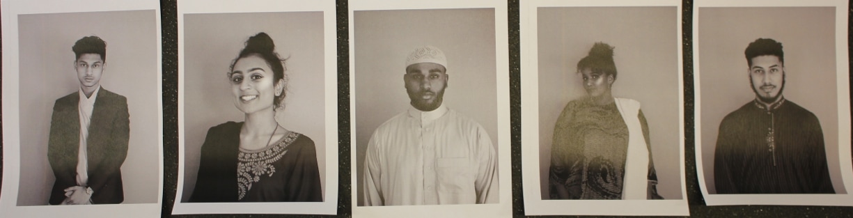
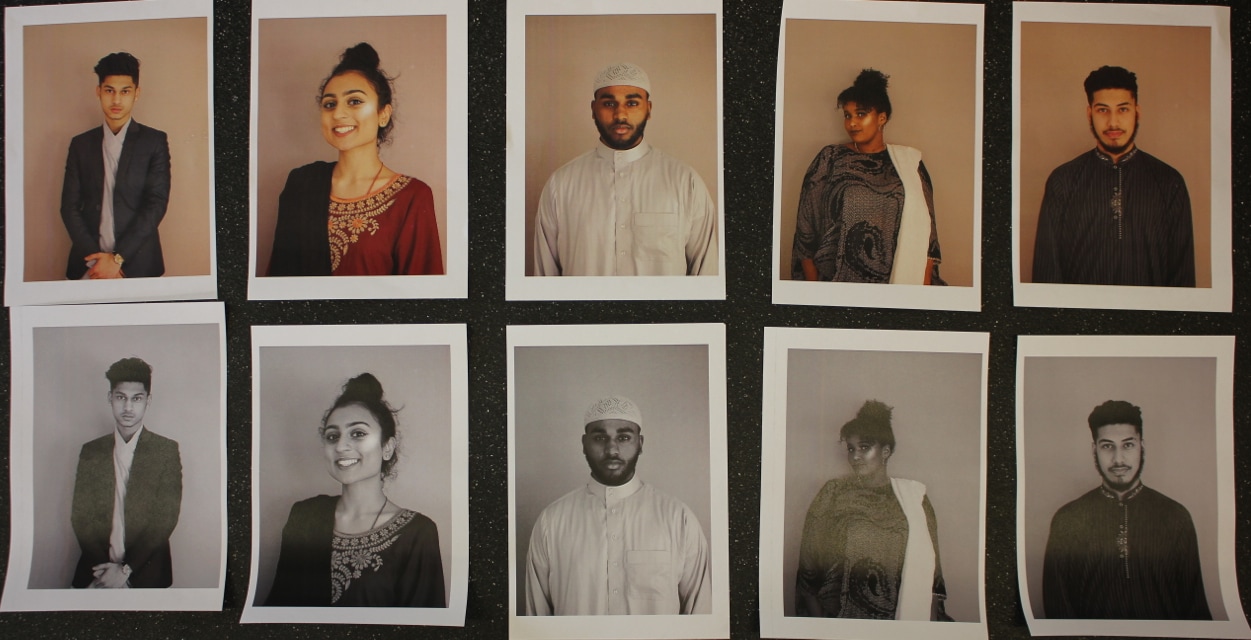
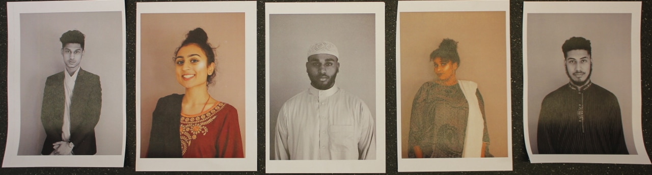
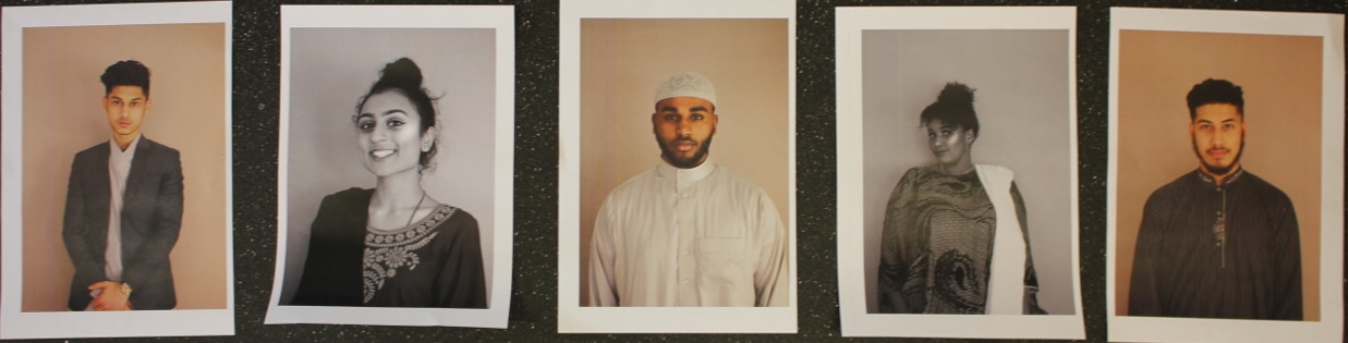
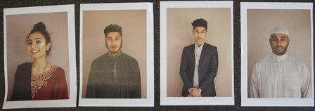
For my first photo shoot I asked my models to dress up in their traditional clothing, because this was just a tester trial to see how it would look in a plain background and just focusing on them. What went really well in this photo shoot was that everyones clothing was beautiful you can see the difference in every culture and the different styles they have. When I combined them all together you can see the beauty within them.
A Few Of The Images
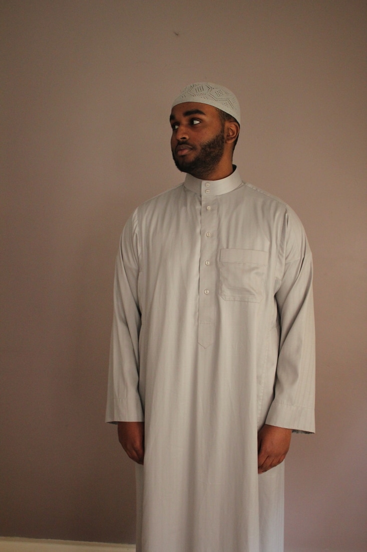
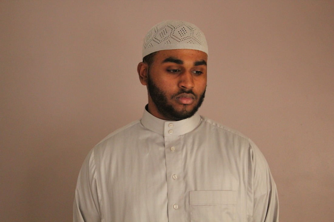
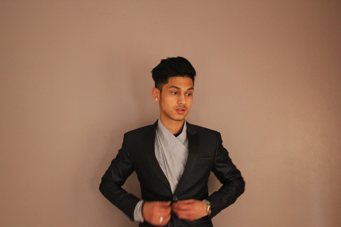
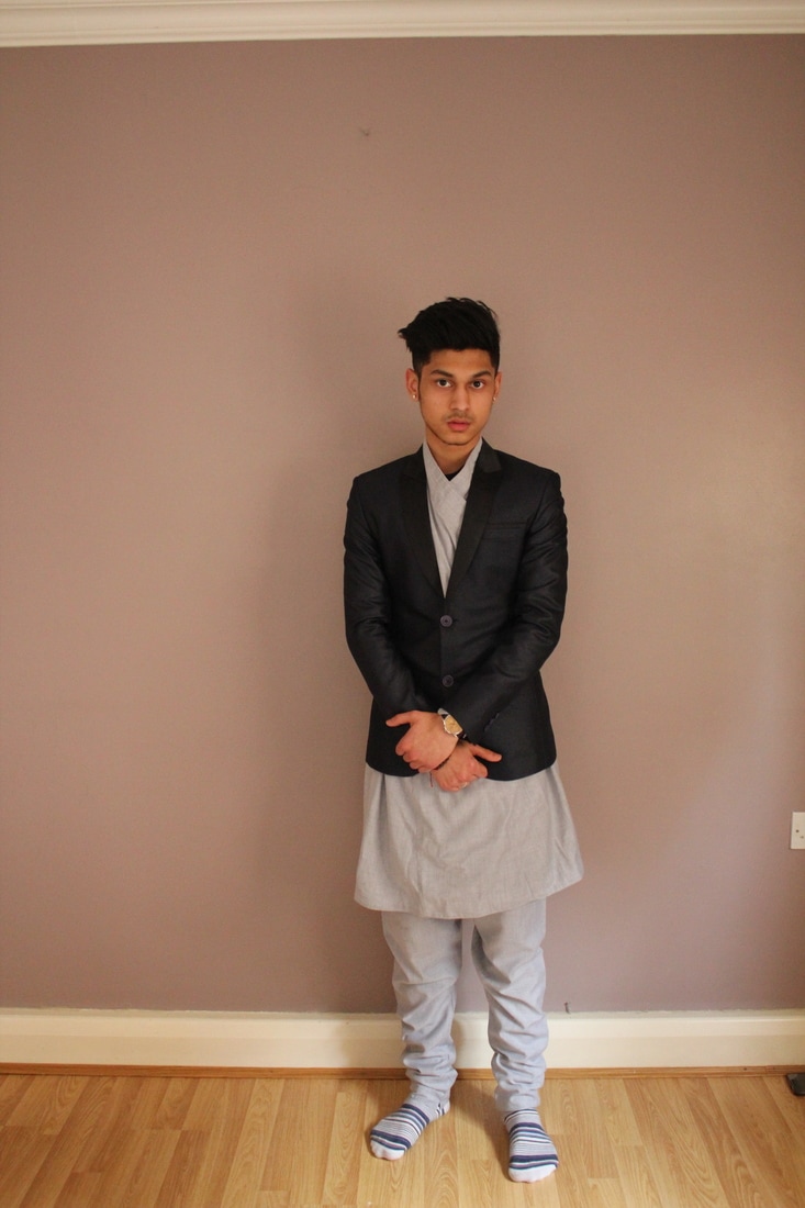
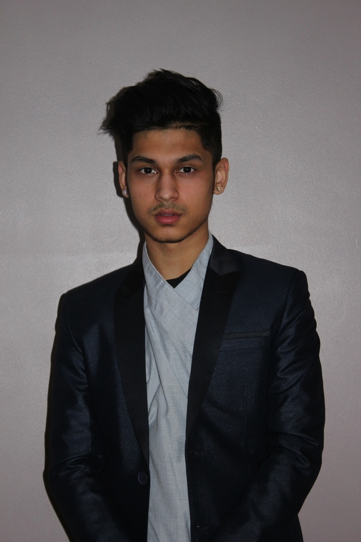
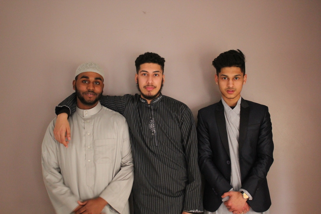
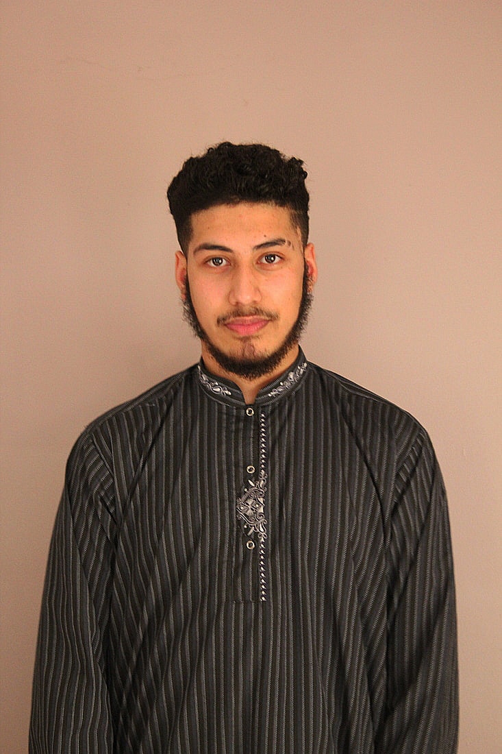
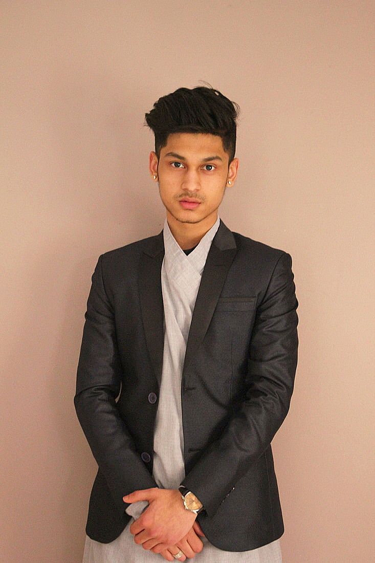
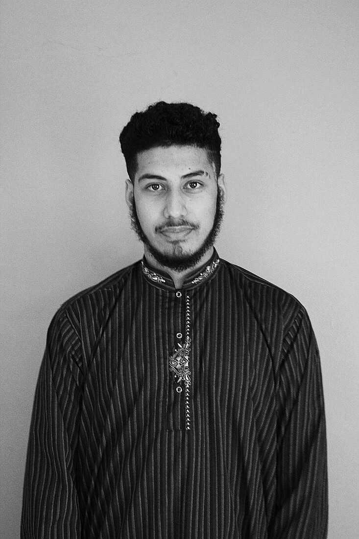
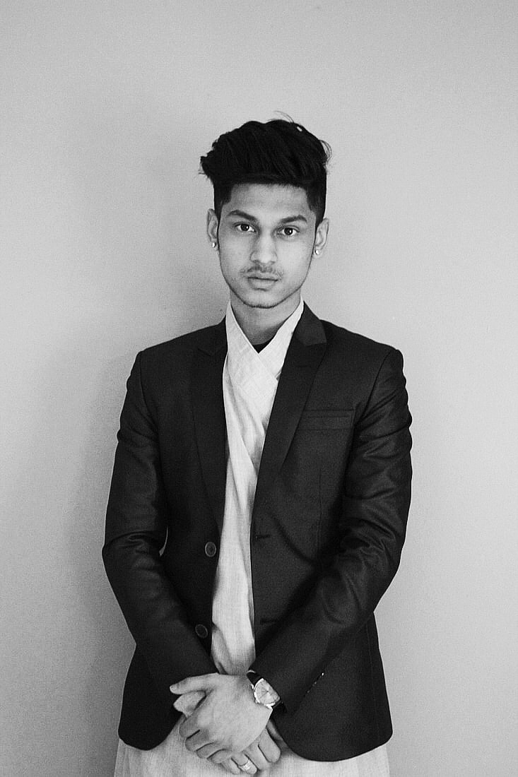
Out of all of the pictures that I have taken I chose a few that have worked better than others. The camera that I used didn't really work that well on the day, it didn't really focus on the main subject, sometimes the pictures will come out out of focus and when my models would move around, it would give a glitch effect of the picture. All of the images that I have chosen in this section has worked out really well because we can get a different theme within the pictures, working around with them in different ways by expressing them with a sense of feeling. Looking closely to each of the images you realise that some of the pictures are formal and the others are informal and what makes them that it the way the model looks towards the camera, the way the person stands and what type of facial expression they give.


|
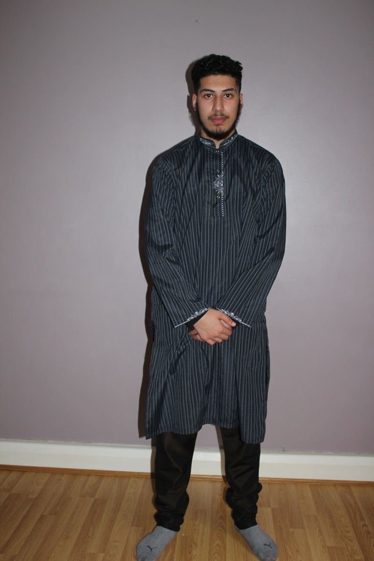
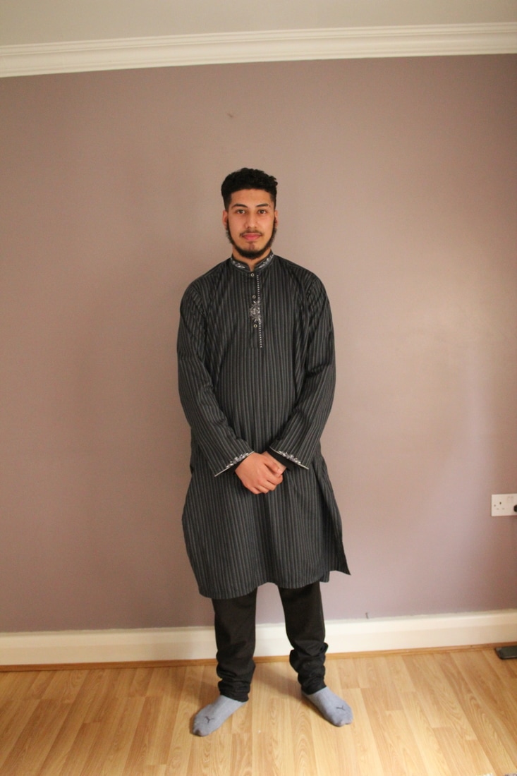
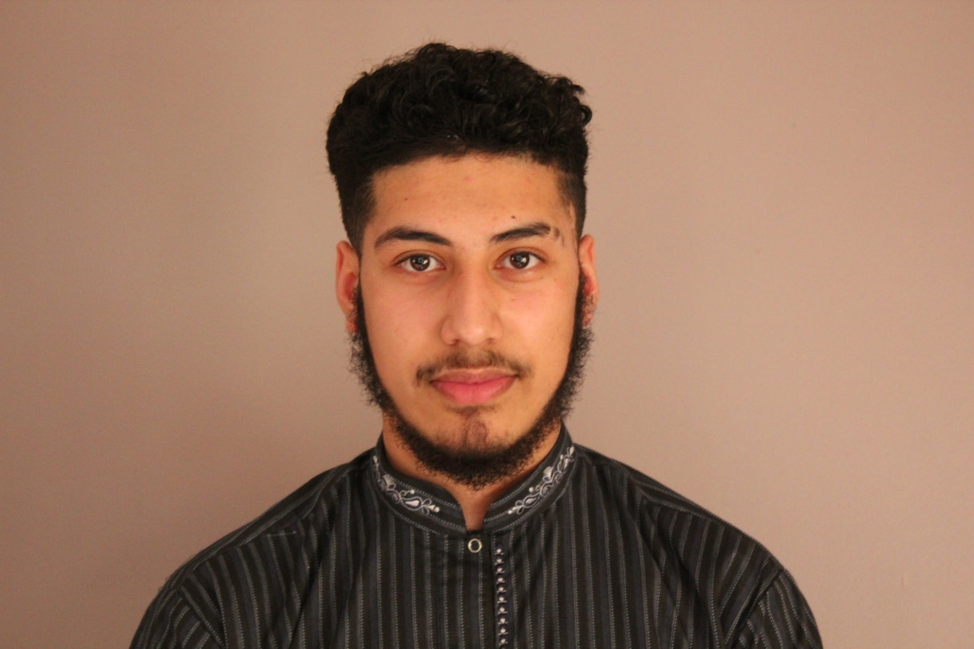
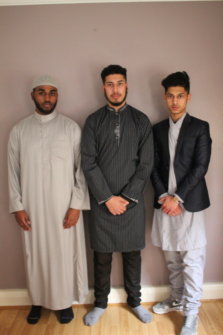
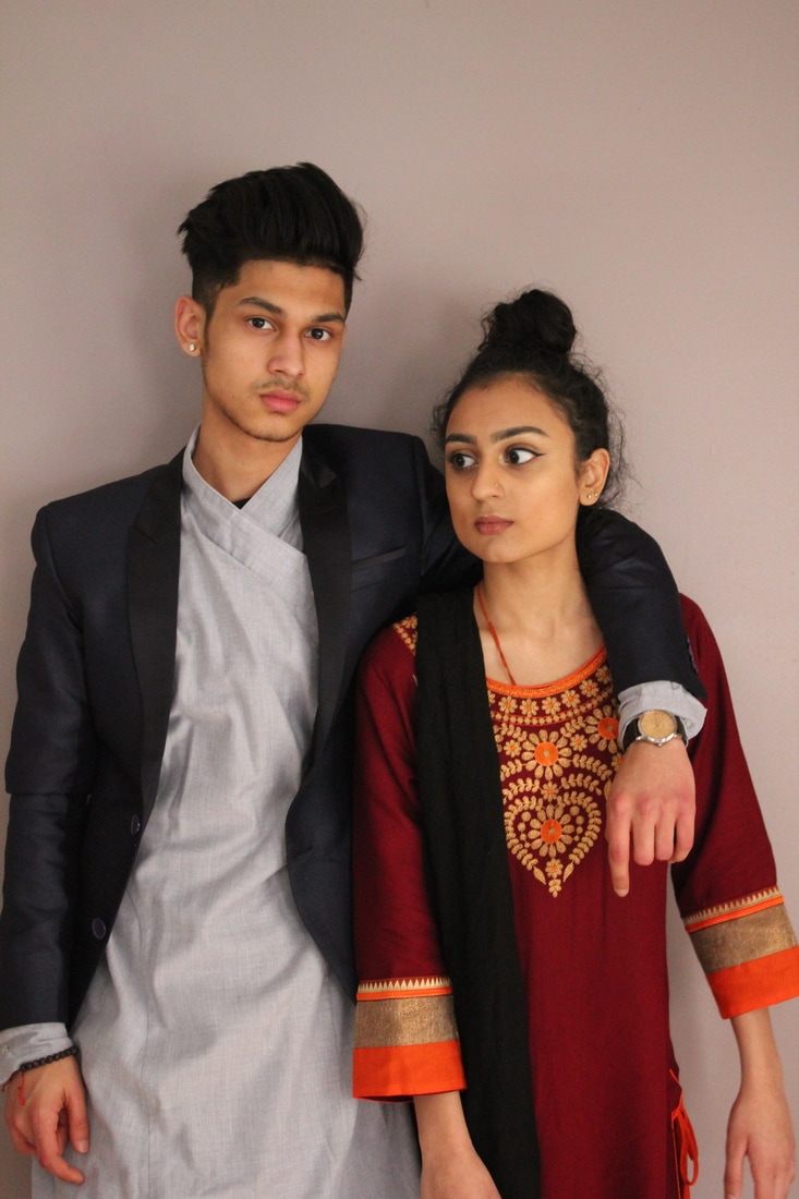
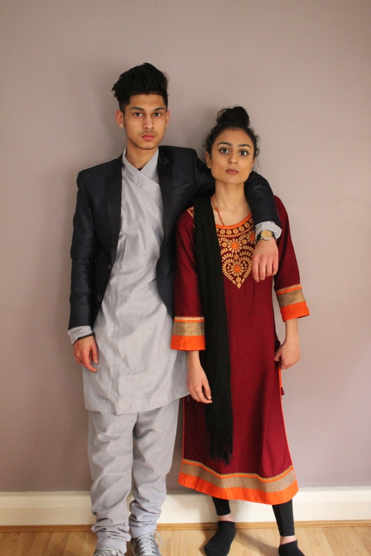
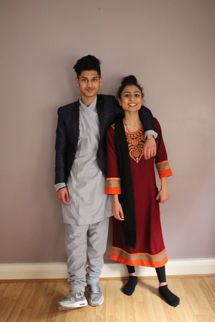
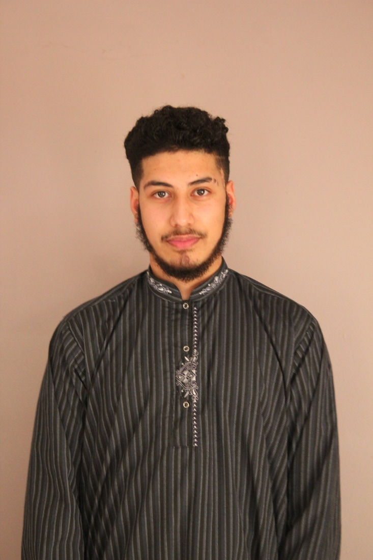
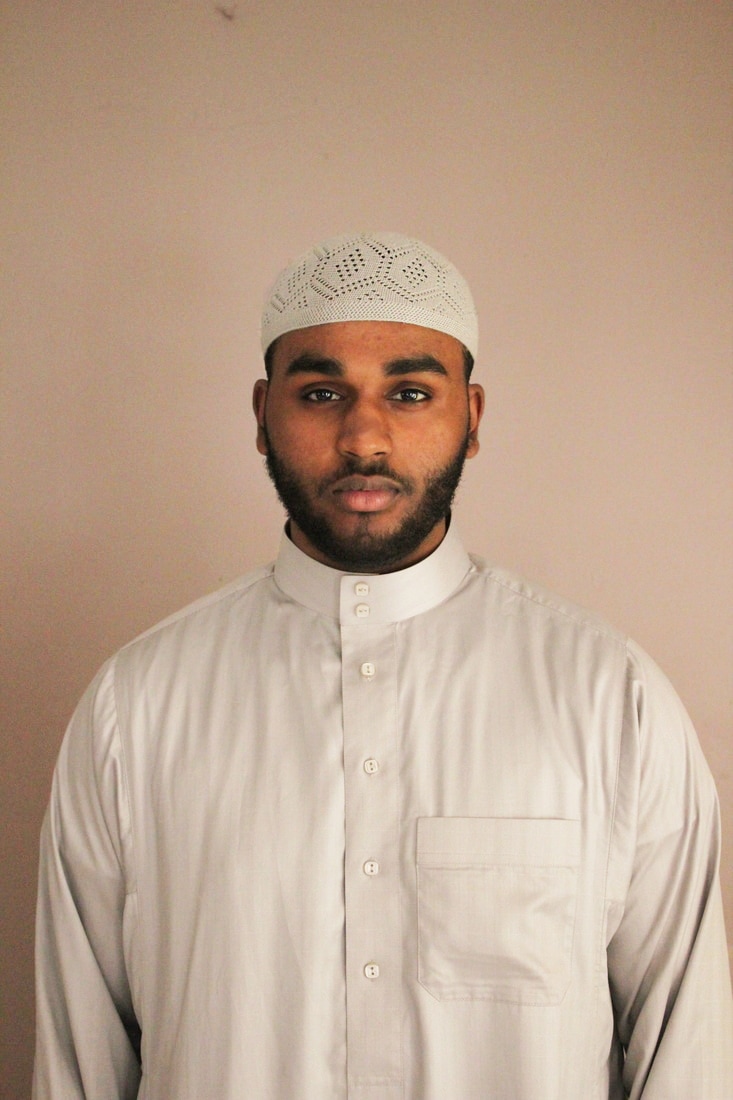
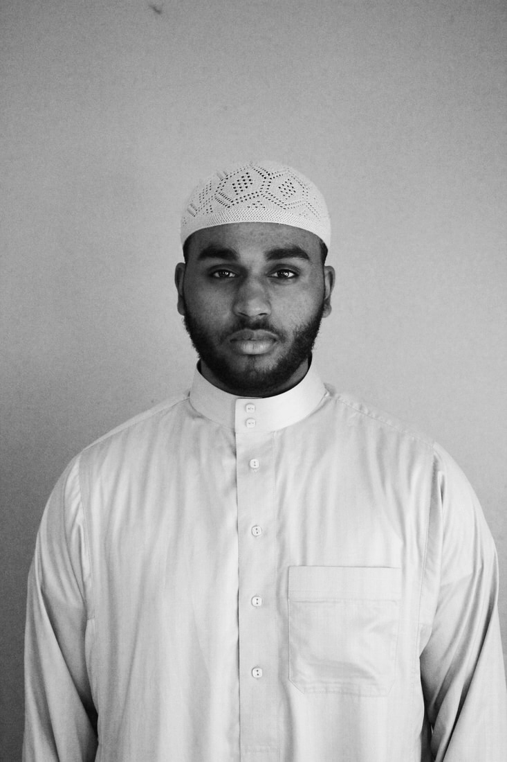
For this photo shoot I have used a DSLR and a tripod, so that my images they can all by levelled out in the same way and making sure that they are all straight. When looking at this image in depth I thought about the colour, how the colours blend to each other, how they cooperate together, could I have tried it out by using a different colour background would it make anything different?, these are questions I keep asking myself so that I could carry on developing my work. The artist that inspired me was Hassan Hajjaj and Felix Nadar this is because in Hajjaj work he focuses on the cultural clothing and also the background that links both ways but with Nadar its a portrait photography with their own cultural clothing, the idea was to link the two together so that we could get a different type of outcome. During the whole photo shoot I didn't look at any of the images till the point where the models wanted to see them and when I was going to upload them to my website, but the mistake I did was not look at the images that I have taken constantly because then I wouldn't know how they turn out to look like or if they are captured the way I wanted them to be and even if they were focused or unfocused, these are things I should of kept looking at. But the best one out of all was the picture of Haroon, because he knew how to pose and to stay serious, the directions I gave to all of them and especially Haroon was to think like a model and to stay serious or try and show me you and what I mean by that is I wanted them to express themselves to me by posing or doing something with their body postures. What I love about this picture is that its symmetrical, makes the image look more interesting and by using the rule of three I was able to think about how to compose the picture and by looking through the viewfinder I was able to balance and arrange it uniquely. Thinking about the shape there is an average amount of negative and positive shape in this picture which makes everything even and making sure that I didn't want a lot going on in the image, making it look simple give it a better finish to the image and better outcome. Having a lot of negative shape isn't interesting because then you have nothing to show others. Haroons posture is expressing himself and telling the viewer that he is confident and makes it formal.
|

|
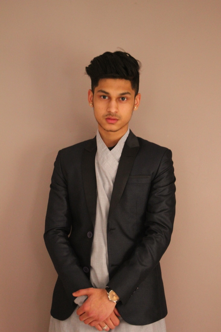
Why did I chose this picture? What did I try to capture? What was my focus/my aim? These are questions that I keep asking myself to carry on extending my work and to try to make it better. My first idea was to get everyone together so that we could combined all of the cultures together seeing the differences and similarities between all of the them. Trying to chose on which picture works the best was this one and this is because it is focused, the composition is just right they are all levelled out well and positioning them into order was tricky because this is the part where you have to keeping changing decisions and trying out the different ways to see which one would work the best. After trying out the all this one was the best one because the girls standing on the side of the boys was more eye-catching and what I also focused on was where the boys stood so I made Haroon stand next to Ahlaam and Mauz next to Riana and Anz in the middle because the two boys next to the girls were the closest to their cultures.
Typology
What my main aim for this photo shoot was to use my Polaroid camera but the film didn't come on time which was a real disappointment because we would have seen something different other than using a DSLR camera and just taking a picture. If I had my Polaroid camera up and going the pictures would have been taken with time and effort, this is because you only have one chance to get the picture right, thinking about every corner and angle of the image, the model would have to be really still as well so that the picture wouldn't look out of focus. And because it prints out straight after you take the pictures it's more satisfying because we have a chance to see all of the images after they were all completed. But these pictures are like a typology, every single one of them are from a different background, all have different type of clothing with different skin tones. What I love about these images are the differences between them, you feel like

Edited Versions For Final Piece

Testing out whether the pictures look better in colour or in black and white and I think its better in colour because we can see the colours on the clothing and also the background adds a better texture to the picture. The picture being in black and white made it look dull and boring, there was no movement to the picture.
|
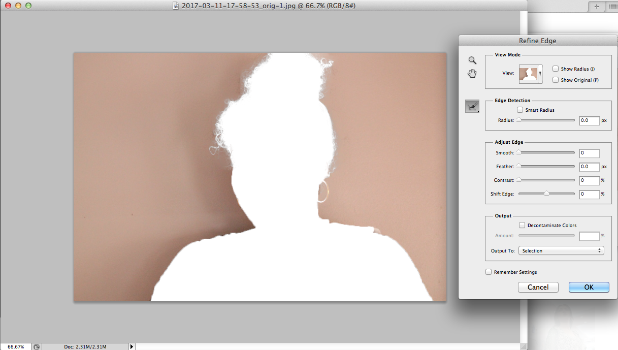
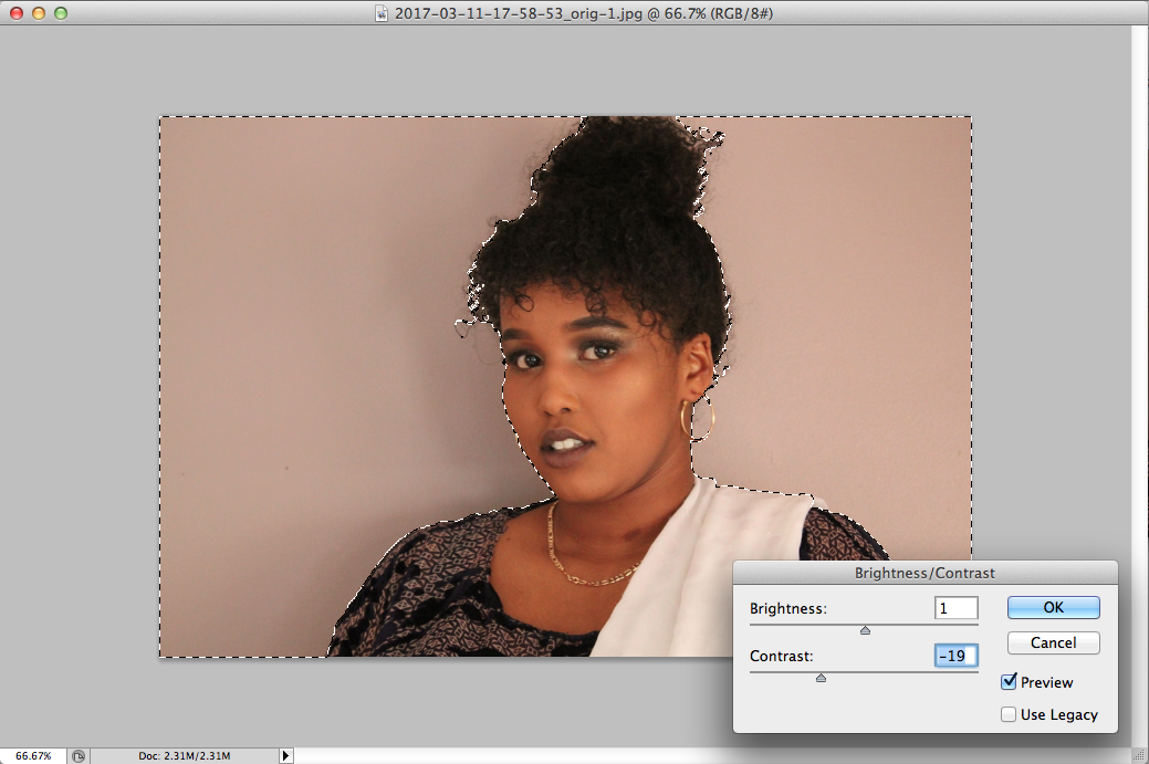
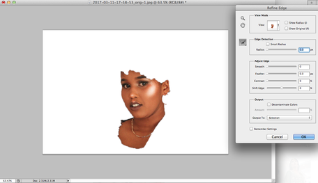
These are my editing processes, first what I did was placed the picture into Photoshop and then by using the quick selection tool I was able to highlight everything on the face and leaving the background. I was able to refine my selection so that I could select the hair that wasn't selected, then I adjusted the contrast, brightness and levels on the images and the settings on each of the images were the same so that they can all stay identical.
|
|
|
After refining the edges of the selection I started to adjust the brightness and contrast of the image so that it could be similar to the other images and also to have a better outcome for a final piece. Then I selected the background so that the image doesn't look too different and by adjusting the background the two pieces would blend to each other and contrast with the natural light that I used on the day of the photo shoot.
|
|
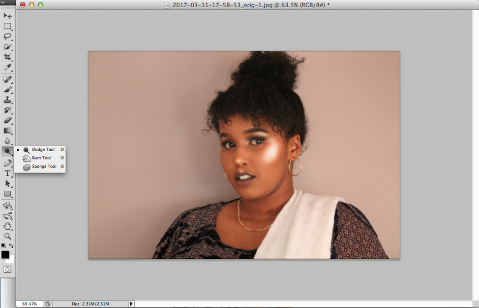
When I made sure that everything was just right and what I mean is everything is blended and in the right proportion to the original image it was time we added contour and highlight to our models. When I edited the images it faded away and because its the new trend to have a "popping" highlight, by using the dodge tool I got this as a result, which worked out really well, made it look natural as well.
|
|
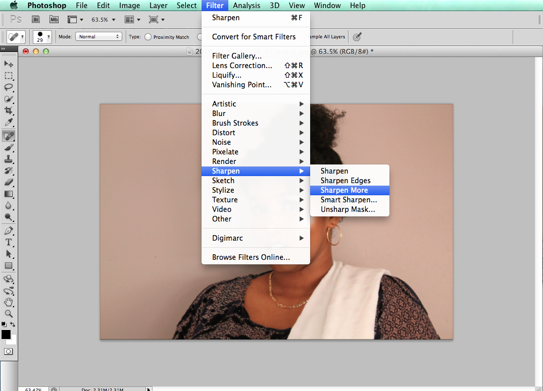
At the beginning if you realised the image was blurry, so I used the sharpen filter. By doing this I couldn't see things more clearer and the image stands out more. To get rid of the spots and marks on their face I tried out the "spot healing brush tool" which worked out well but you have to be careful on how you use it because it makes it really obvious that you tried to smudge it out.
|
|
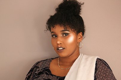
For the final step, by doing the final finishing touches to the face making sure its just right and that it blends with the image, this was the final outcome to my edited version, which I think works really well, it still looks like the non edited version. The image still has the nude look because of the background which was already like that and also the natural light that we was using.
|
|
Playing Around With Black And White
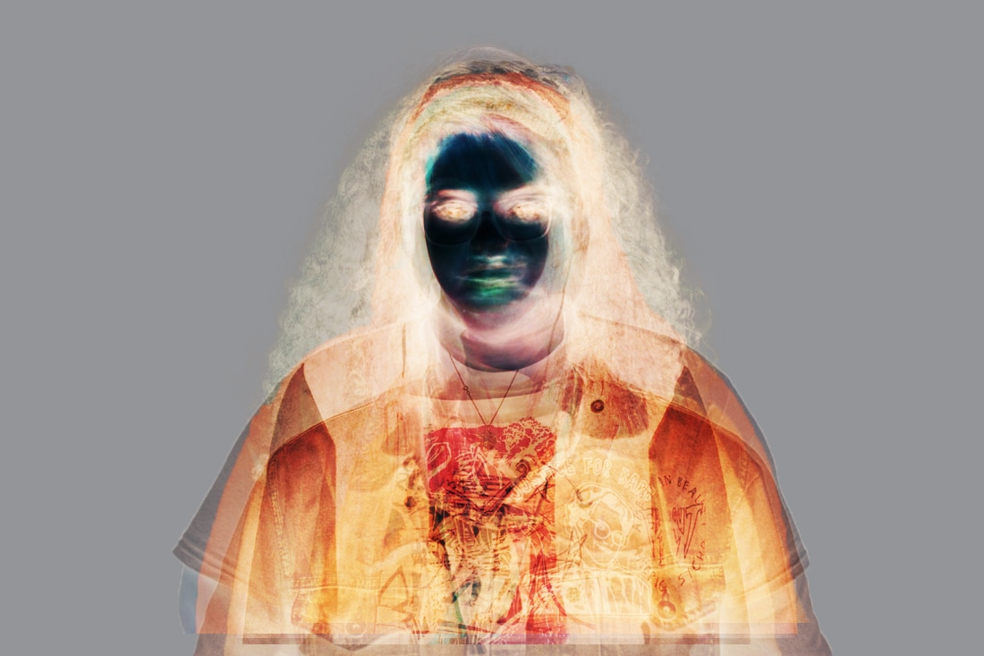
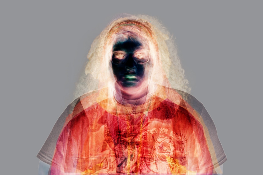
Converting these images into black and white was an idea from Jane Bown and Eric Kim. I thought that the whole black & white idea could change the way you look at an image which could give it a different meaning and expression. I tested out by mixing the images together to see how it would look like if we mixed colour and black & white together and I don't think it worked well this is because it looked too confusing and I couldn't get anything out of the piece.
|
|
But maybe if I did go for something like this it could of meant something about the cultures, things that they might be hiding or covering up from others, things that they might not want other people knowing.
|
|
|
Taryn Simon is my inspiration towards my work and to my final piece, I was able to do something similar to her work. By using the images that I have taken of the people in their traditional clothing with the plain nude colour I would place them like a typology. Simon focused on family bloodlines with two other frames which contained text and something that meant to them. For my final piece the main idea is to get the pictures of the traditional clothing printed in A4 and then having the person writing something about them it could be a word, a phrase or a whole paragraph, and then there would be a third frame that either contains an object, a piece of fabric or a picture. The whole idea is to make that frame personal to them.
Gathering Ideas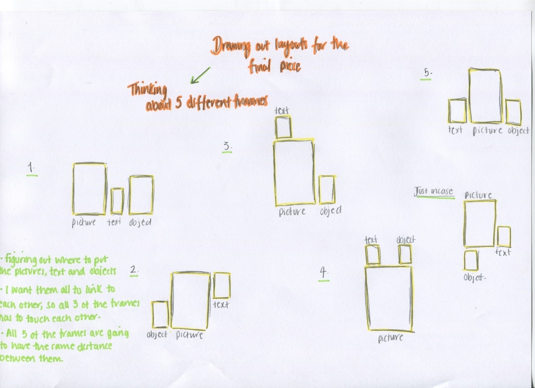
|
|
Henna Night PhotoShoot |
Wedding PhotoShoot |
|
|
Edited Versions
|
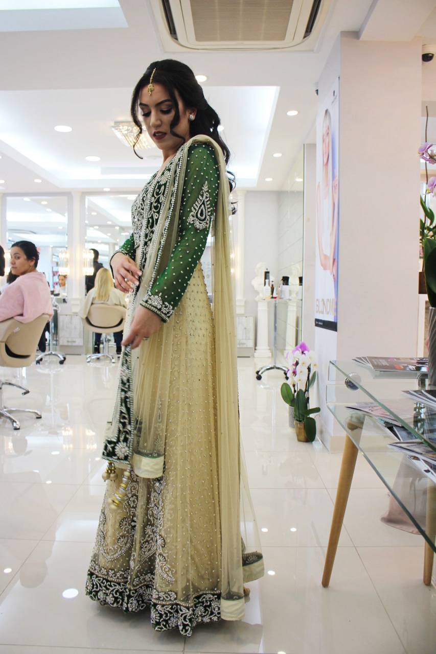
For my cousins henna night, I thought it was the best time to be taking pictures because it matches my theme, the traditional clothing on people. While she got her hair and make up done she put on her dress that is something that we wear in different occasions. When we was at the hairdressers I thought why not take some pictures because the lighting was right, there was enough lighting so that we can see the person clearly instead of using the flash. In this picture I didn't use flash because I thought that when I use flash it doesn't come out the way I want it to and that's like a natural look. I used a DSLR Canon camera with a standard lens which I wish I used a macro lens because then it would of been better and so when taking the picture the sequences on the dress would have stand out better. When the bride was trying to fix up her henna dress, I thought it was the best moment to take pictures because she doesn't know I'm taking pictures so I would leave her facial expressions to chance and the way she's standing because I don't know what she's going to do next I'm here sitting down on the chair waiting for the best moment and this picture was the best one out of all, the camera was on continuous so that it would keep on taking pictures while she's moving. When taking this picture I carefully thought about how I was meant to stand with the camera, testing out the angles in the salon, I stood up, sat down and even stood midway by seeing which one was better for this dress and for the lighting I thought that being midway was better this is because we could see the dress better from the bottom. I edited the picture using Photoshop, changing the contrast and brightness to the image made the dress stand out more because the original picture was more darker and we couldn't quite see the beautiful dress and our bride. What I could do better was by taking pictures of the same pose in different angles so that we could see the dress in different ways. Also next time I would have to think about what I should include in the background as well, because the lady in the back doesn't really look nice, I could have carefully thought about the rule of three, the angling and thinking about what type of things I would want in the image, other than just clicking on the shutter and saying here you go this is your picture, if the picture was plain, it would have been more effective and you wouldn't see the lady in the back first. I could have tried taking the picture in different angles for example I could have stop right text to her and from below I could have taken a picture showing that she's the boss, more powerful.
|
|
|
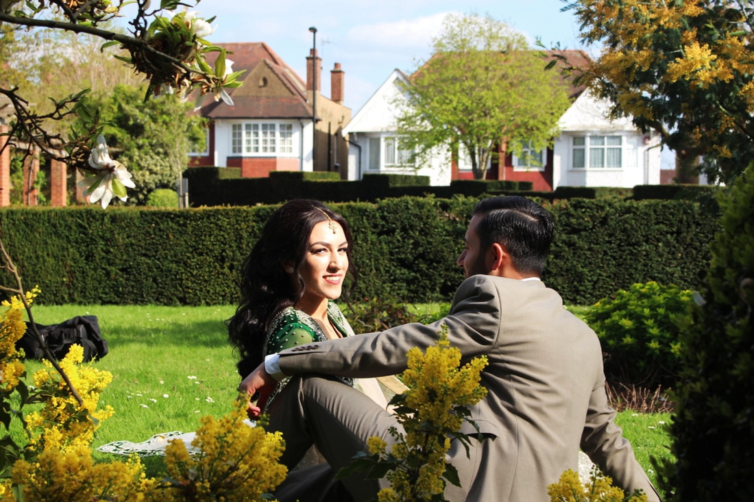
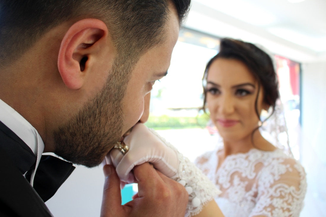
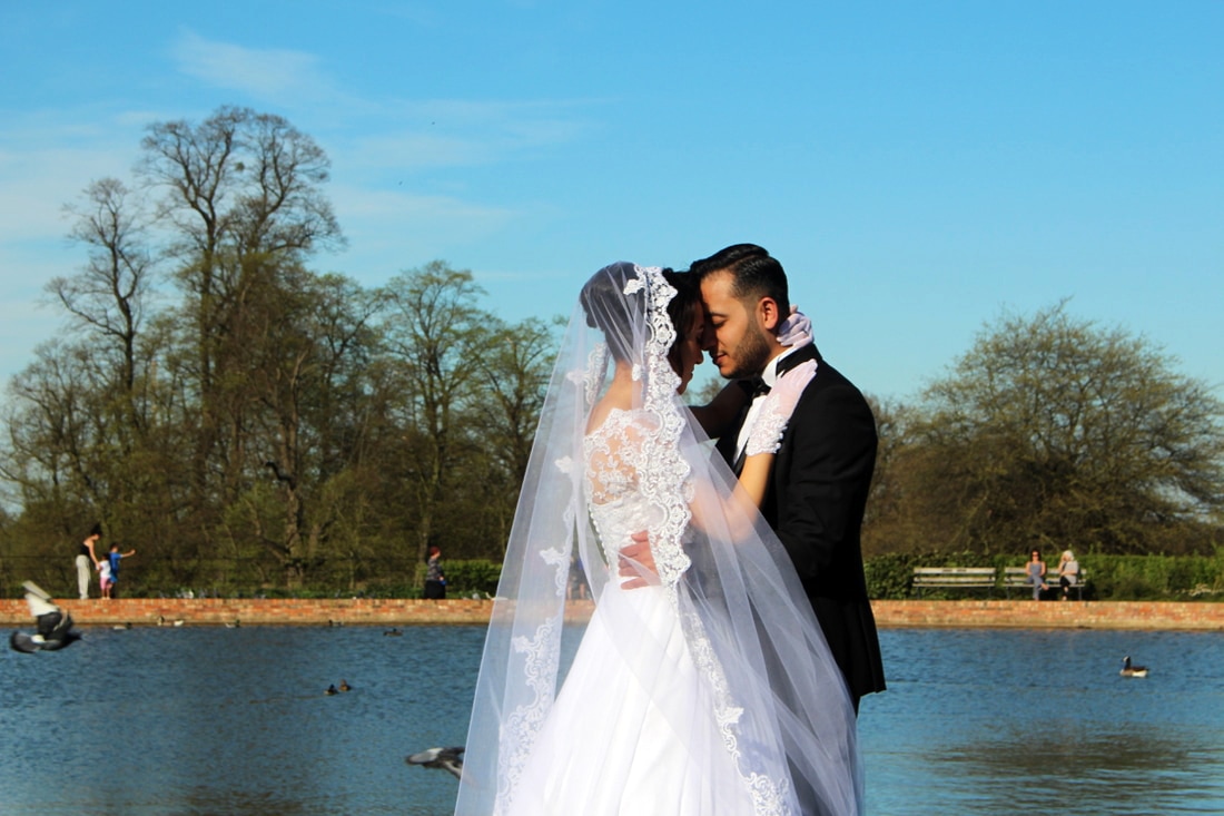
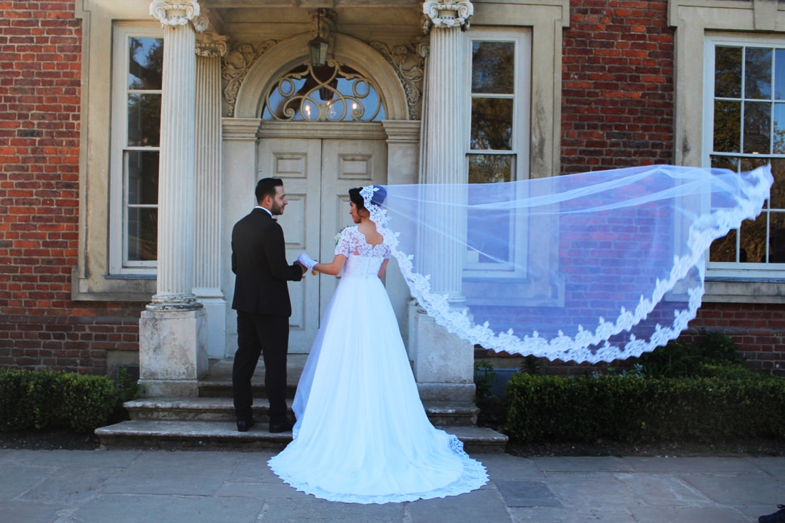
What I did here was we all went to a park to take picture with the photographer was a group with the braids maid. While the photographer was getting ready I asked if I can get a few shots and he said go ahead so, what I did was made the bride and groom sit down, I told him to look at her and the bride to look at me nothing else, they chose the way they sat I didn't have to do anything. Because we was in a park we had to quick because people kept walking past and interrupting the pictures. For this picture I got behind a bush crouched down a little so that we could see a bit of the plants in front and the our two models. What has worked out really well in this picture is that the lighting towards the bride was just right, there wasn't that many shadows other that her facials expressions. Maybe if I stood a bit more higher it could have been a better picture because then we wouldn't have seen the buildings behind and just the green area.
|
|
|
Figuring Out The Layout For The Final Piece
|
|
At this point I am deciding on what type of order I should put my pictures in and why? The first image on the left is what I was thinking to do at the beginning before I printed them out but then after printing them out and laying them out you have a visual idea on how it looks and how you could improve it. By looking at the one on the left the picture in the middle it annoyed me because it wasn't right and what I mean about that is it that because its landscape and the rest are portrait. My final decision was to remove that image and just to keep the four images as shown on the right
- Age order.
- Random order.
- Colour order by what they are wearing.
- Name order from the beginning of their name or surname.
The images I have taken I edited them and put them all together but it didn't really like the look of it, so then next plan was to print them all out in the same size and laid them all out. At this point I have to start to think about what type of order I would want them in and why? What would be the most appropriate layout for this outcome. At this stage I tried out age order which didn't look too bad, but then it just looks like boys on the left and the girls on the right.
Colour Order By What They Are Wearing
|
|
Age Order
Figuring Out What To Do Next
|
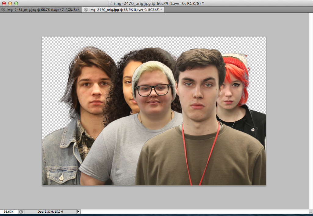
After trying to figure out on what type of order I should put these images in I them thought that these aren't going to work because what annoyed me the most was the background, the fact that it was the same black drop background with the same camera settings with no flash each time, it still came out looking differently. After trying to edit the background so that all of the images looked the same, I then came to a stop and thought about layering after my sisters pictures idea. I thought of creating someone out of these 8 people, so that I wouldn't have to worry about the background anymore and the different tones to the picture.
|
|


Editing Process
|
|
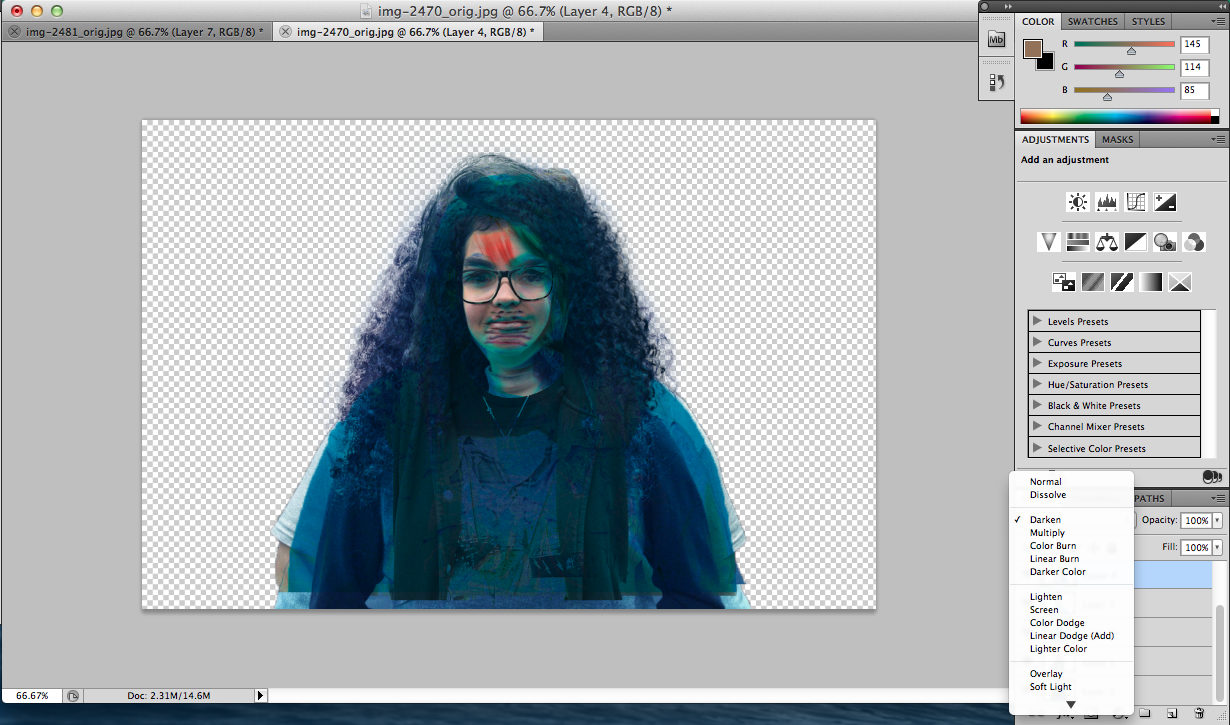
At this stage I have layered all of the images together and by testing the differences of the layering I have a rough idea on which one I would want to use. I have started to try out the 'darken' layer on all to see how it would look like leaving the opacity and fill at 100 and then changing the opacity to 50%.
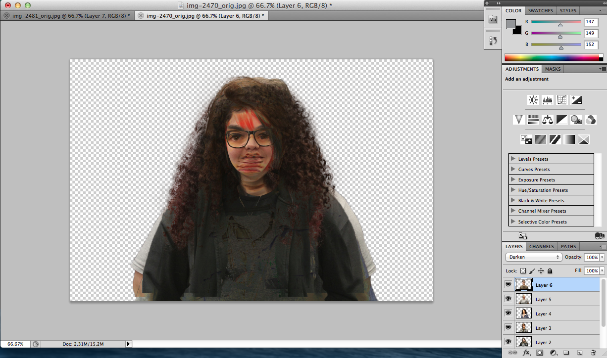
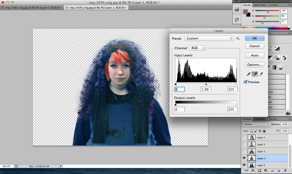
After converting all of the images into the darken layer, I then thought about adjusting the levels of the picture so that it could be an average setting, so by bring the points to the beginning of the level on each image and using the grey scale I made all of the images the same.
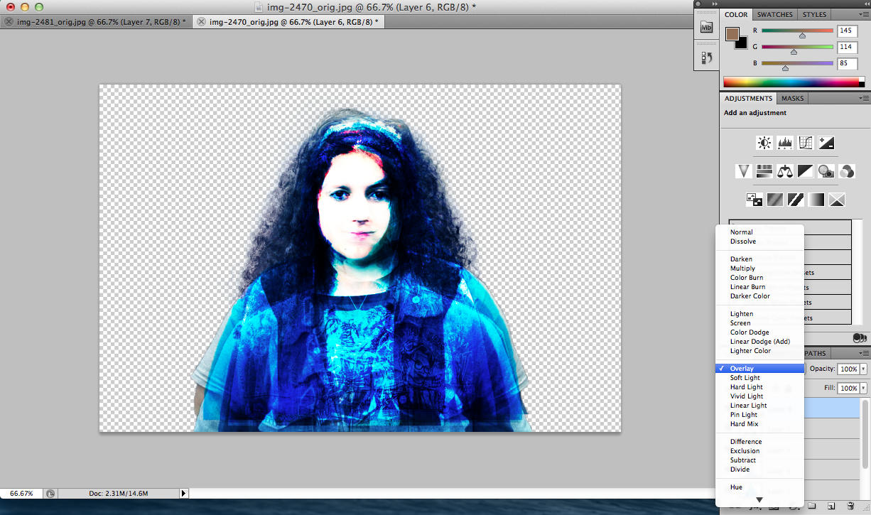
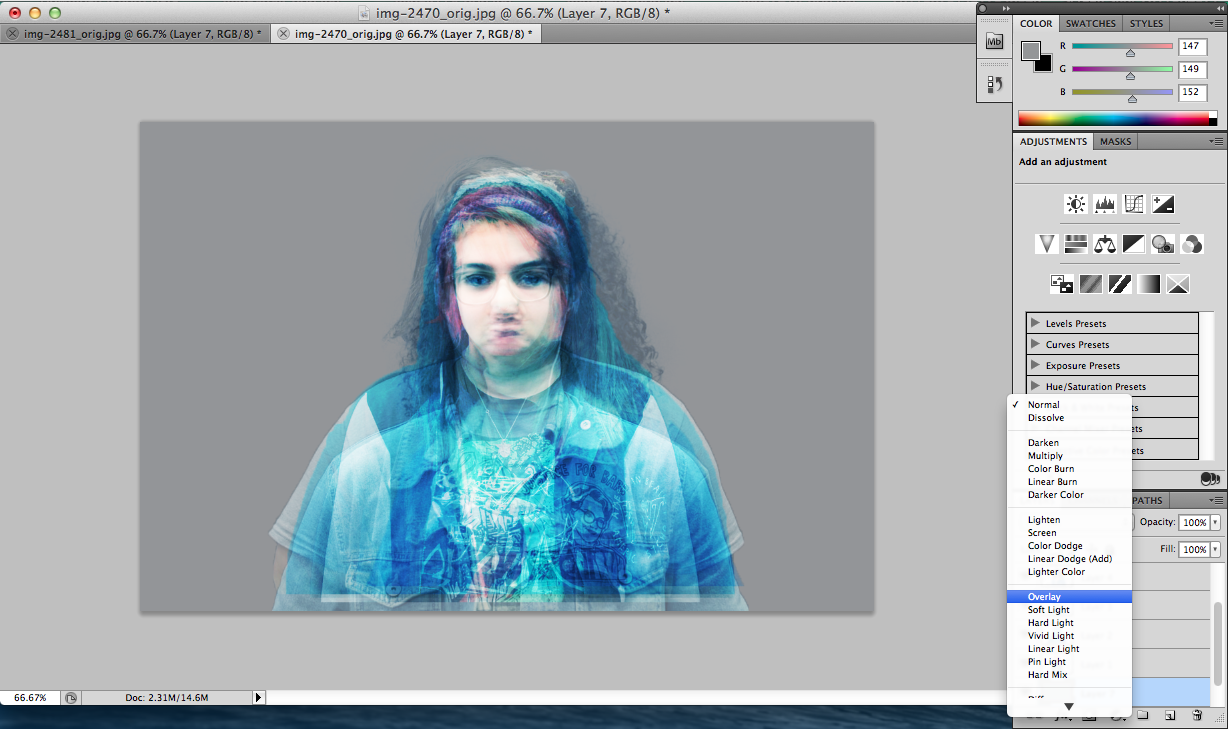
Now the two pictures that shows a big difference between the two settings on the layers. The picture above is darken and the one below is overlay which has a better effect to all of them because then on the face you cant see the different parts to the picture expect the bottom part of the body.
After making sure that each person is in the right position and the face looks like a person I then thought of adding a background to the image and thats by adding a new layer to the picture and finding the middle grey tone on the colour chart.
Final Outcomes
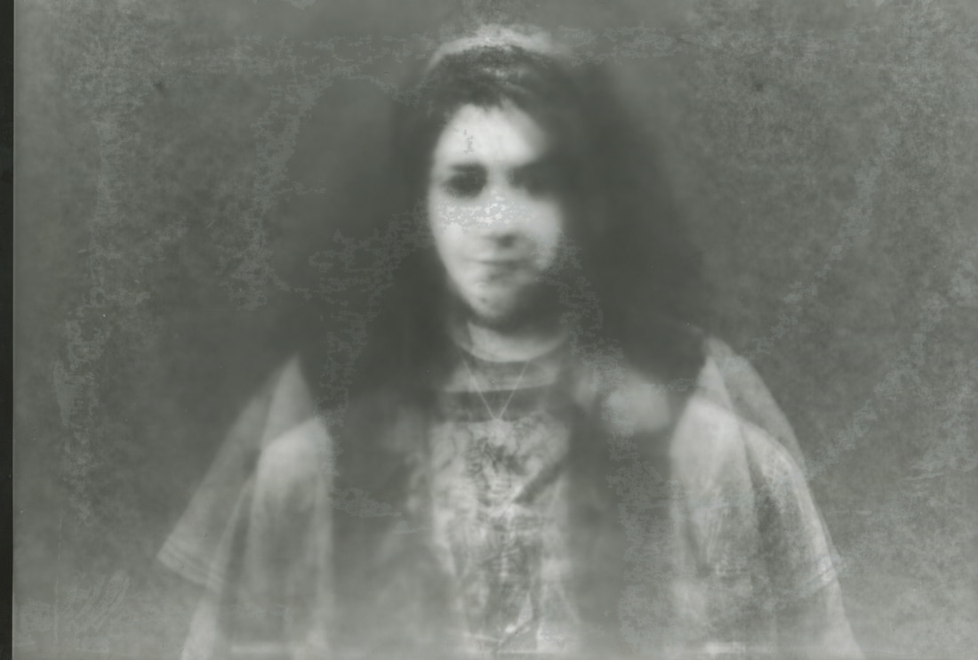
These are the two final outcomes that I came up with using the 8 people in my photography class. I think that they have worked out really well because I wasn't assuming that it would actually work. Who would think that this outcome has 8 different people. Yesterday I showed my work to my parents and when they first saw it they were like "what did you do?" "Who did you create?" "This hurt my eyes as soon as I looked at it" "How did you create it?" "This is so interesting", getting these types of feedback towards my work is interesting because you want people to see something different to what they see everyday. The whole idea beneath this is to create someone an average person using everyone in the classroom, making it average makes it more fascinating because you see different things creating something that might even exist, trying to imagine if someone like this that actually existed is scary but exciting. What I loved the most about this was the face, the face has such a unique and reflective look to it but with such a low resolution but I think that if it was in a high resolution we wouldn't get the same effect. With this piece the main focus is on the face rather than the body because when editing I placed all of the faces together, angling all of them together, by zooming in and out just to get the right angle for it and thinking about the edges to the image such as the hair and the several bodies that we have included to this it confuses you on what part to look at and who's faces comes first. At first I could have just used the edited versions and made them as a final piece but then whats the fun in that, testing new things out, taking the risk is more exciting, so with the help of Photoshop we are able to achieve these things. When I started layering all of the images together and testing out the different options you start to see that you are getting somewhere, you wouldn't find the right one unless you try all of them. When I finally found the right one which was "overlay" I said to myself that this is the one, as soon as you look at something you realise that you've chose the right one. When looking at the image you say that this is an average person, everything that you changed from the settings is average even the background from the greyscale. After making sure that this was the final outcome I printed it out to see if I need to develop it a bit more so that I could improve my work. So an idea came to mind was to try this out in the darkroom creating a photogram. The first step was to invert the image which makes it a positive so what we have to do is get the negative out of it. By cutting the photographic paper to the size of the image and using the enlarger I was able to develop my work with the chemicals to get these below as a final outcome.
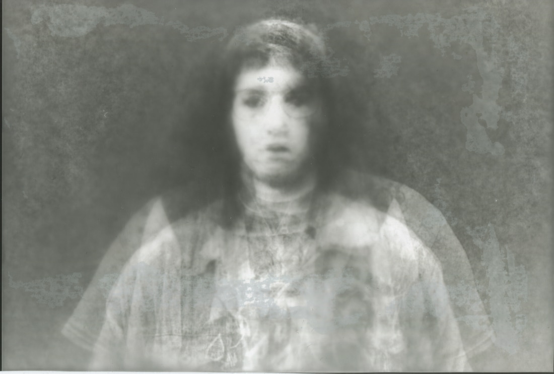
Inverting The ImageThe final outcome felt like I need to try something else next to it just so I can carry on experimenting with it because if I don't try something out I wouldn't have an idea what to do next. I thought about doing Photograms with these images, I dragged the images into Photoshop and 'Inverted' the image this is because the picture right now is positive so we need it to be a negative so that we can expose it.
|
PhotogramsAnd this is what I came up with in the darkroom using the chemicals. What I love about these images is that its less obvious and you can't really tell that there are more than one person standing in the picture, but really theres around 8 people creating an average person. The grey scale in the image makes it more interesting because its makes it more mysterious.
|
Instant Print
|
|
Final Piece
Evaluation
This whole project started off with our teachers giving us our exam papers and talking through each of the options and each of the titles we can pick. At first it was all about testing and researching which one you would want to go for throughout the investigation. To start it off I started to look at the threshold concepts that started to create links and where I could go with this. The title I chose was Portraiture, the threshold concepts that I focused on was genre, visual language and grammar, with genre its the most important with portraiture because you can express it in many ways and it would led to anything you want. I discovered that with these two concepts you can go whatever route you want, there would always be a link between the two. Then to gather more information on the whole concept on portraiture I started to do some research using Pinterest linked above. To get the actual definition on what "portraiture" actually means and just to make sure that I understand the true meaning I refined it by translating it into Turkish as well. The photographers that I have researched were Felix Nadar, Jane Bown, Omar Victor Diop, Erik Kim, Hassan Hajjaj and Taryn Simon. By reading through the exam paper and answering the questions these photographers Felix Nadar, Jane Bown, Omar Victor Diop and Erik Kim are on it, its like a timeline of photographers that should be researched that would help during the research and helping you understand the whole history and story for photography. By studying their work and doing depth research about them you understand how they started with photography and how they developed their work. You start to understand the concept between art and photography and before photography even existed. For example Felix Nadar was one of the earliest photographers in my research and you start to see a big change between the artworks for each of the photographers and the time differences between them. Around Nadars time photography just started to get popular so they used it for portraits, capturing things to keep it as a memory, having something to remember them by which was the best way they had, because a photograph can last forever. After Nadar we have Jane Bown, which you can see a big difference between the way they take pictures, the structure to the picture, hairstyles and clothing. Then when it came to researching Omar Victor Diop everything got more colourful with more movement with his pictures.
The plan was to take lots of pictures in Dubai of the people there and their traditional outfits, but then after reading the laws and going there to find out that its illegal to take pictures without permission so you don't really want to risk things so you leave it. But what I did was took pictures of my sister around the hotel with my iPhone 7 plus using the portrait effect. The ones I loved the most were the three that I selected later on because it’s the way she expresses her emotions to the picture is beautiful. Then I wanted to create a prep so what I did was started layering all three of the pictures together which worked really well the way that you can't half of the facial expressions and in every picture it covered the eyes which could mean that there is something that we could be hiding, keeping it a secret. After that I stop where I was and did a next step plan, it was some ideas that came to my mind that I might want to do and take action. But then to gather more ideas and trying to figure out what to do for my final piece, I went to the National Portraits Gallery, which was interesting because I saw a set of typologies that were in age order. After a while I was able to do more photo shoots that were linking to cultural photography. I was able to ask my friends to model for me with their traditional clothing. I was able to create a typology with them as well all of them standing the same, the camera in the right angle but just the way they are posing and their outfits are different. During these photo shoots I took pictures using my iPhone 7 plus, a Canon DSLR and a film camera. The photo shoots all of them were really successful but the one of the wedding and henna night didn't really work out the way I expected it to, maybe that it didn't really go well with the other shoots I did.
Overall I have two final outcomes that are inspired by Taryn Simon. It all started with me being fascinated with traditional clothing and the differences between all of them. By having a photo shoot I was able to get pictures that would help me for my final piece and the ones that worked the best was the ones I chose for the typology because they are all formal, the angling for each picture are all the same. What I wanted to do next was what to put next to them because the inspiration is Taryn Simon and how to display them, I thought about writing a phrase about themselves, making it personal to them, telling the model to say something about themselves and a small object or fabric that is also personal to them. What I would do is frame them all, the main pictures would be frame in a A4 frame and the text and object would be frame in a A5 or A6 whichever one is more suitable. At first I was just thinking to just frame the pictures and leave them like that but then when you print them out start to see everything visually you start to think what can I do to make this better. I think wanted to link another artist to this final piece which was Erik Kim, I was thinking about the whole black and white idea, so I edited my pictures using Photoshop and when I printed them out and displayed them you start to see that it didn't really work, I realised that it covered the main idea from the picture, there wasn't anything meaningful towards the picture.
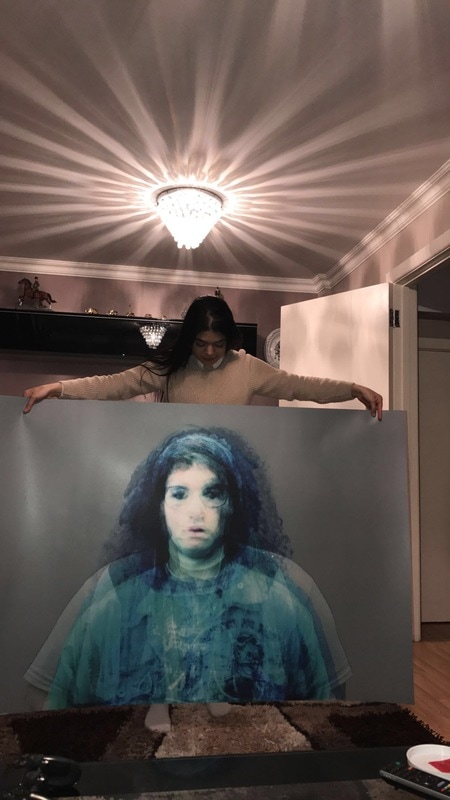
The other final outcome is an average person from 8 different people. At first the idea was to edit the pictures and create another typologies, but then the background didn't work well with the other images because they were all different tones. So I still gave it a try I edited the images to make the background all the same making it look like an actual typology and then trying to decide on which order I would want the images to go in, I tried out the following; age order, a random order, colour order by what they are wearing and name order. To develop my work a bit more I wanted to try out layering with these images and what type of outcome I get, and the whole creating an average person with 8 people was interesting, by selecting, copying and pasting, changing the settings and testing out all of the other settings I finally came to an end and got an average person at the end. Which was interesting because who would have thought you could create an average person with 8 other people. What I want people to say when they first look at the final outcome is "What is this?" "How did they do this?" "How many people are in this picture?” The thing that worked out was that you could actually see a person; the face looks so realistic that you wonder if someone like that actually exists. The thing I could have done better was the bottom half of the image, because the part where you can see everyone’s t-shirt and shoulders, them not being leveled wasn't nice and effective. After a while I wondered how these outcomes would have looked if they were photograms, so I inverted the pictures and exposed it with the enlarger onto photographic paper and developed it. Which I think it was a really good outcome because the outline of the body isn't that obvious anymore and from a distance you can actually see a face with a body without the other unnecessary lines. But going back to the originally edit I wanted the picture printed it really big so I sent it off using Instant Print which the size would be 60 x 40 the size of a bus stop poster.
The plan was to take lots of pictures in Dubai of the people there and their traditional outfits, but then after reading the laws and going there to find out that its illegal to take pictures without permission so you don't really want to risk things so you leave it. But what I did was took pictures of my sister around the hotel with my iPhone 7 plus using the portrait effect. The ones I loved the most were the three that I selected later on because it’s the way she expresses her emotions to the picture is beautiful. Then I wanted to create a prep so what I did was started layering all three of the pictures together which worked really well the way that you can't half of the facial expressions and in every picture it covered the eyes which could mean that there is something that we could be hiding, keeping it a secret. After that I stop where I was and did a next step plan, it was some ideas that came to my mind that I might want to do and take action. But then to gather more ideas and trying to figure out what to do for my final piece, I went to the National Portraits Gallery, which was interesting because I saw a set of typologies that were in age order. After a while I was able to do more photo shoots that were linking to cultural photography. I was able to ask my friends to model for me with their traditional clothing. I was able to create a typology with them as well all of them standing the same, the camera in the right angle but just the way they are posing and their outfits are different. During these photo shoots I took pictures using my iPhone 7 plus, a Canon DSLR and a film camera. The photo shoots all of them were really successful but the one of the wedding and henna night didn't really work out the way I expected it to, maybe that it didn't really go well with the other shoots I did.
Overall I have two final outcomes that are inspired by Taryn Simon. It all started with me being fascinated with traditional clothing and the differences between all of them. By having a photo shoot I was able to get pictures that would help me for my final piece and the ones that worked the best was the ones I chose for the typology because they are all formal, the angling for each picture are all the same. What I wanted to do next was what to put next to them because the inspiration is Taryn Simon and how to display them, I thought about writing a phrase about themselves, making it personal to them, telling the model to say something about themselves and a small object or fabric that is also personal to them. What I would do is frame them all, the main pictures would be frame in a A4 frame and the text and object would be frame in a A5 or A6 whichever one is more suitable. At first I was just thinking to just frame the pictures and leave them like that but then when you print them out start to see everything visually you start to think what can I do to make this better. I think wanted to link another artist to this final piece which was Erik Kim, I was thinking about the whole black and white idea, so I edited my pictures using Photoshop and when I printed them out and displayed them you start to see that it didn't really work, I realised that it covered the main idea from the picture, there wasn't anything meaningful towards the picture.
The other final outcome is an average person from 8 different people. At first the idea was to edit the pictures and create another typologies, but then the background didn't work well with the other images because they were all different tones. So I still gave it a try I edited the images to make the background all the same making it look like an actual typology and then trying to decide on which order I would want the images to go in, I tried out the following; age order, a random order, colour order by what they are wearing and name order. To develop my work a bit more I wanted to try out layering with these images and what type of outcome I get, and the whole creating an average person with 8 people was interesting, by selecting, copying and pasting, changing the settings and testing out all of the other settings I finally came to an end and got an average person at the end. Which was interesting because who would have thought you could create an average person with 8 other people. What I want people to say when they first look at the final outcome is "What is this?" "How did they do this?" "How many people are in this picture?” The thing that worked out was that you could actually see a person; the face looks so realistic that you wonder if someone like that actually exists. The thing I could have done better was the bottom half of the image, because the part where you can see everyone’s t-shirt and shoulders, them not being leveled wasn't nice and effective. After a while I wondered how these outcomes would have looked if they were photograms, so I inverted the pictures and exposed it with the enlarger onto photographic paper and developed it. Which I think it was a really good outcome because the outline of the body isn't that obvious anymore and from a distance you can actually see a face with a body without the other unnecessary lines. But going back to the originally edit I wanted the picture printed it really big so I sent it off using Instant Print which the size would be 60 x 40 the size of a bus stop poster.
