PhotoBook
'A photo-book or photobook is a book in which photographs make a significant contribution to the overall content. A photo-book is related to and also often used as a coffee table book.'
|
A photobook is a piece of diary or a document where photographer can record, print out their images and present it to others. In a photobook each page should be thought about carefully, and it should try to tell a story. The first and last page would be the most relevant pages of the book because when the viewer sees it they would want to know what it's about.
|
|
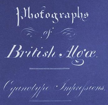
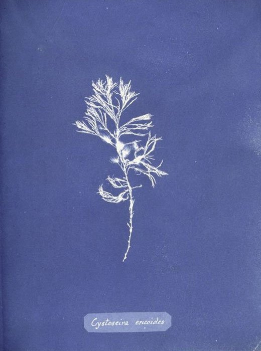
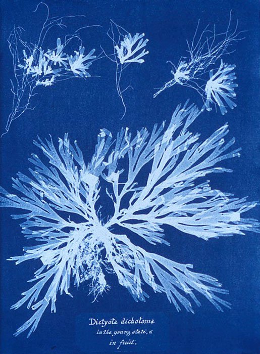
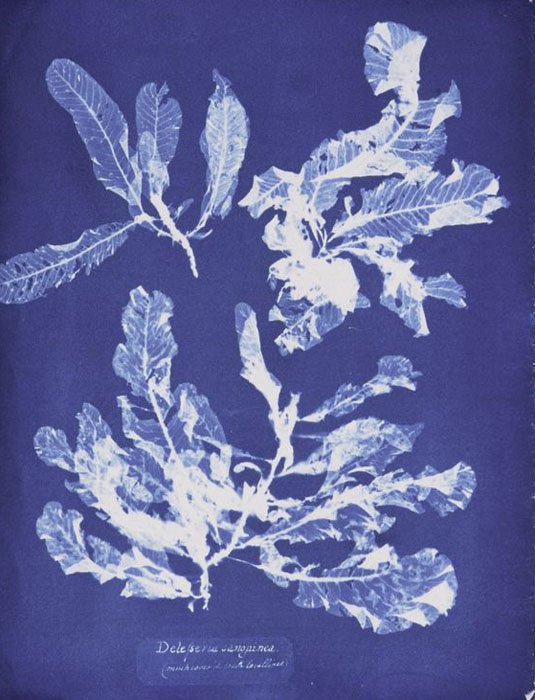
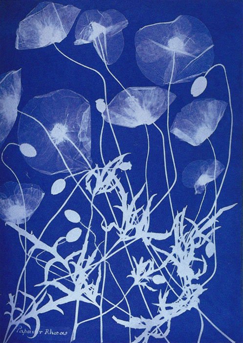
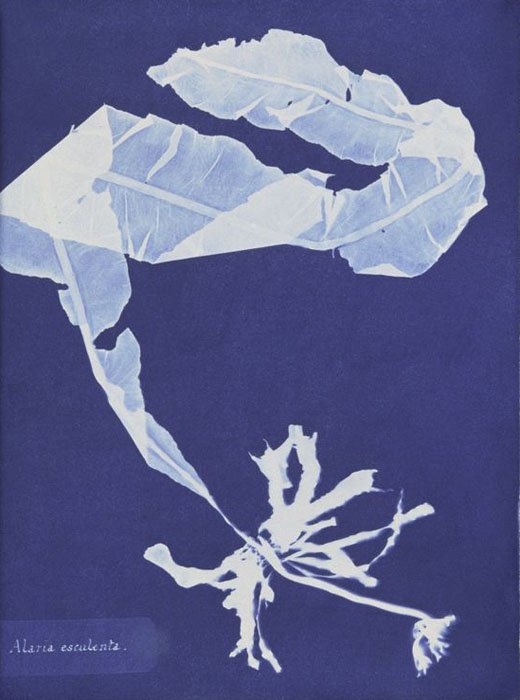
Photographs of British Algae: Cyanotype Impressions
- Anna Atkins 1843
One of the first ever photobooks was hand made and published by Anna Atkins in 1843. It contains different type of cyanotypes that she of made British algae, thinking about different page layouts and composition.
To start off my investigation I researched the first photobook, and then after looking at books, looking through each pages, then I found photobooks that focused on architecture.
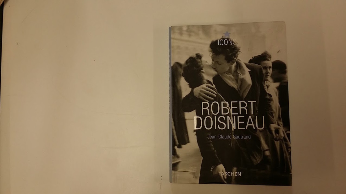
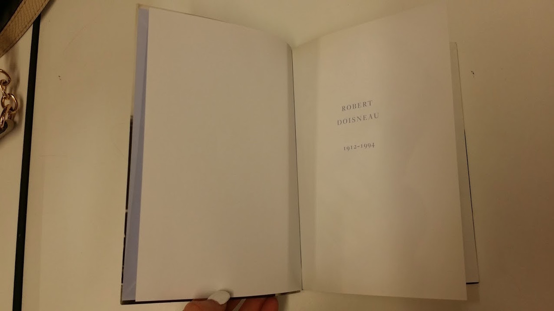
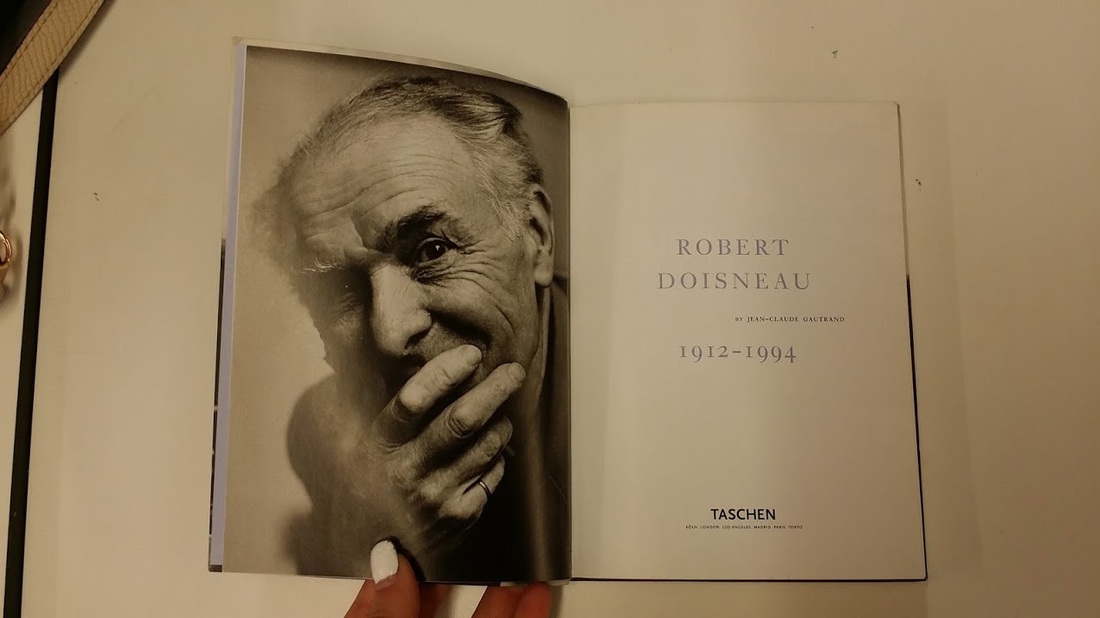
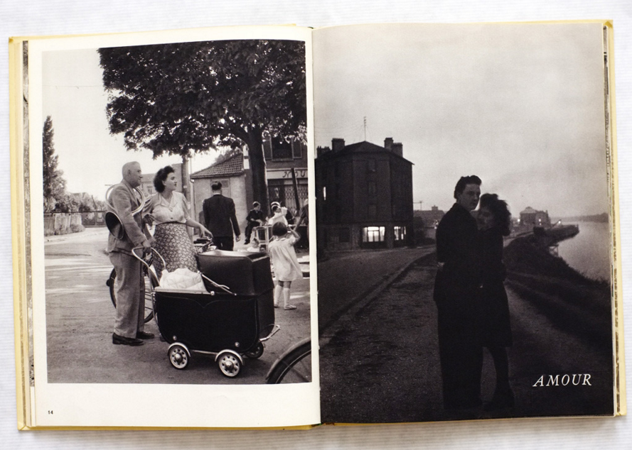
Robert Doisneau
The book is about seeing things others don't see as Doisneau says 'There are days when simply seeing feels like happiness... You feel so productive; the elation seems almost excessive, and you want to share it by capturing the ordinary gestures of ordinary people in everyday situations.' For the cover design the publisher has chosen to use a matt cover, this could be because he wanted a different type of effect so when they see or touch the book, they will feel something and try to understand why and what the book it's about. When you look at the cover of the book the photographer should give a small introduction to the book so you would have a rough idea of the book and also by putting a cover on the book the viewer would also have a feeling towards it. He has also used a full-size image for both front and back of the book, but he has used two sets of images, he has used a picture of a couple kissing in public, which could be that he sees that every day while walking along the street or that he is lonely and expressing his feelings by placing that image, and for the back of the book they have used a man which has pulled a grumpy face to the camera, he looks like he is in a bad mood or him has gave up on life, by putting a picture of someone with that facial expression it could tell us how the photographer felt while taking the pictures inside the book, he is trying to express his emotions. Both of the images they have used for the cover it is in black and white, this could be because the photographer wanted to create an effect, for example, giving it an old look to the pictures, which they might have chosen to use black and white because it could cause fewer distractions meaning that the artist might have just wanted the object to be the primary focus and the rest was just pointless. I also think that the black and white effect adds a hint of the type of composition of the image when we see a coloured image we tend to focus straight on the main thing of the picture, but with a black and white image, we think about every single bit of the picture. The placement of the title is just in the centre of the book, which they have used a clear standard typeface and has included the publisher's name.
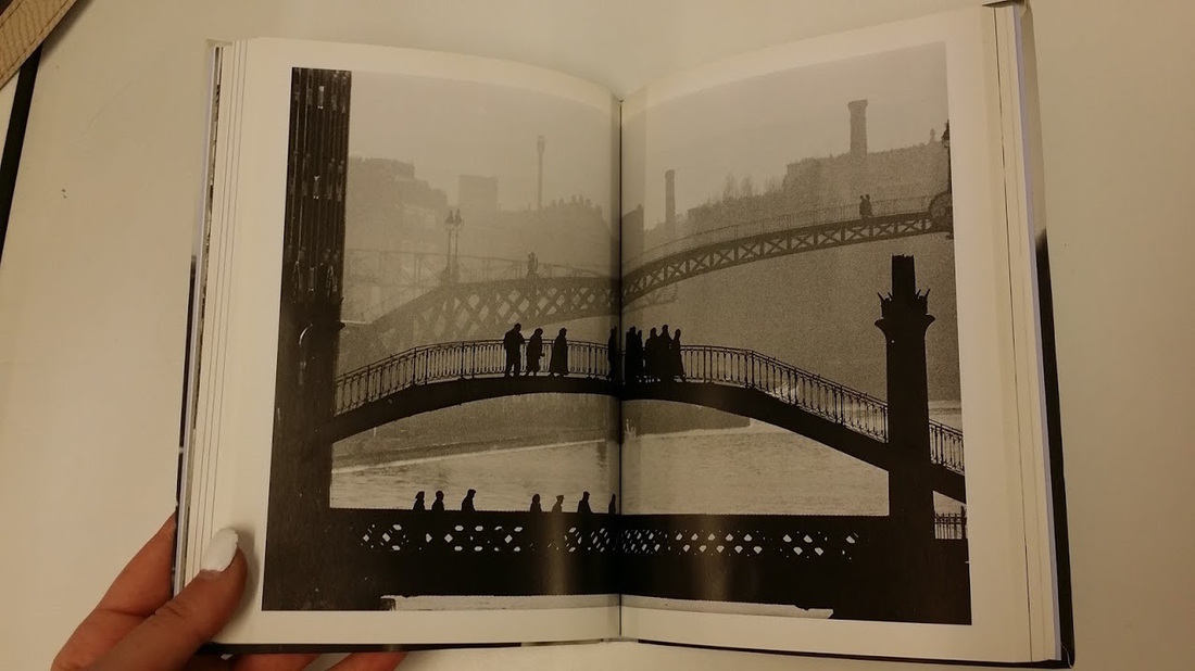
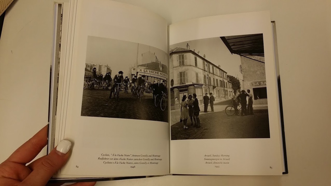
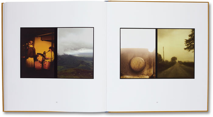
The strength of the photographs which allow it to grand out is that they all link to each other in some way. For example if I was to show one of the photographers pictures to my friend she wouldn't be able to understand what the image is about, but if I were to put another picture next to it she would then know what the images are about and then from there she will be able to guess the subject matter. With the placement of the pictures on each of the pages, they have placed two sets of images on both pages with a lot of white space around them which underneath includes text that summarises the picture that the photographer has taken. On other pages, the publisher has decided to place one single image into two pages that go through the gutter of the book. The placement of the pictures seems conscious choices; I think this because both of the images that have been placed next to each other links to each other meaning that you can see the same people on both sides of the pages. In front of the book so the first few pages of the book it says a little bit about himself and the book. Then when you move on to the other pages, he talks about his life story, which he has used a clear typeface and font for his text it isn't something curly and over the top type of font. I've been inspired by the book myself, and that's because of its subject matter just capturing regular stuff. I would love to take response images from his pictures because it links to my theme that I would like to do for my photo book.
The strength of the photographs which allow it to grand out is that they all link to each other in some way. For example if I was to show one of the photographers pictures to my friend she wouldn't be able to understand what the image is about, but if I were to put another picture next to it she would then know what the images are about and then from there she will be able to guess the subject matter. With the placement of the pictures on each of the pages, they have placed two sets of images on both pages with a lot of white space around them which underneath includes text that summarises the picture that the photographer has taken. On other pages, the publisher has decided to place one single image into two pages that go through the gutter of the book. The placement of the pictures seems conscious choices; I think this because both of the images that have been placed next to each other links to each other meaning that you can see the same people on both sides of the pages. In front of the book so the first few pages of the book it says a little bit about himself and the book. Then when you move on to the other pages, he talks about his life story, which he has used a clear typeface and font for his text it isn't something curly and over the top type of font. I've been inspired by the book myself, and that's because of its subject matter just capturing regular stuff. I would love to take response images from his pictures because it links to my theme that I would like to do for my photo book.
La BanLieue De Paris
- Robert Doisneau and Blaise Cendrars, 1949
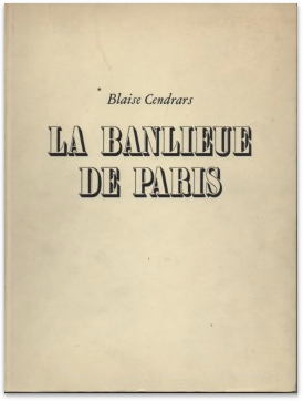
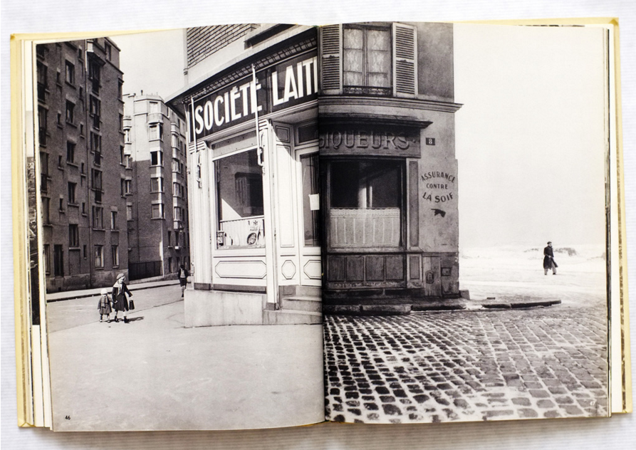
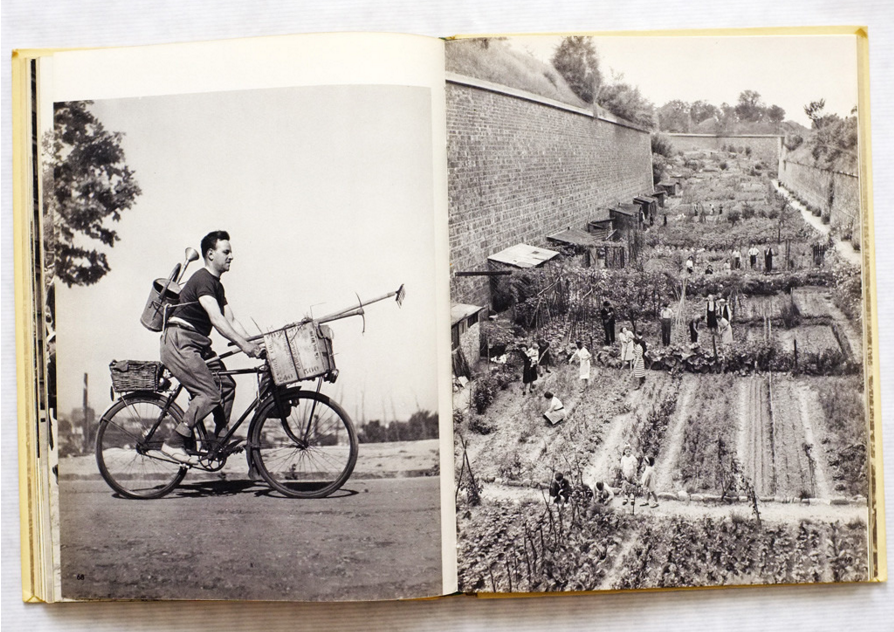
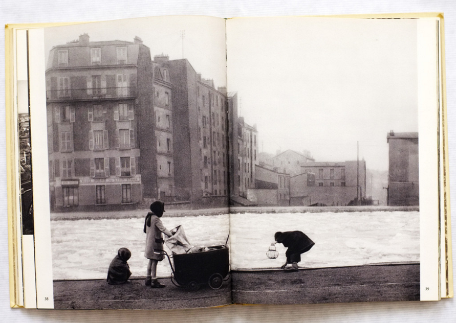
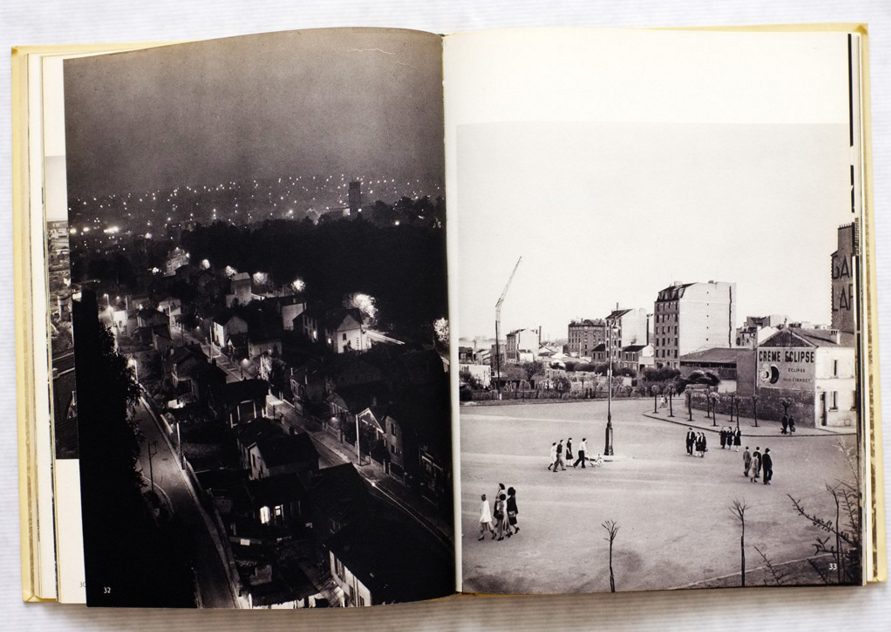
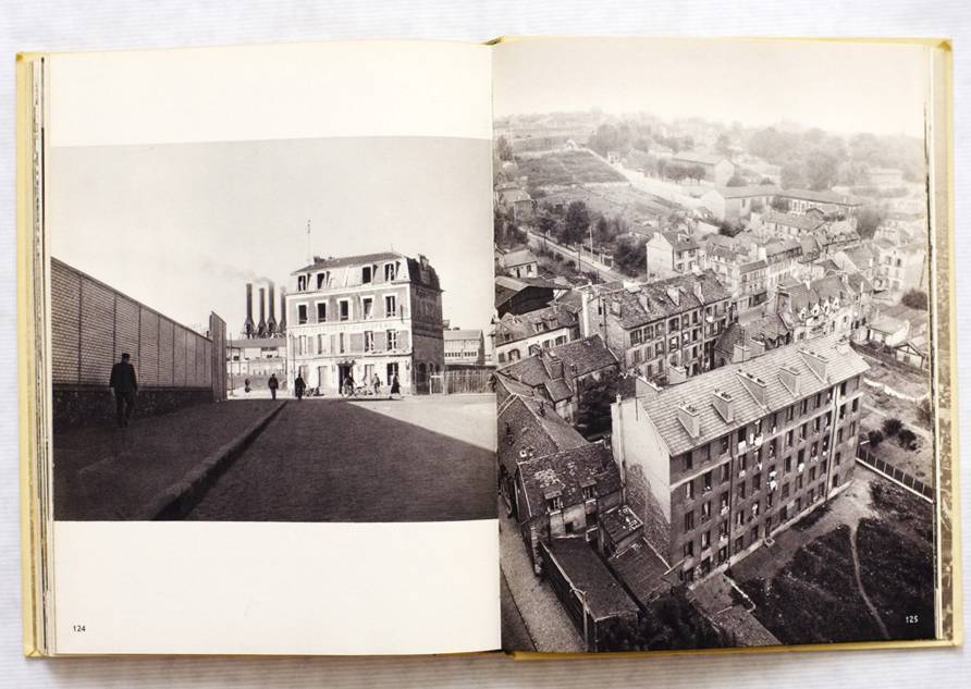
Robert Doisneau La Banlieue De Paris is one of the classics in the French tradition of the humanist documentary, which also displays all of his characteristic warmth and humanity, 'yet it is a serious work that is generally free from the cuteness and the annoyingly obvious visual jokes that can sometimes push him into the dubious category of humorous photographer, detracting from his real achievements'. This was a part of a paragraph that he has written about his book which I thought that it was really influential on how he describes and speaks about his book, he doesn't just say that I've done this and that he gave a good description. The cover design of this photo book bounded in printed yellow covered boards with photographically illustrated endpapers and dust jacket. Which is in a fine condition with a fine dust jacket that is along the spine and the edges of the book.
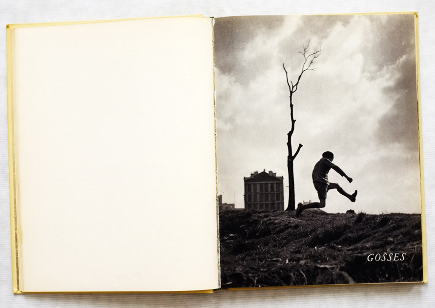
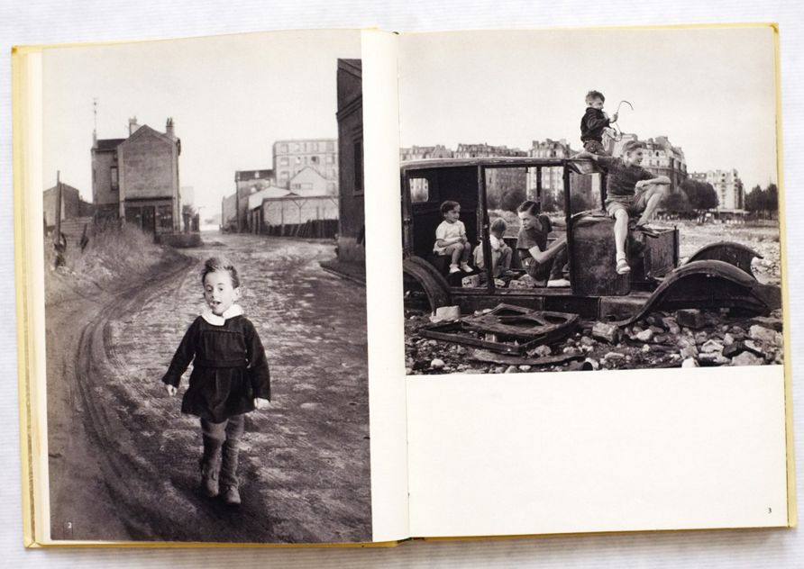
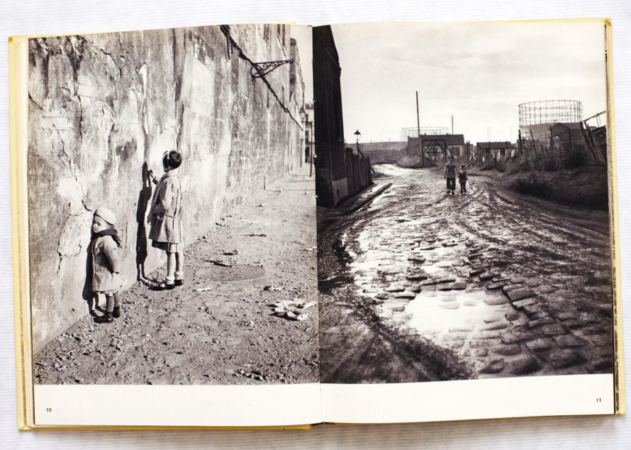
The collection of the book stands out because it could be pictures that mean something to him that links to him. But what I like about the photographs are that they are all different to each other which makes the photo book more interesting and extraordinary to the photographer. He might want us to think about what the book is about by just asking each other questions and trying to find the answer that we don't even know, but the thing that could be about it is that the answer might not always be right or wrong answers. For the layout of the photobook, it is in an old position; I might be thinking that because with myself I find placing all of the images in random orders and different sizes is a bit weird because of my OCD. But the photographer might want it to be in that way because that's how he liked it and that was the best way to describe the images. Some of the photographers that the photographer has taken are in a different way, which they are not all the same, some of the photographs have taken from various angles for example; birds eye view, straight across, and upwards. Which gives a massive effect on the image this is because by taking pictures from an angle could mean many things, might say that they wanted to crop out some things that weren't necessary to the image. Once again about the layout of the pictures are that some of the pictures cover the spine of the book meaning it goes through both sides of the pages but with some of the other images they are either smaller than the page.
The collection of the book stands out because it could be pictures that mean something to him that links to him. But what I like about the photographs are that they are all different to each other which makes the photo book more interesting and extraordinary to the photographer. He might want us to think about what the book is about by just asking each other questions and trying to find the answer that we don't even know, but the thing that could be about it is that the answer might not always be right or wrong answers. For the layout of the photobook, it is in an old position; I might be thinking that because with myself I find placing all of the images in random orders and different sizes is a bit weird because of my OCD. But the photographer might want it to be in that way because that's how he liked it and that was the best way to describe the images. Some of the photographers that the photographer has taken are in a different way, which they are not all the same, some of the photographs have taken from various angles for example; birds eye view, straight across, and upwards. Which gives a massive effect on the image this is because by taking pictures from an angle could mean many things, might say that they wanted to crop out some things that weren't necessary to the image. Once again about the layout of the pictures are that some of the pictures cover the spine of the book meaning it goes through both sides of the pages but with some of the other images they are either smaller than the page.
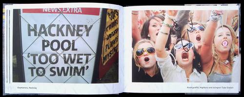
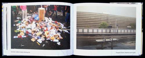
Shit London - Snapshots Of A City On The Edge
- PATRICK DALTON
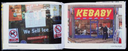
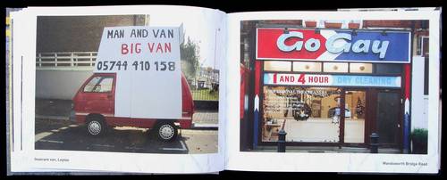
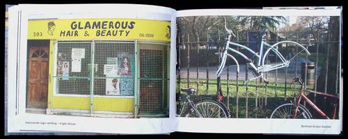
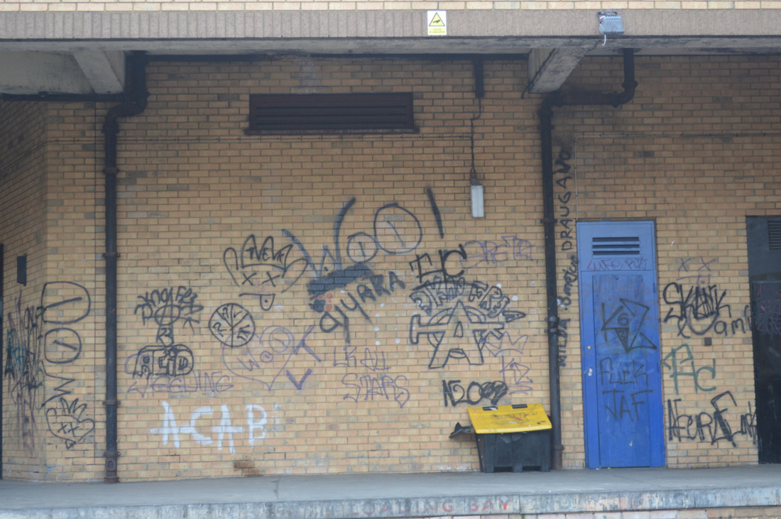
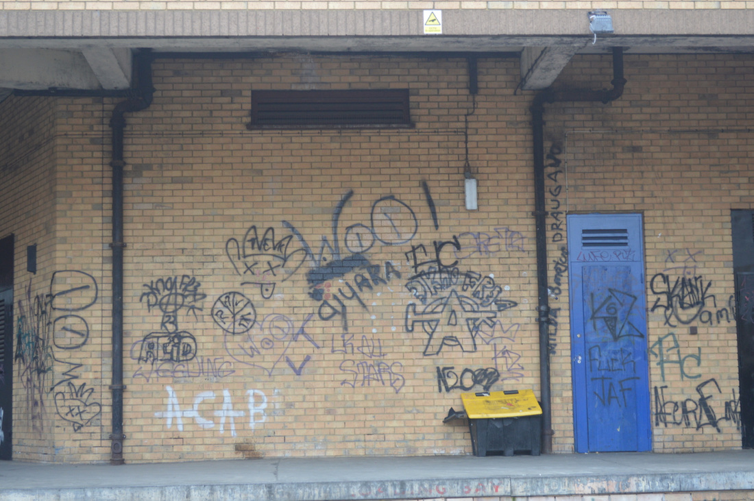
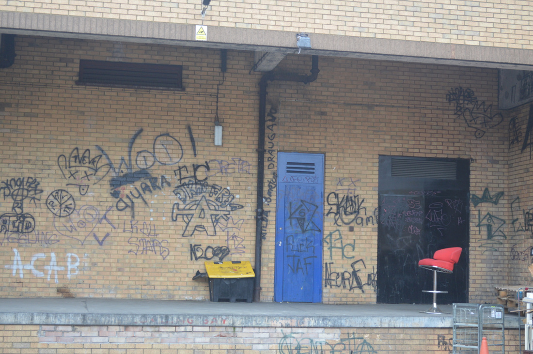
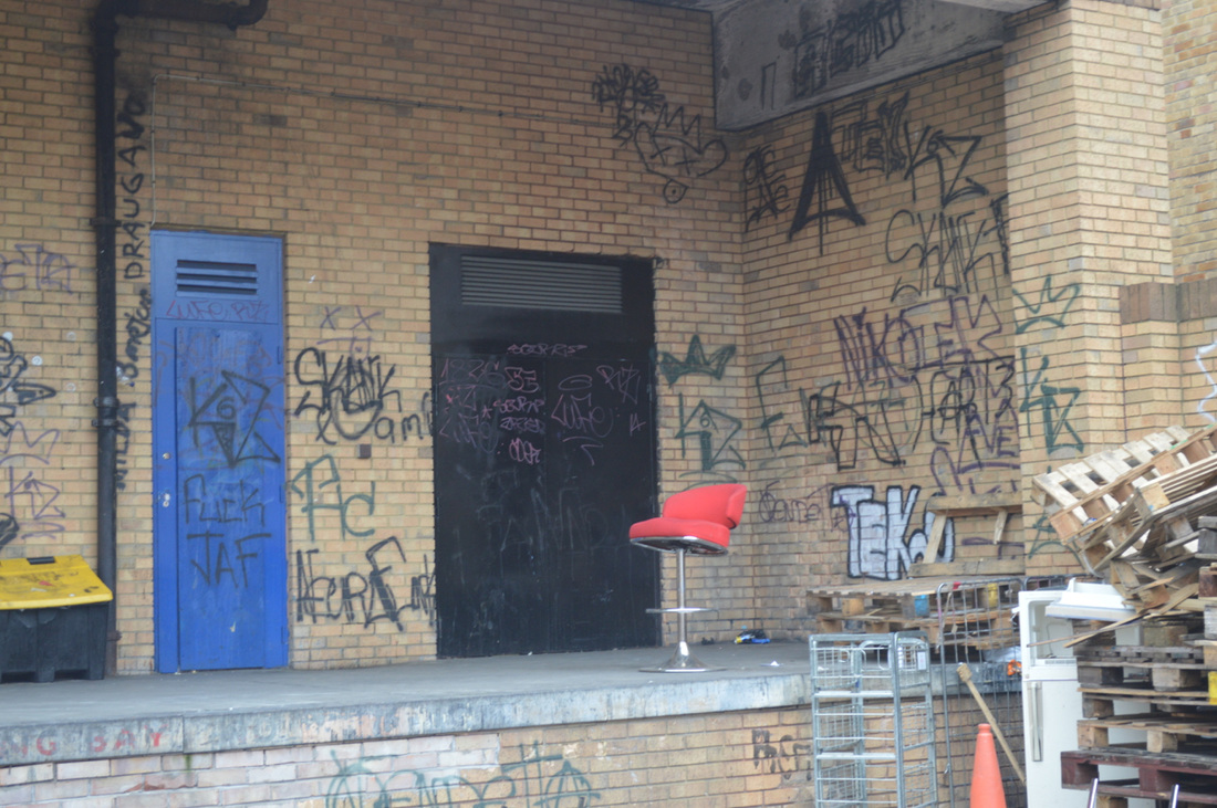
The book has many different types of images that are all different to each other, which is a really mild book with funny photos of the city London. But most of the images that has been taken shows the predictable deface of posters and signs with hand-lettered ones. Which for the other shots that he has taken are the falling parts of the environment, cars which are full of unnecessary stuff, bikes which has been padlocked or has been broken down.
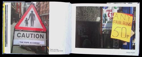
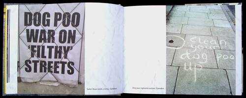
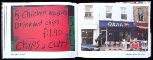
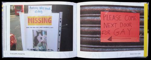
Well, the book is about the whole of London, the photographer has tried to capture different types of things within various parts of London, from South to East to West and North. For the cover design, he has just used one simple picture that he has taken with the other images that are in the book which relates to them as well. It is a picture of a bike laying on a post which has been padlocked. But the weird thing about the image is that the bike hasn't got any wheels, so either the photographer or someone within the community has decided to draw out the wheels on the pavement, and the photographer has taken a picture of it. But he hasn't just taken the picture he has looked at the object in front of him apparently and while taking the picture he has thought about the angle of the image and the 4 corners, because I think that there the two things you would have to focus on while taking a picture unless it's a stress photography where you would take the picture from what you see. So what the photographer has done is lined the drawing of the wheels which the bike and he have taken a bit of the pavement and just the corner of the gutter.
The collection of the photographs grand out is that they are all different to each other which it doesn't have a subject matter expect from the fact that he takes images of the things within London. But the images are either of a broken bit of the wall, old shops that have been there for years, signs that don't make sense, pictures that have been drawn on and that hasn't been treated nicely. The photographer's intention was to take a picture that would be eye-catching as he says, "Whenever I saw something that caught my eye I would snap it, and being somewhat of a hoarder; I soon assumed quite a collection of hilarious/disturbing photos". Meaning that whatever he finds interesting he would stop and take a picture of it, which after doing all of this and making it look like a collection he came up with the idea of Shit London. Which now he seeks out about around London taking strange nature pictures, while crossing the street within the city and looking around for oddities, curiosities and weirdness which we could also include an urban safari. Just by taking a picture of these types of things he was able to see the world from a different perspective or should we say a new light. He had used a digital camera to take these images because he had started making these types of images when he first bought his digital camera. Each of the pages has different images on each; they don't overlap or have a double page spread.
The placement of the pictures seems like it's a haphazard, but it could also be a conscious choice. I think it is a haphazard because when you take pictures, it would be in order in your gallery which in the book it says where the image has been taken which the photographer has said; Hackney, Camden, Islington, Crystal Palace, etc. So if they were in order, the pictures on each page would have different pictures but the same address beside them which in the book it isn't like that, each page has images from various parts of London. The book was good looking at but it wouldn't be something that I would focus on this is because it doesn't interest be like the first time I see it. When I first saw the book, I wanted to view the pages and see what was in there because I could see things that I didn't see before. But now because I have seen it a couple of times, and I know what's in it then I lose interest.
The House I Once Called Home
- Duane Michals
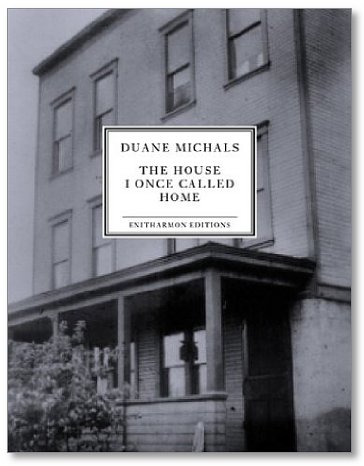
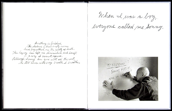
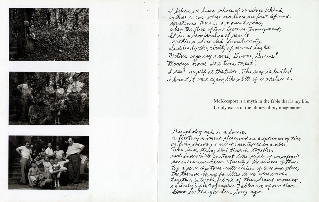
This book is about the photographer himself, telling us about his life and what he is and where he comes from. He had created this book when he was age 70 and that when his mother has died, he went to visit the place he once called home and where he was born and where he grew throughout his childhood. The book provides words and images of his sensitivity and moving account of the one man's journey. Within the book, he creates a high effect on his emotions and his time there which he had taken new photographs then he would compare it with the old images that he had taken years ago which were taken at the same location and the same place within the house. The cover design of the book is made out of a hard cardboard which they have mounted the picture onto it instead of creating a flip on the book cover.
The cover feels like a matt type of material which they have put a sticker on the centre of the book with the photographer's full name and the title of a book and the publisher's name. Which they have added a border around the inside bit of the sticker, and for the back of the book, they have placed a middle sized image in the centre of the book with a few short sentences underneath it. The image that they have used for the front cover looks like they have cropped the image of just the home and enlarged it to a full-size book cover, which is really effective because you can see everything really clearly and you would know what the thing really is then just a small piece of picture with a lot of blank space. But also the picture is in black and white which could mean many different things, but in a negative way which could be, he had appalling memories there making it show how much he hates the place, there wasn't any good positive emotion throughout his childhood in that location.
The collection of the photographs grand out is that they all link together and how does that work is that he took pictures that all related to him and his house that he once called home. He tried to recapture the same picture they have taken a few years back trying to do a flashback to the past. When he took the picture he wrote beside is saying 'this picture is a fossil' which could mean that he loved that time of moment he would love to go back in time and replay that whole scene once again, which it could also be saying that the meaning of a fossil is that a fossil never dies out it will always stay the way it was 200 years later so he could be saying whatever happens that fossil meaning the picture or memories will never die out it will never be forgotten. For the layout of the pages he has used a weird design, and when I mean, weird is that there isn't a theme for his pages. With his pages, he starts it off with some sentences of his life in the centre of the page and on the opposite page he has displayed a full-size image in black and white, which it could be a picture of him facing the city from his window. But when we move on to the next page he has left one of the pages in grey, so what could that mean, what is he trying to tell us, what's his intention for that blank page? There could be millions of questions to ask just about that blank page. Well for the page next to it he has used a mixture of words and a picture. But the words and sentences he has used for this page look like it has been handwritten, but not all of the sentences are in the same font he has used three different typefaces. With an overall opinion about this book is that I love this book has so much power to it, which makes me love it even more, he tells us about his whole life but in ambiguous phrases which you have to understand what his saying just by reading a few words. Even the fact that he over layered two images together of the before and after pictures, they are powerful, you can see an enormous change between them.
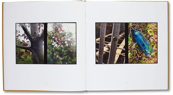
After looking at several photobooks and seeing the different layouts, they use different type of techniques and the one I liked the most was the two frame films and this is because it gave a different look to the book.
Two-Frame Films
A two-frame film is where they put two images together, it could be that they are totally different to each other or something that would relate to each other. You would have to think carefully about what two images you chose but you could also do the opposite where you don't have to worry about the order of them and how to display them, you could just leave everything to chance and see how it would turn out. The focus with two-frame films are to see what others cannot see and how it would effect the image in another way. A two-frame film and a photobook link together is by the way they are both set up for example when your making a photobook you have to think about the order and how you want to lay them out on the page, this is where the two-frame films come in handy, you would have to think about how you want to display them in your book. For example, my book is about "architecture", I would either chose it to display them in a type of order but I might also not chose to do that and leave them how they are because they are all buildings that look different to each other.
Luke Fowler
Luke Fowler is mostly known for his video work with the two-frame films, he explores the differences and similarities between the artist and a lens. He began his research in Bamburg, the fact that it was 2 images next to each other or for the appearance but by the element of he chance that as involved when producing the images.
First Set Of Images
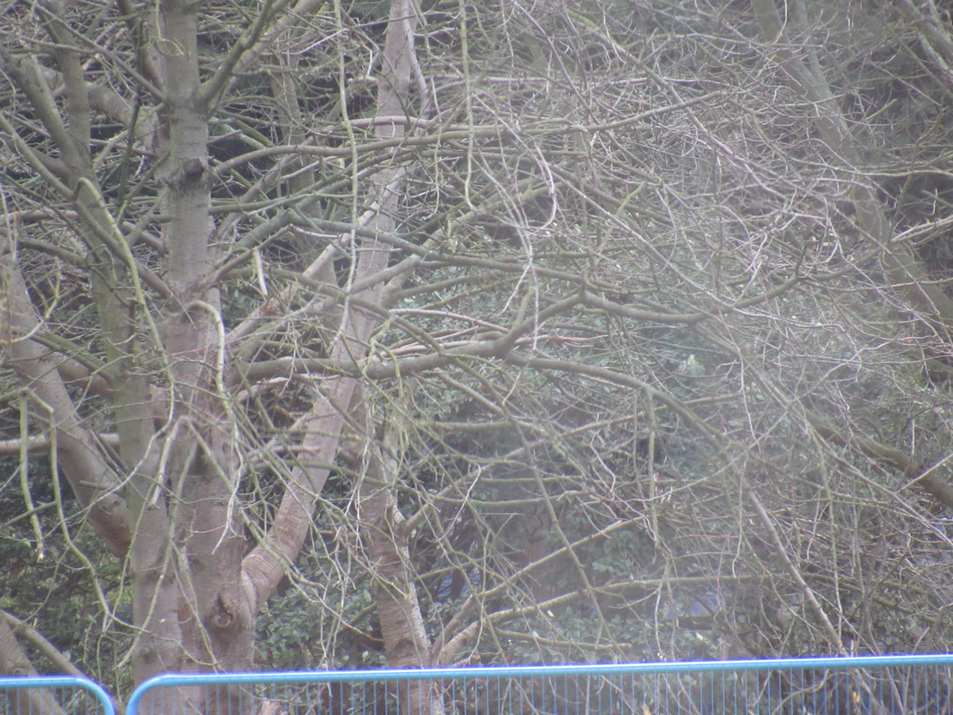
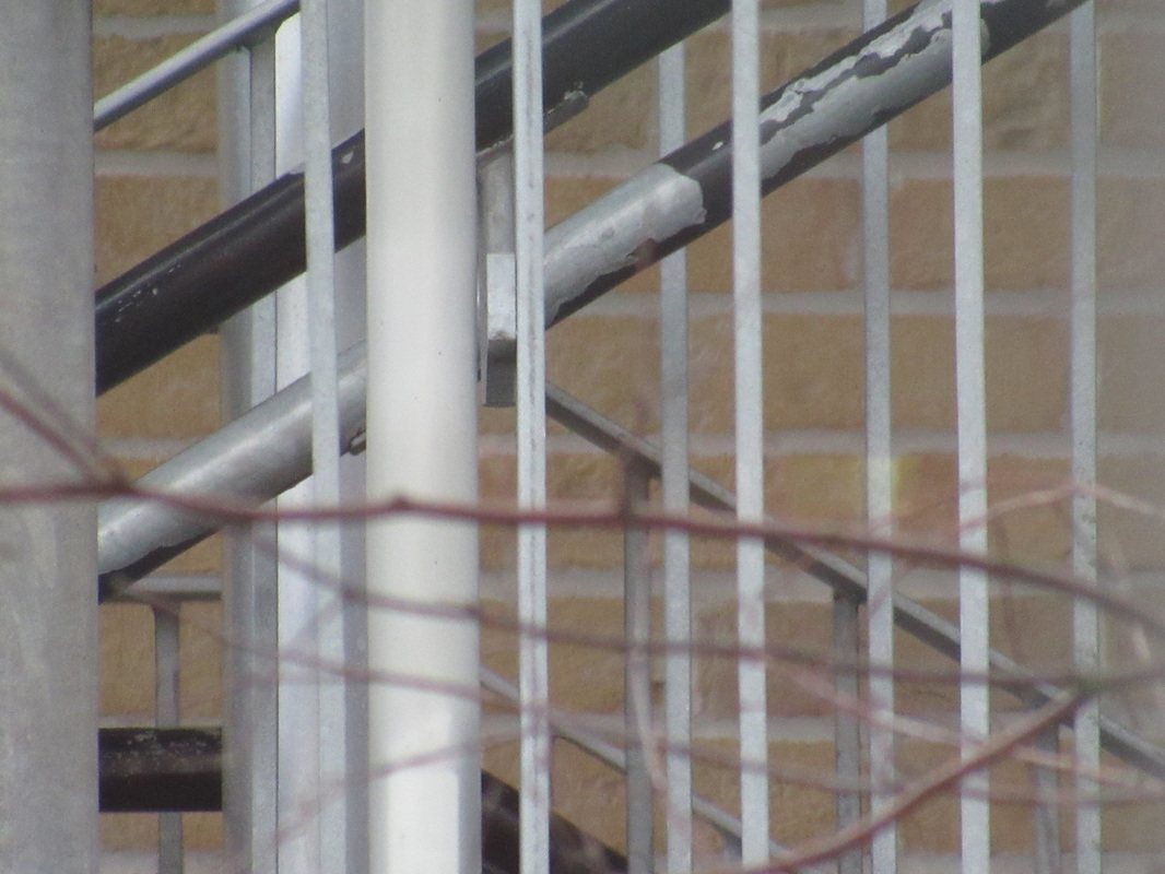
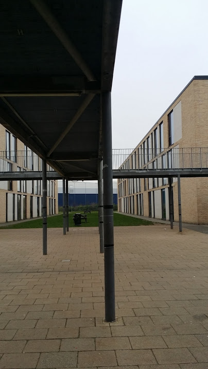
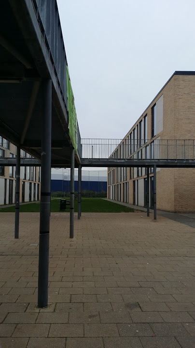
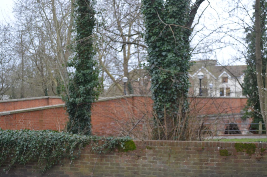
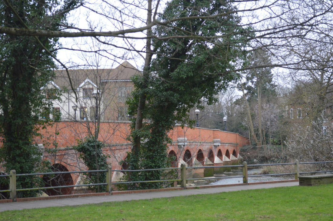
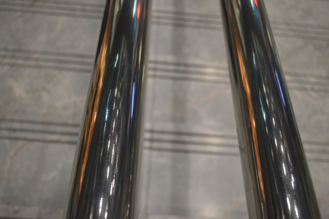
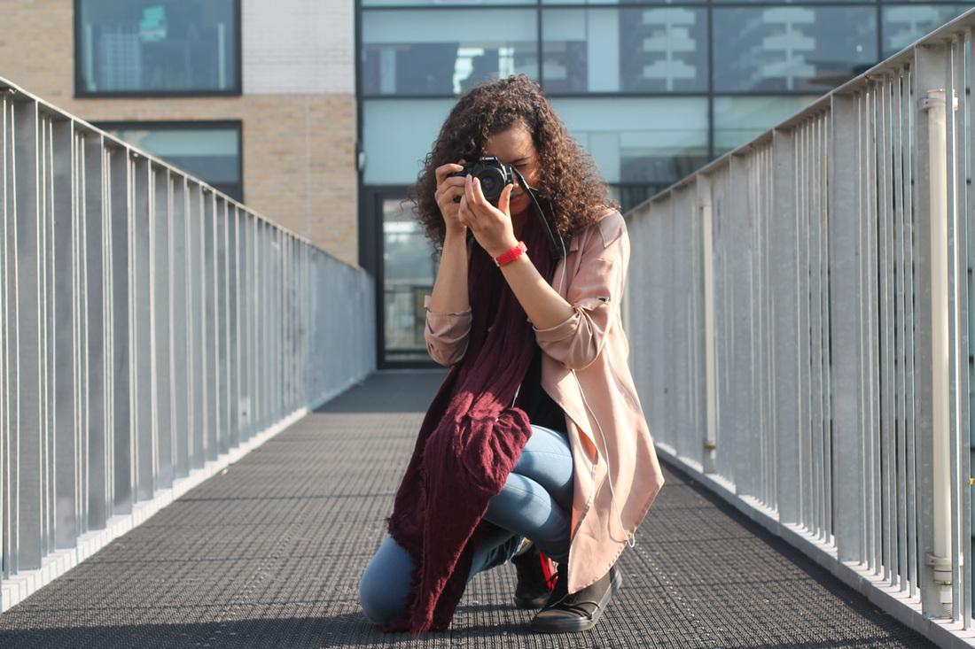
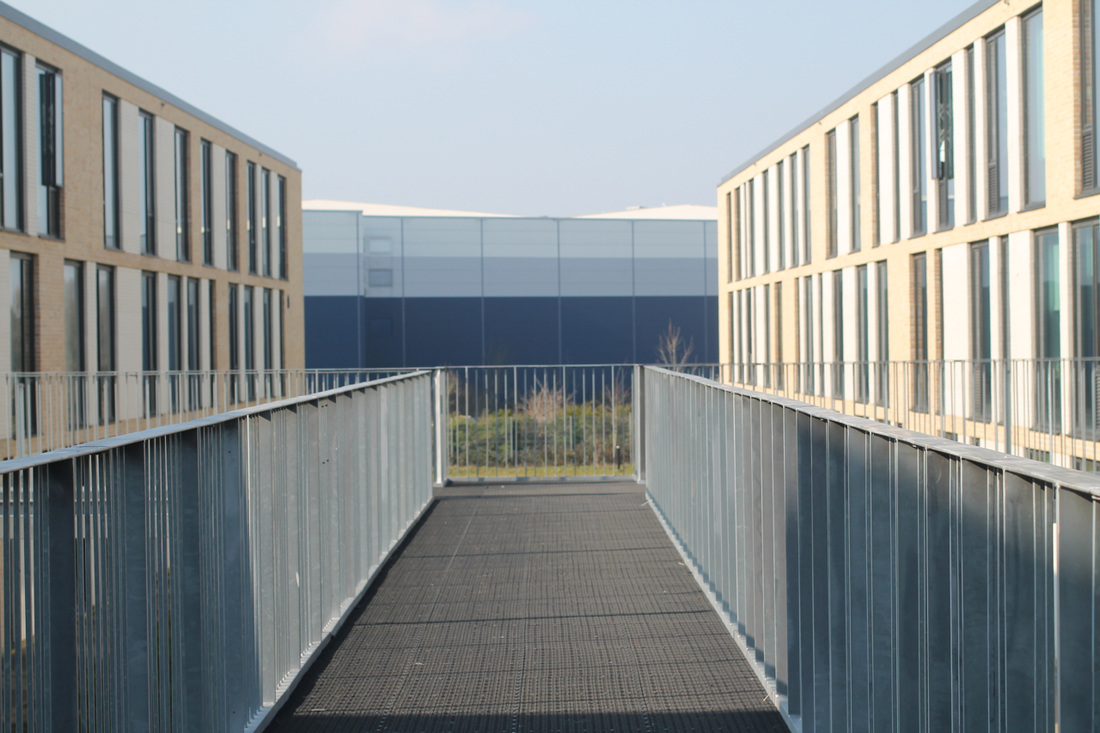
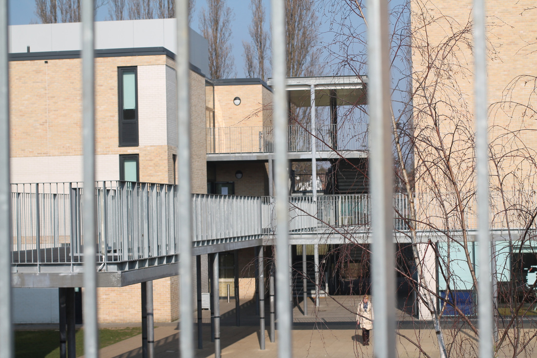
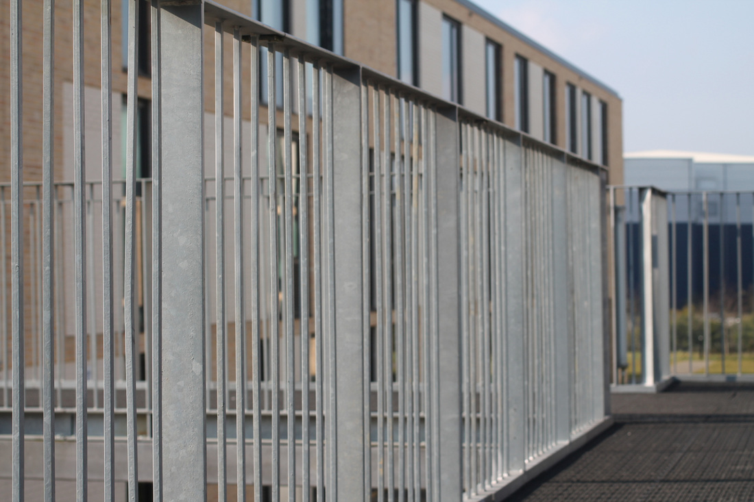
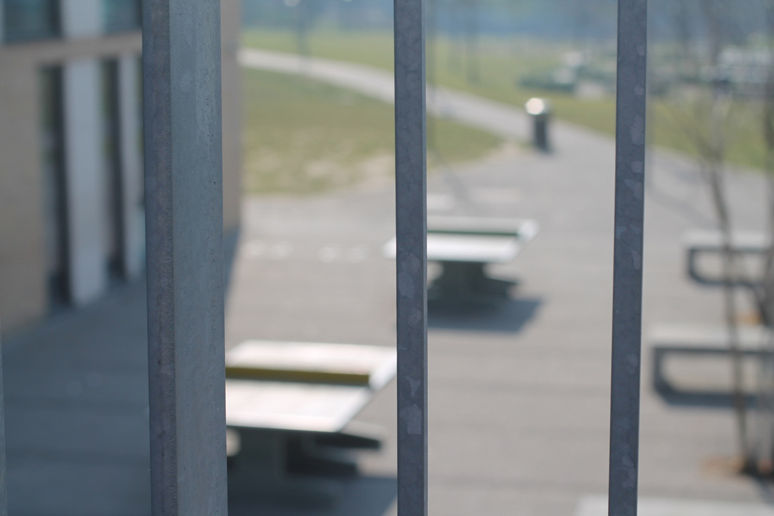
I decided to experiment with images for diptychs so experimented by taking images around the school. I used a bridge camera which allowed me to zoom into object from far distances.


Response #1
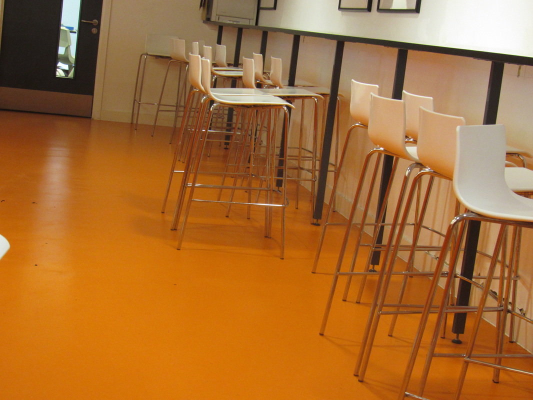
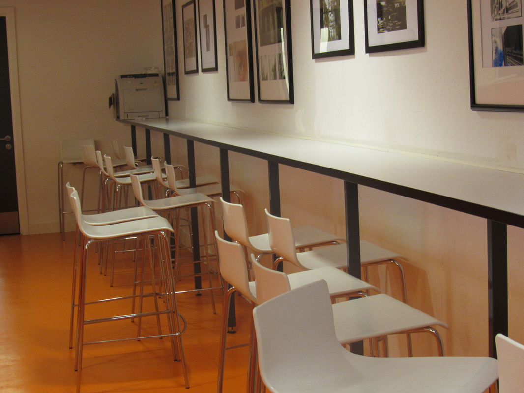
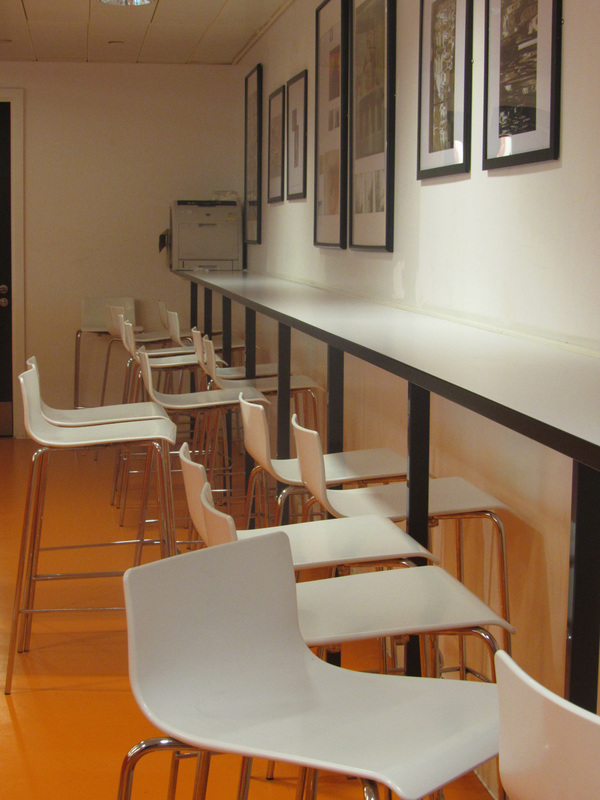
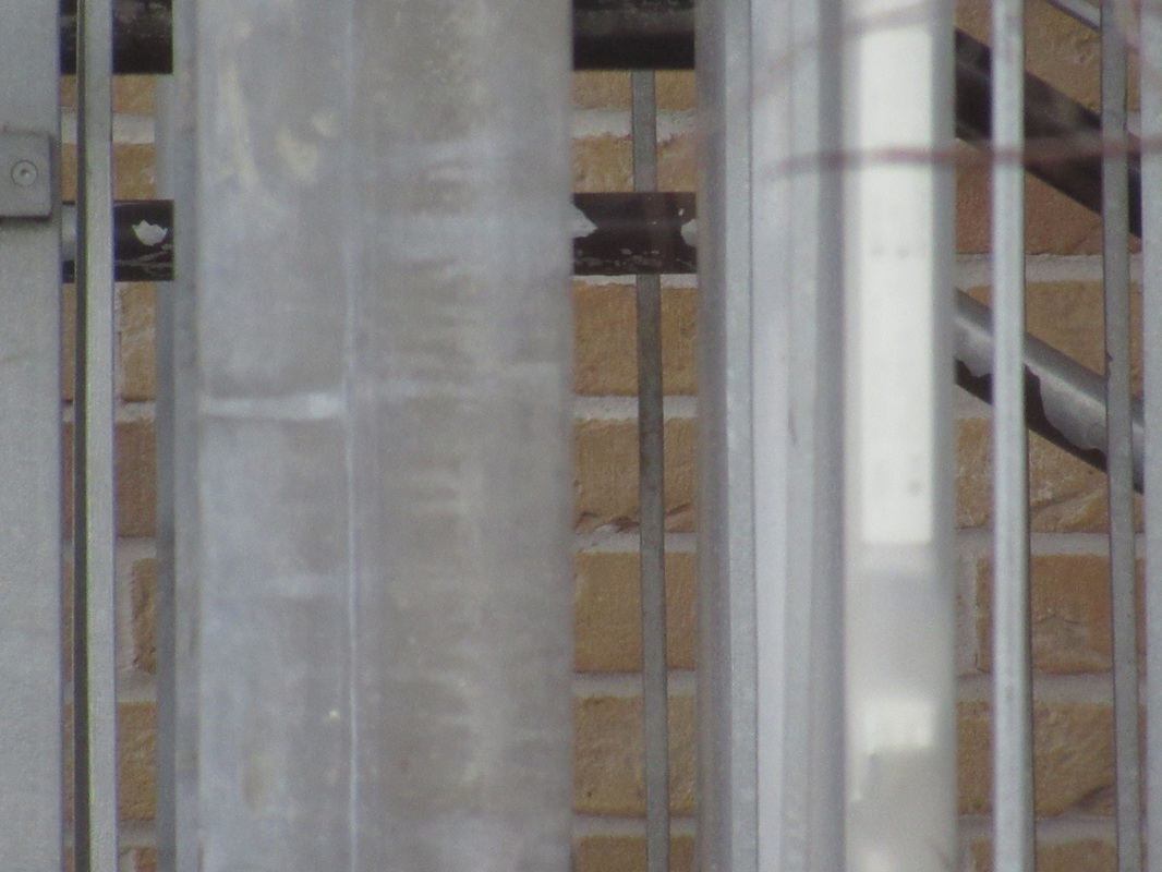
I have chosen these two images because you can see the two images which they both compare and link to each other, and thats because of the lines creating from the chairs in the cafeteria and the lines that were from the stair case on the school ground. There is a lot of rectangle in book images which allows the images to match to each other.

|
|
Response #2
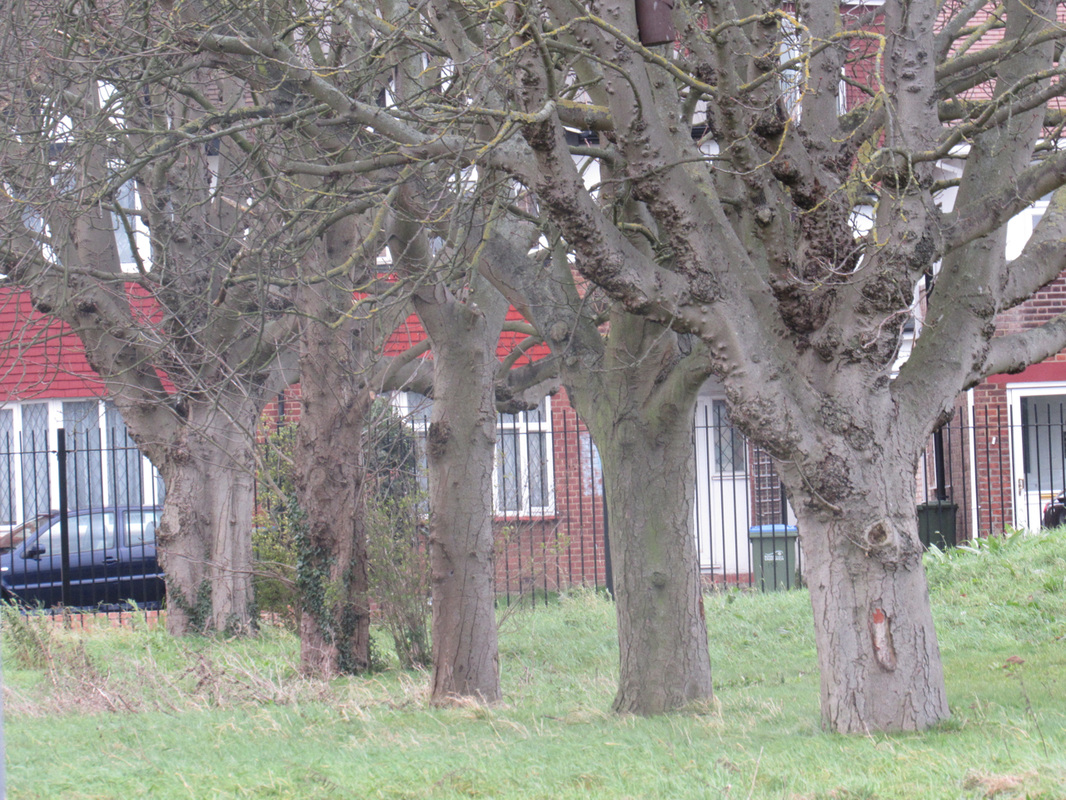
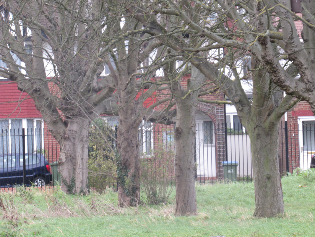
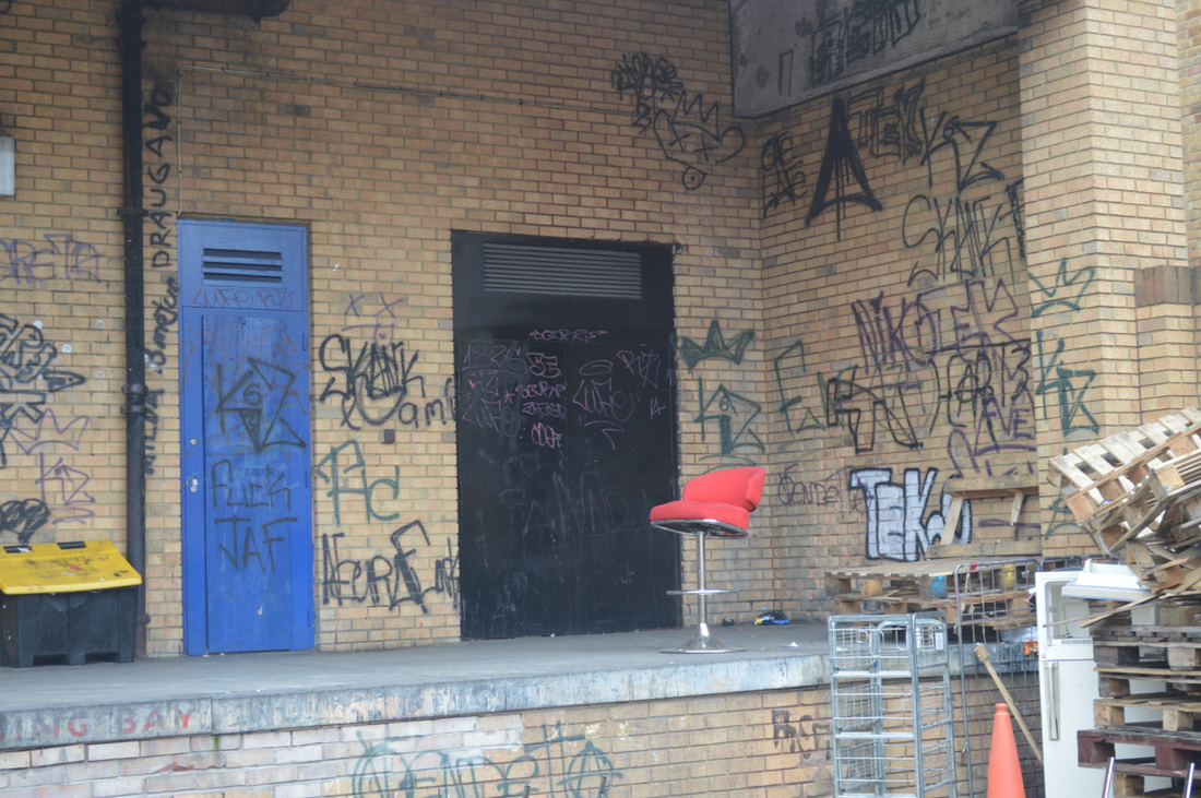
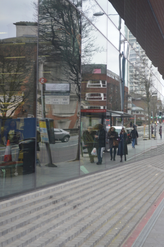
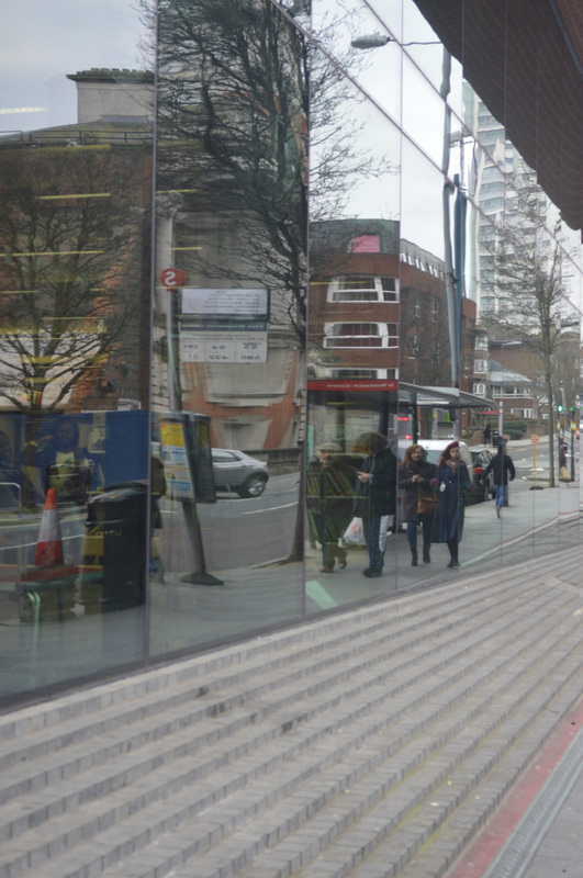
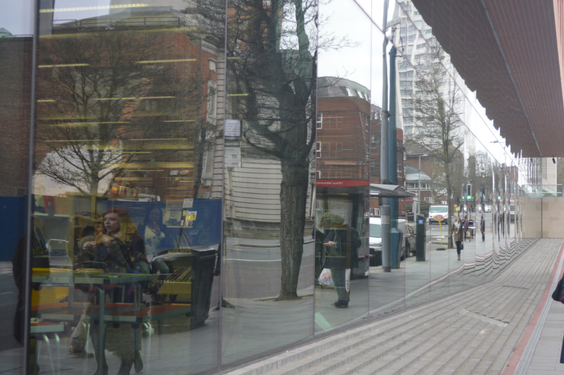
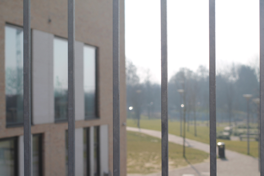
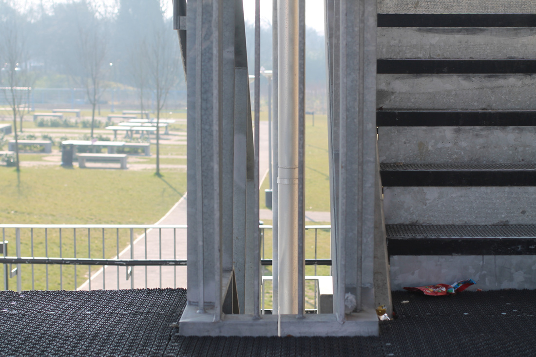
I have chosen these two images because I thought there was a great contrast between the urban landscape which I found near the school, this image had a lot of negative space. I matched this with an image from the city In Canary wharf with completely fills the frame with buildings, they inspired me a lot. This small photoshoot has made me look at architecture more closely. There were many images that both complete and contrast each other.
|
|
Response #1
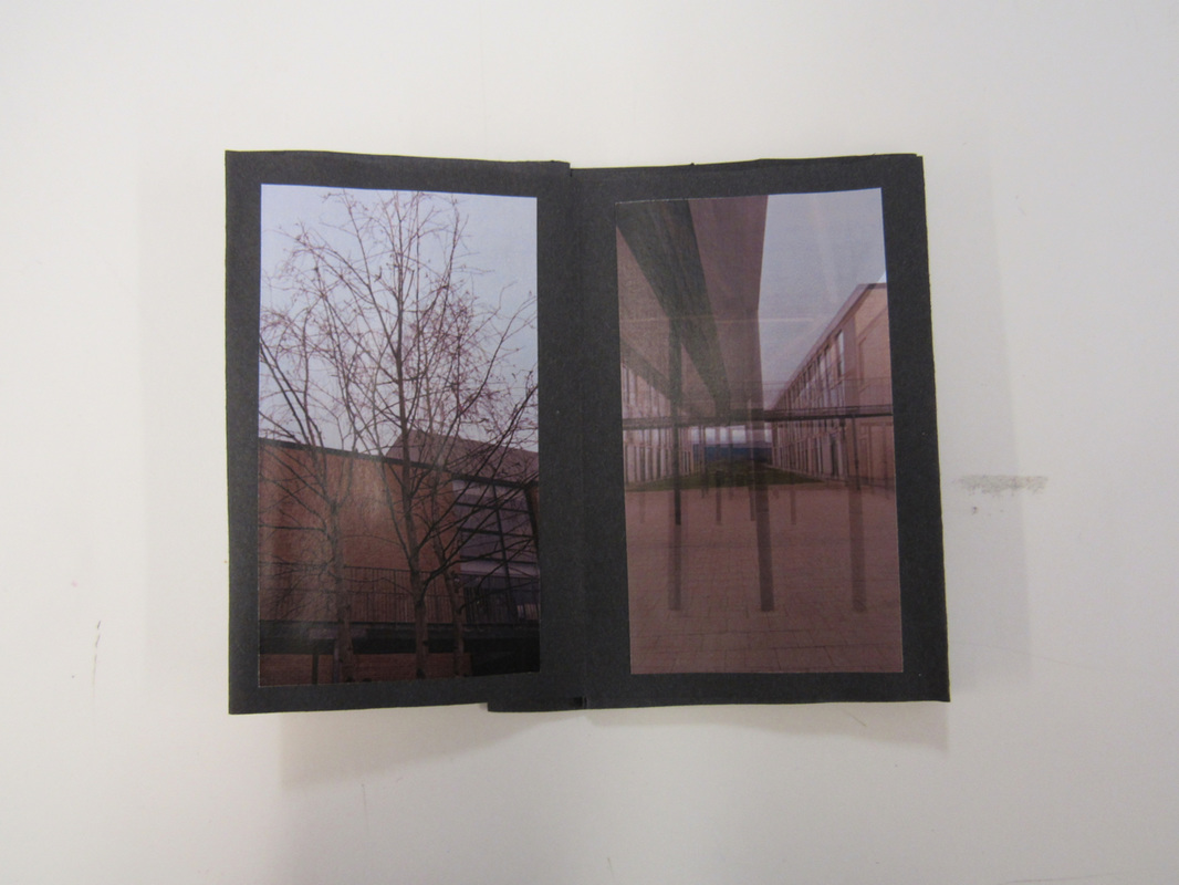
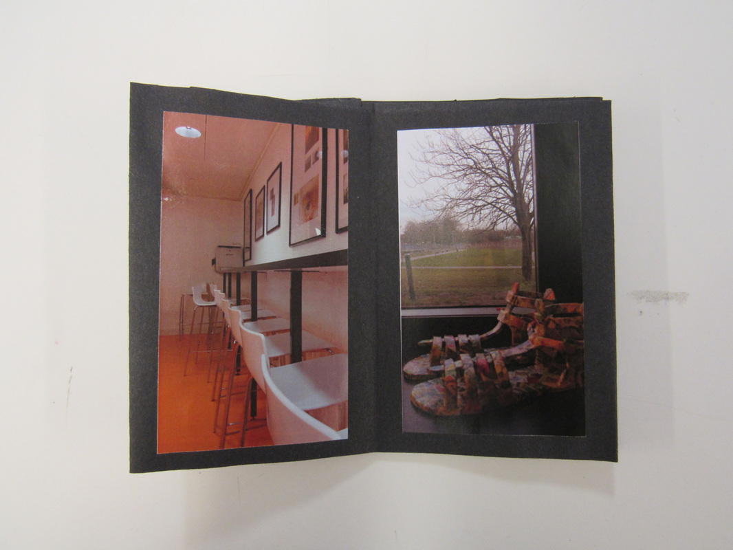
I took photographs that I might consider to use in my photobook. They are located at Tallis, where I wanted to experiment on taking pictures in different angles and compositions, by doing this I would be able to find the theme for my photobook. The photographs below weren't really effective because they were just quick experimentations. My task was to create a small photobook after taking a set of images, to test out the proportions and layout of each page. What could have worked out better with these pictures were that if they were in black and white, covering up some of the picture, making it less obvious.
The pictures that I have taken I created a photobook, the book was successful and worked well because I tried out diptychs, which helped me think about what other picture could I have placed there and what could it be. When choosing the diptychs you think about what would go together, which picture works best together. With my photobook, I placed all my pictures onto the table and just placing the pictures next to each. When looking at the photobook when it's completed I liked the pictures that I have taken they didn't work alone but it has a different look when it's next to another picture.
Response #2
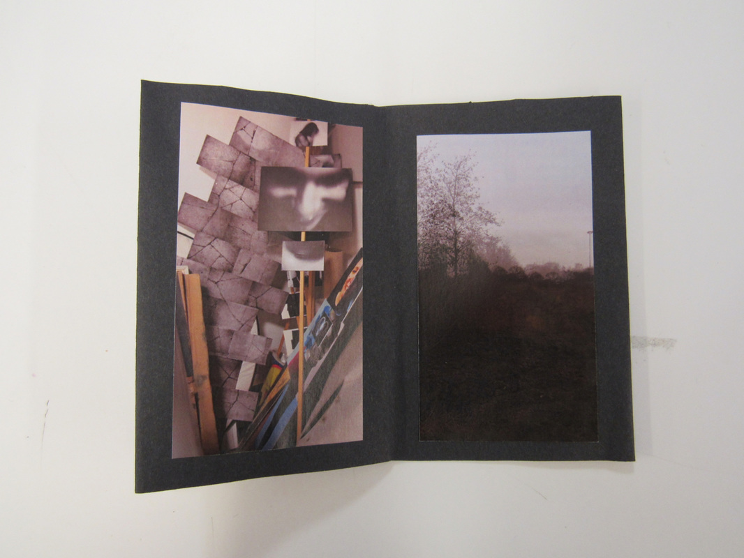
A day out in Central London was interesting because I realised whilst walking I thought that the architecture was very similar. Until I turned a corner and saw a building that had a totally different design to the others. I found this really fascinating because all of the building in central London looked similar for the one in the corner whats the difference? What type of effect does it give? What is the meaning to it? While taking these images I thought about these questions but couldn't find a conclusion to why they have done this.
Response #3
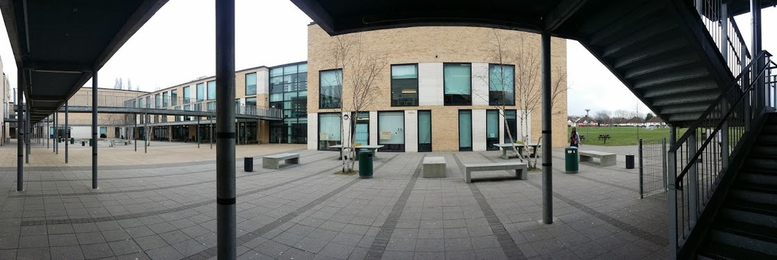
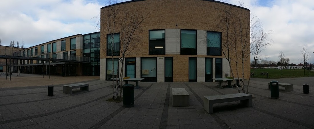
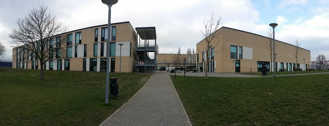
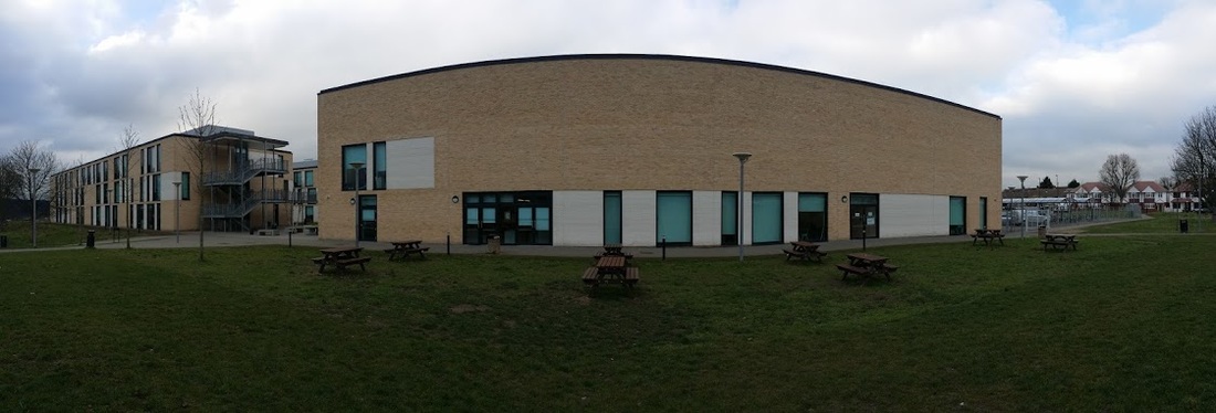
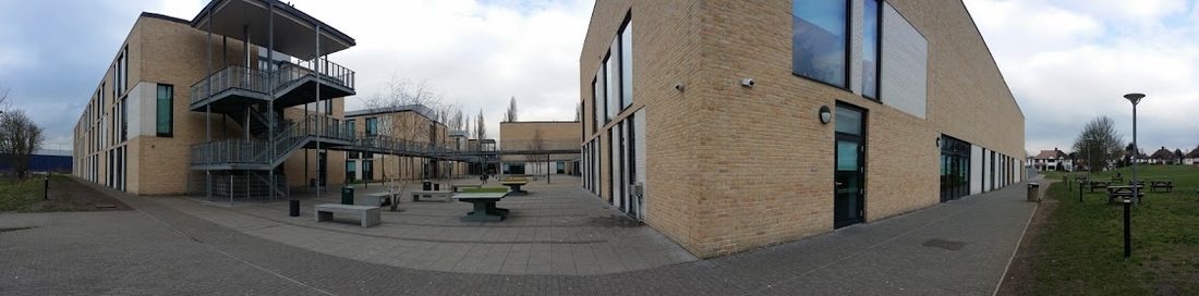
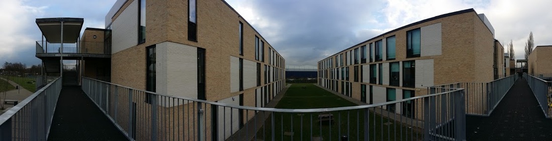
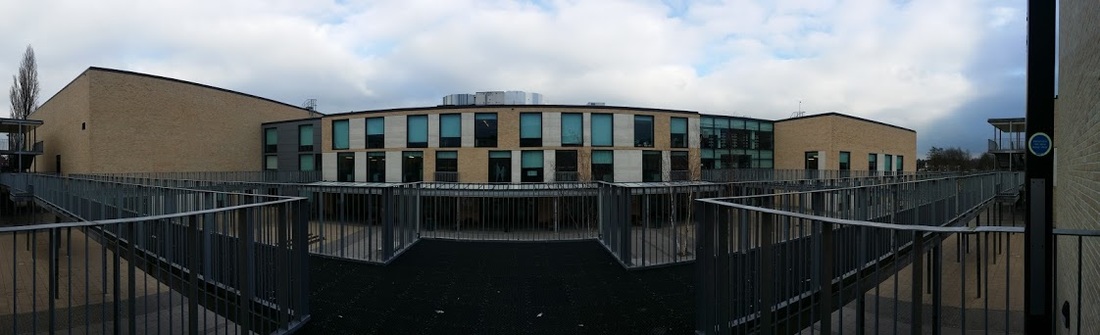
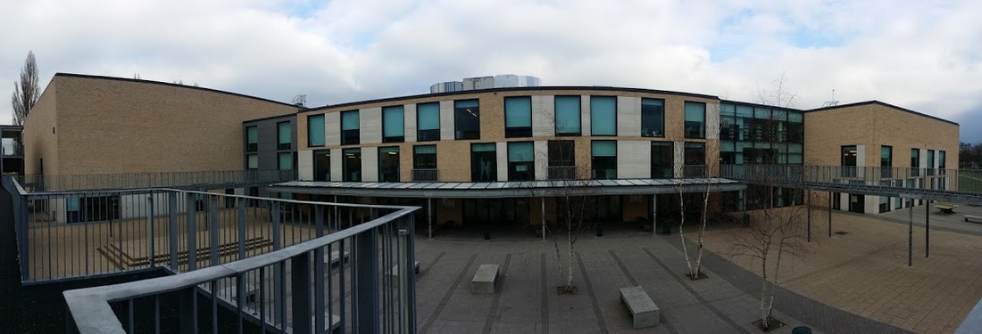
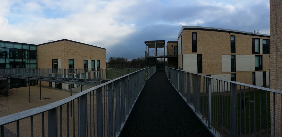
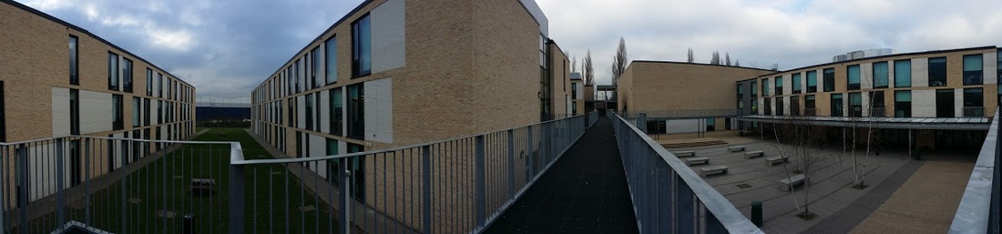
The next technique that I tried out was Panorama. My experimentation started in Tallis, I think it has worked out effectively because the building has a different look and identity when its in this type of style. Knowing how the building looks like and seeing it in a different way, you start to look at the building in a different way. Overall I liked the outcome of the images, I wasn't expected it too look like this, I started thinking about how would a building look like it we tried it out by taking the picture vertically.
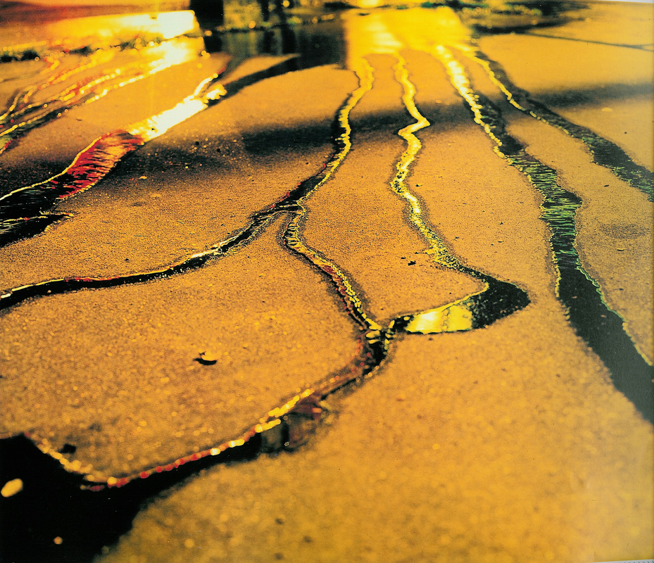
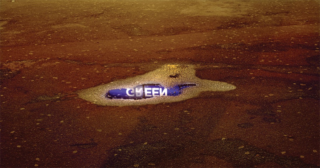
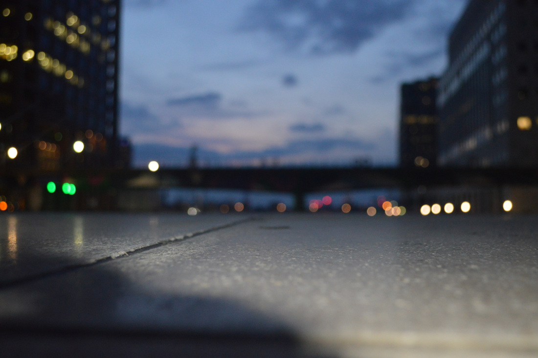
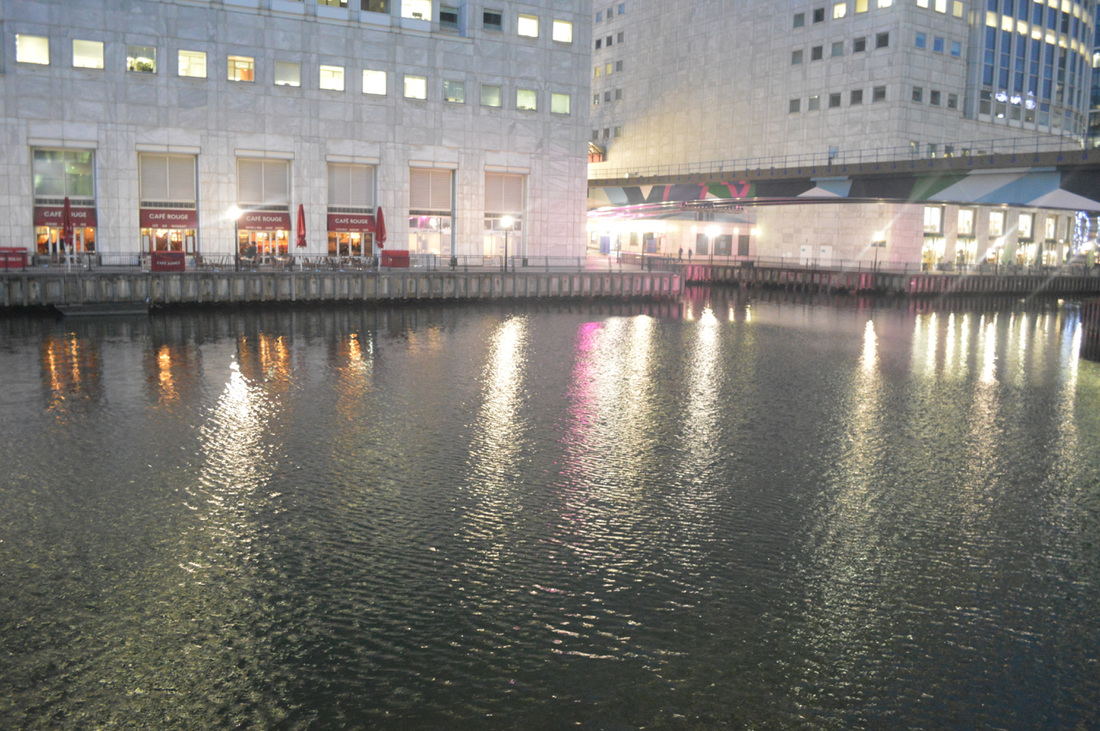
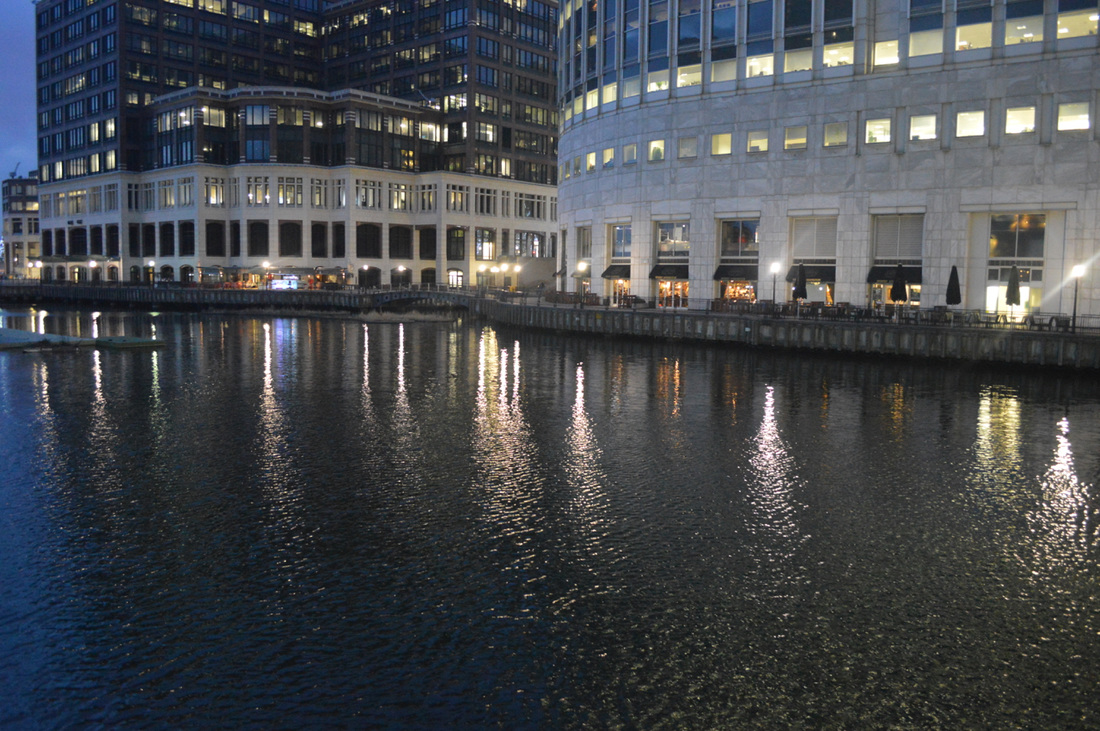
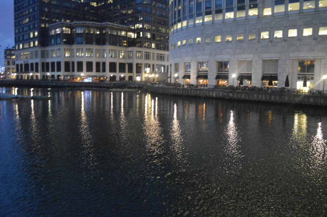
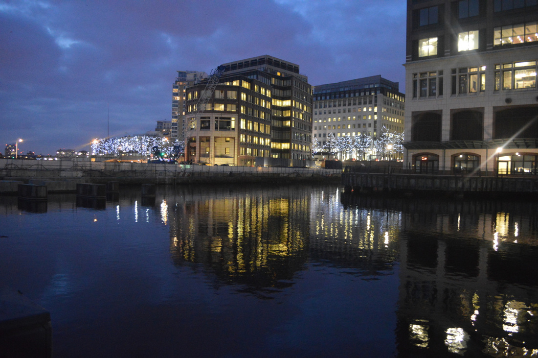
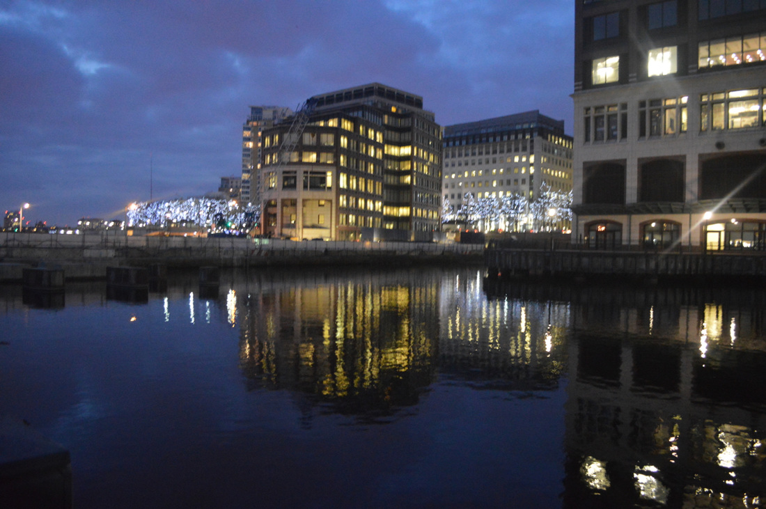
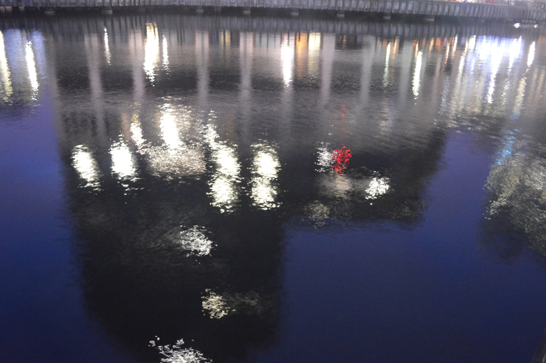
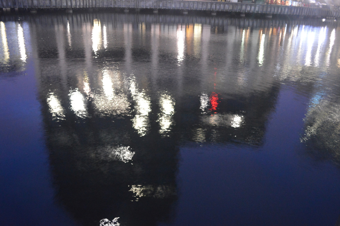
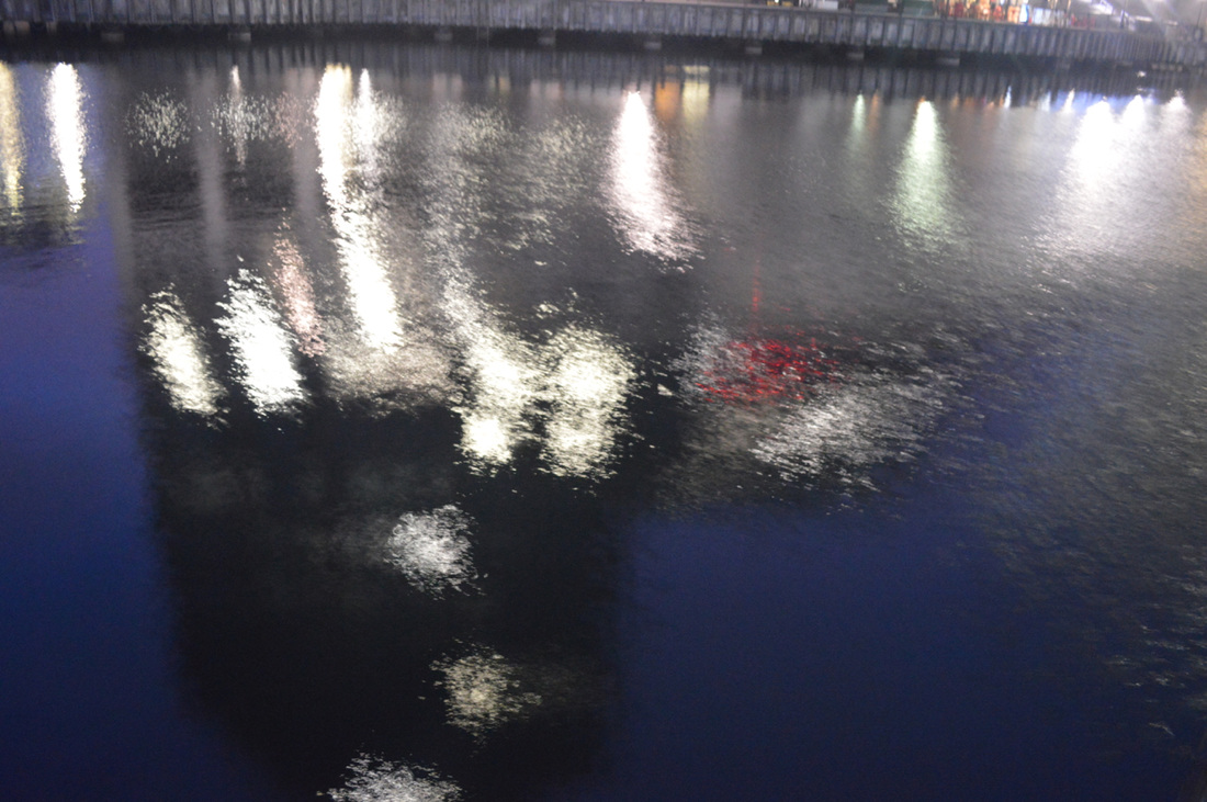
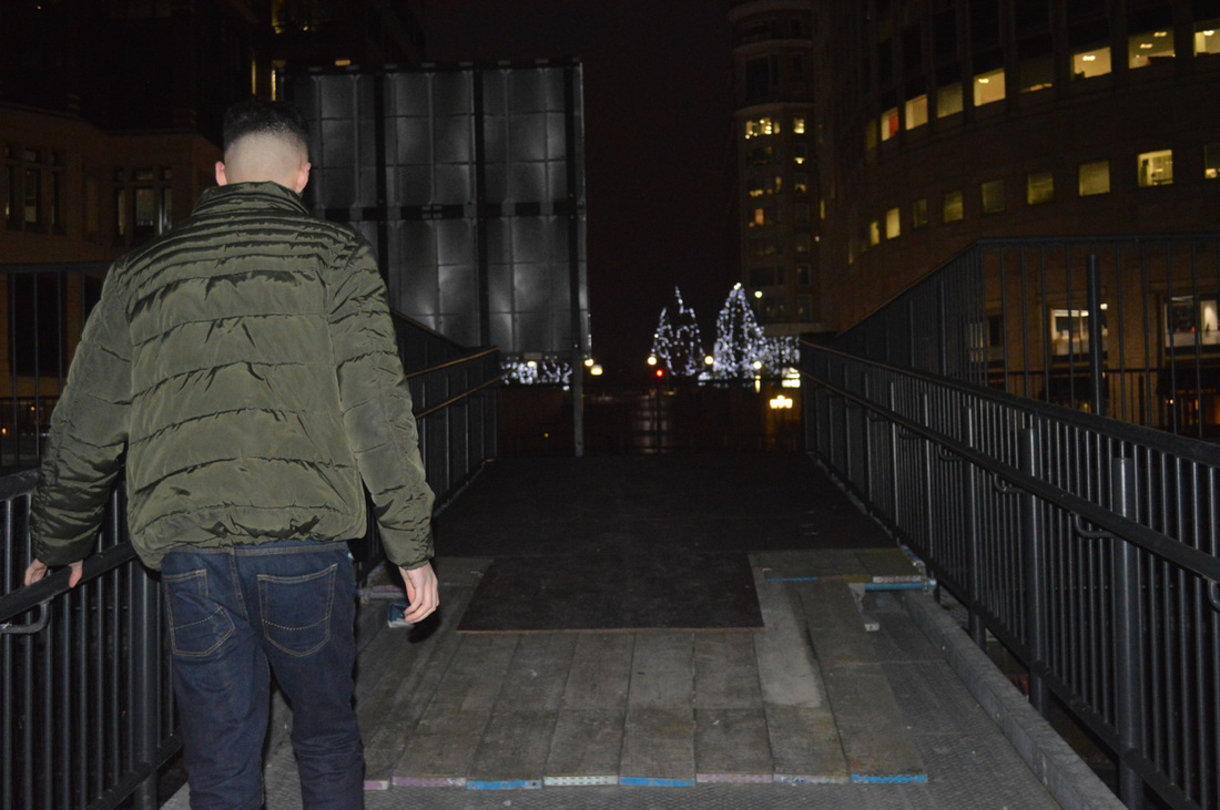
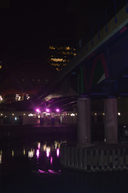
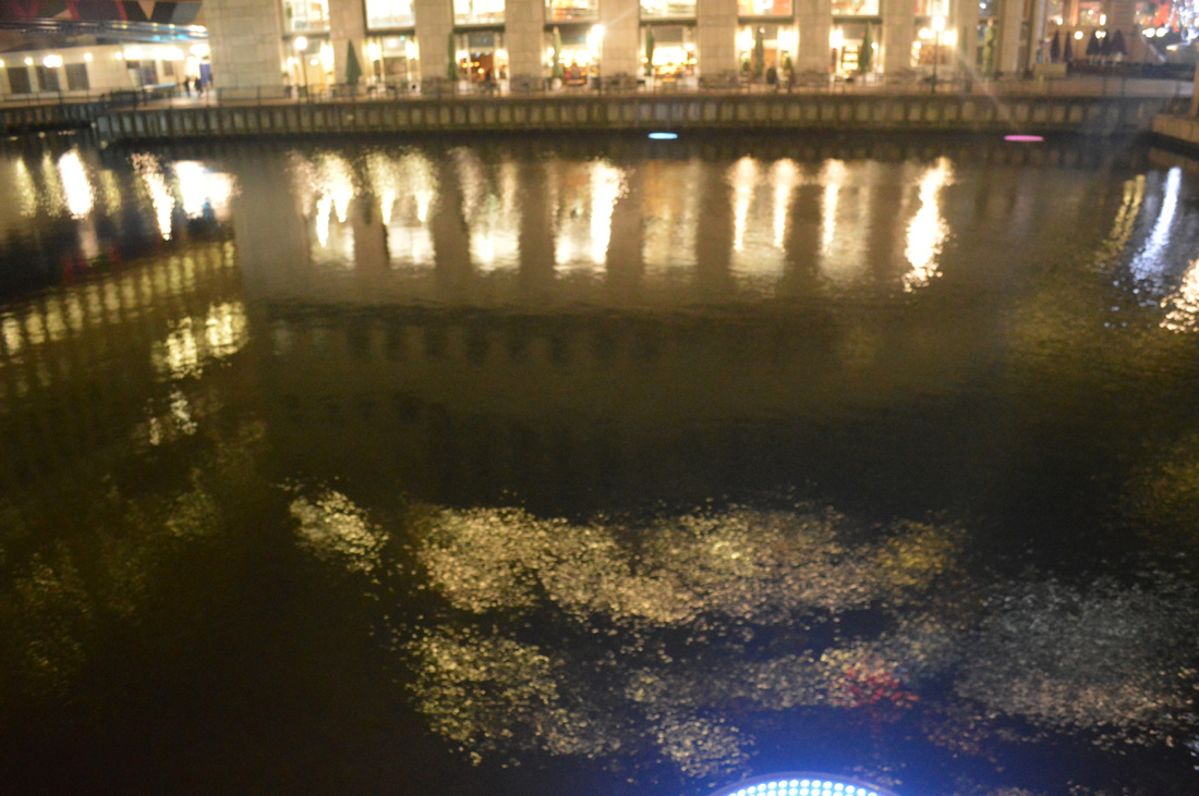
Rut Blees Luxemburg
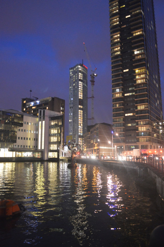
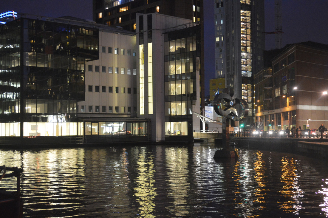
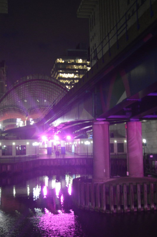
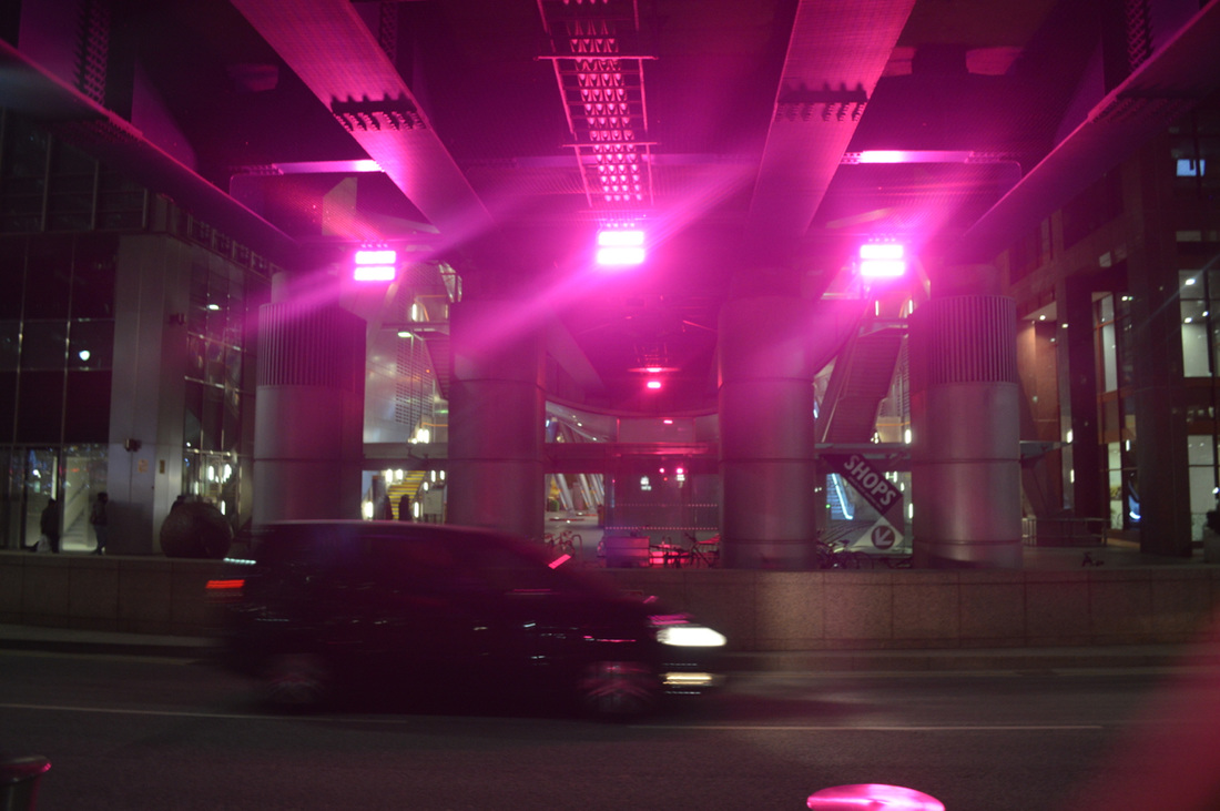
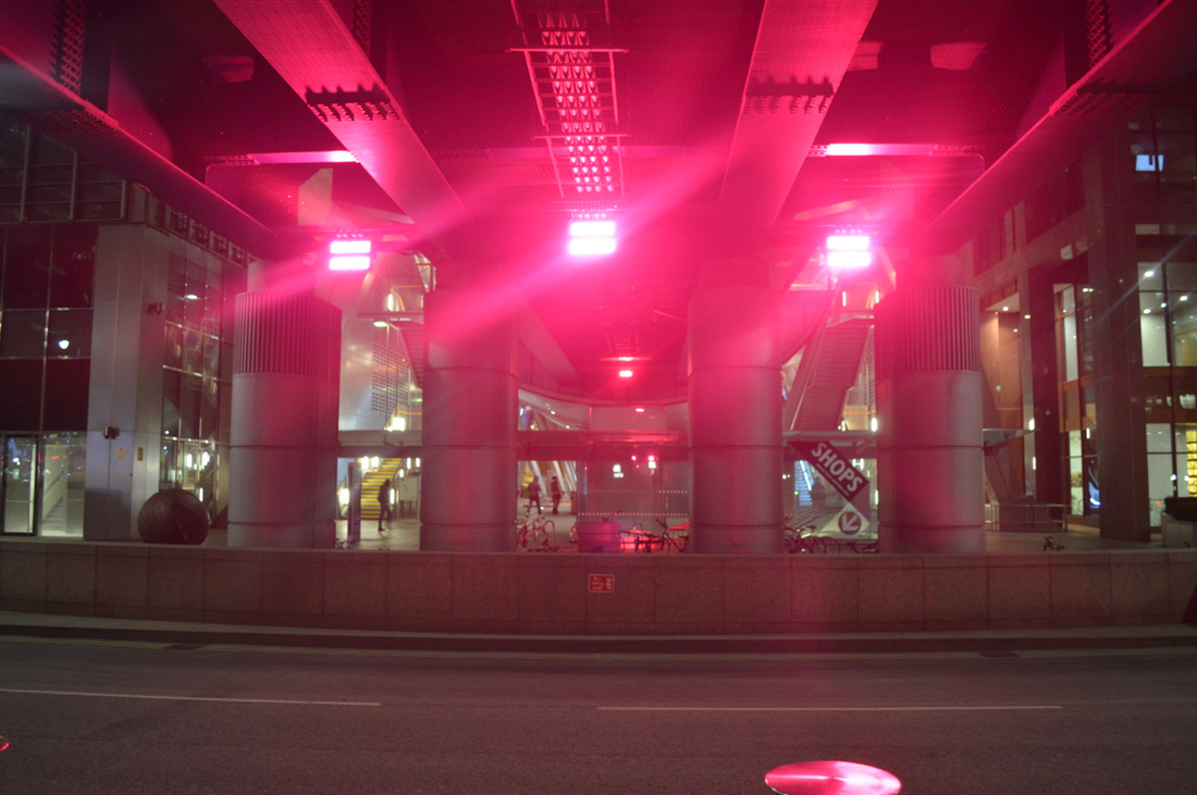
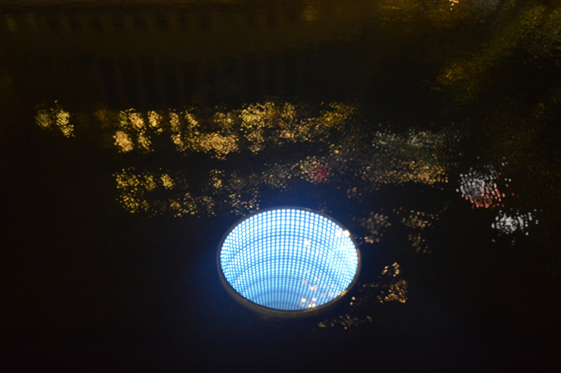
Rut Bless Luxemburg is a German photographer that takes photographs during the night, which she was interested in urban landscape. I think that his work is really successful because the way he has captured his images are really different to other photography, this photographer has focused on the position is the image and she has taken her time while taking it, she has thought about what should be in the image and what shouldn't, if it was necessary or not.
Response #4
|
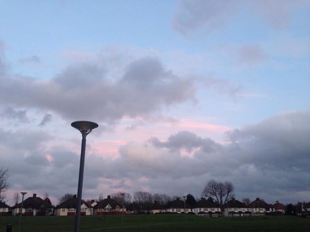
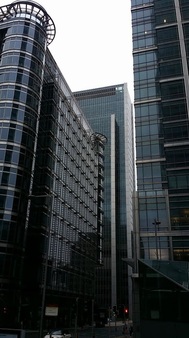
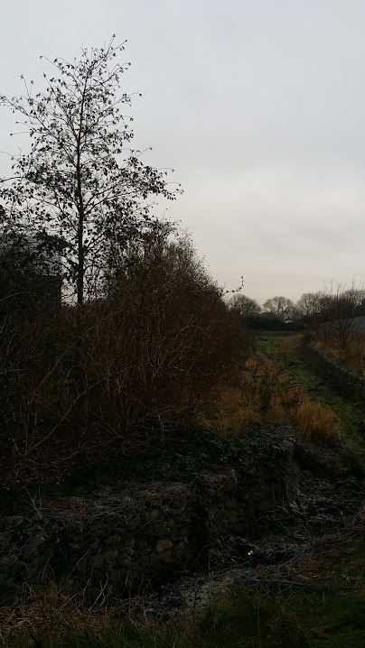
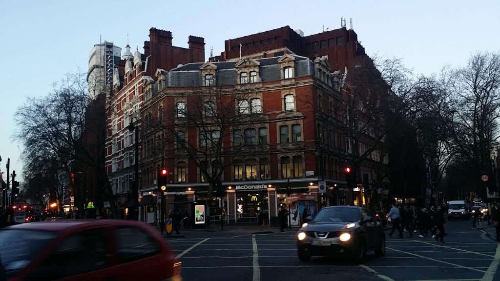
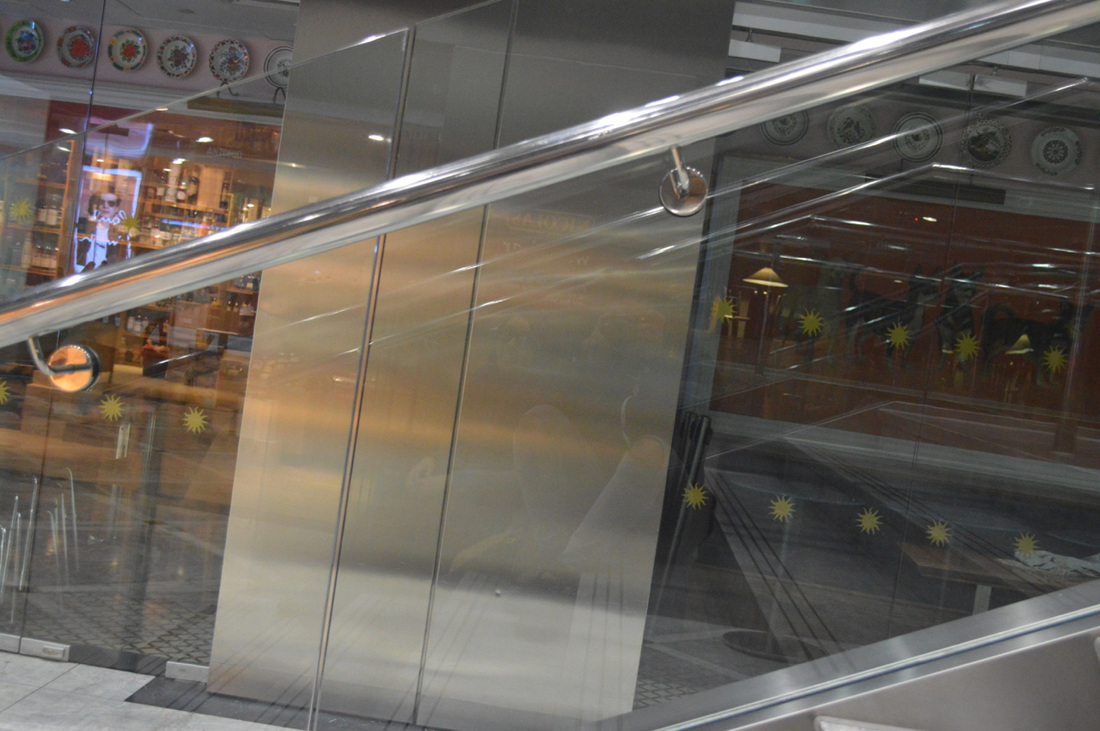
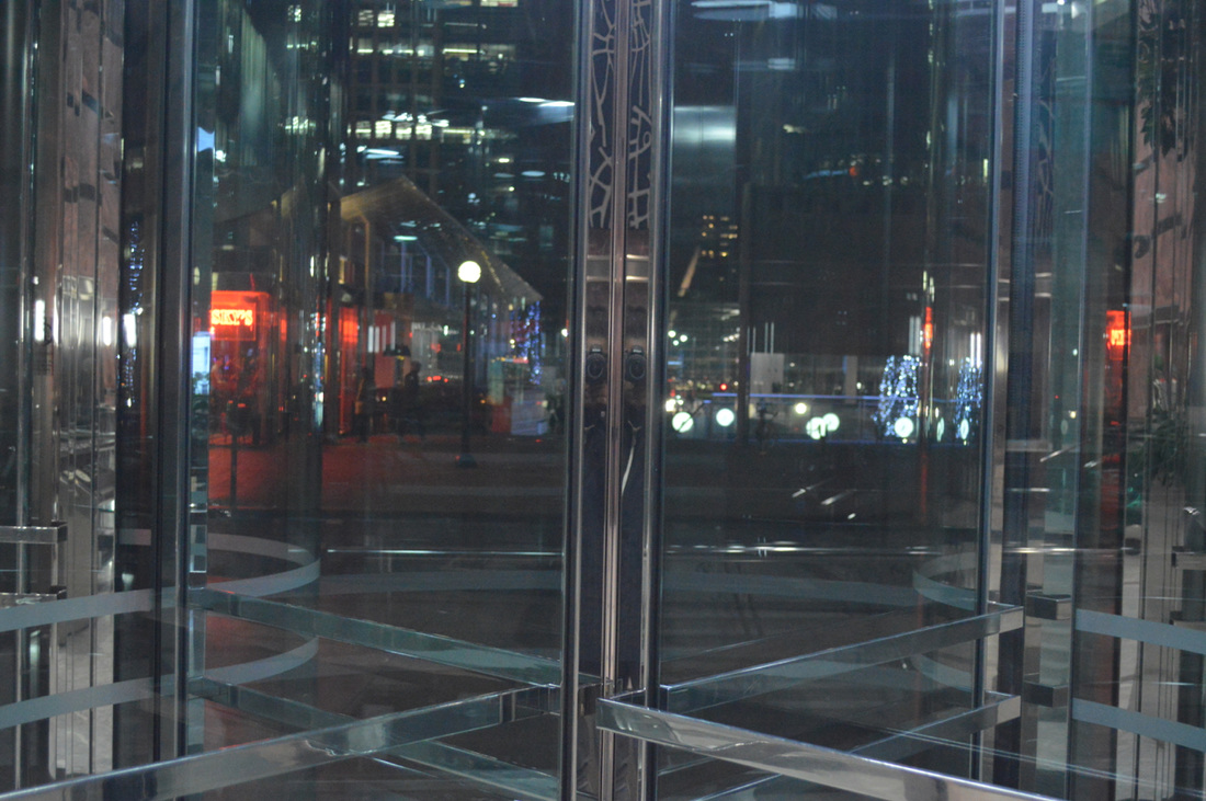
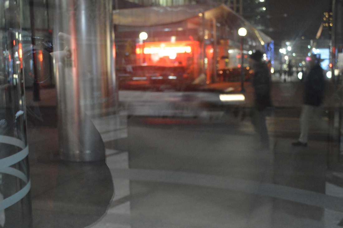
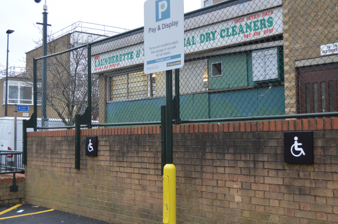
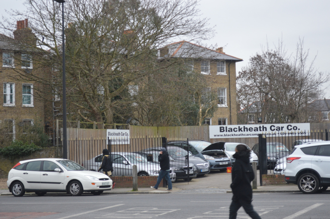
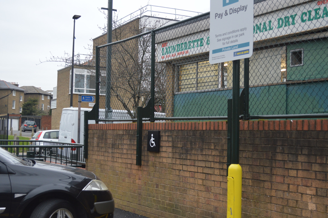
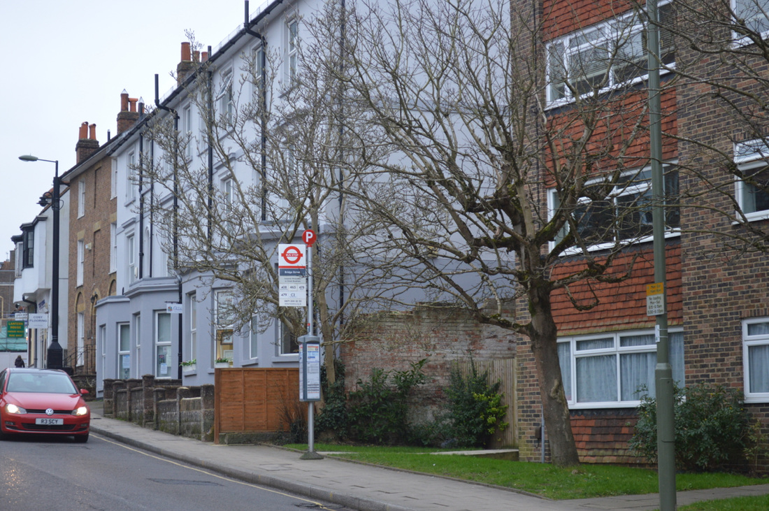
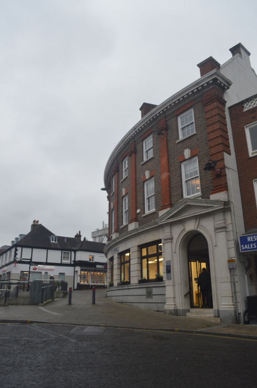
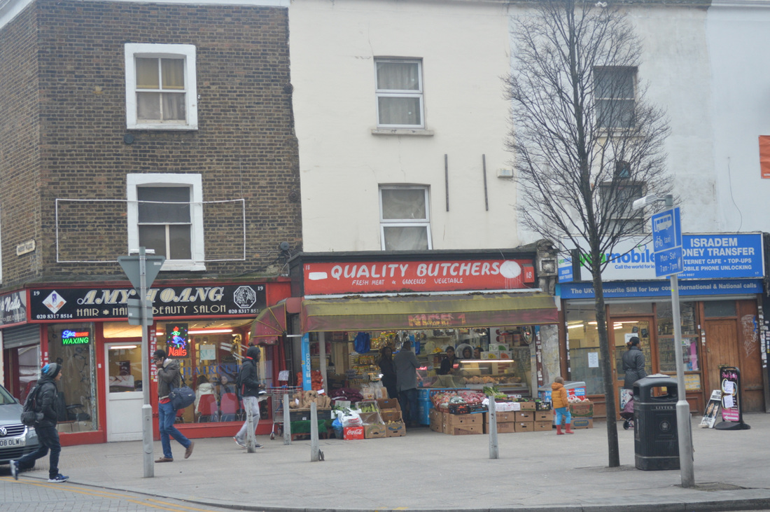
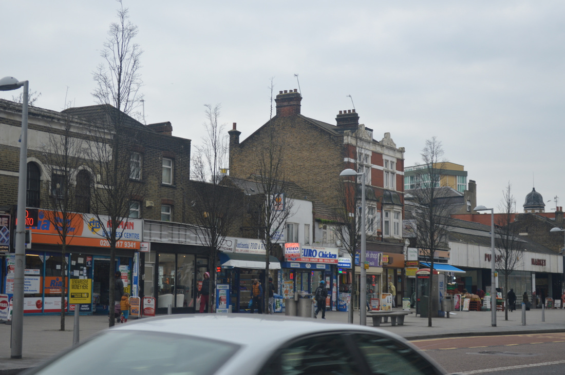
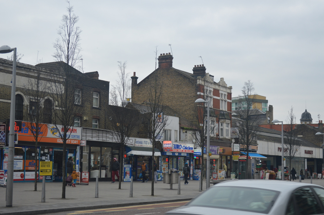
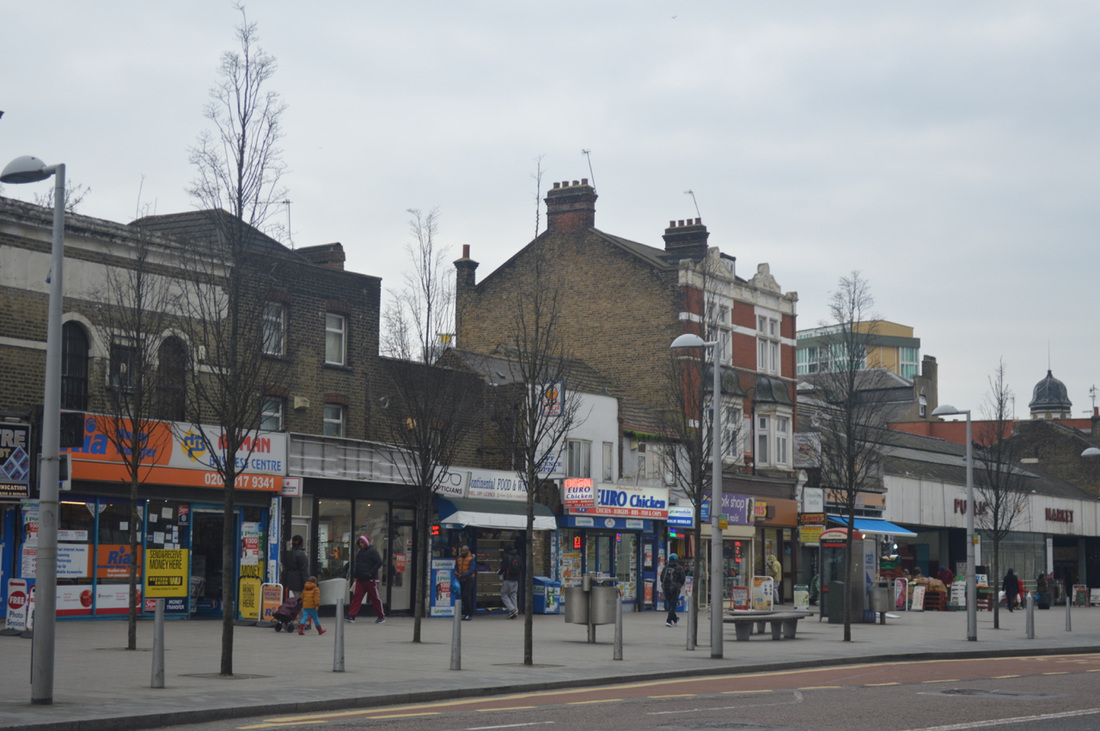
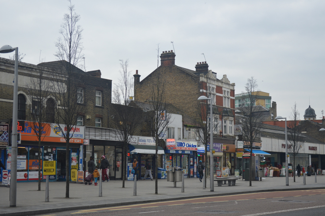
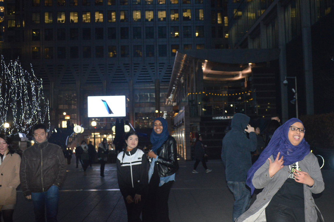
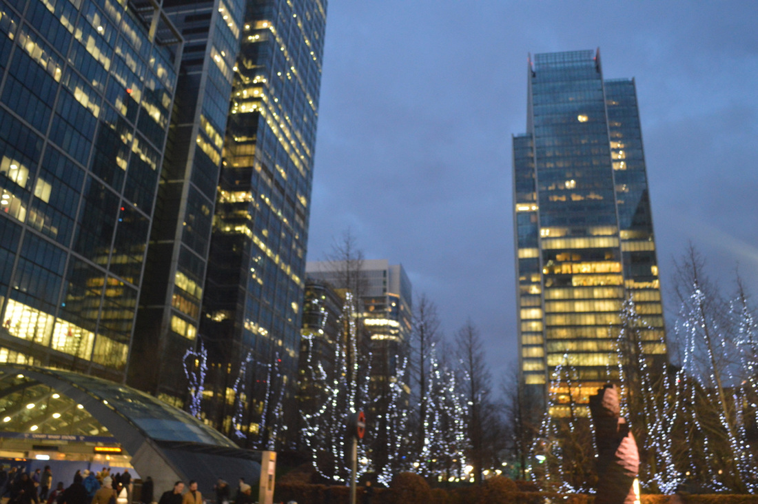
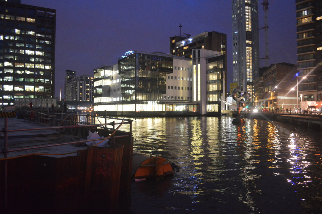
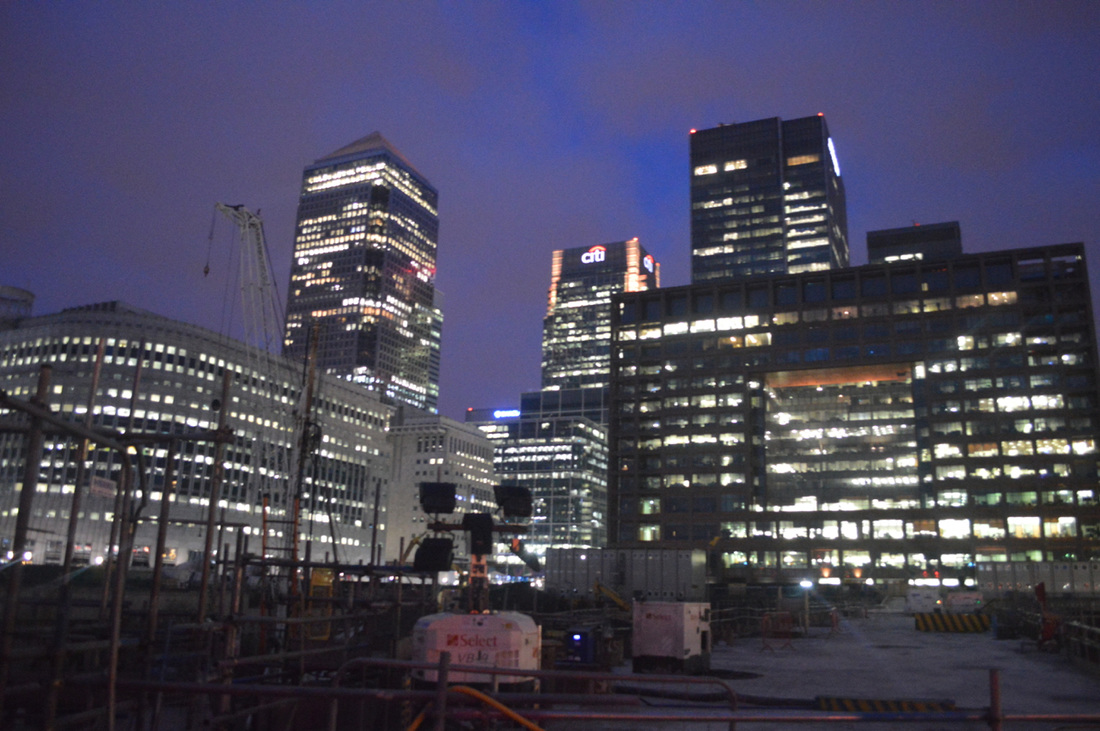
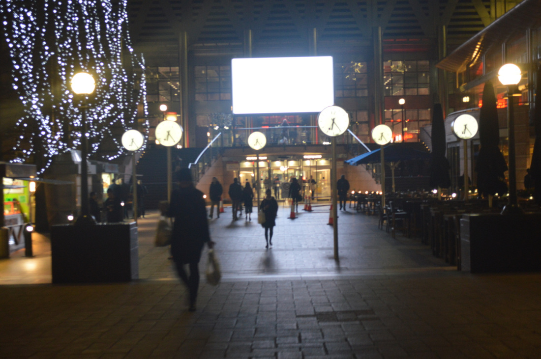
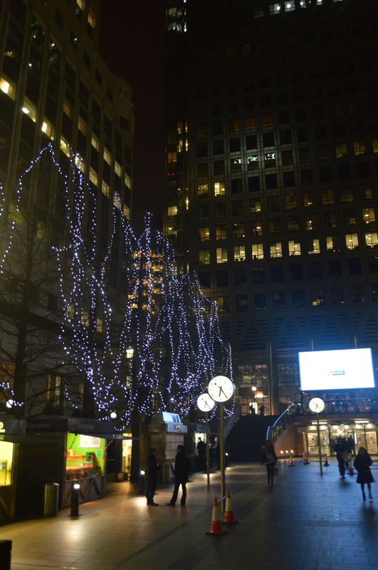
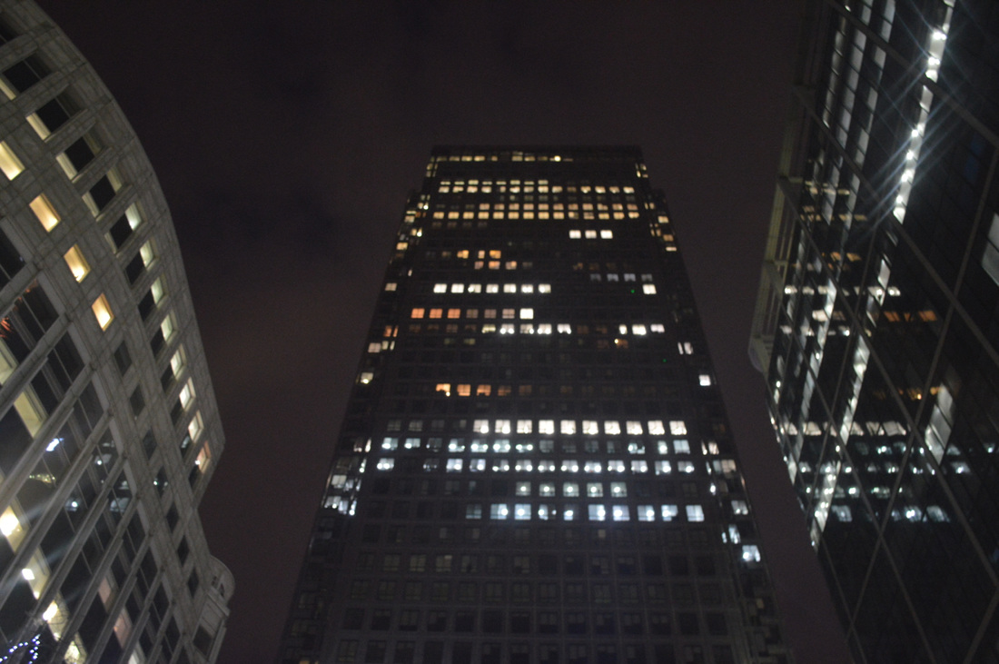
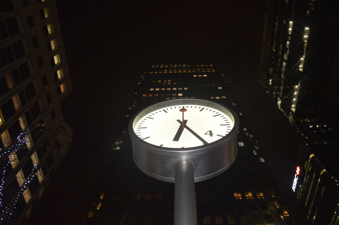
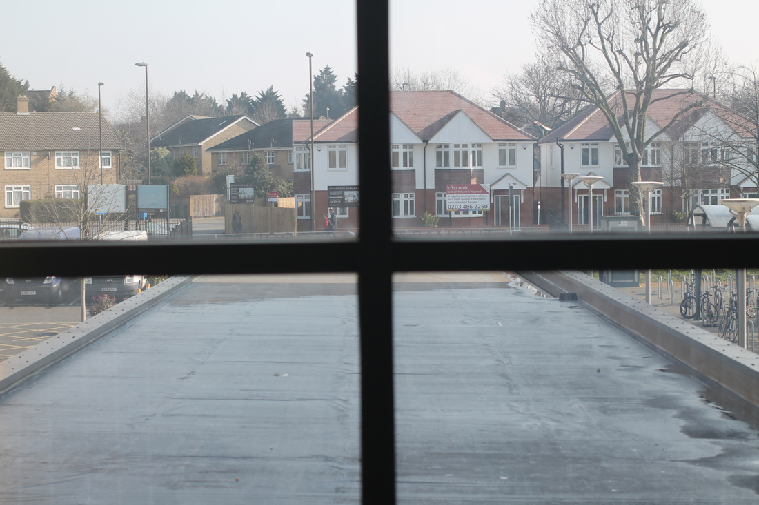
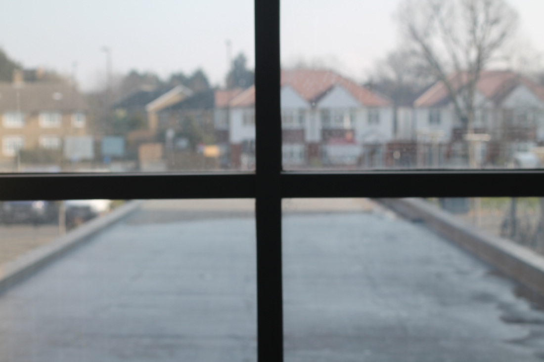
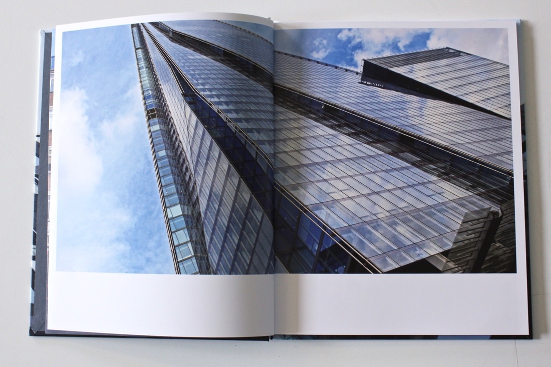
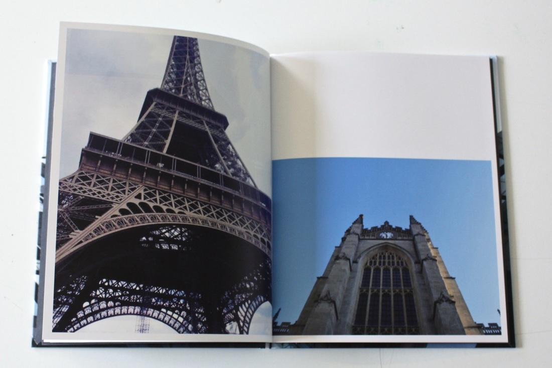
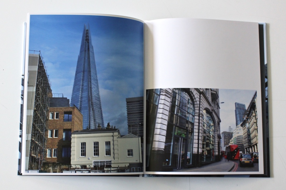
A day out at The Shard was interesting because I had the experience to see the view of London from the 72nd floor of the building. Which was scary because when you look down, you see the landscape in a different way, visualising it differently and something you wouldn't expect for that to seem like that, especially looking down to the train station seeing how awful the railways look and how muddy the river is. Other than that the visit was excellent, I saw things I would never expect to see. I was able to take a set of images of the buildings around there, but what I love about them buildings is that they all have a different meaning and different look to each other with several patterns, shapes and sizes making it unique to myself, they are not just a row of a few buildings lined together. Some of the images were taken while in the car, they all have a different type of perspective, but it would be from the same angle, but just by taking pictures while in the car is something entirely different this is because you would have to think really fast and capture that once image within seconds, it wouldn't be anything like standing next to the subject matter for an extended period, trying to focus the object and getting the angle just right and also thinking about the four corners and the rule of three.
|
|
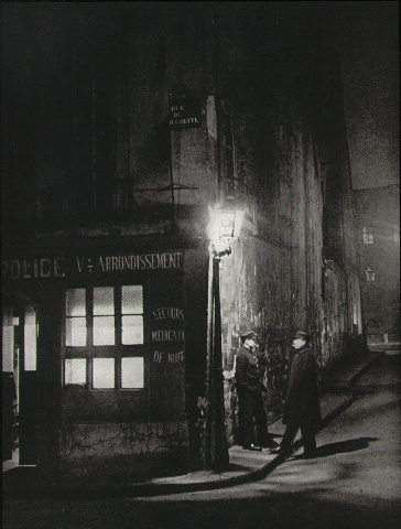
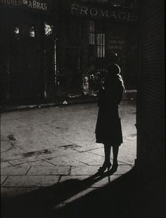
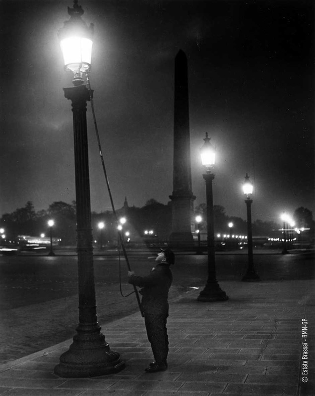
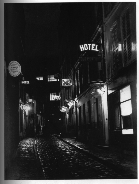
Brassai
Brassai is a French photographer, which he is known primarily for his dramatic photographs of Paris at night, I personally think its really strong and it could have a strong meaning to it, which they could be hiding something. I think this because they have decided to take images in the night, why not in the day light? Brassai didn't really like the idea of photography, he disliked it at the time but then he found it really interesting after using it for journalistic assignments and for other mediums. After taking several images his photograph concentrated on the nighttime world of Montparnasse, a district of Paris. While the times of the German army, Brassai had escaped southward towards the French Riviera but then had to go back to Paris to get his negatives back. Once he was back from a long trip, he wanted to start photography again but photography on the streets was forbidden because of army. So instead he decided to draw the things he saw which he does best.
Response #5
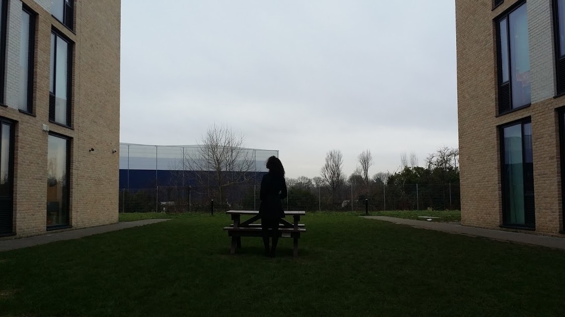
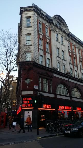
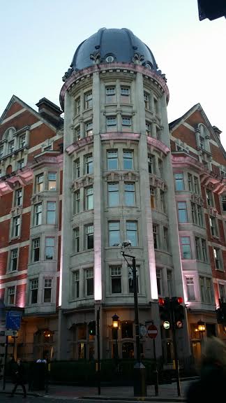
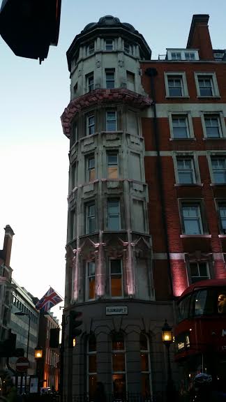
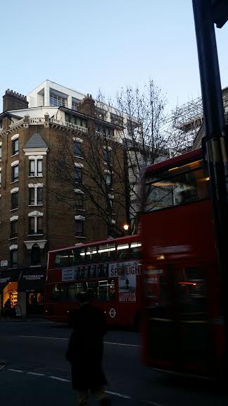
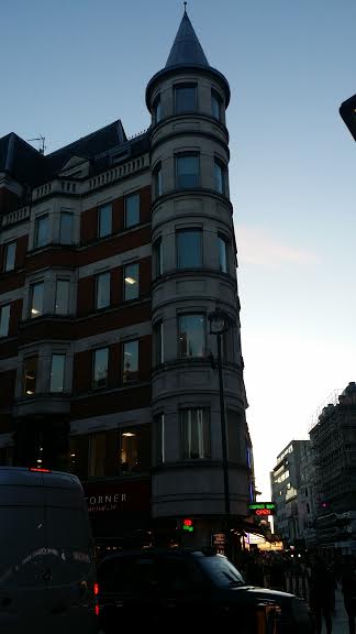
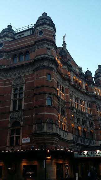
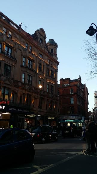
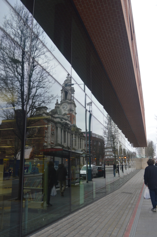
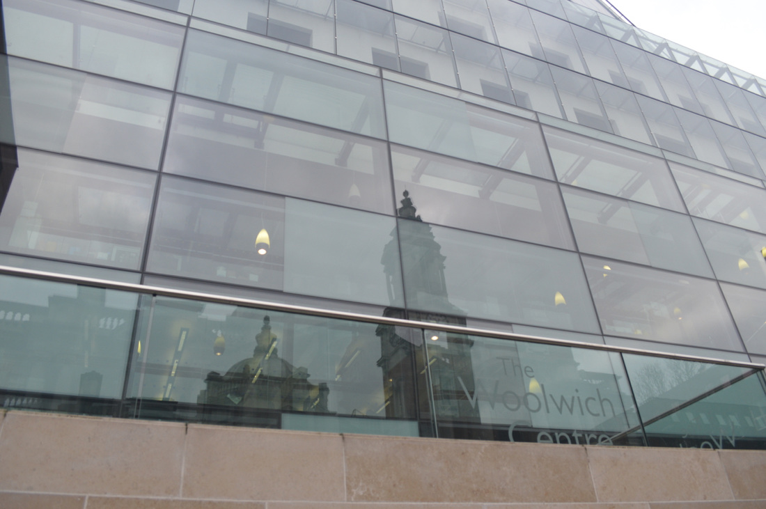
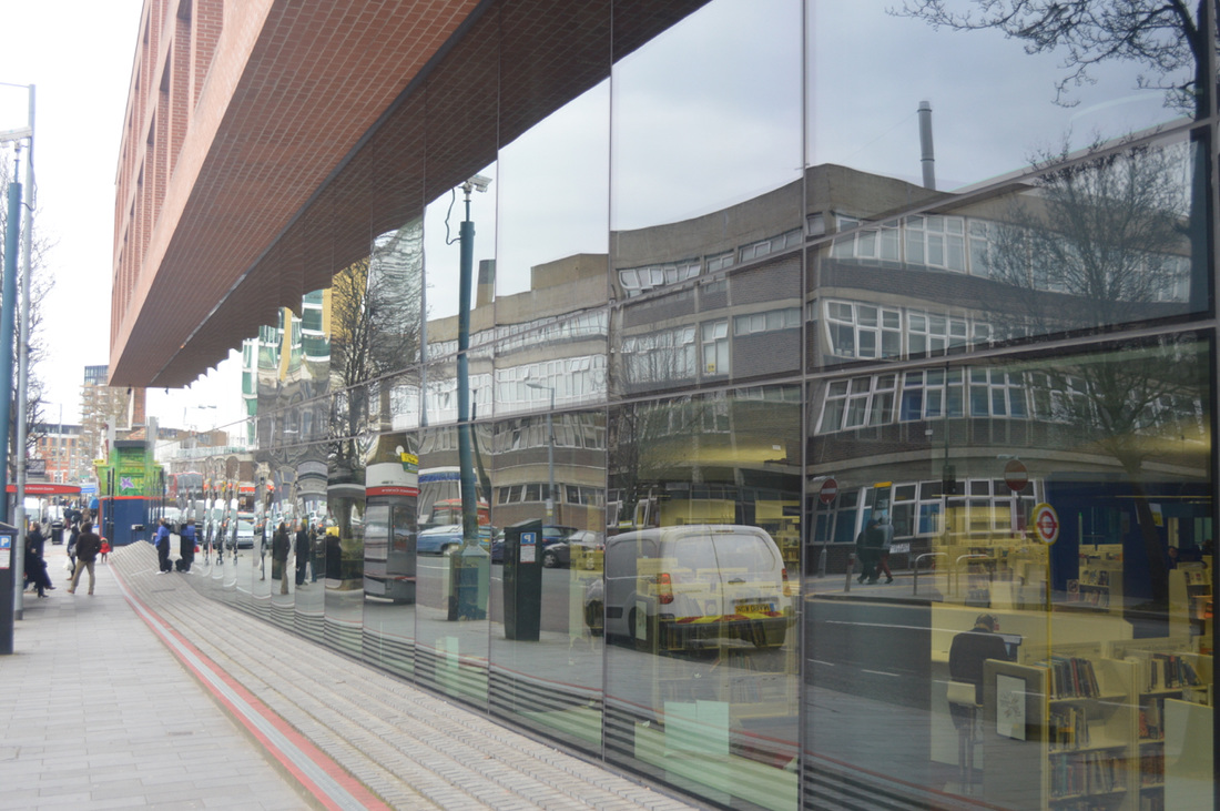
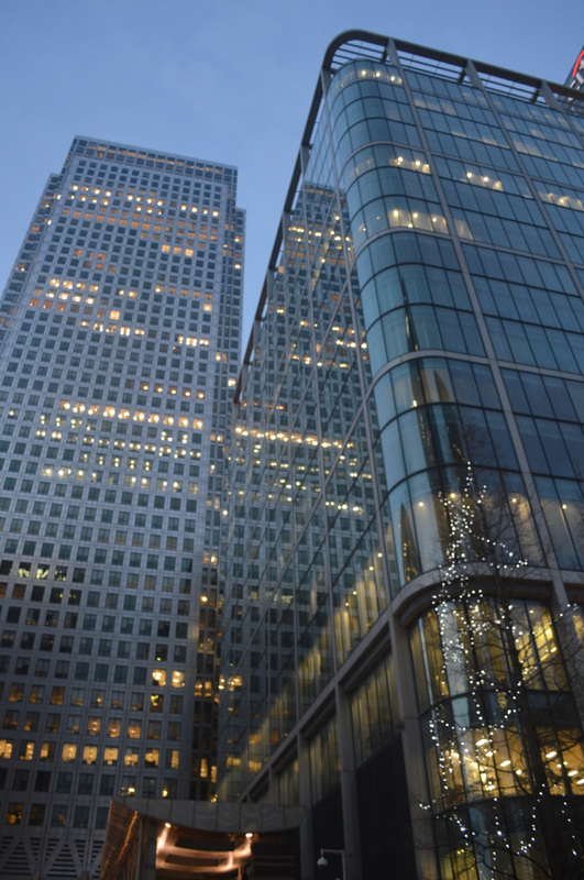
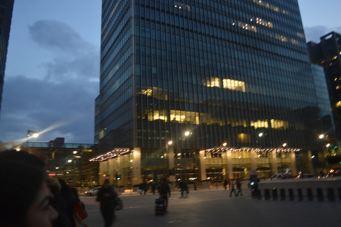
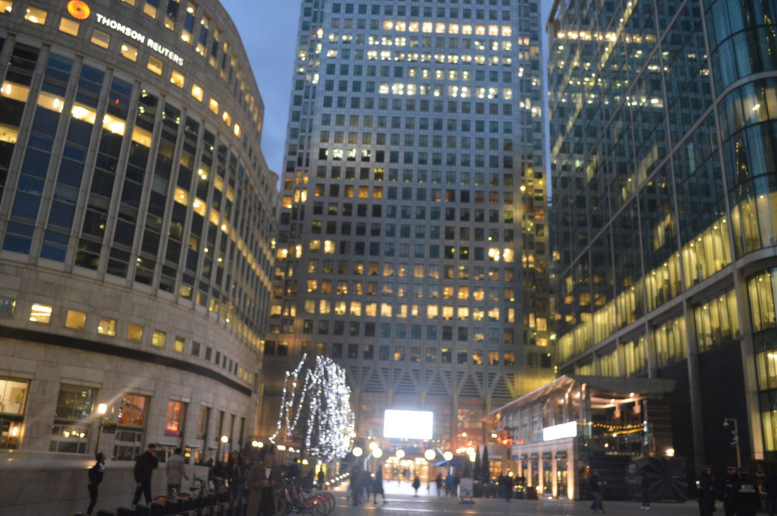
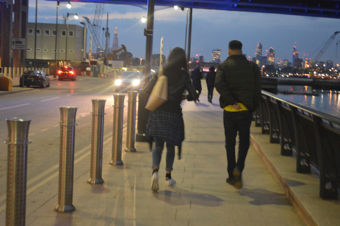
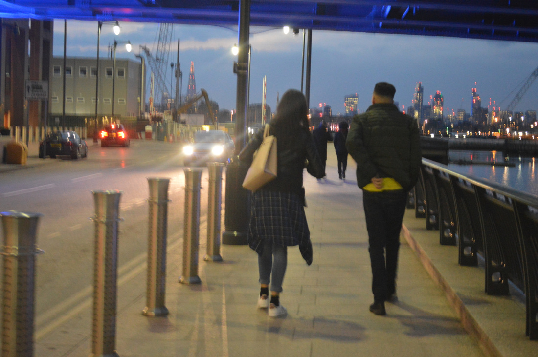
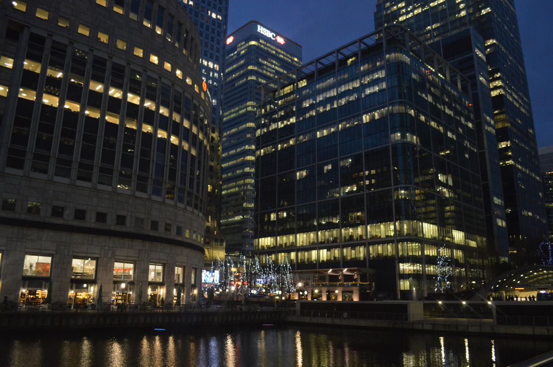
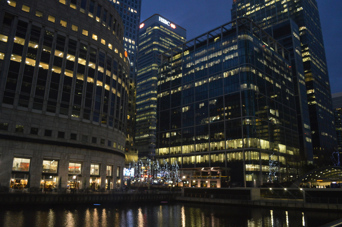
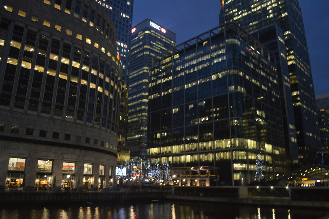
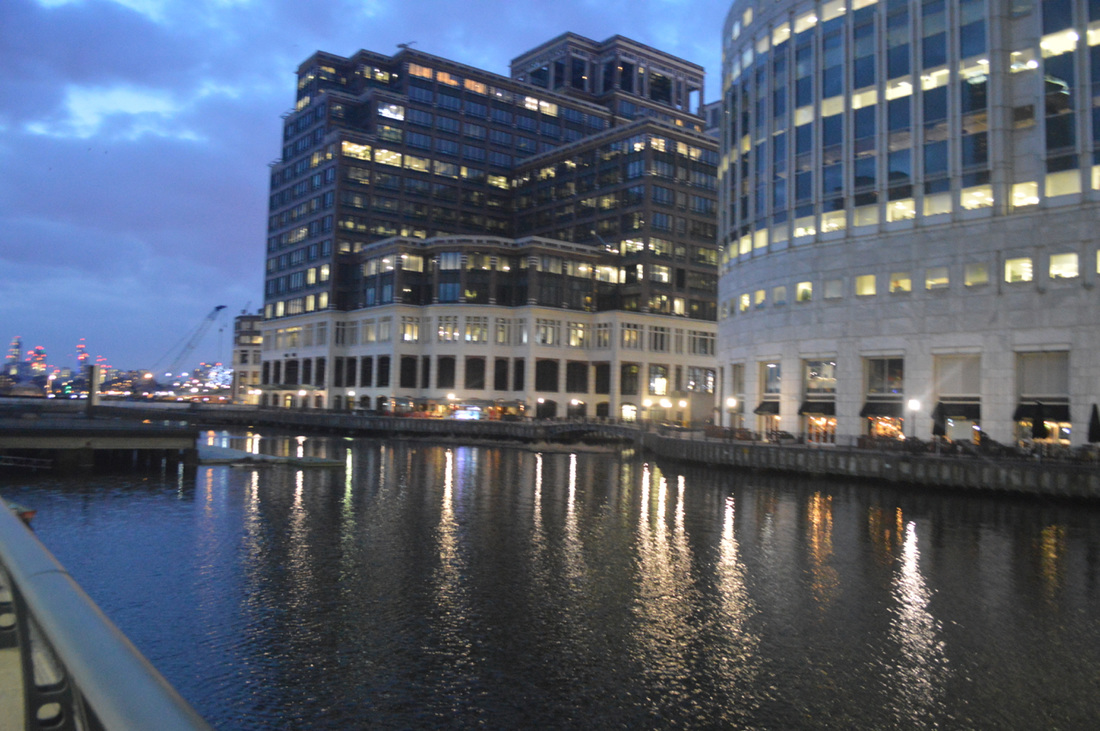
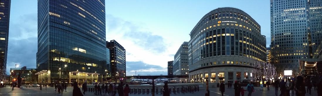
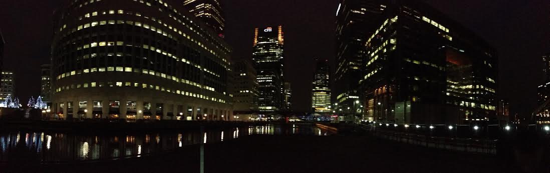
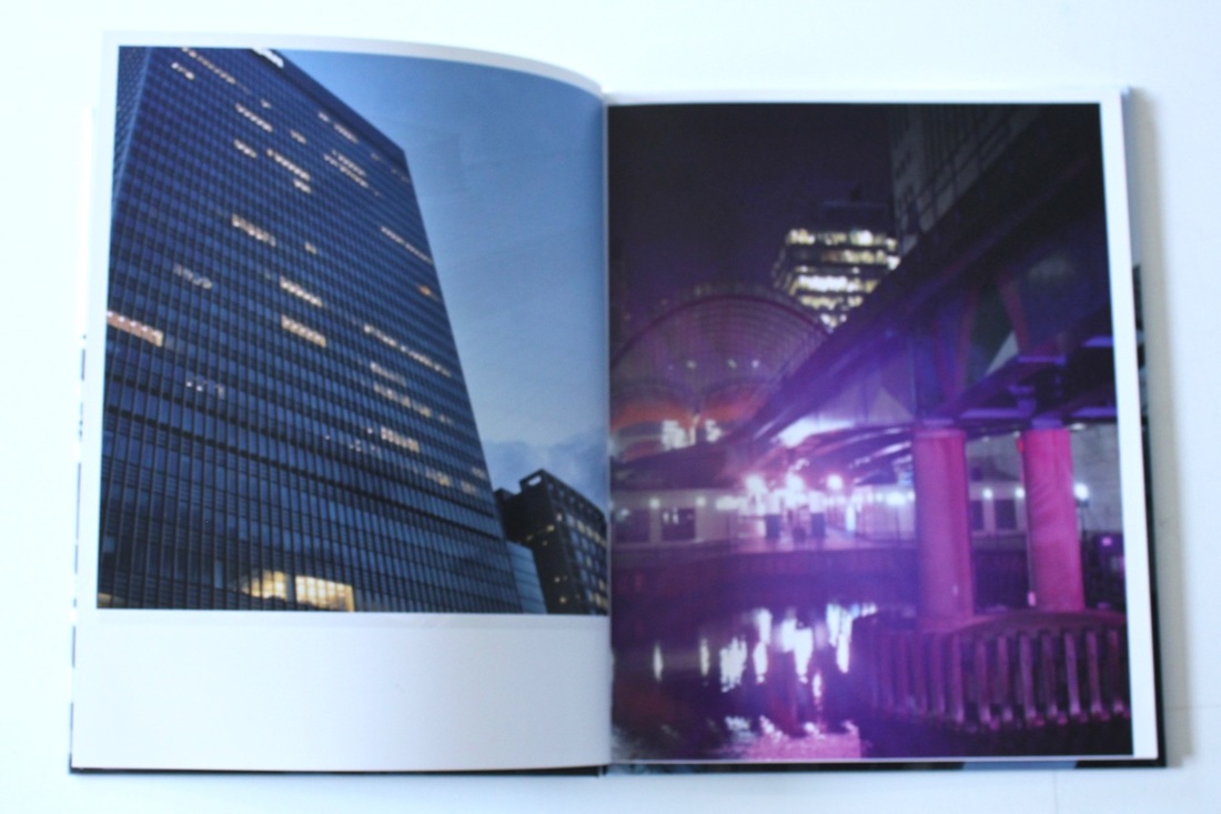
We went out for a trip to London to take some images of buildings that would link to my theme for my photo book. I went to Crawley to check out the architecture and landscape, I wanted to compare the two cities together. What I realised was the layout of the building, the bottom floor of the building would have a business and the top half would be resistance home. When comparing Crawley with Woolwich are is a big difference between the two you see the different type of layout between the two. Woolwich is more of a broken, damaged area that's been like that for years. But when focusing on Woolwich now, there are two sides to it which are; that has been left the way it is for years, just a row of shops making business and the other half it's been redesigned and contemporary buildings. Our next location was Canary Wharf, the reason why I visited was because I could see the differences between all three cities in one go comparing all three and seeing how they all changed.

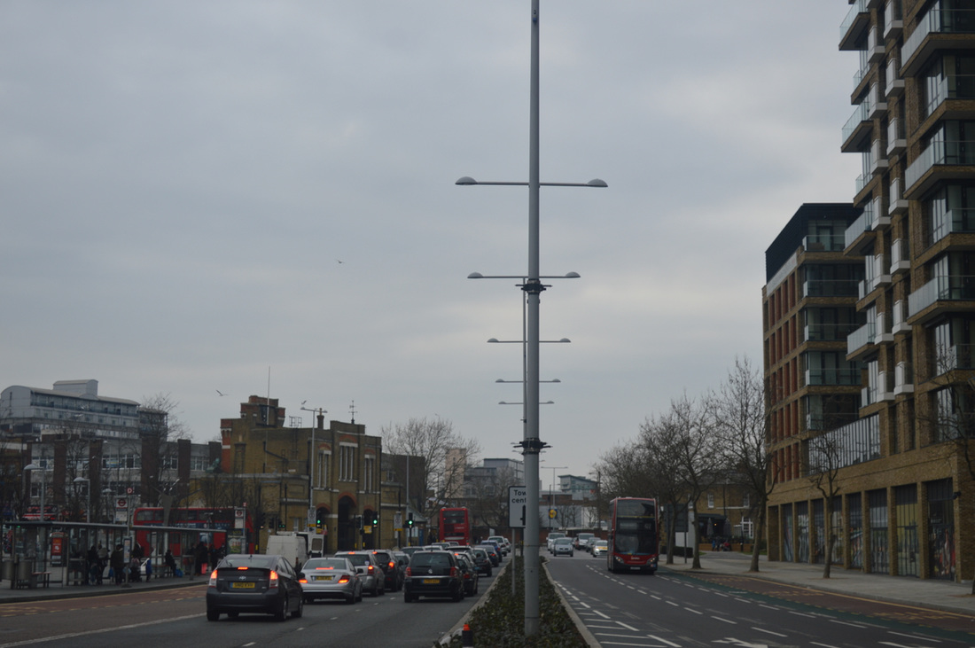
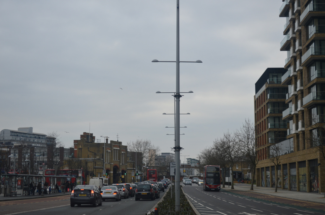
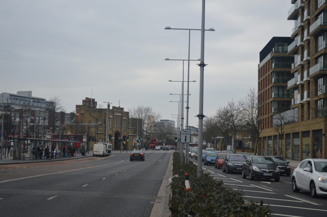

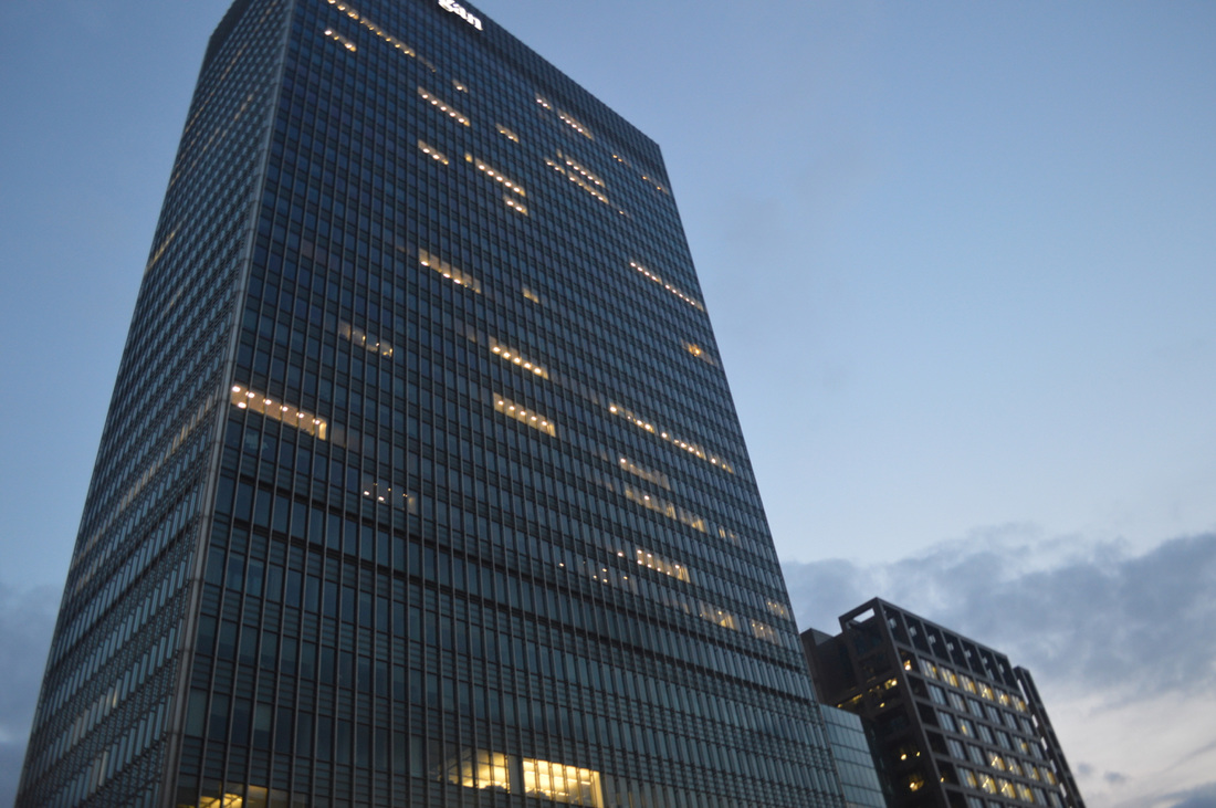
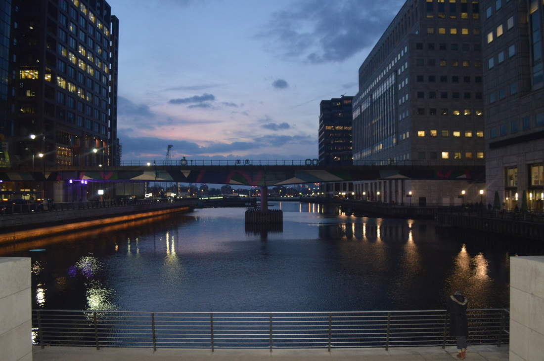
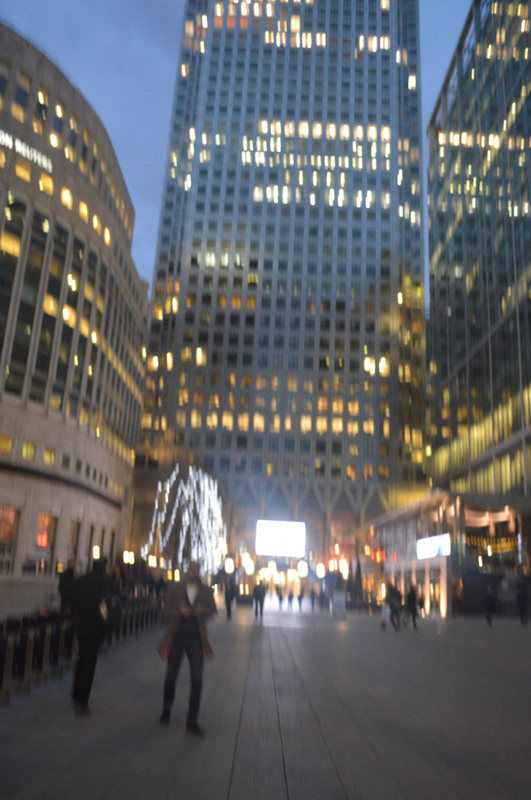
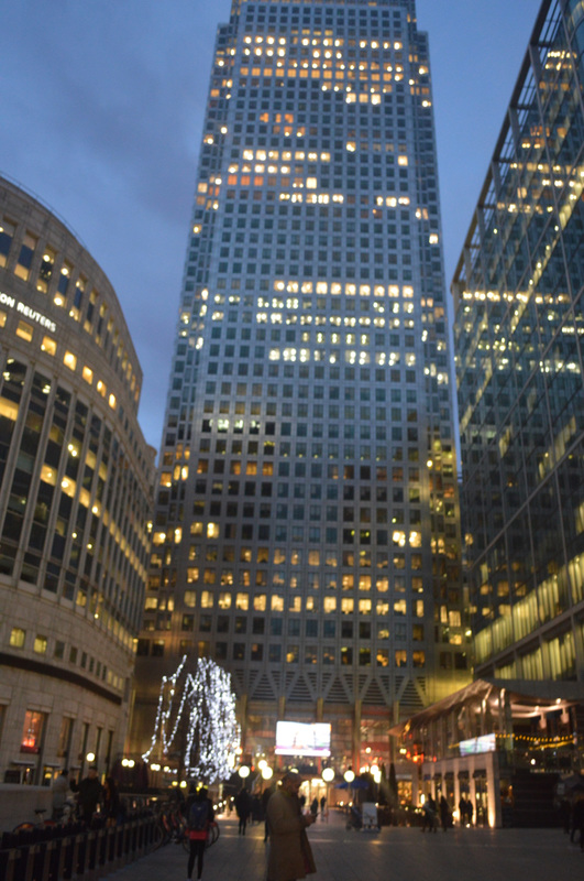
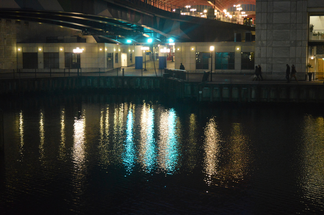

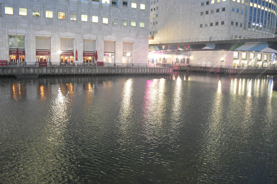
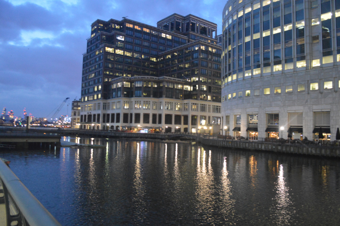
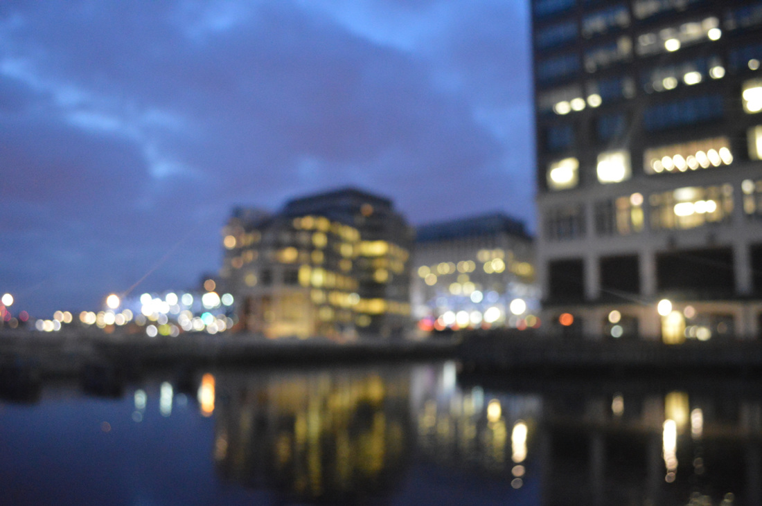
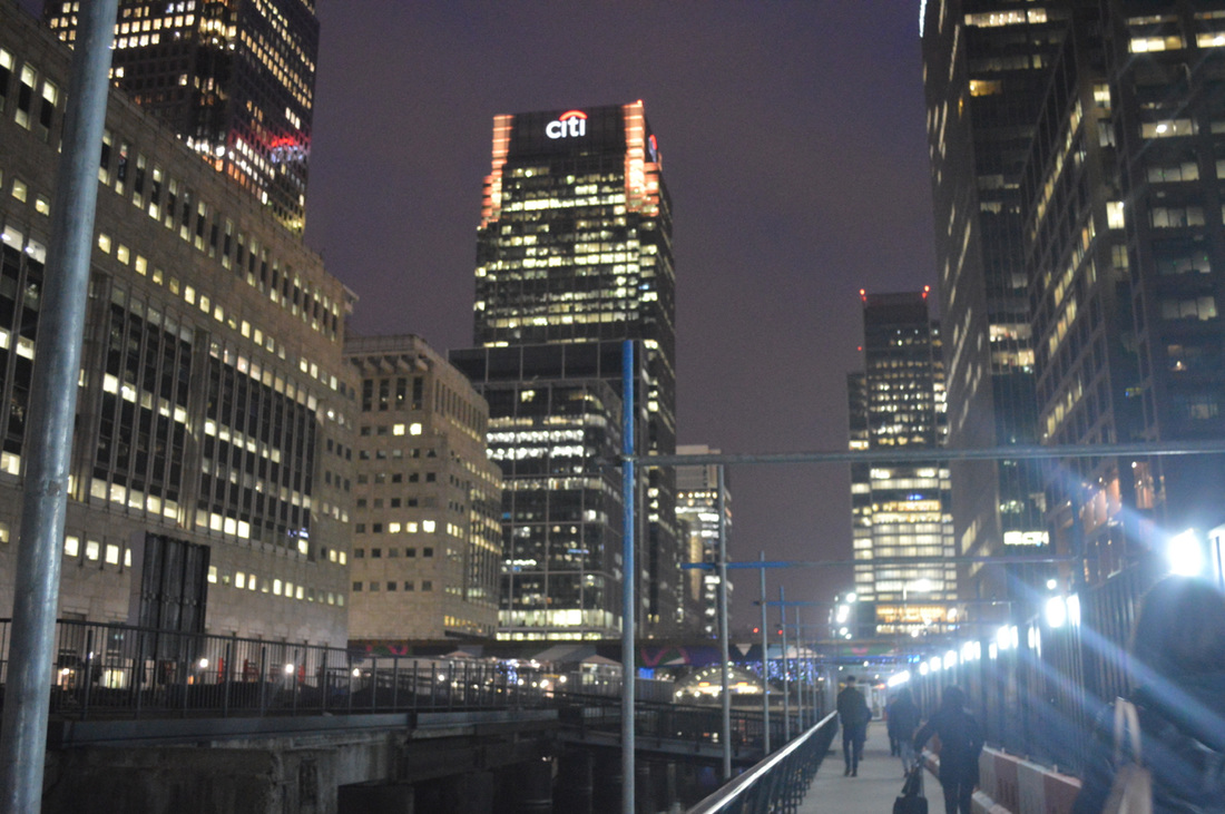
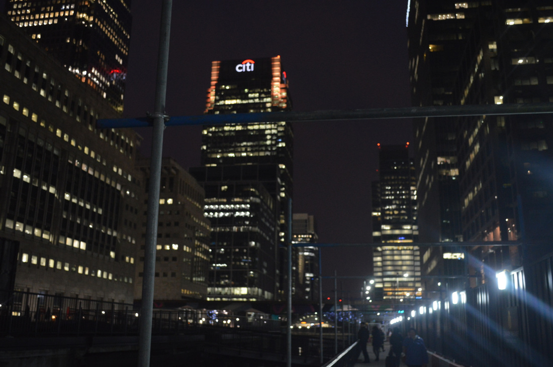
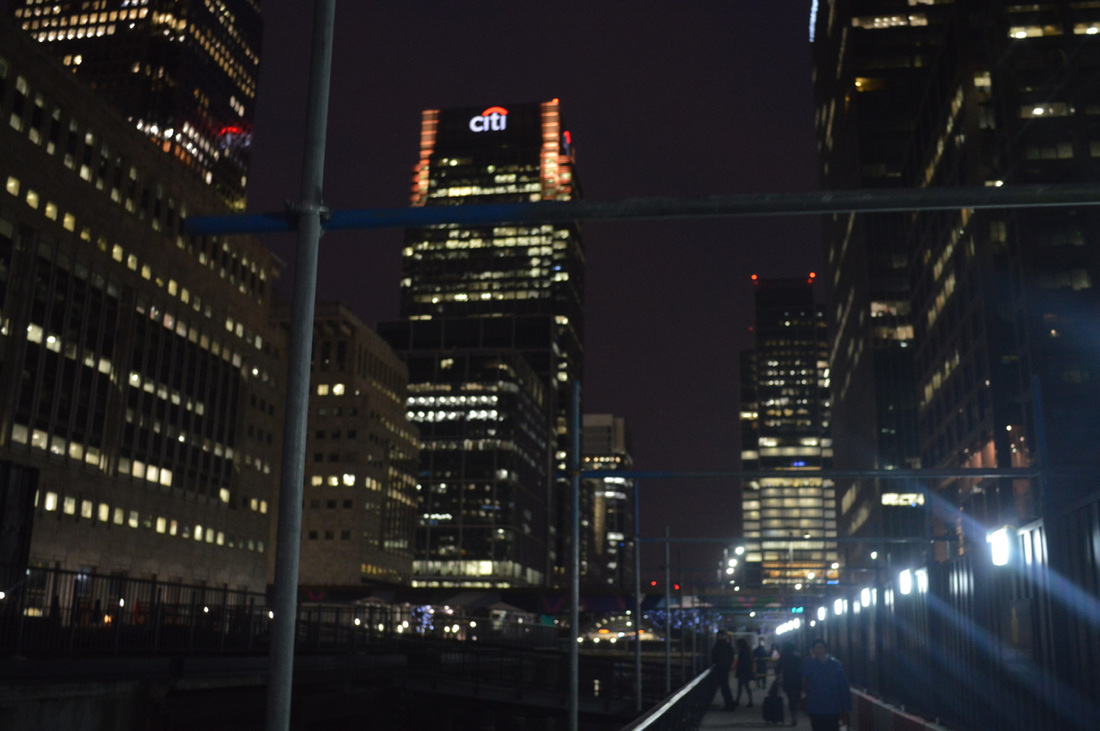
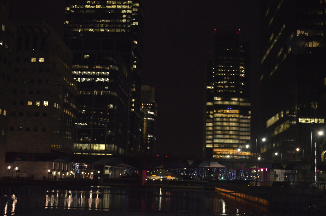
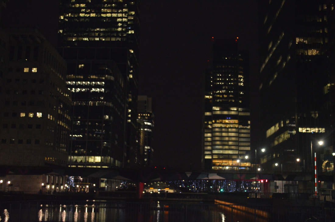


With these 2 set of images, what I was trying to achieve was to capture the buildings by using the panorama effect because I wanted to see the outcome it would have gave when I was really close to the building and see how curvy the centre of the image will become. I found this really interesting because you can shoot everything you see within one image, just by moving your phone clockwise around the object. The first image worked out well because you can see everything as a whole when walking out of the train station. Whilst standing close to the buildings you still have a clear picture of the buildings which creates more of a curve to the picture. The image turned out the way I didn't expect it to, I was expecting more light and it to be curvier within the centre of the image this is because I thought it would look similar to the first image. If I was to go out and retake the images I think I would change the time of my location this is because then I could see the differences between the timing and the effect of the images.
Response #6
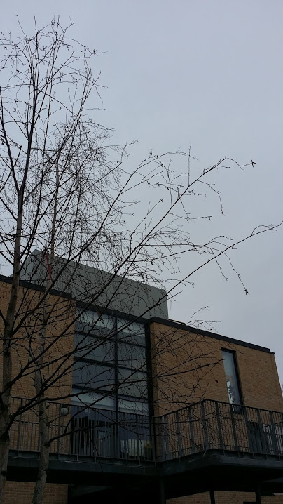
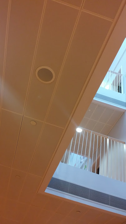
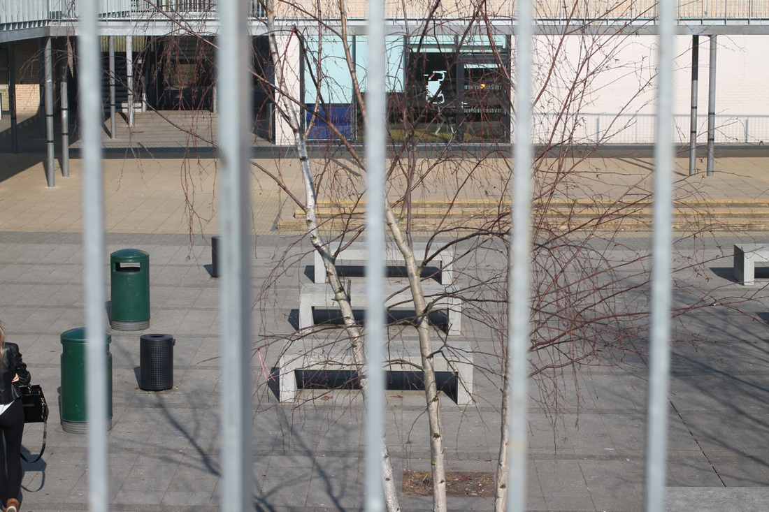
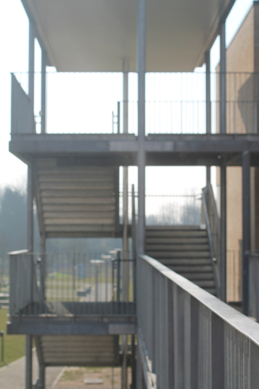
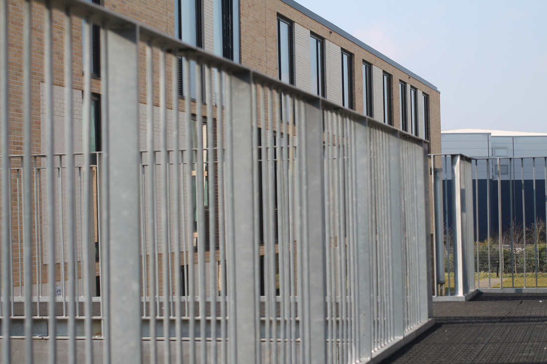
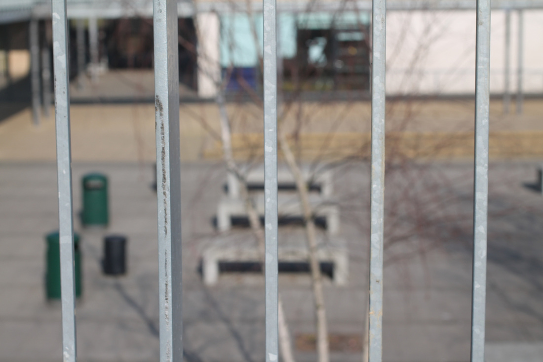
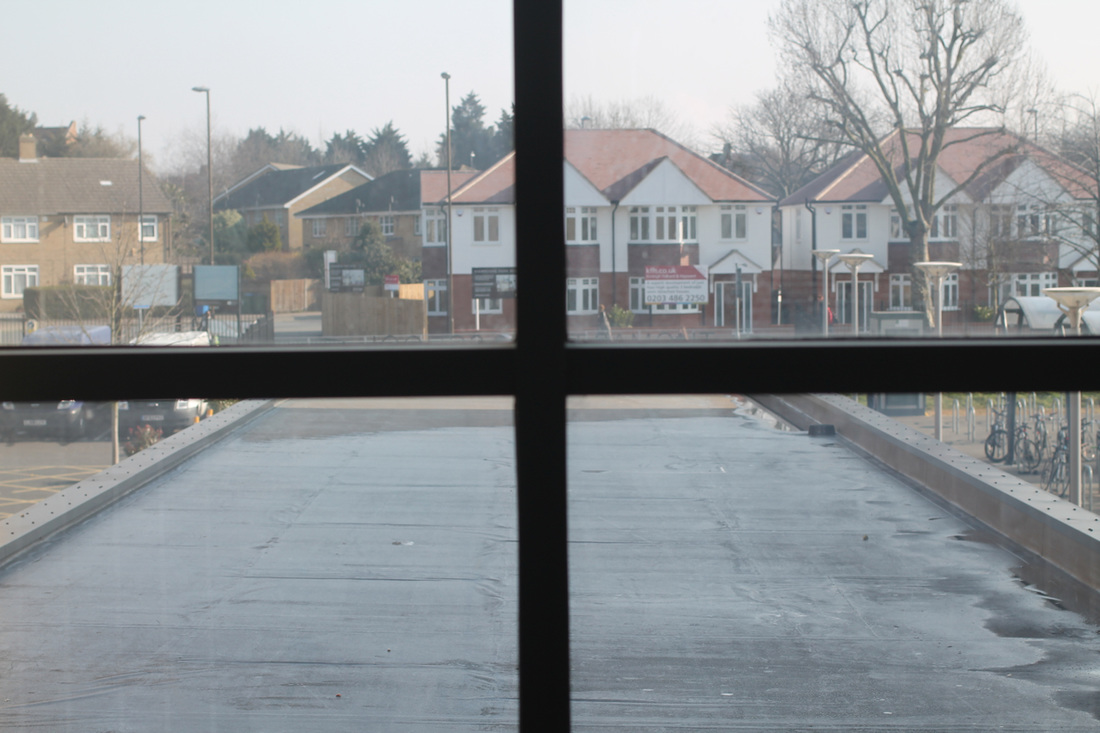
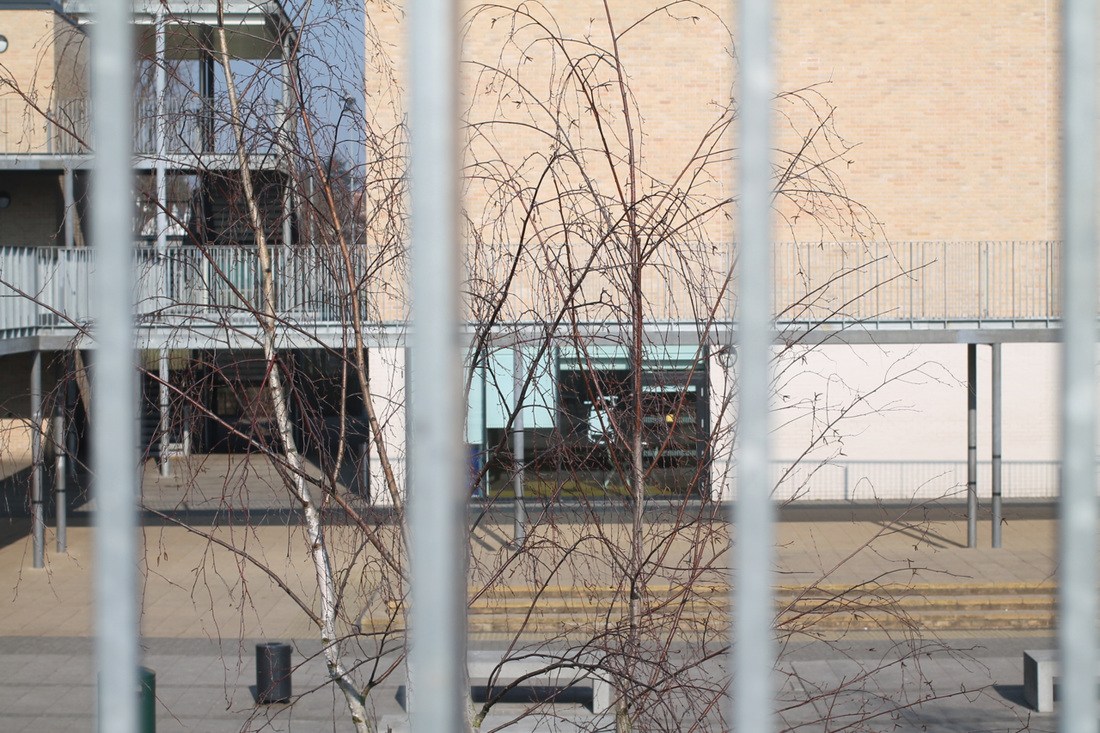
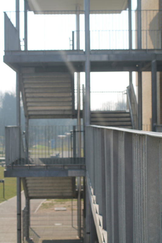
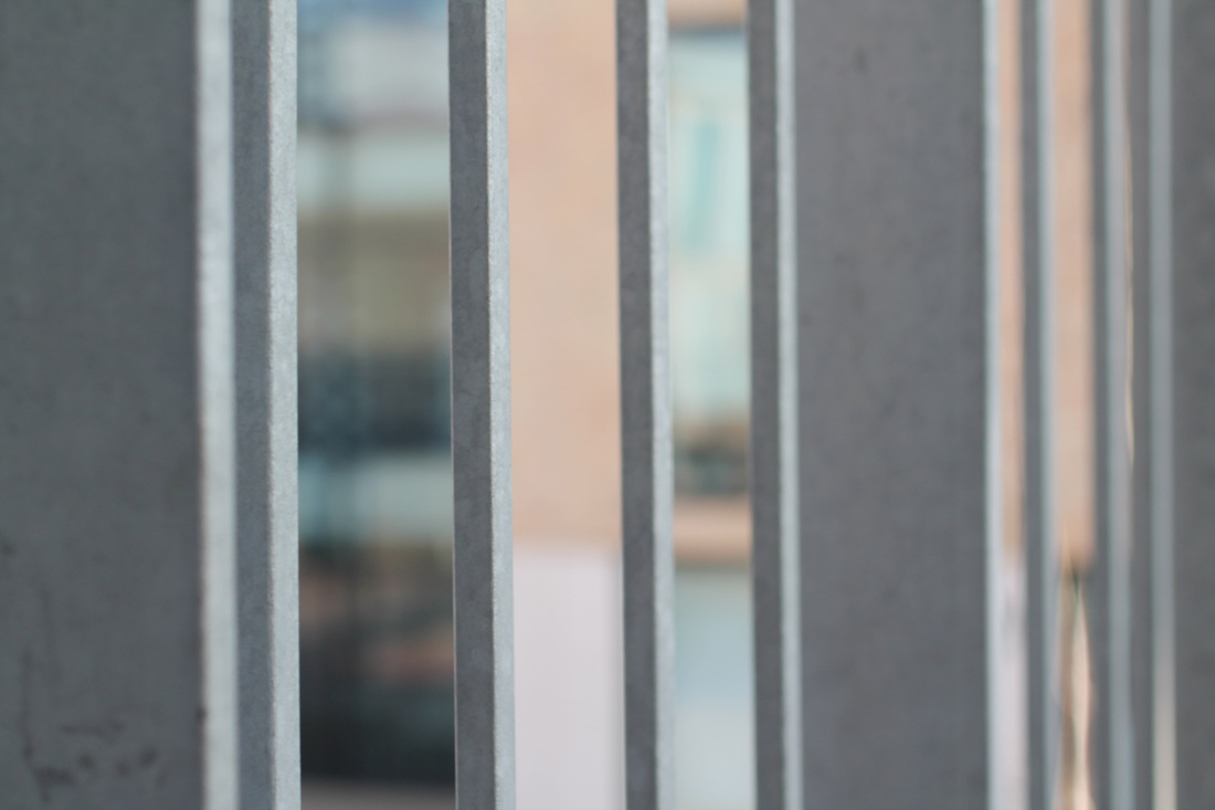
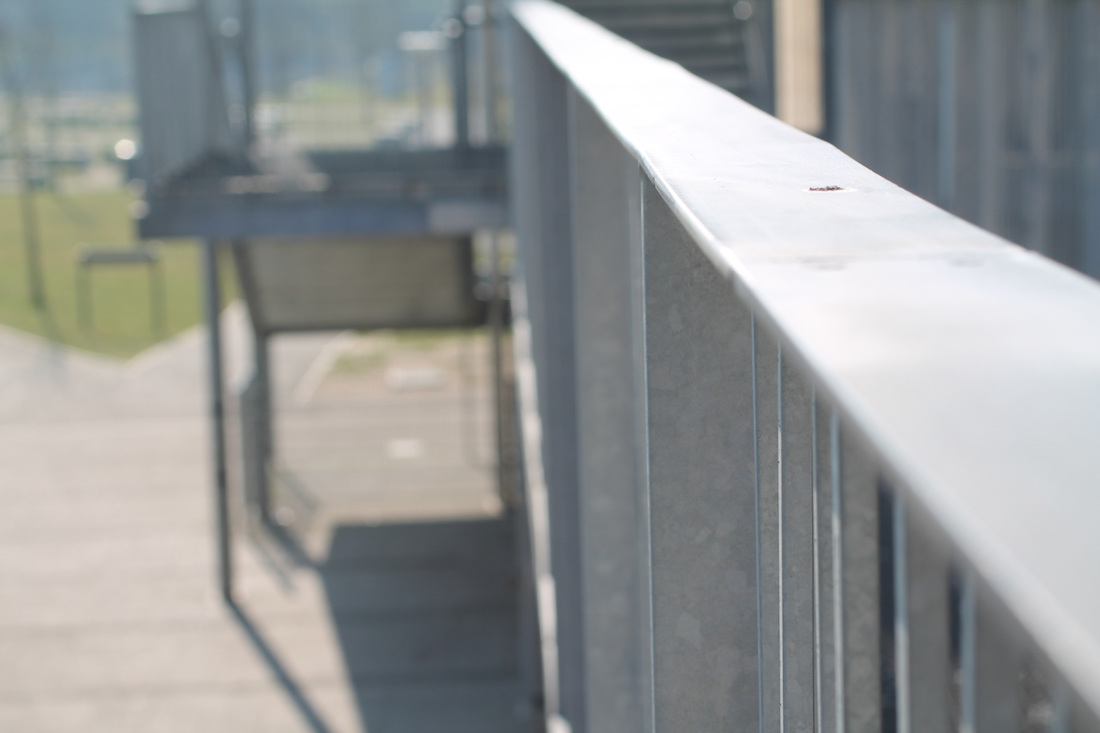
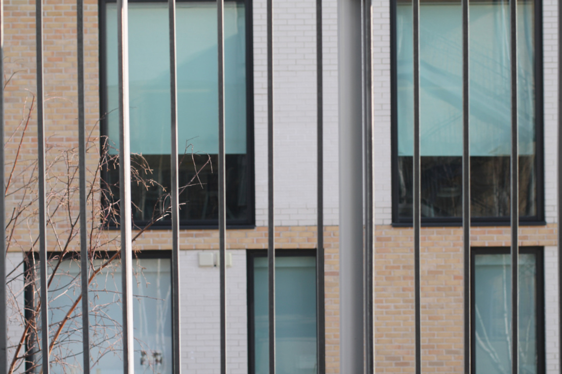
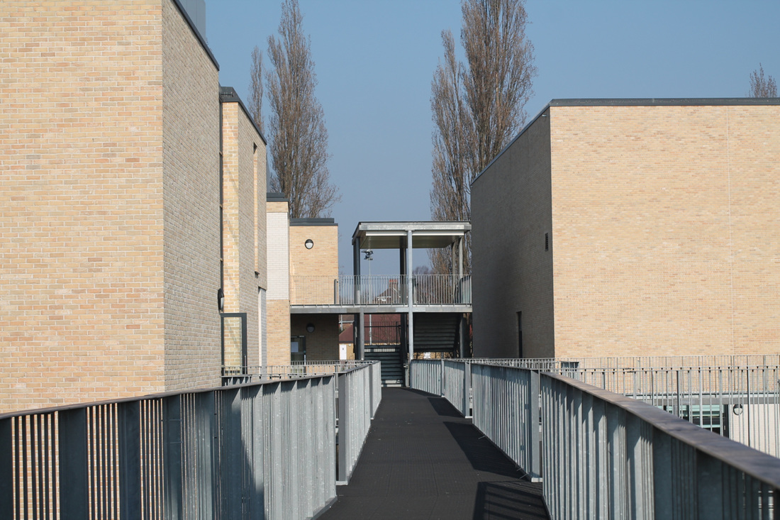
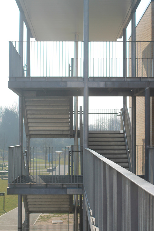
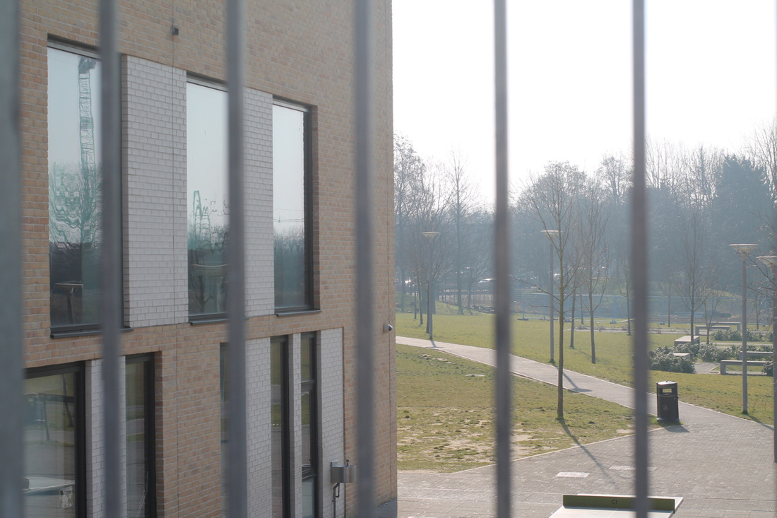
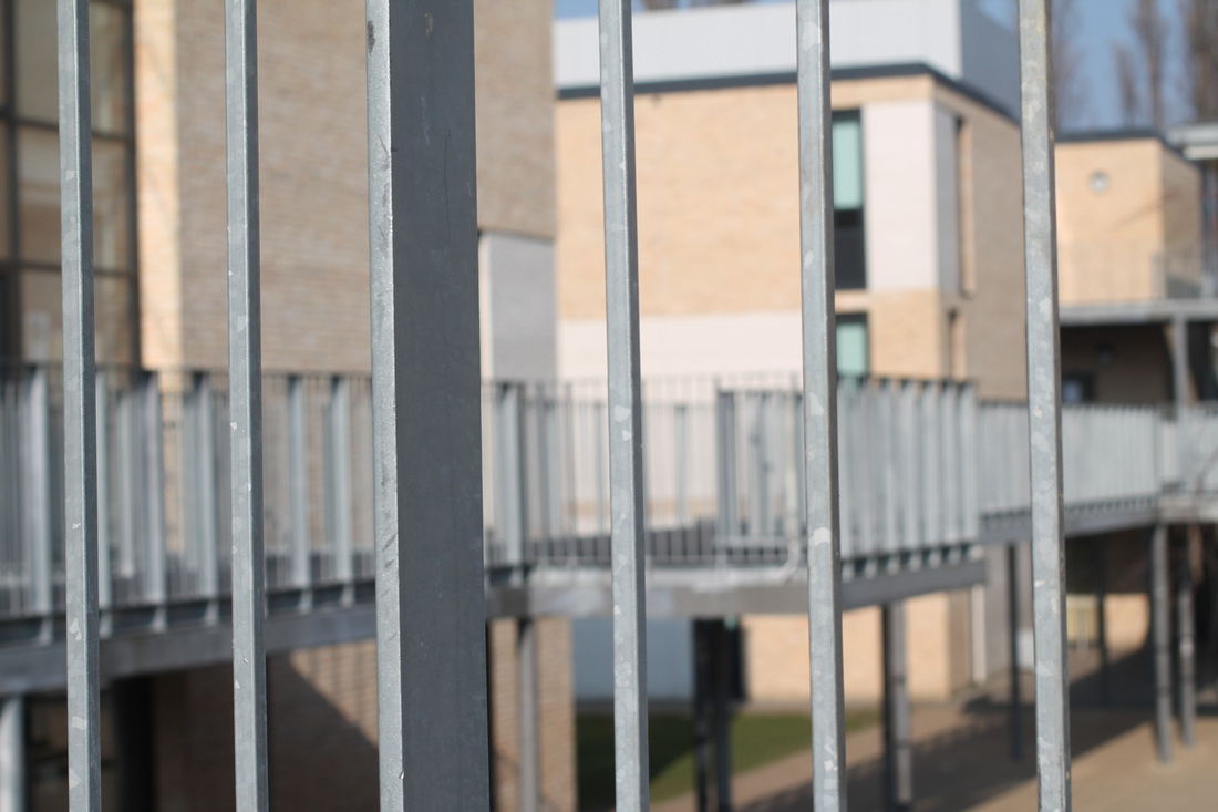
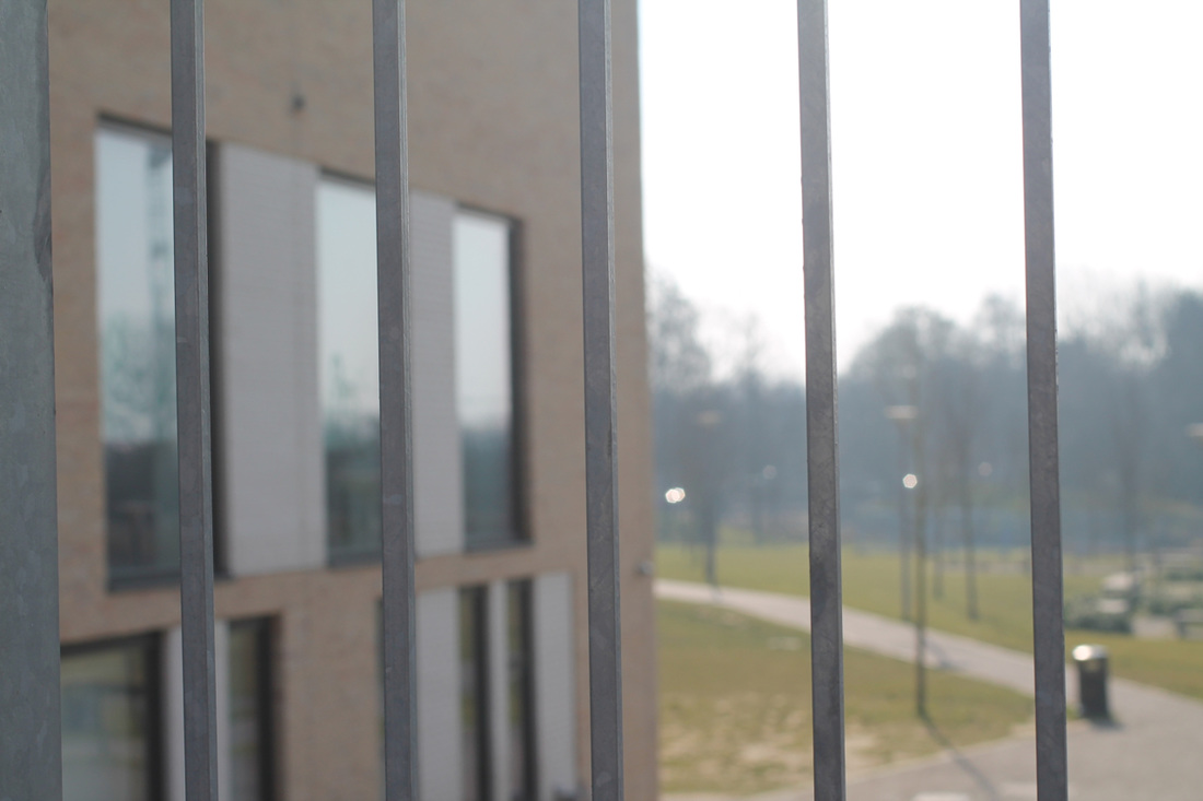
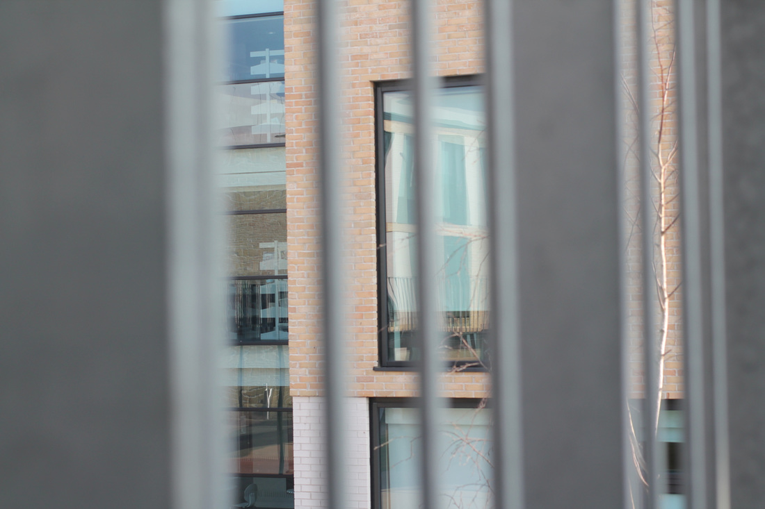
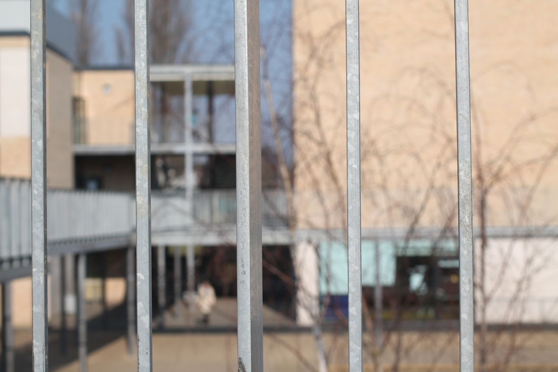
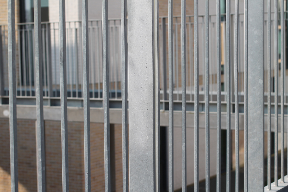
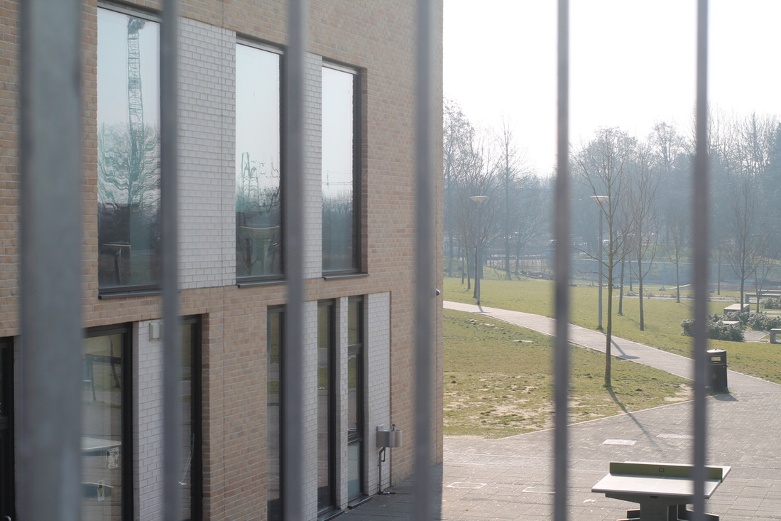
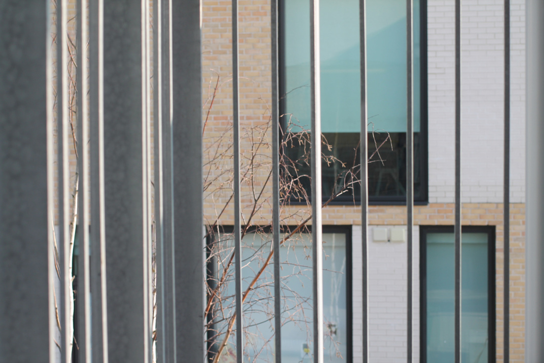
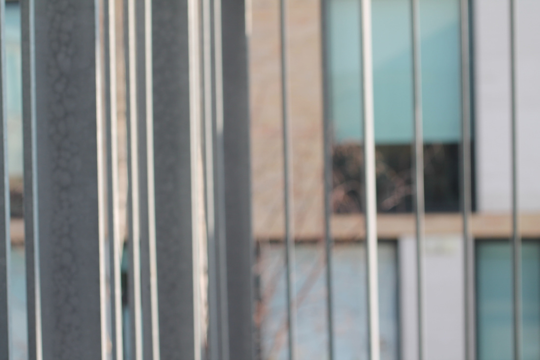
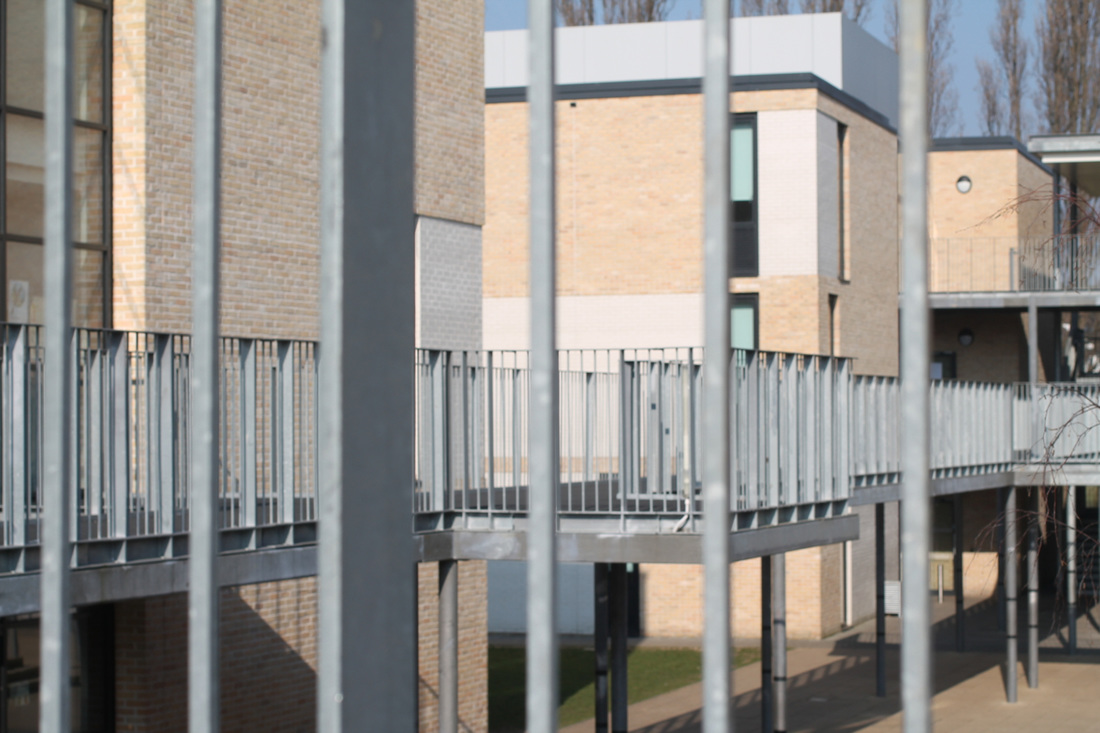
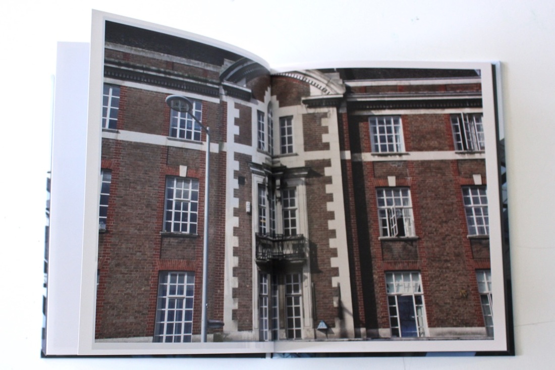
Within the lesson what I have done was went out on the school ground to take some pictures of the school buildings. I have used a DSLR Canon camera with a macro lens, I wanted to use the macro lens because I thought I would take close ups of the buildings. I think the pictures work really well because I have thought about all of the four corners and carefully decided on the image I am taking. By focusing on the image within the camera's screen you have to think about all of the four corners this is because if you want to make something your main focus you have to think about the rest of the image instead of the main thing, because by focusing on the main thing you will forget about the rest and then when you at the image again you would realise that the image wasn't taken at the right angle, which is too busy in the background. What has worked really well with these pictures is that their turnout the way I didn't want it to, which was just trying to make the building the main focus. If I was to go out to take another set of images I would focus on the main object and taken several images of the same frame but in different angles and then pick out from a few.
PhotoBook Layout Preparations
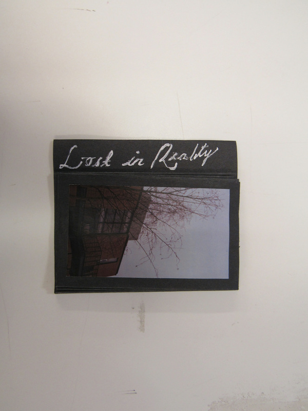
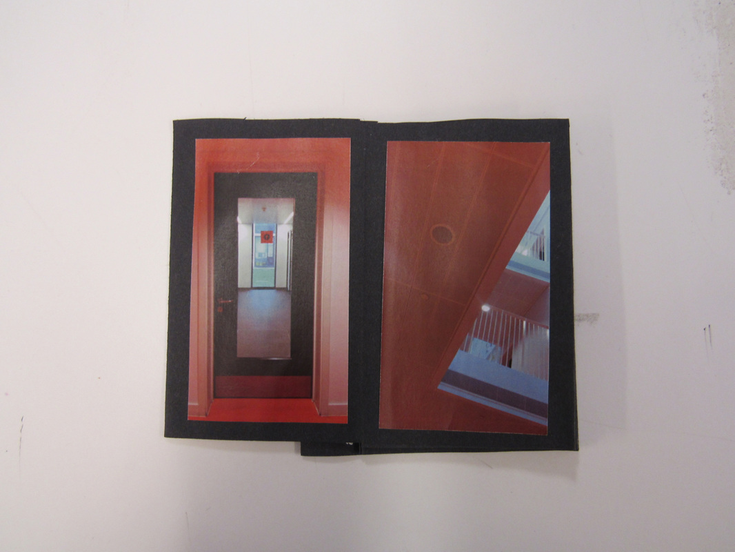
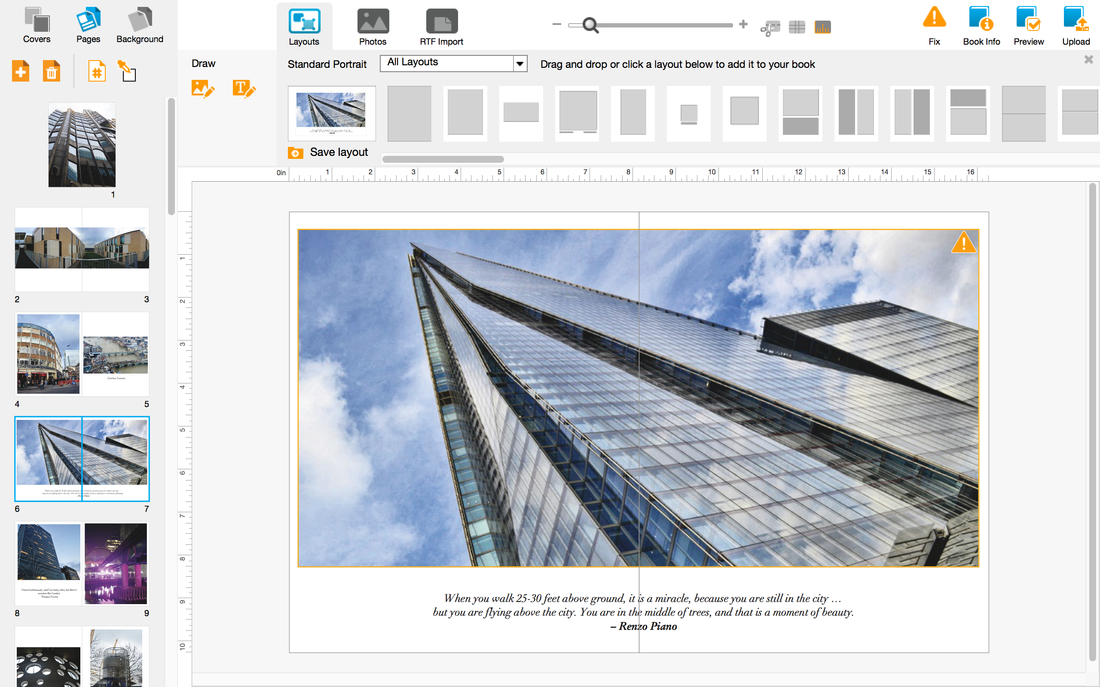
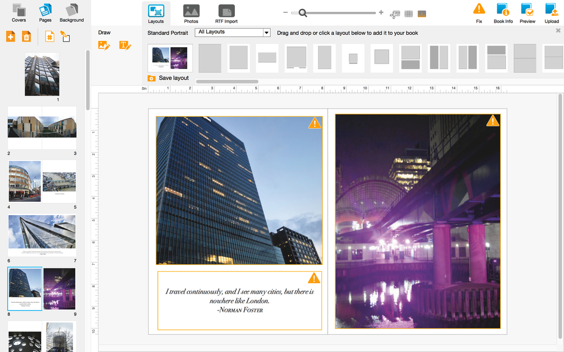
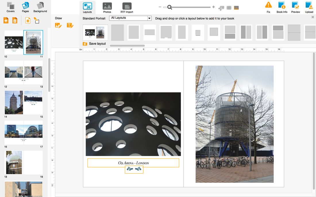
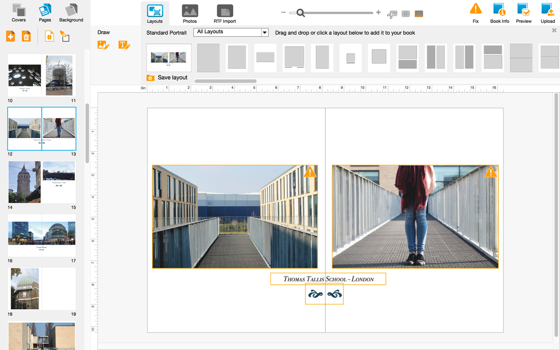
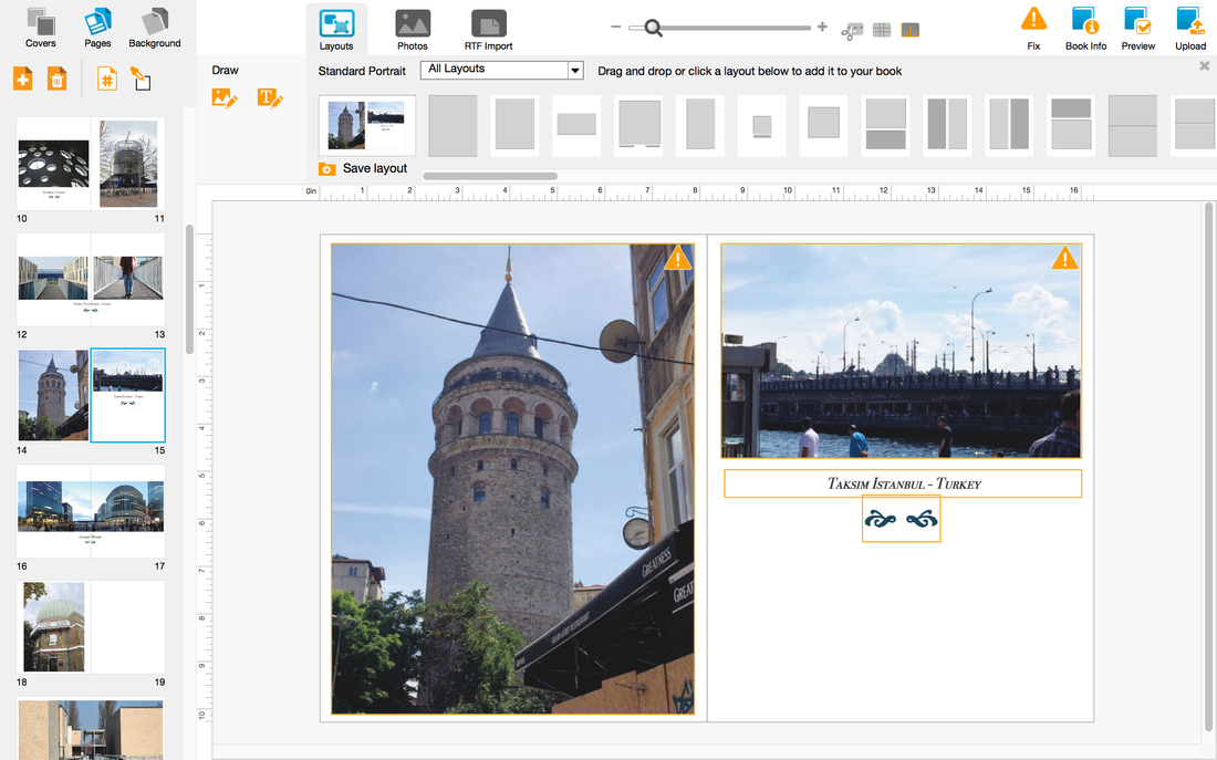
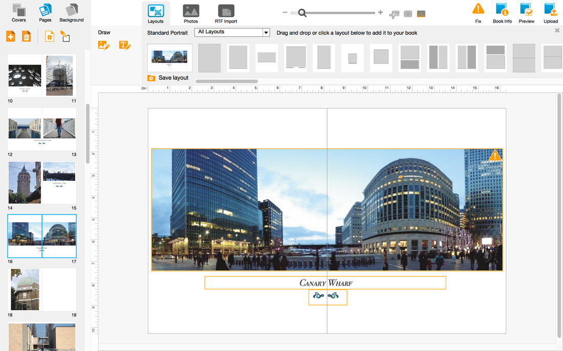
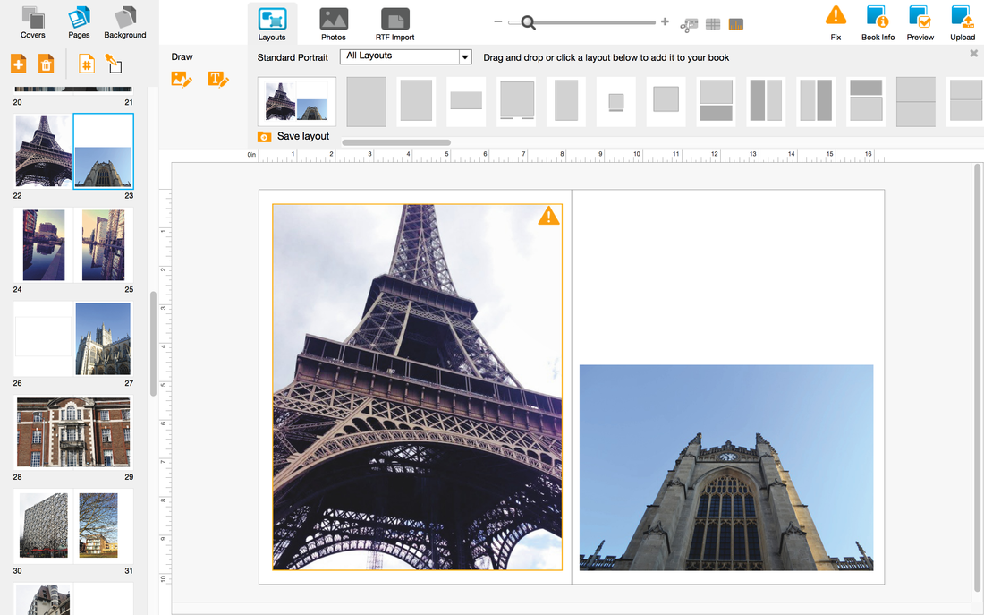
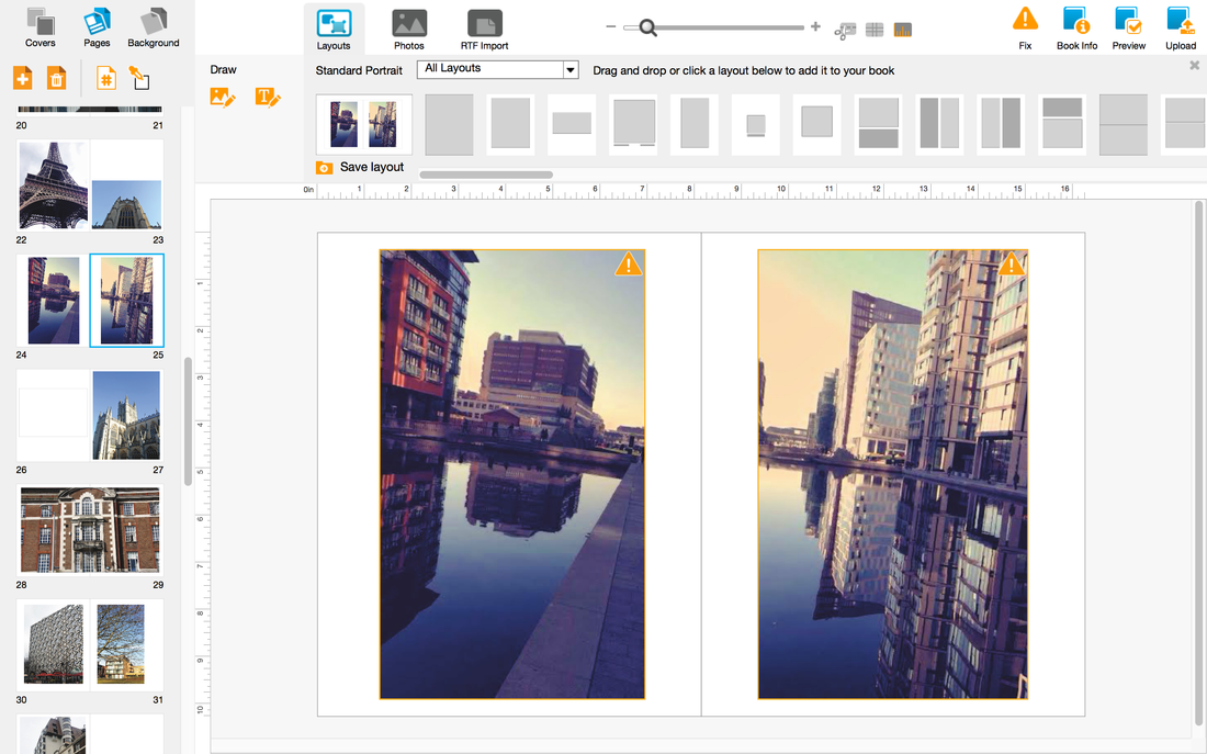
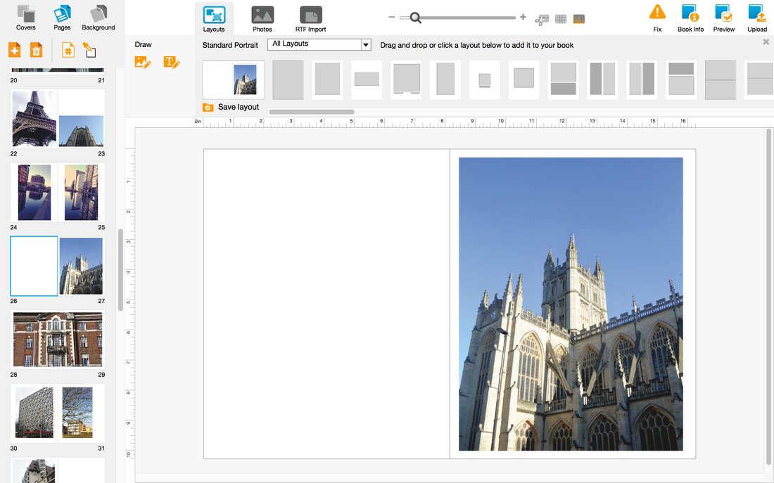
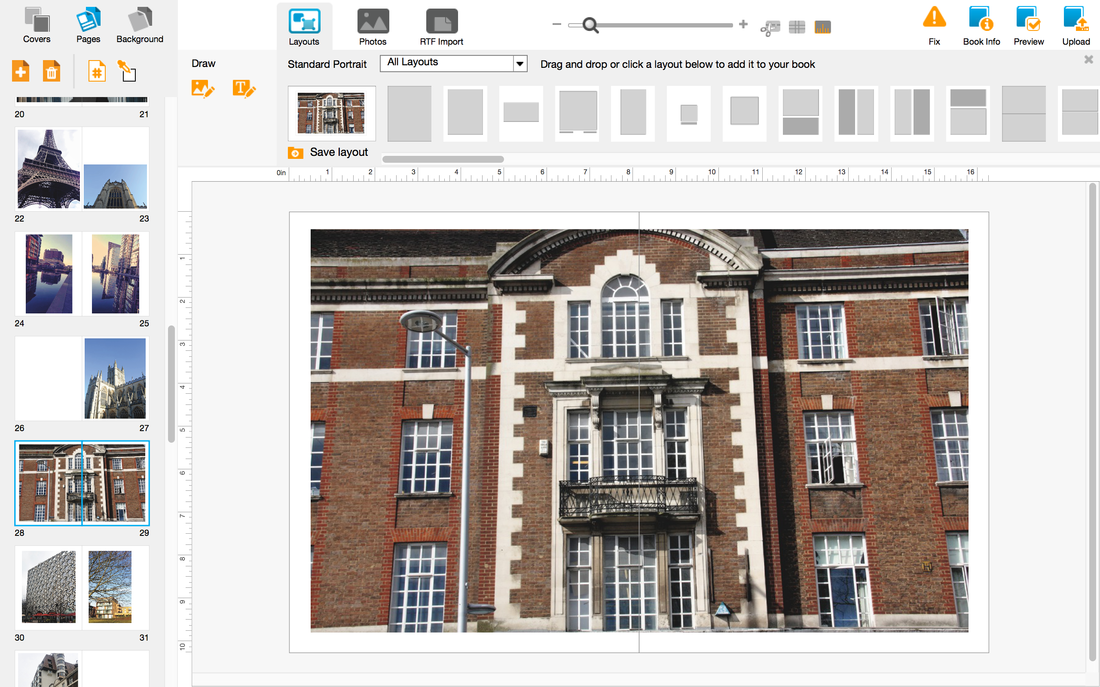
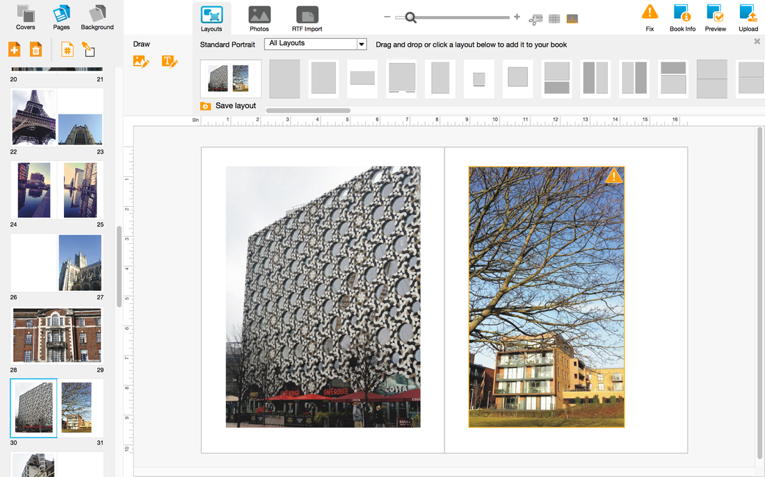
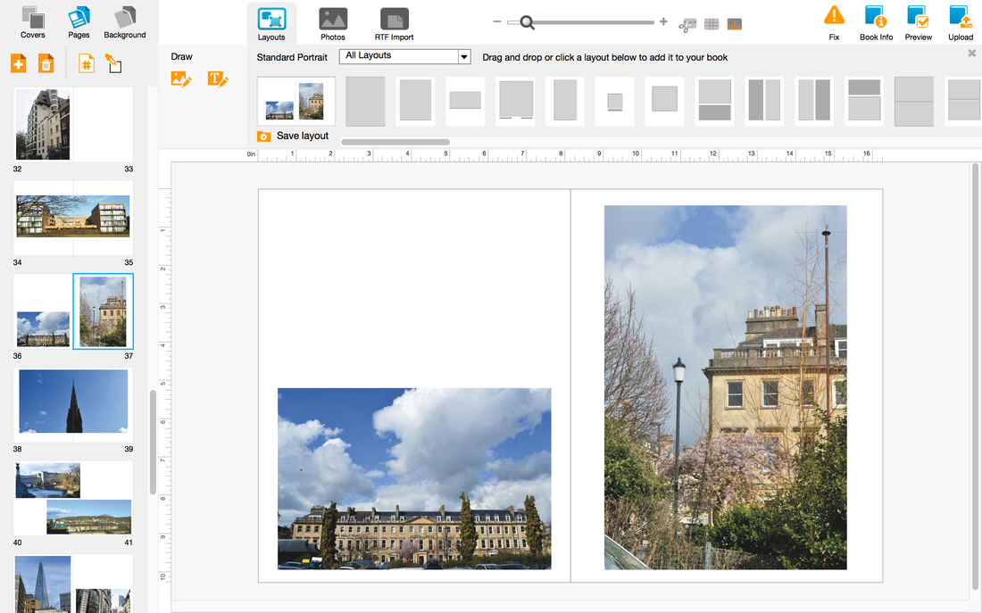
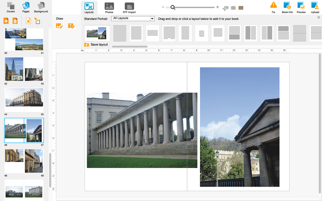
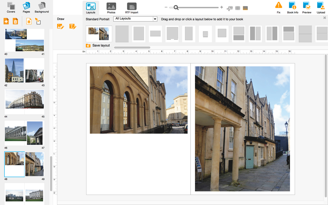
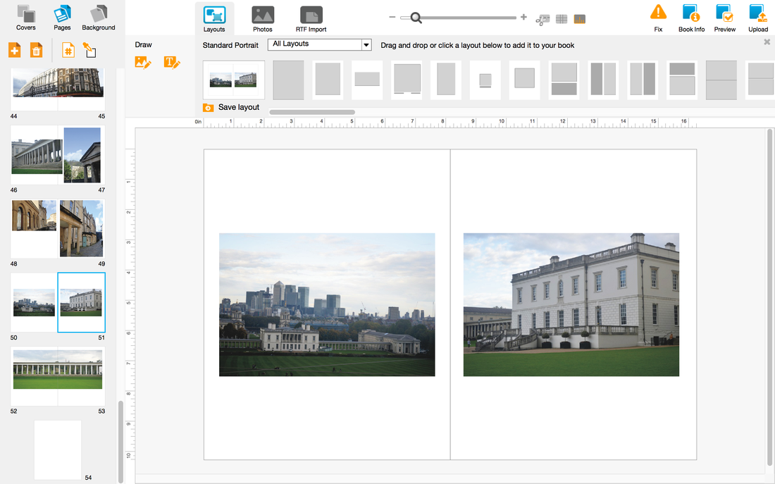
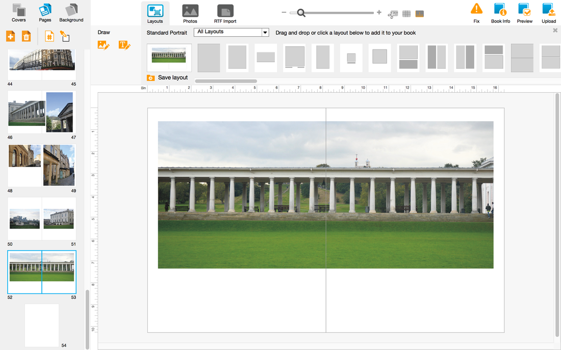
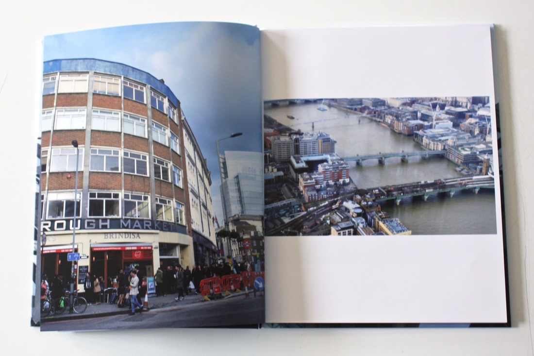
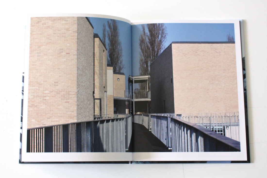
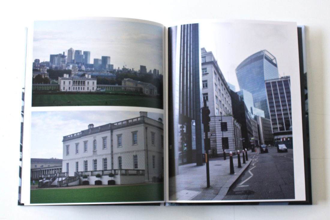
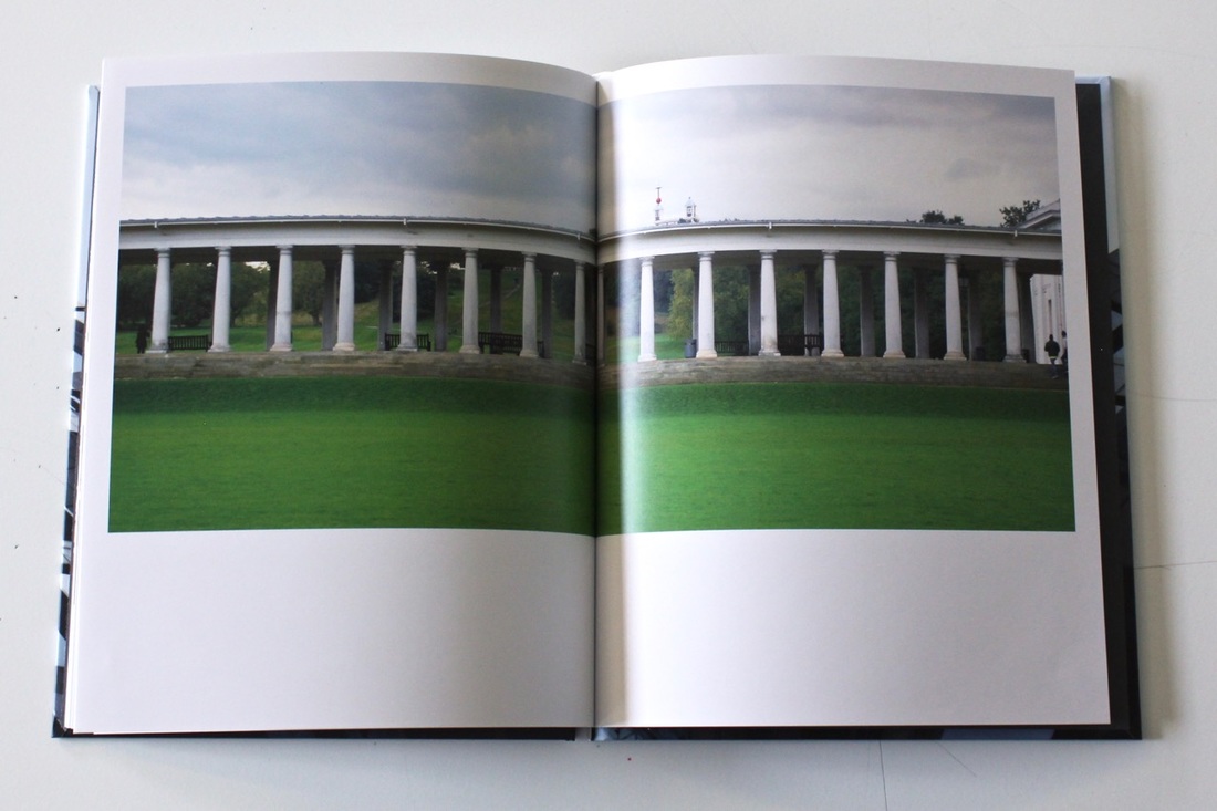
At this stage I started to select my pictures that I wanted to include within my photobook. The disadvantages of having a lot of pictures is that you have a lot to chose from, thinking about which one would work better and why. I printed out a contact sheet, which made it easier for me to go around and asking my classmates for advice. The one they chose I cut them out and laid them all onto the table figuring out, what type of pictures they went for and why? I selected the pictures that I wanted to use for my photobook using the advice and feedback that my classmates gave. Then I placed all of the selected pictures into BookWright, I was able to layout my pictures in the order that I wanted it to, by giving me different options on if I waned to add text or a border. The hardest part of making your own book is the layout because you would then ask yourself Why this layout? Why these pictures? Couldn't you tried other pictures? When asking these questions you then improve your work by changing things that might not have worked when you first looked at it. The order that I was going for was time period, because then we could see the differences between then and now and what has changed over the years.
- Quality of research - Your research is very detailed and thoughtful. The writing on your web page would benefit from proof reading, especially with regard to adding more punctuation and paragraph breaks. take care with some of the factual details. For example, Duane Michals' book 'The House I Once Called Home' wasn't made when he was 17 but in 2003 at age 70! Also, some of the writing sounds a little bit like you have mostly copied it from a web page e.g. "it is a serious work that is generally free form the cuteness and the annoyingly obvious visual jokes that can sometimes push him into the dubious category of humorous photographer." I really like how you have explained the making of your book and the creative decisions you have taken along the way.
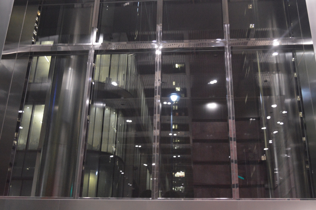
- Quality of photographs - The photographs are very skilfully made and varied in composition. You reflect very carefully about how looking at others' work has improved your images. I wonder whether some of the photographs would have worked better in black and white. I like the variety of camera angles and viewpoints, as well as the inclusion of some panoramic images of the city. Given your interest in Rut Bless Luxemburg's photographs, I wonder whether you could continue to experiment a little more with longer exposures, photographing at night and getting a bit closer to the surfaces of buildings and other structures so that the images become a little more mysterious.
- Quality of published book - The completed book looks very professional. I like the variety in the layout which creates a nice rhythm for the reader/viewer. You have carefully controlled picture quality. Did you think about grouping the buildings in any way - age, style, materials, viewpoint etc? I wasn't sure how you had decided on the sequencing of the pictures. Congratulations on the production of a very impressive photobook.
During the process of my photo book, I have researched Brassai, Richard Billingham, Rut Blees Luxemburg, Robert Doisneau and Duane Michals. I chose to research these artists because they all have a similar theme and kind of link to my theme, but they all have their own work. What has inspired me with their work was that they all have something different that I could pick up from and use their techniques with my own work. For example, with Rut Blees Luxembourg's work, I could take images of buildings but reflect them from a pond or river of a small lake. I was able to find these photographers by doing some research online, by searching on Pinterest - I was able to find really useful photographers that link to my theme and also with the help of their work I was able to expand my idea with the buildings. By doing things like this you are able to gather more ideas and by developing your ideas you will be able to get to a final stage where you say, yes I love this, and then carrying on doing the same thing with the other images that you have taken. The theme that I have explored was "architecture", this is because I wanted to explore more about the structure of the buildings and how I could change them with just a picture and trying to express my mood.
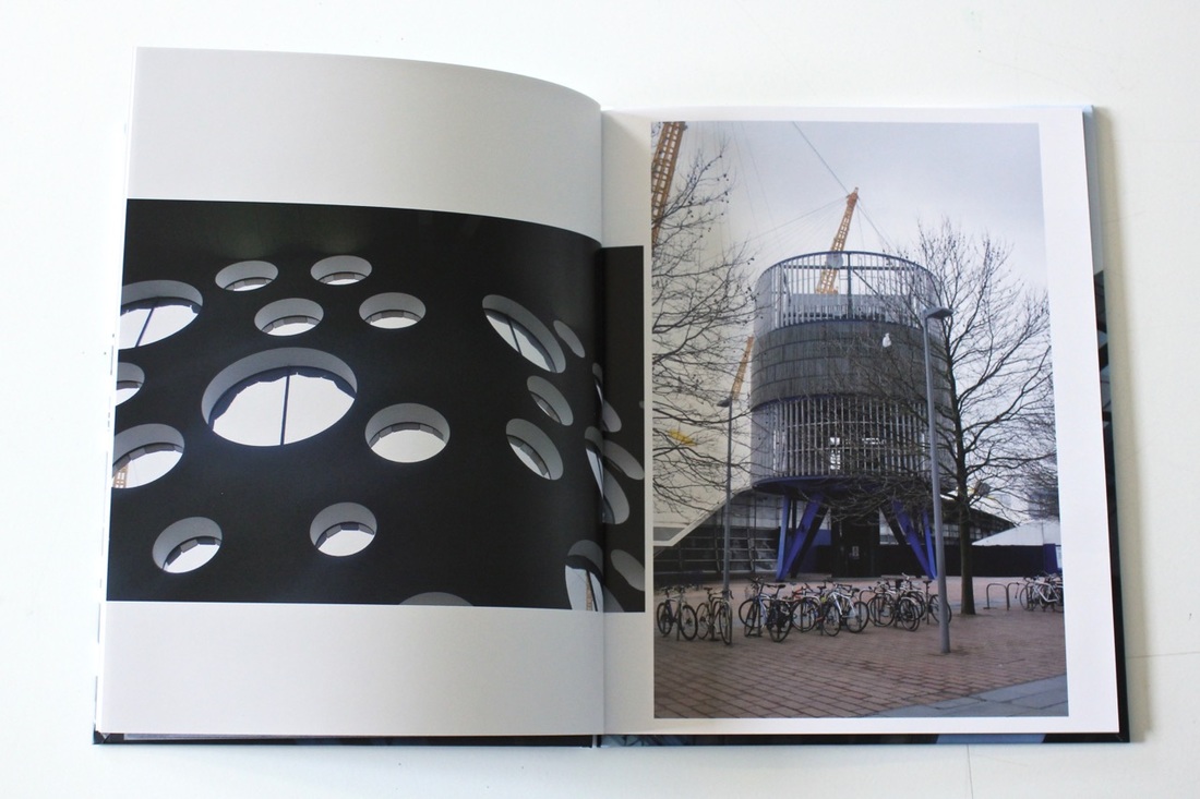
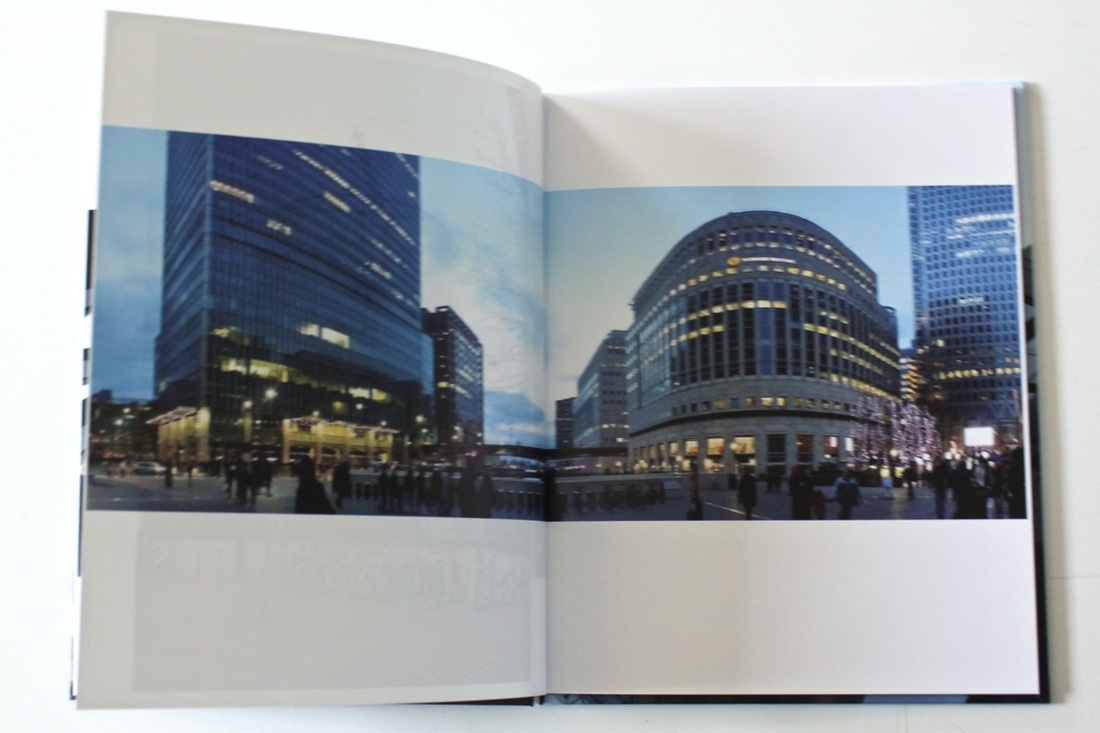
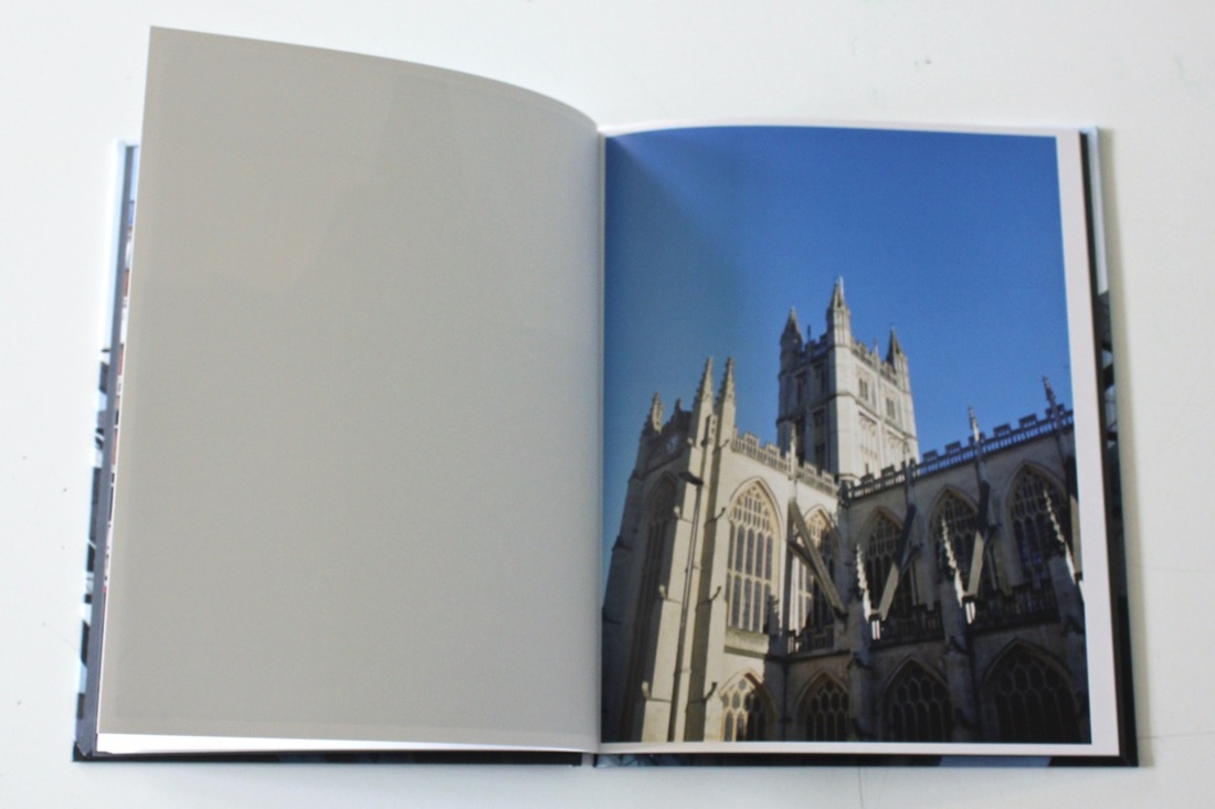
Firstly my thoughts about this theme were really keen that I would be able to complete and achieve everything I want, but when you actually try to do the things you want to do and experience different things but it isn't as easy when you say it. But my thought on my theme was that I was really keen on everything I do because I know my way around with buildings and the way they are structured. When I started doing my work on buildings I was regularly doing the basic stuff, for example, taking pictures without thinking about the angling on the image, thinking about the four corners of the image and also extending the image into something else. But after seeing other photographers work I started to change the way I work and I try to capture buildings in different ways, for example capturing a picture of a lake or river of the building reflecting to it, by doing this I would be able to give the picture a different atmosphere and allow the viewer to think about the mysterious picture. While taking pictures of buildings I sort of understood how to work with them and how to work with another type of cameras by using different techniques, I was able to borrow some of my relatives professional cameras and the different type of lenses they have, I was able to capture the same images many times in different forms. With my phone I tried taking pictures with automatic settings but I didn't really like it maybe because of the lighting or the effect, there was something to the images that I didn't really like, but what I could of done to make it better was to still take the images but then do double exposed with another image to see the effect, well then I used the panorama effect which I absolutely loved this is because by using that effect I was able to capture everything I wanted within one single image and the effect it gave is really impressive because of the curve effect it gives in the centre of the image, it makes the landscape look like that in real life but then I used my Nikon d3500 which I was able to get really detailed images because I used my telephoto lens and my macro lens for close-ups which they were both really useful because I was able to blur everything else expect the main object.
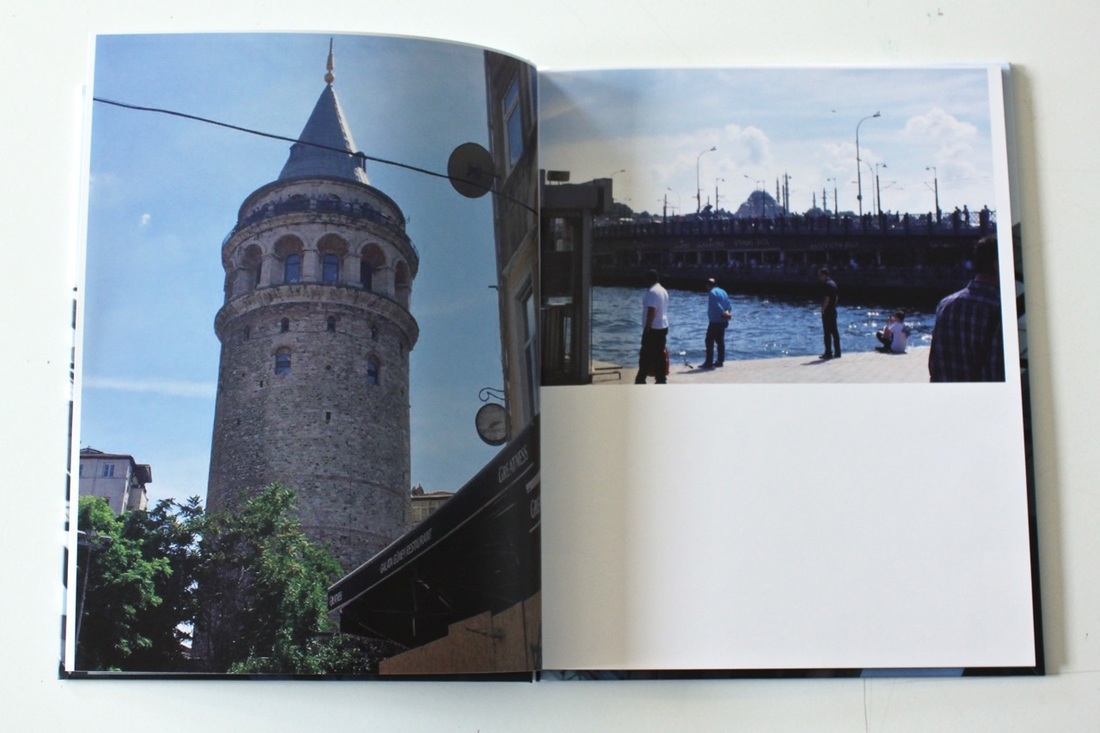
While these different processes I was kinda confused on how to capture some of the things in a different way because if you take a picture of buildings with the same technique it wouldn't have looked as effective as some other techniques would look. So while I was out taking pictures with my phone, I decided to bring my Nikon camera and my different lenses so I could try out something, what I did was went to a really interesting and weird place that has a really good atmosphere, marked a place where I would always stand and by doing the different cameras I was able to capture the same picture in different forms. Which then you would be able to see the differences between each of them by laying them out altogether. After taking a lot of images of the city, other cities in England and in Turkey, it was time to figure out which ones are more appropriate to put in my book. What I did was printed all of them out as a contact sheet and laid them all over the table and asking my classmates for their opinion, I told them to mark the ones they think is most successful for my photobook, this idea was really useful because then I was able to select the ones I liked and by doing a few adjustments I started placing them in my book and trying to figure out which side or opposition I should place it in. I think this part was the hardest bit ever, I think this because trying to figure out which pictures look better together or alone. So just by placing a picture on one page, I was able to drag several images next to it till I found the right one. But overall I think my book has worked out really well, the placing of images for each page has worked better than what I have thought it would look. The things that have worked really well is the style of the pages and that is because the layering on the website looks totally different to the layering on the book. When you are editing online you have a borderline to place your pictures within because if you passed that borderline the images would be cropped out from the book so that it could fit in the right place of the book.
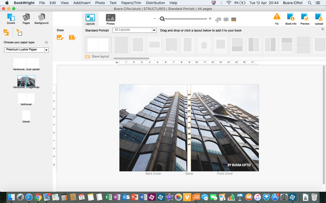
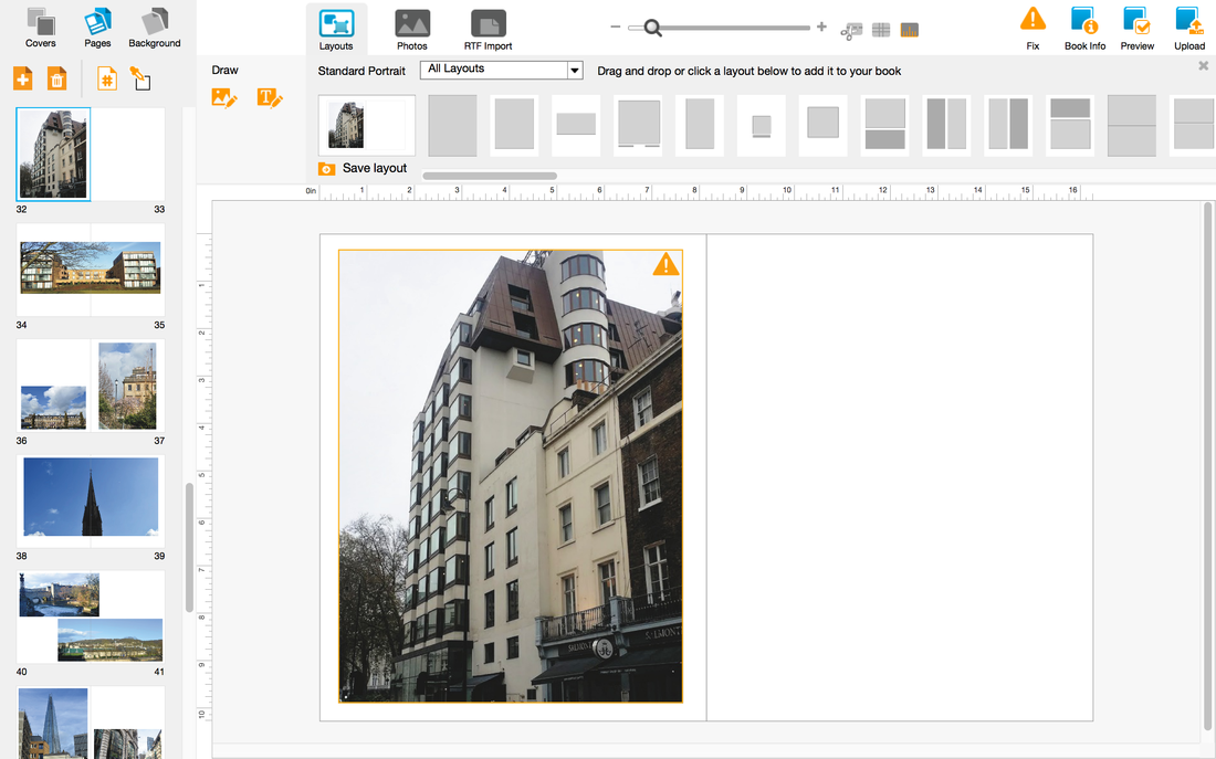
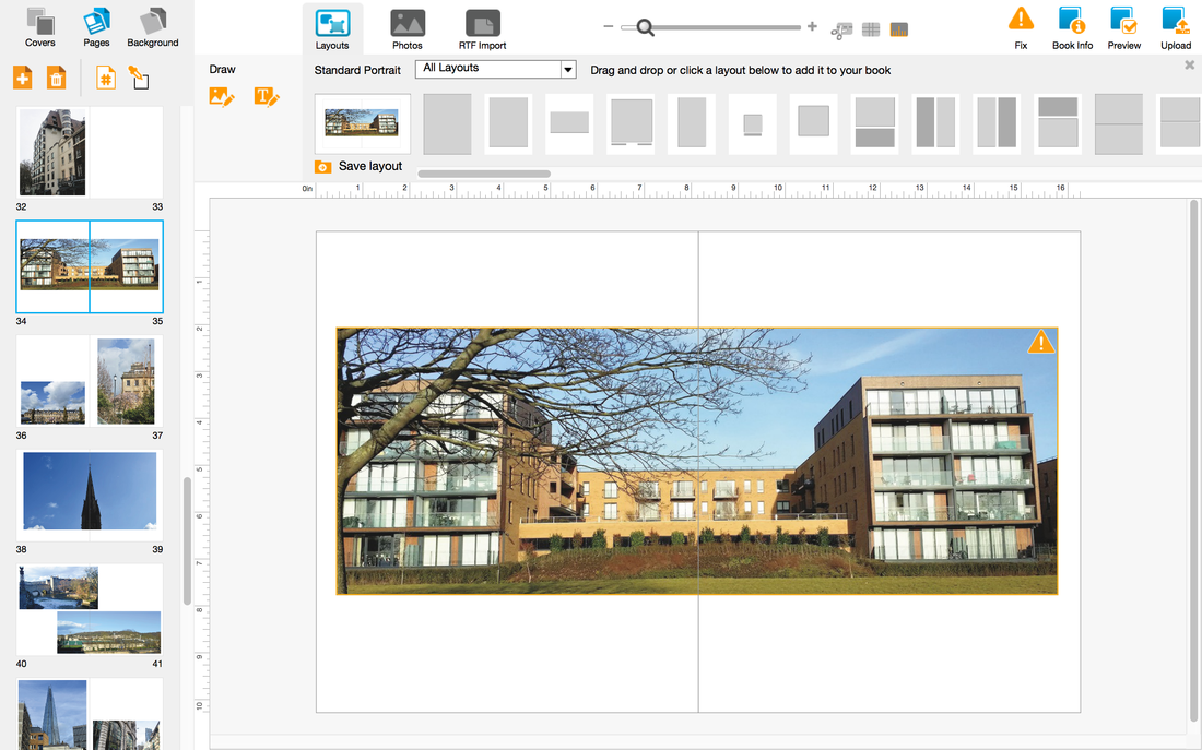
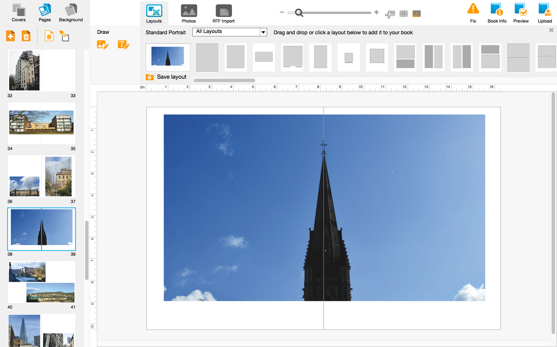
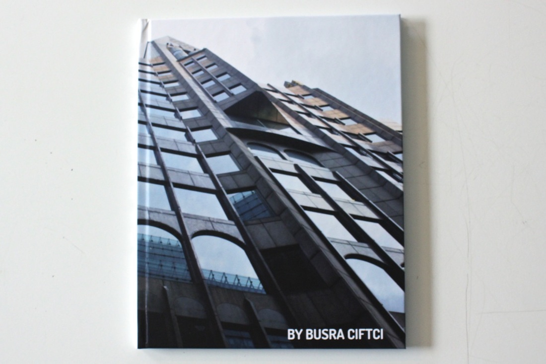
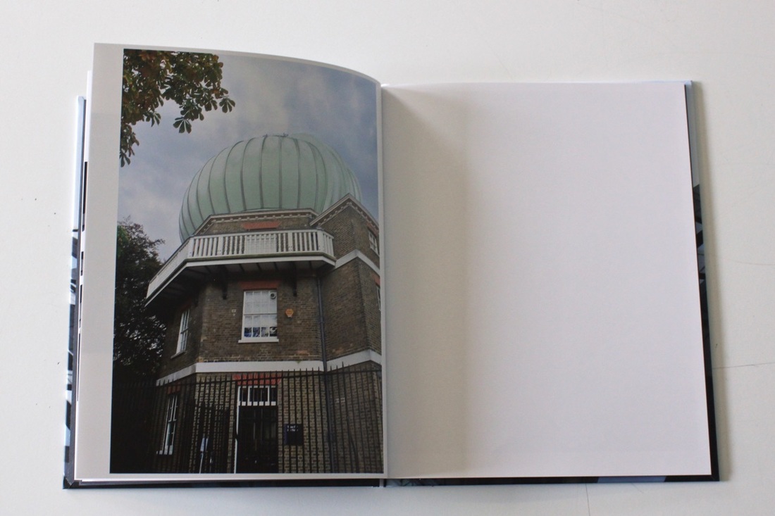
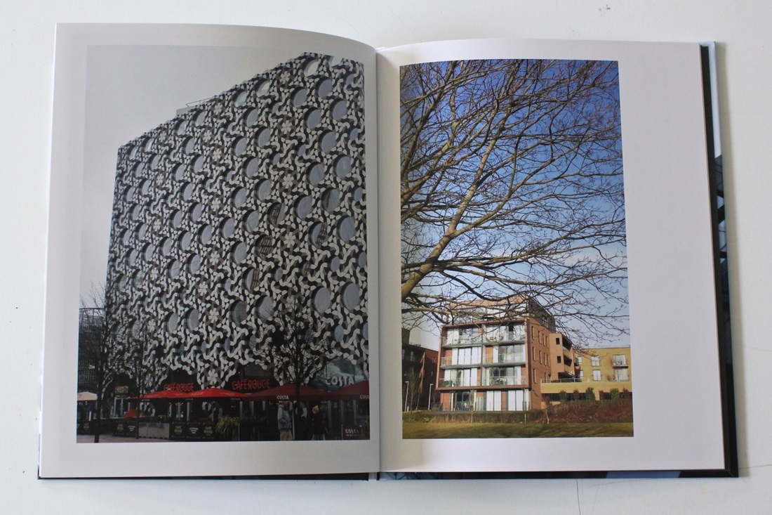
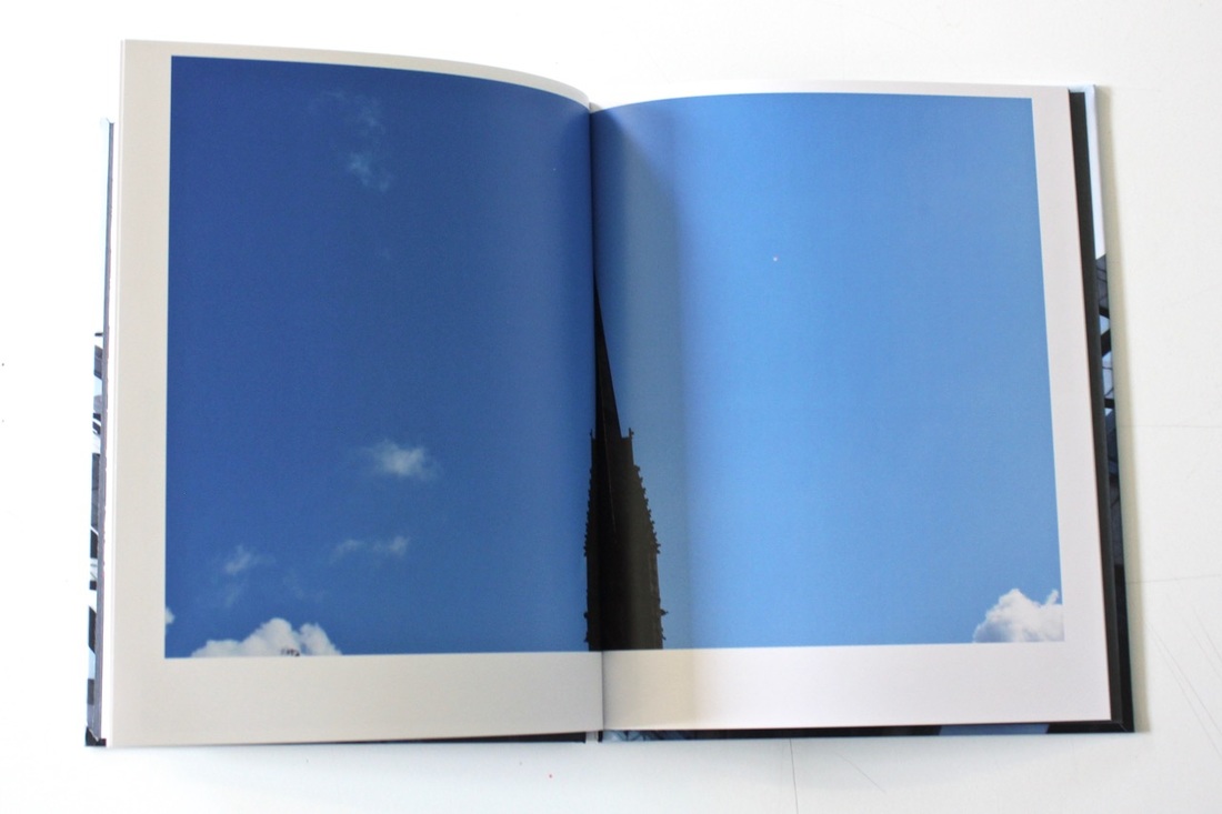
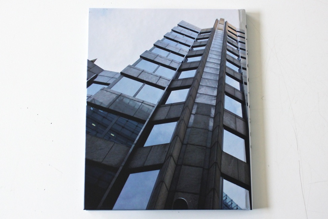
The cover of the book, I have placed an image of a building which is going over the spine of the book, I wanted it to do it like that because it looks better than placing two different images because it's going to look weird and too mixed up, by placing one image you can see the image clearer. I have placed the title on the spine of the book because if I had placed it on the front cover it would have been too messy and it wouldn't have looked as effective as it would look by itself. The disadvantages of this book have been that I could have added text into the images for example, including the location of the image so that the viewer would know where the place is if the image has been taken someplace where they have never seen before or they would like to visit it because of the atmosphere. I could improve the layering of some of the images, where they have been placed and the organising of them. And with one of the images I have placed it right in the centre of the page which didn't work really well this is because the image that I have taken the picture the object was right in the centre of the image the and rest was the sky so by placing it right in the centre of the book when you open the book you can not really see the image clear enough or realise what the image really is, so what I could do better next time was make a handmade book and I should have placed all the images and see how it would have looked before publishing the book.
Firstly my thoughts about this theme were really keen that I would be able to complete and achieve everything I want, but when you actually try to do the things you want to do and experience different things but it isn't as easy when you say it. But my thought on my theme was that I was really keen on everything I do because I know my way around with buildings and the way they are structured. When I started doing my work on buildings I was regularly doing the basic stuff, for example, taking pictures without thinking about the angling on the image, thinking about the four corners of the image and also extending the image into something else. But after seeing other photographers work I started to change the way I work and I try to capture buildings in different ways, for example capturing a picture of a lake or river of the building reflecting to it, by doing this I would be able to give the picture a different atmosphere and allow the viewer to think about the mysterious picture. While taking pictures of buildings I sort of understood how to work with them and how to work with another type of cameras by using different techniques, I was able to borrow some of my relatives professional cameras and the different type of lenses they have, I was able to capture the same images many times in different forms. With my phone I tried taking pictures with automatic settings but I didn't really like it maybe because of the lighting or the effect, there was something to the images that I didn't really like, but what I could of done to make it better was to still take the images but then do double exposed with another image to see the effect, well then I used the panorama effect which I absolutely loved this is because by using that effect I was able to capture everything I wanted within one single image and the effect it gave is really impressive because of the curve effect it gives in the centre of the image, it makes the landscape look like that in real life but then I used my Nikon d3500 which I was able to get really detailed images because I used my telephoto lens and my macro lens for close-ups which they were both really useful because I was able to blur everything else expect the main object.
While these different processes I was kinda confused on how to capture some of the things in a different way because if you take a picture of buildings with the same technique it wouldn't have looked as effective as some other techniques would look. So while I was out taking pictures with my phone, I decided to bring my Nikon camera and my different lenses so I could try out something, what I did was went to a really interesting and weird place that has a really good atmosphere, marked a place where I would always stand and by doing the different cameras I was able to capture the same picture in different forms. Which then you would be able to see the differences between each of them by laying them out altogether. After taking a lot of images of the city, other cities in England and in Turkey, it was time to figure out which ones are more appropriate to put in my book. What I did was printed all of them out as a contact sheet and laid them all over the table and asking my classmates for their opinion, I told them to mark the ones they think is most successful for my photobook, this idea was really useful because then I was able to select the ones I liked and by doing a few adjustments I started placing them in my book and trying to figure out which side or opposition I should place it in. I think this part was the hardest bit ever, I think this because trying to figure out which pictures look better together or alone. So just by placing a picture on one page, I was able to drag several images next to it till I found the right one. But overall I think my book has worked out really well, the placing of images for each page has worked better than what I have thought it would look. The things that have worked really well is the style of the pages and that is because the layering on the website looks totally different to the layering on the book. When you are editing online you have a borderline to place your pictures within because if you passed that borderline the images would be cropped out from the book so that it could fit in the right place of the book.
The cover of the book, I have placed an image of a building which is going over the spine of the book, I wanted it to do it like that because it looks better than placing two different images because it's going to look weird and too mixed up, by placing one image you can see the image clearer. I have placed the title on the spine of the book because if I had placed it on the front cover it would have been too messy and it wouldn't have looked as effective as it would look by itself. The disadvantages of this book have been that I could have added text into the images for example, including the location of the image so that the viewer would know where the place is if the image has been taken someplace where they have never seen before or they would like to visit it because of the atmosphere. I could improve the layering of some of the images, where they have been placed and the organising of them. And with one of the images I have placed it right in the centre of the page which didn't work really well this is because the image that I have taken the picture the object was right in the centre of the image the and rest was the sky so by placing it right in the centre of the book when you open the book you can not really see the image clear enough or realise what the image really is, so what I could do better next time was make a handmade book and I should have placed all the images and see how it would have looked before publishing the book.
